Drawing like a pro - 92, Masterclass - The Last Supper by Leonardo da Vinci, part I: Analyzing the drawing
Hi friends!
We will use the knowledge acquired throughout all the drawing lessons to gain an understanding of the drawing process of these masters of all time, sometimes we will try to understand their thinking, the meaning of the composition of the drawing, etc.
We will also be going a step further in our drawing study because I will take advantage of this study to make several approaches to achieve the closest interpretation that we can make of this painting through drawing. To carry out this task I am going to make the drawings step by step with different media using different tools, digital or paper and pencil.
So, I hope you follow me step by step in each post and don't wait to have the full tutorial because that can take several days.
Throughout this lesson, I will try to refer you to the corresponding previous lesson in case I find it necessary.
Well, I hope you enjoy this process as much as I do.
I think this painting needs no introduction but anyway: it is "The Last Supper" by Leonardo Da Vinci.
We will put aside any religious consideration for or against this painting. What concerns us is trying to understand what makes this painting, its drawing, so magnificent and so simple at the same time.
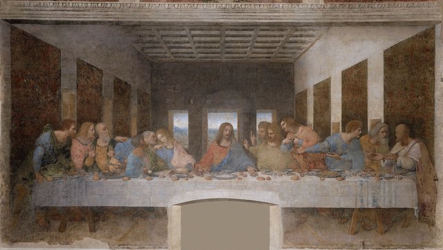
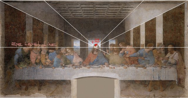
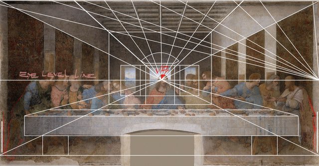
We immediately appreciate that it is a symmetrical composition, where the central character is situated in the middle of the composition and all the vanishing lines converge towards him.
By tracing the vanishing lines coming from the ceiling and walls we can determine the vanishing point (VP) and the eye-level line (horizon line).
This places the viewer in the middle of the painting facing the main character's face.
See One-point perspective
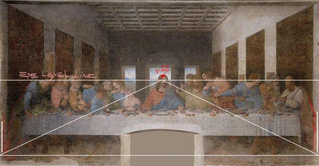
To determine the location of the vanishing lines from the floor, I have outlined the clothes on the backs of the characters on both sides of the painting in red, to be able to see them better, thus preventing them from appearing embedded in the walls (with the vertical white lines I have highlighted its location), then using the table legs I get the level of the floor to intersect it with the bottom edge of the walls on both sides and make these lines converge to the VP.
Now it is possible to determine the edges of the rear wall by the intersection of the vanishing lines from the ceiling and those coming from the lower edges of the walls.
We can clearly see at this point that all the elements of the composition are intentionally placed to direct the eye towards the main character.
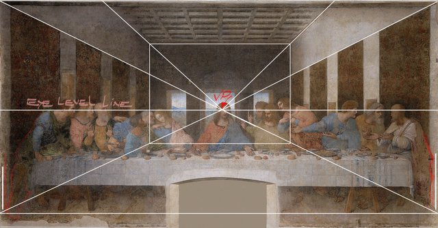
Another aspect that we can begin to glimpse here is symbolism. In the Catholic religion the "Holy Trinity" is spoken of as the representation of three divinities, "the father", "the son" and the"holy spirit" in a single entity, this is present in all Catholicism, and through numerology, it is represented (as it is logical) with the number three (3), so here we begin to see the representation of three in the composition of this painting. Where? The rear wall; that wall occupies a third of the width of the composition.
Also in the aesthetic field, dividing the support into three parts gives harmony to the composition and directs our gaze to the centre of it.

We see here that the rear wall is also divided into three, in some way, placing three windows. Under the religious or mystical aspect, we see here, again, the representation of divinity by the number three (3 windows) where the central one coincides with the VP and consequently with the main character who is crowned by the frieze of the window.
Regarding the aesthetic treatment, we begin to recognize another aspect that I have spoken to you about previously: repetition. We see that the back wall repeats the same pattern of repetition that the entire composition already has. Interesting and beautiful. Yes?
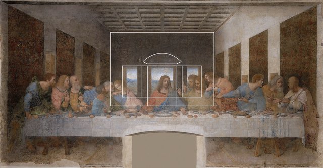
This is another beautiful relationship: the entire width of the painting is represented in the perspective of the walls, that is, the width of the composition is equal to its depth in a perspective view.
As you can see we can find the correct location of the tapestries placed on the walls using the diagonals method already seen several times in early posts.
And again, we find the repetition through the tapestries that help to break the monotony of the walls and take us to the centre of the composition, you already know why!
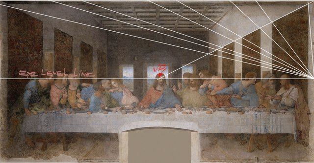
We have the table, placed in the middle and in front of the composition, destined to give unity to the group of characters that are divided by six on each side of the central character, which allows for preserving the strict symmetry of the entire composition.
You will have noticed that we could divide the painting vertically in two and see that the left and right sides correspond completely, the back windows, the tapestries on the walls, and the six characters on each side which add up to twelve (12 = 1+2 = 3 in numerology). Again the religious character and the esoteric representation are present here.
In symbolic terms, these characters are echoing the "Holy Trinity" that is represented by the central character.
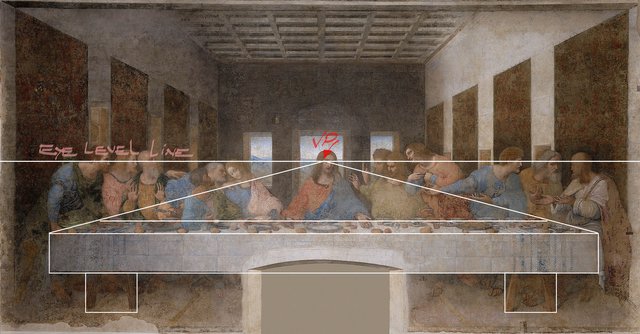
The ceiling: all its vanishing lines go to the central VP. Have you counted them? There are six (6 = 2 times 3 in numerology). The representation of the "holy trinity" must always be present, that is imperative because that is the central theme of the painting behind the representation of the last supper.
We also see the ceiling divided into cells to make it more interesting and accentuate the sense of depth through orderly repetition.
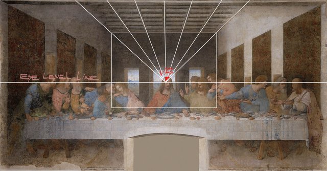
These are the lines that will guide us to start with this challenge, drawing this interior scene.
This is a really simple composition from a one-point perspective with a central vanishing point.
It's said that Leonardo hammered a nail into the wall, then tied a string to it to make marks that helped guide his hand in creating the painting's angles.
We will not try to draw the characters because what concerns us right now is the perspective, later we will study the face and the human body.
I wish you a very nice day and good exercise!
https://steemit.com/hive-185836/@fumansiu/color-and-light-orange-round-3
is his newest lesson.
Very interesting indeed!
Well, our friend @arcoiris is back with his magnificent watercolour lessons.
Check out this last post that contains very interesting and useful advice about watercolours in different qualities and formats from different brands.
Here are the links to the previous related posts.
1 - 2 - 3 - 4 -
5 - 6 - 7 - 8 - 9 - 10 -
11 - 12 - 13 14 - 15 -
16 - 17 - 18 - 19 - 20 - 21 - 22 - 23 - 24 - 25 -
26 - 27 - 28 - 29 - 30 - 31 - 32 - 33 - 34 - 35 - 36 - 37 - 38 - 39 -
40 - 41 - 42 - 43 - 44 - 45 - 46 - 47 - 48 - 49 - 50 - 51-feedback - 52-Masterclass - 53-Homework Contest #6 - 54-Lesson - 55-Lesson - 56-Lesson - 57-Lesson - 58-feedback - 59-feddback - 60 Masterclass - 61-HW Contest #7 - 62-Lesson - 63-Lesson - 64-Lesson - 65-Lesson - Lesson-66 - 67-feedback - 68-feedback - 69-feedback - 70-Masterclass - 71-Homework Contest #8 - 72-Lesson - 73-Lesson - 74-Lesson - 75-Lesson - 76-Masterclass - 77-Homework - 78-Lesson - 79- Lesson - 80-lesson - 81-feedback - 82-lesson - 83-Masterclass - 84-HW contest - 85-feedback - 86-lesson - 87-lesson - 88-lesson - 89-feedback - 90-feedback - 91-lesson
Also, thanks to @xpilar for making these initiatives possible with their great support.
I have seen images with this picture many times. But I never paid attention to its construction. It's just too harmonious and the details disappear from view.
We can say that your lessons are presented here with a perspective at one point. It's hard to find a better example. Although...I think it's not difficult for you, Jorge :)
THank you very much!!
My Pleasure :)
Your post is manually rewarded by the
World of Xpilar Community Curation Trail
STEEM AUTO OPERATED AND MAINTAINED BY XPILAR TEAM
https://steemit.com/~witnesses vote xpilar.witness
Thank you!!
I'm speechless. I never looked at this painting this way, but maybe subconsciously that's what drew me towards it…the mathematical and logical symbolism. This is a very impressive explanation of this painting.
Thank you very much!
Hi Jorge, thank you for this impressive lecture, it was like I was there and was listening to you live. I actually needed to read the post couple of times, because after each section I needed to go back to painting and to see what you mean, but also to find the points that you were talking about.
I always loved this painting, I did not why but maybe because of the harmony and symmetry. There is nothing irritating in this painting, it is even something that calms me down, relaxing and giving a very special feeling.
I never thought about all the rules that Leonardo applied in this painting and it is funny that now knowing what is a foundation of esthetic drawing it is easy to understand what and why it was done like that.
Absolutely valuable knowledge thank you for tips and guidance.
Dear @steemcurator01, would you please assess this post and if you feel like me that it deserves more support then it would be appreciated!
Hi Stef, thank you very much for your kind words. Also thanks for the nomination.
Do you think he knew all this when painting or it was a happy conididence
Hi Sarah, glad to see you again!
Happy coincidence? Of course, no.
Brunelleschi (1377 - 1446), a noted architect, rediscovered the principles of linear perspective, known to the Greeks and Romans but buried during the European Middle Ages.
Da Vinci, born in 1452 (6 years after Brunelleschi's death), around the age of 14 became a student and study boy in the workshop of Andrea del Verrocchio, who was the leading Florentine painter and sculptor of his day.
Thus, when Leonardo da Vinci painted The Last Supper, he knew and applied everything he had learned since his adolescence.
In any case, it is unthinkable that someone could do something similar with all those geometric and esoteric relationships and this symmetrical perfection by coincidence.