A Collected Photography Post - My Own Work (13 photographs with discussion and new edits)
Introduction
I've posted a lot of photography on Steemit and due to me not having a lot of followers initially some of my favourite pieces of work were not really seen by many people. I hope you won't mind if I reshare some of these pieces. I tend to tinker with photos a lot and some of these have been re-edited to increase contrast and change the feel slightly. I will also try to share some of the information and insights behind them too.
The Photos
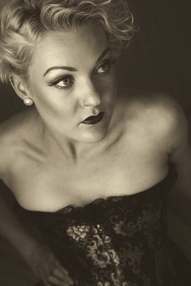
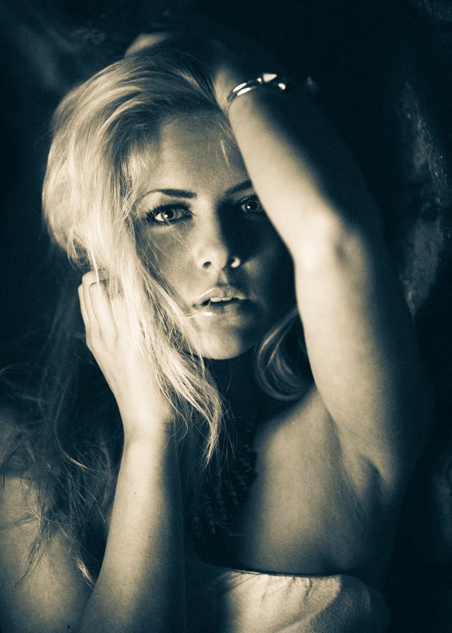
1 Zoe "Untitled" Sepia Processed Shot:
This one has not been posted before in any form. As always it was a combination of LR, PS and Nik Silver Efex Pro 2. I added some extra contrast by using a little dodging and burning in PS. I love the composition and tones here. This was shot using a beauty dish with a white cloth attached and fairly close to the model.
2 This is my favourite shot from the 50 Shades of Zoe Post.
I just love the out of focus book and the closeup of the focussed face here. I have left it as is. I think posting it in a series of shots from the same set actually detracted from it and it works better on its own.

3 - When I originally posted this it was suggested to increase the contrast on it and a few people preferred the high contrast version of this shot of Zoe but it was only a small thumbnail version.
Here is the larger version. Personally I still like the lower contrast version but I think for the majority of screens (which are not using professional colour management) this probably works better.
4 - This is a complete reworking of the previously posted shot from this set.
I wanted to try increasing the contrast so it would look better on the vast majority of screens. I think it works better like this. The darker background also helps to draw attention to the face more.
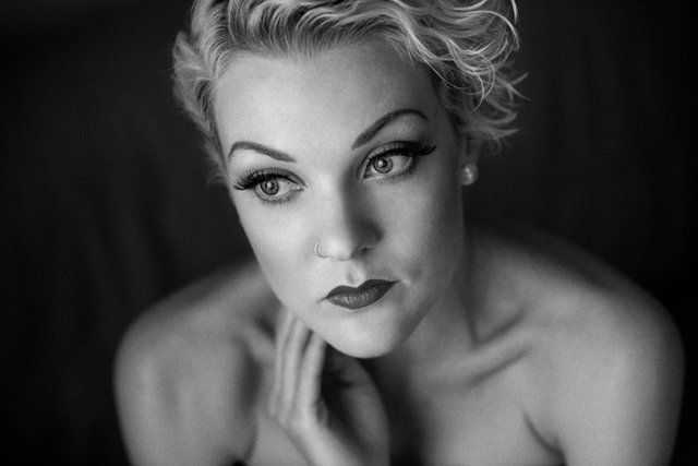
5 - Rachelle "The Look" - this has been posted before but this is a re-edited high contrast version.
The original is one of my favourite shots and has won a number of online and magazine favourites and Editor's picks type awards. I think the simplicity and intimacy of this shot is what I like most.
6 - Portrait of Rachelle
- I have not altered this because I like the bright sepia and the contrast with the dark eyes. I'm not sure if increasing the contrast would help on this one. Let me know what you think though.

7 - Rachelle - Soft Portrait.
This is a very soft black and white portrait. I was tempted to try to make a high contrast version of it but I just like it as it is. I like the composition and lines here and the softness lends it a dream like quality for me.

8 - Rachelle - "Breeze" - another one of my favourites.
This one has a mild increase in contrast to how it was when I originally created this edit but is the same version from my original Steemit post which wasn't seen by many people. I love the pose and expression here.

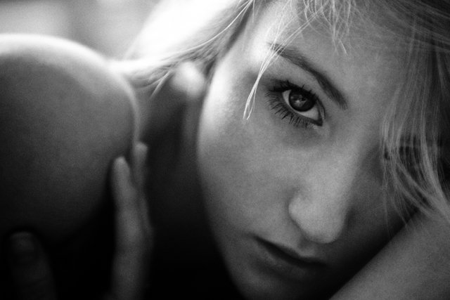
9 - Portrait of Emily.
Another one of my favourites - this is re-edited to reduce the contrast which I thought was too strong. This was taken in a tunnel under a very old bridge in a park. I placed a beauty dish in front of Emily and came around the side of it to take the shot - there wasn't much room. You can see the highlight created by the dish in her eyes. I used a blue/yellow split tone option in SEP2 to which I felt suited the shot more than standard black and white but I have included both for you to decide.
10 - The Standard black and white of the same shot.
As often happens when I see the two together I keep going back and forth between which I prefer. What do you think?
11 - Taken "From the Magic of Controlled Light Post"
- This is another one of my favourites and is a shot of Jenny which was taken in the basement of a night club. I loved the patterns of the vintage wallpaper in the background and the way the light from the single - gridded beauty dish I used created a very prominent "focus" of light. A grid is a plastic mesh which you can place over lights to reduce the spread and scatter. I have enhanced the contrast on this version compared to the original.
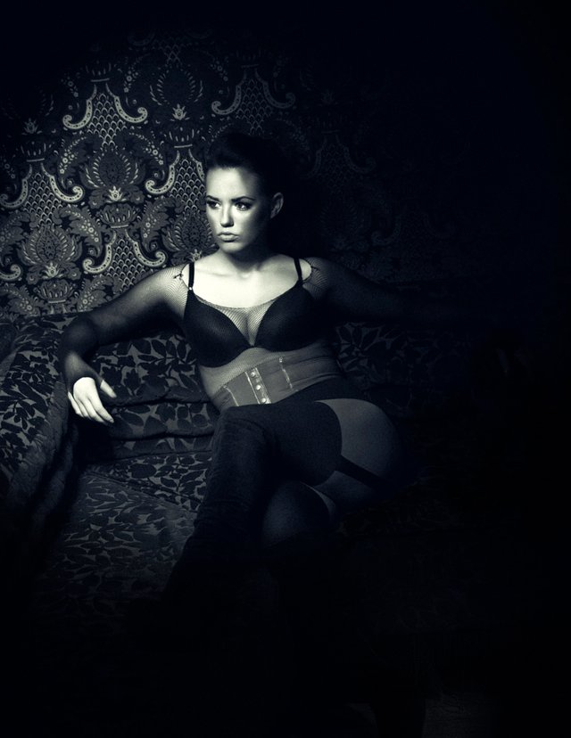
12 - Portrait of Sandra.
I love the eyes in this shot particularly. It is an extreme closeup which I love. This was also taken outdoors in natural light in a park next to some old stone structures. I used a reflector in my hand to get the highlights in the eyes. Monochrome/sepia conversion was in SEP2.

13 - Unlucky for some - "Darkness" - portrait of Rachelle.
I was disappointed that not many people saw this but that is the luck of posting at the wrong time and not getting your post put together correctly. This is one of my all time favourite shots. It is a black and white polaroid photo so is the only film photo in this list. I called it "Darkness" and at other times I thought of changing it to "Melancholia". It is an artistic representation of the perceived receding of light that occurs in depression. I hope you like it. I have not altered this any further from the original post.

Let me know what you think of the shots as always - particularly if you prefer the new edits or not.
Also if there are any particular questions you have or technique you would like me to discuss or explain please feel free to ask - I could do a new tutorial or just answer in the comments if there is enough space.
If you like my work please follow me and check out my blog (I don't just discuss photography) - @thecryptofiend
I have also created a new channel in the chat dedicated to photography of people/portraits called "Photography-portraits-people". Please check it out and post your photos there.
Technical Information:
- Nikon D800 Camera.
- Sigma 24-70mm/2.8 lens, Sigma 70-200mm/2.8, Nikon 85mm/1.8 Prime Lens.
- Adobe Lightroom CC, Photoshop CC and Nik Silver Efex Pro 2 for processing.
- The models are Zoe CT, Rachelle Summers, Emily Nolan, Sandra Riley Osterlund and Jenny Gallagher.
- Various Locations and lighting.
- NB: - The final shot (No. 13 - "Darkness") uses a Polaroid 250 Land Camera and Fuji FP-3000B film.
(Verification for me here: http://www.aapicture.com/about-me)
My Previous Photography Posts and Tutorials:
- Lisa-Marie Outdoor Summery Shots - Photography - My Own Work
- Serenity at the Beach - Photography
- Rachelle Polaroid Portrait Photos Part 2 - My Own Work
- Closeup Portraits of Rachelle: Photography - My Own Work
- Daphne at Sunset: Photography - Own Work.
- How to Fix Damaged Photos in Photoshop - Tutorial with Example Image
- Quick Portrait Retouching in Lightroom : Tutorial
- Gabriella - Evolution of an Image from Camera to Photoshop
- Easy Black And White Portrait Conversion (Using the Now FREE Nik Silver Efex Pro 2 Plugin - Photography)
- Gabriella Image Retouching and Editing Workflow Part 1
Love them all <3
Thanks:)
Melancholia is sometimes referred to as "consuming darkness"...
in #11 I believe the facial shadows should be transitioned a little more... or were you going for stark lines across her face?
Overall wonderful art!
Thanks. I was trying to make it stark for number 11 but it does look quite abrupt in the small version of the photo here - it isn't quite as prominent on the full size (36 MP) shot. That is the problem with shrinking photos down to a fraction of their size it tends to make certain things more pronounced and other things less visible.
I am partial to your opinion of #9 and #10. The yellow makes me feel more of the emotion of the shot for some reason. Both very strong though. I love your style/posing/lighting. Can't wait to see more.
Thank you. I'm glad you like them.
Interesting stories, beautiful women.. nothing more to add...
Thank you:)
I have to say that #5 is my favorite, you are right is it very intimate and beautifully done. Great job! It keeps my interest and makes me want to know more and see more from the shoot.
Thanks:)
congratulations beautiful photographs
Thank you:)
I'd really like to get back into photographing people. Tiny spiders is one thing, people are another :P
They are both fun. With people you can direct them more though:)
I like #12 @thecryptofiend near sepia or maybe im wrong with the term
and very clear!
Thanks. I think it is sepia but it can be hard to tell sometimes there are lots of similar tones:)
great photos! I love black/white 1st is best from my sight
Thanks. Glad you like it:)
Nice photos, man!
Thanks:)