SEC20/WK4: Graphic Design Hands - On practical 1
 |
|---|
Hello students, welcome back to this week's class, of course I've prepared something beautiful for you just as you can see. Just like I promised, I told you I will be taking you from the basics to pro level, this made me crafted my course content the way I did and of course I have followed it up to this point. We did typography last week and today I've added something extra to it and that's image and effect.
This week and subsequent ones will be purely practical, so brace up guys, you're close to your dream. Let me cease this opportunity to commend those that have come this far with me on this journey. I must say, I've seen remarkable changes since we began.
I'm made to say many of my student now understand how graphic design works, am sure at the end we would be able to count many who can now do beautiful design on steemit. This is my dream and it's fast becoming a reality. Anyways, let me save the talk and get into the business of the day...smiles
• Introduction
• Practical Section
• Homework Task & Rules
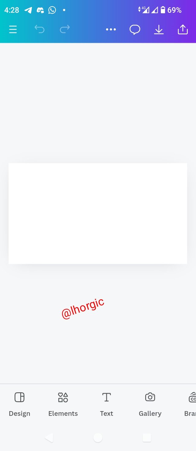
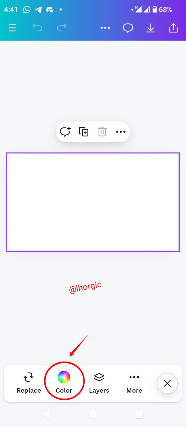
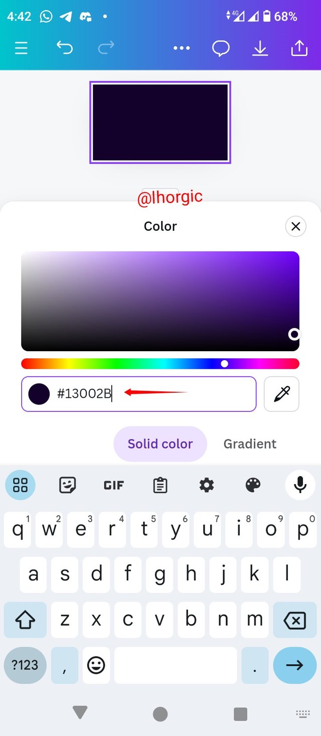
• Step 1: Launch your Canva app, choose your dimension, and set up your workspace just like mine. Click on the colour icon and select your colour. You can see my hex code.
 |  |  |
|---|
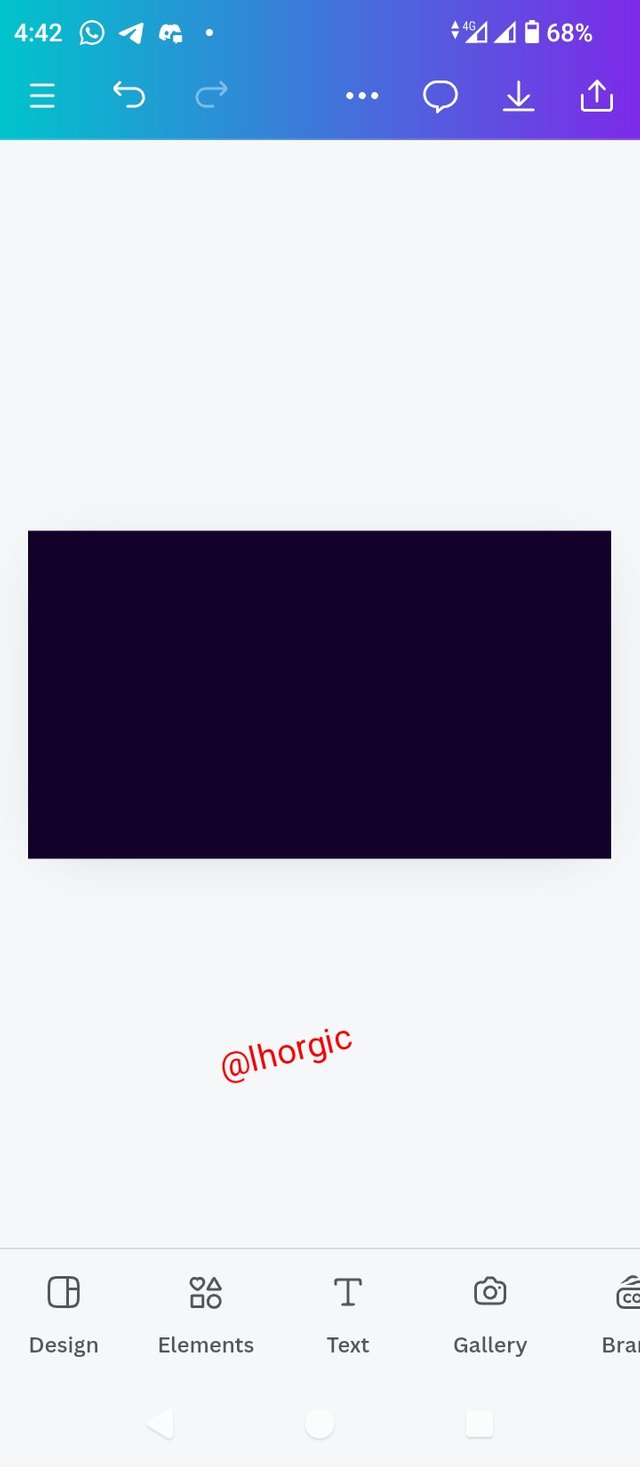
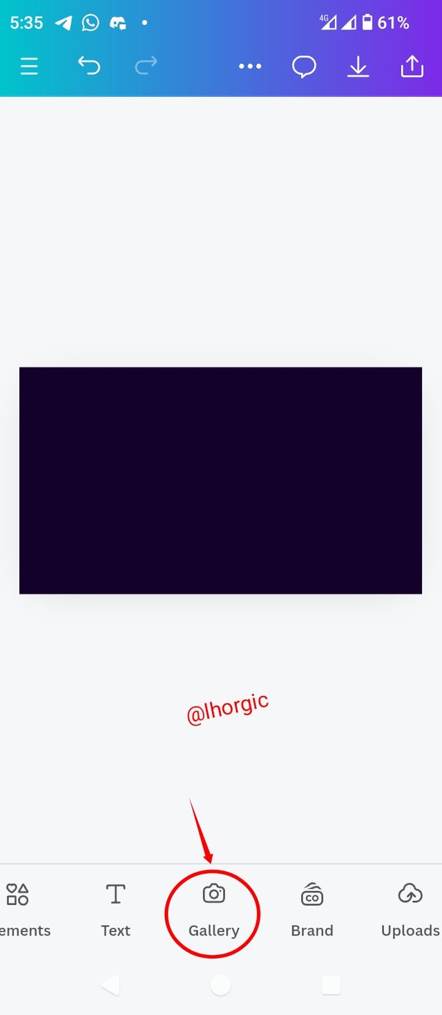
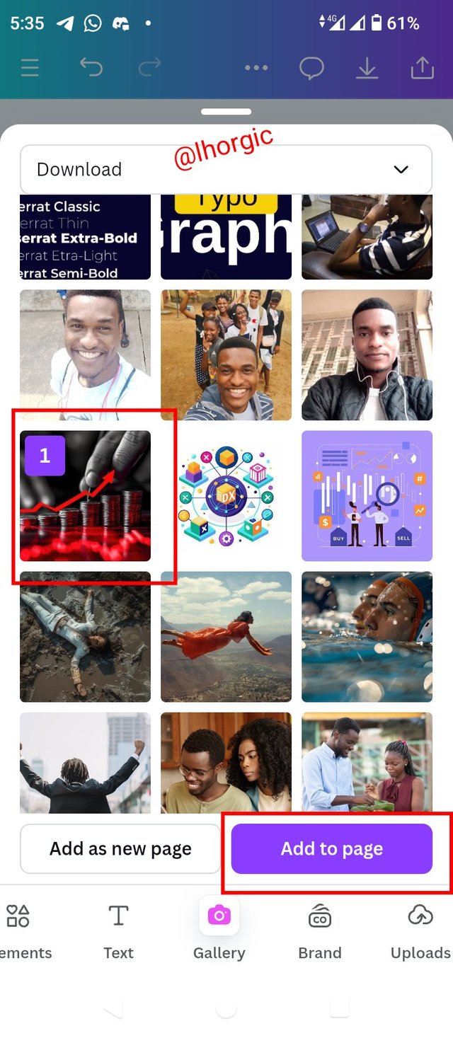
• Step 2: My background is set just as seen, next is to click on on gallery to choose any image of your choice, preferably, image around money or finance, to give our background some effect.
 |  |  |
|---|
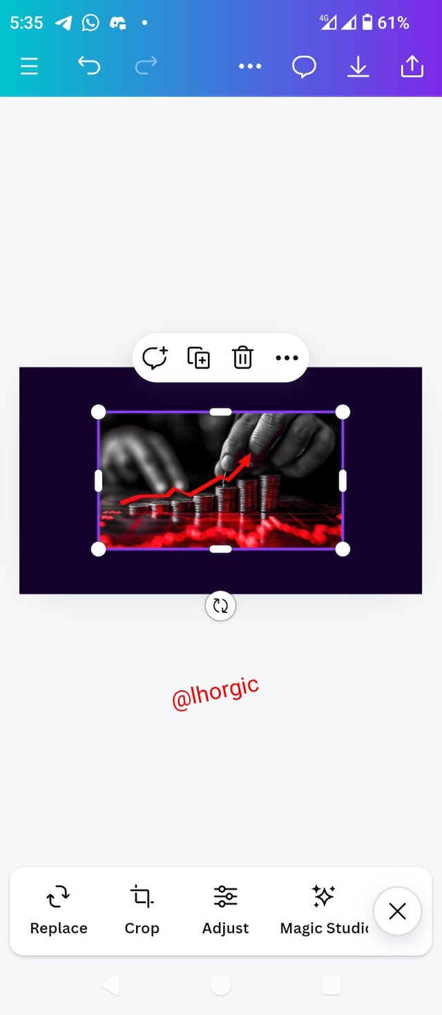
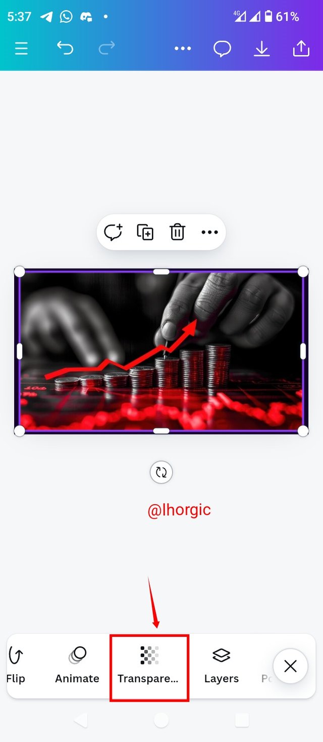
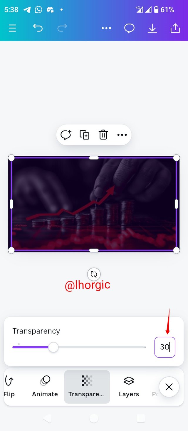
• Step 3: My image in on the workspace as you can see. I enlarged it and then go for the Transparency option and set it at 30 using the slider. You can also input the figure manually.
 |  |  |
|---|
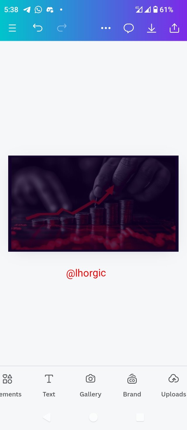
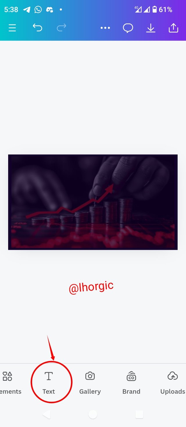
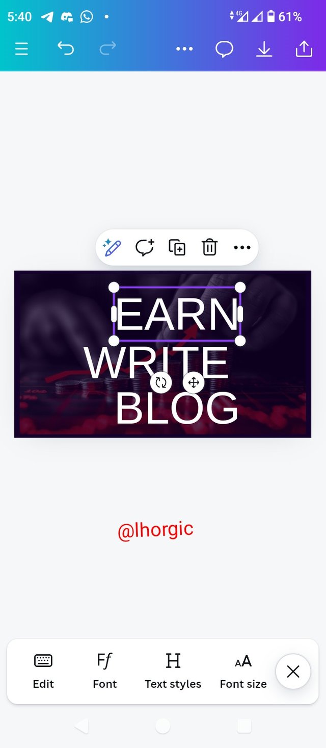
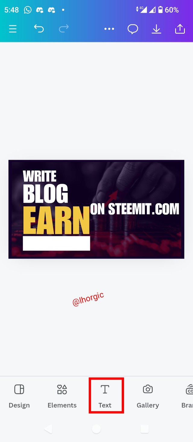
• Step 4: My background is set as you can see, I then clicked on the Text icon to introduce my text just as seen.
 |  |  |
|---|
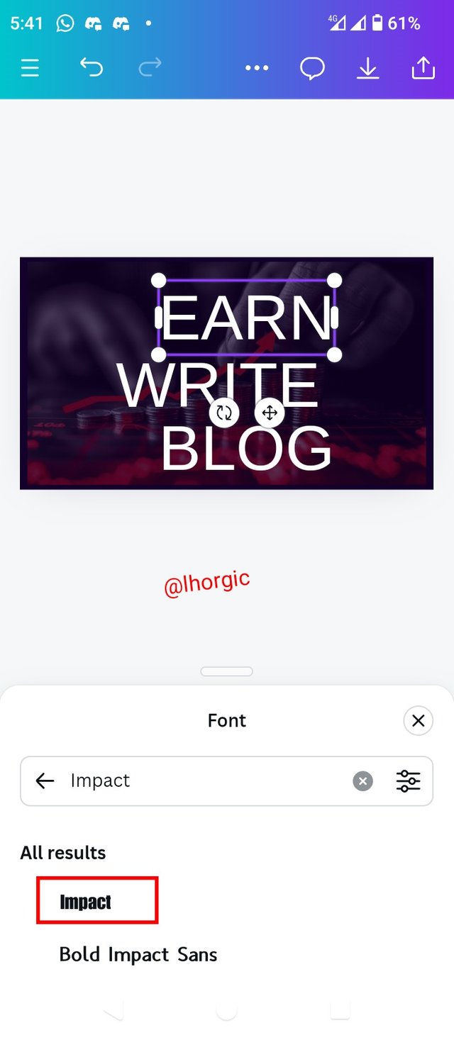
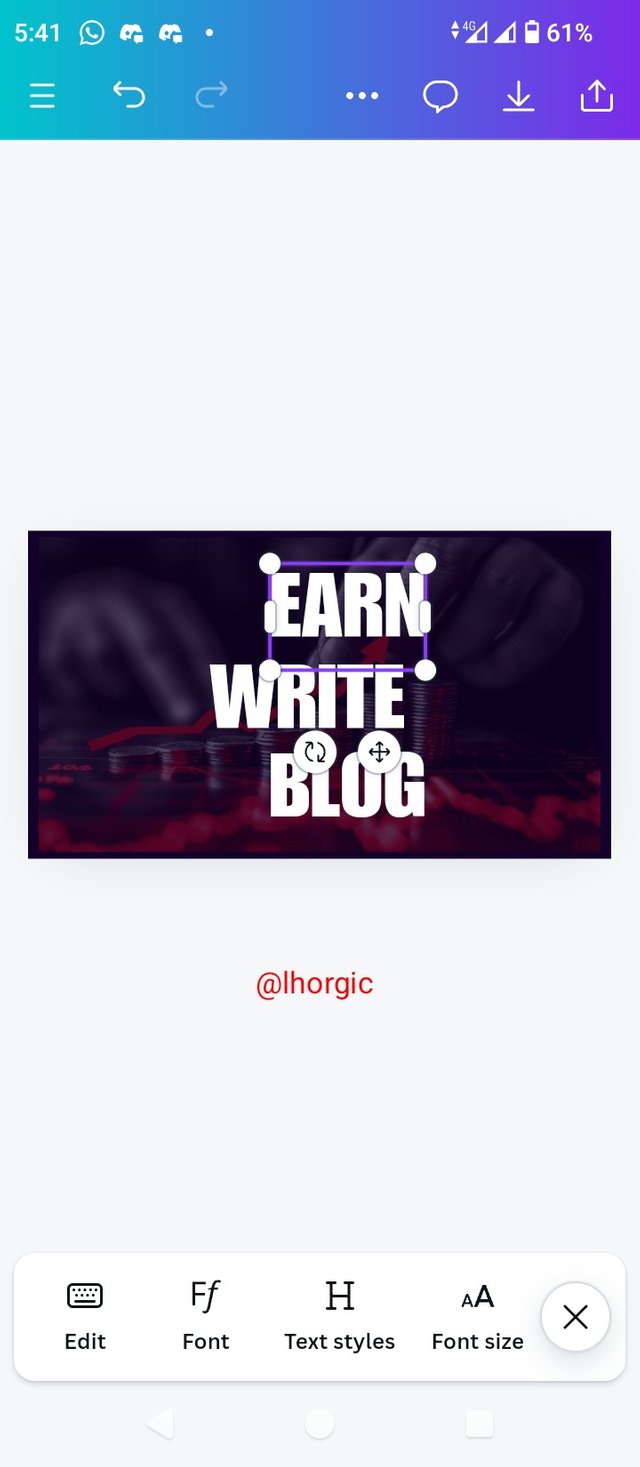
• Step 5: I chose my typeface (Impact) just as seen and then arranged it to my taste. You can see the principle of hierarchy playing our via the sizes of my text.
 |  |  |
|---|
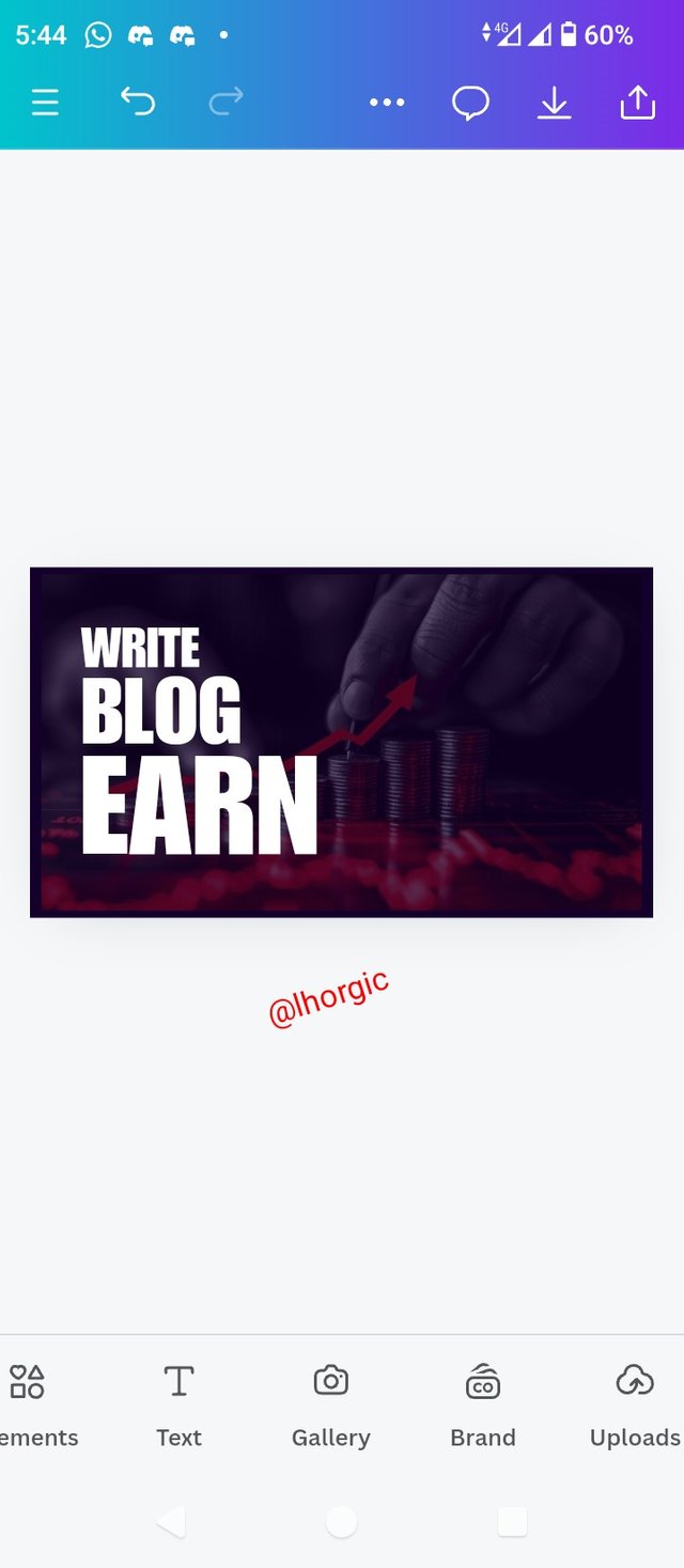
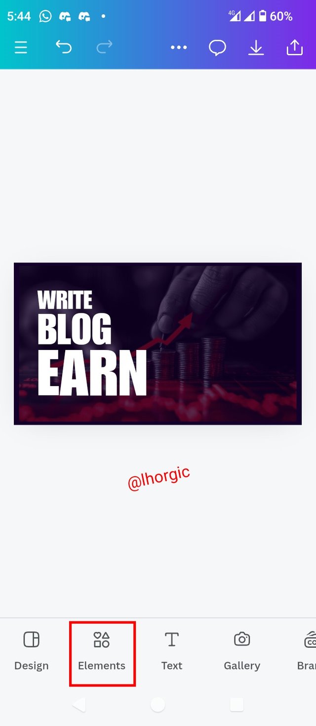
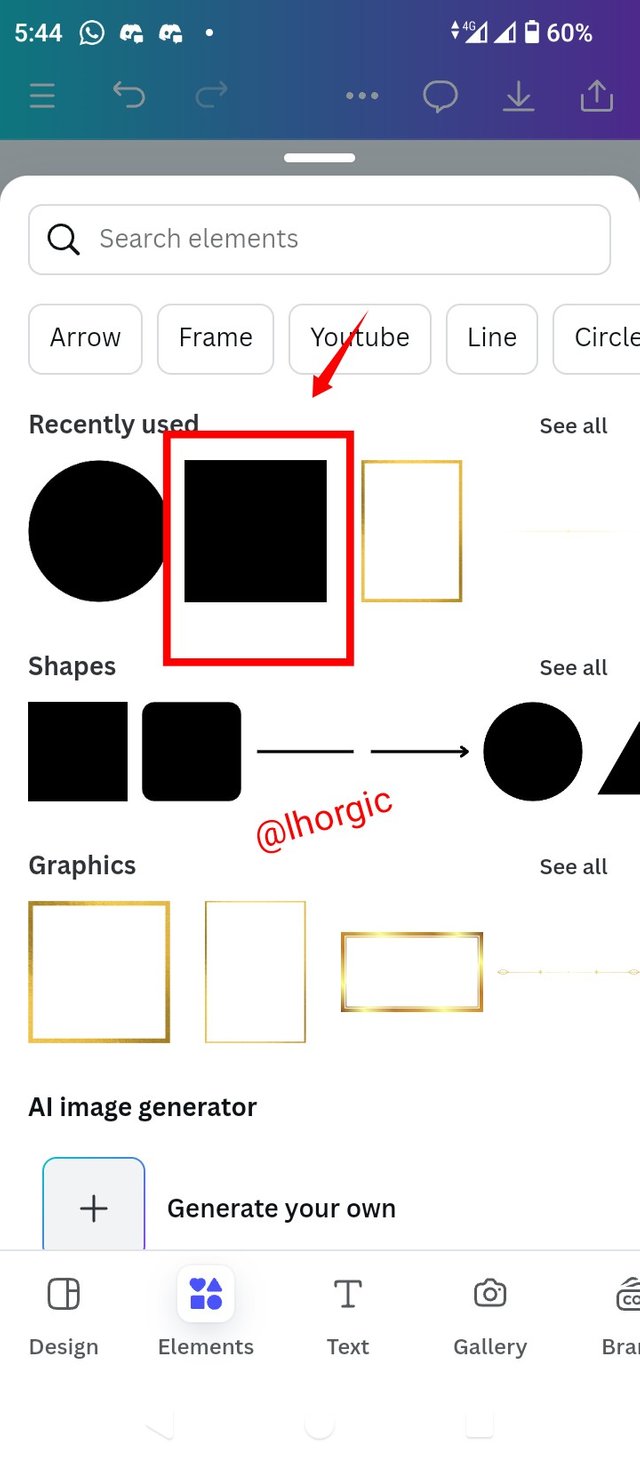
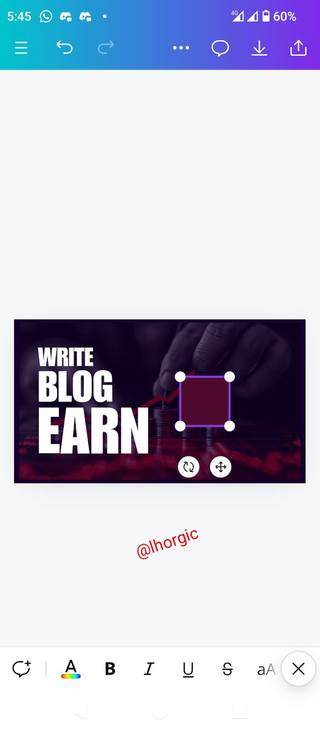
• Step 6: You can see the outcome of my arrangement. The next thing was to select the Element Icon to pick a square shape I intend using on my design.
 |  |  |
|---|
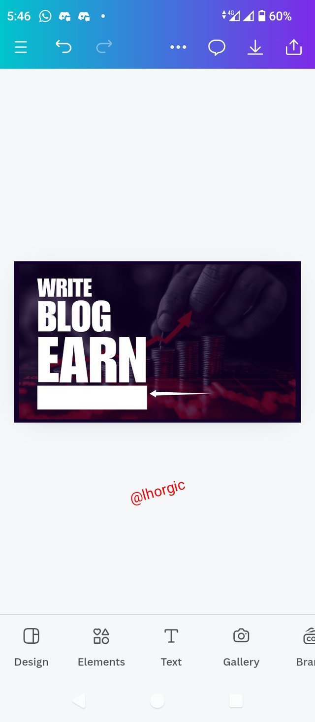
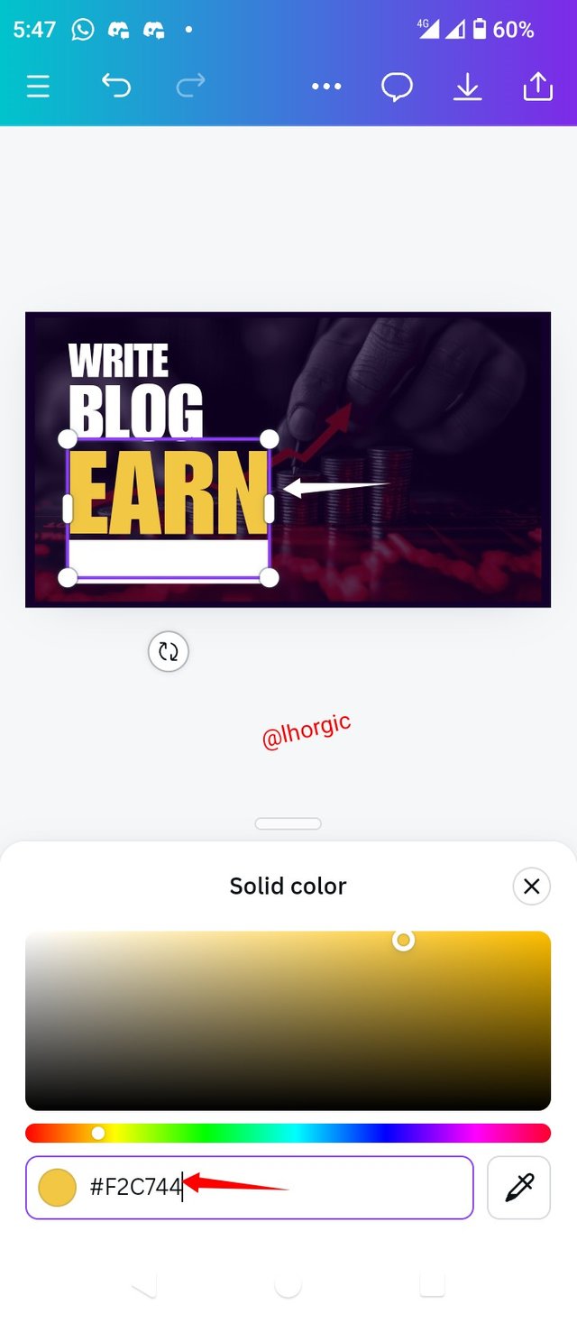
• Step 7: I resized my square shape and positioned it below my text, I then used the principle of emphasis on "Earn" by changing it colour. The hex code can be seen. Another text was also Introduced, which is "STEEMIT.COM".
 |  |  |
|---|
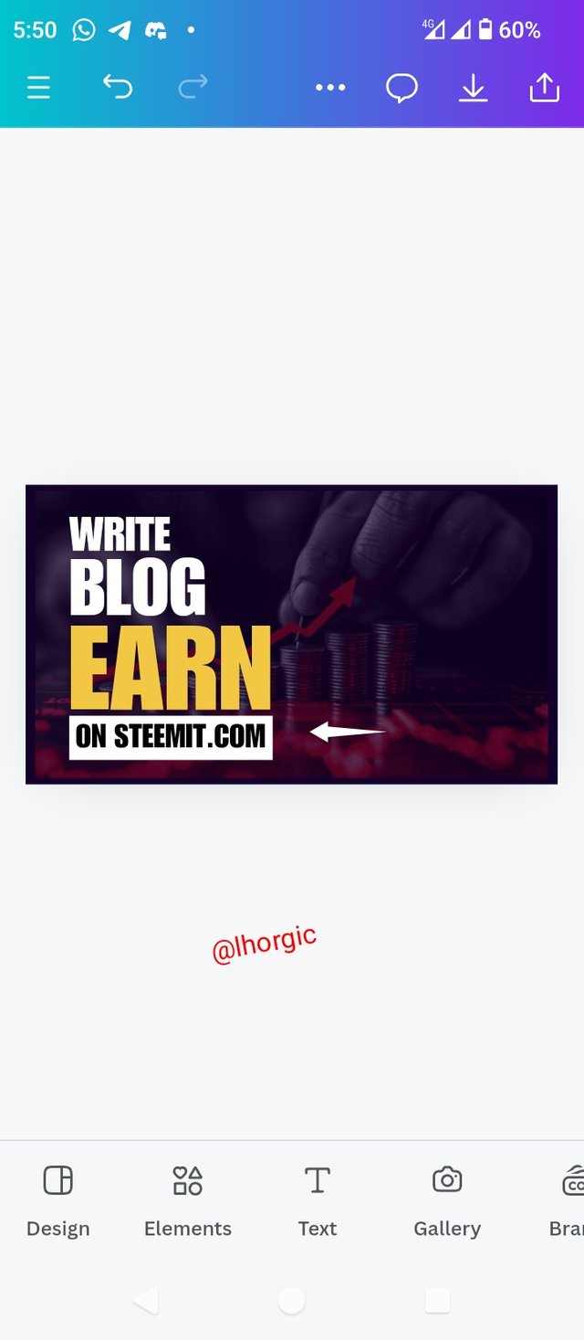
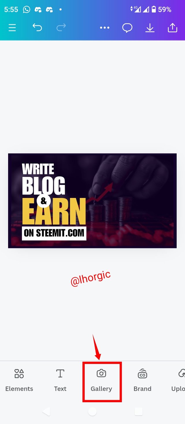
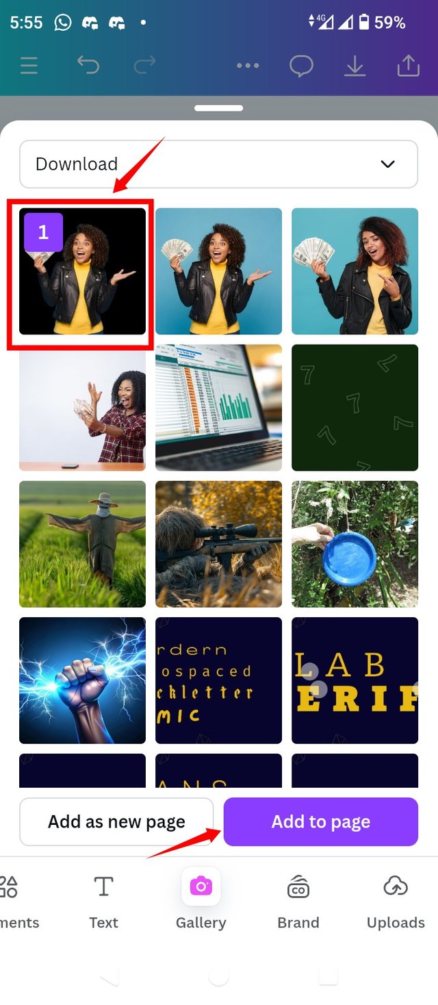
• Step 8: I positioned the text and then repeated the process of getting a shape and text for our "&" in a circle shape. I needed an image for our design so I clicked on Gallery to get my ready-made image without background. If you need to remove background from picture, use the website remove.bg, its very easy to use.
 |  |  |
|---|
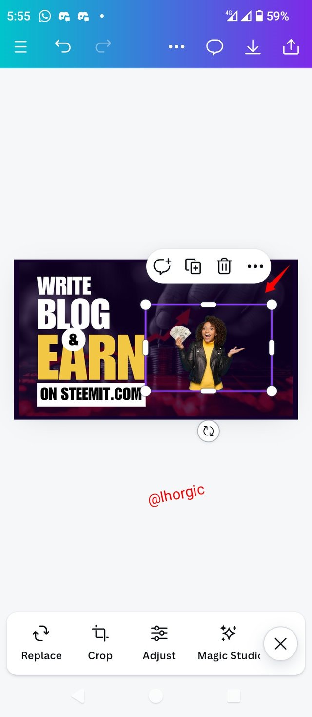
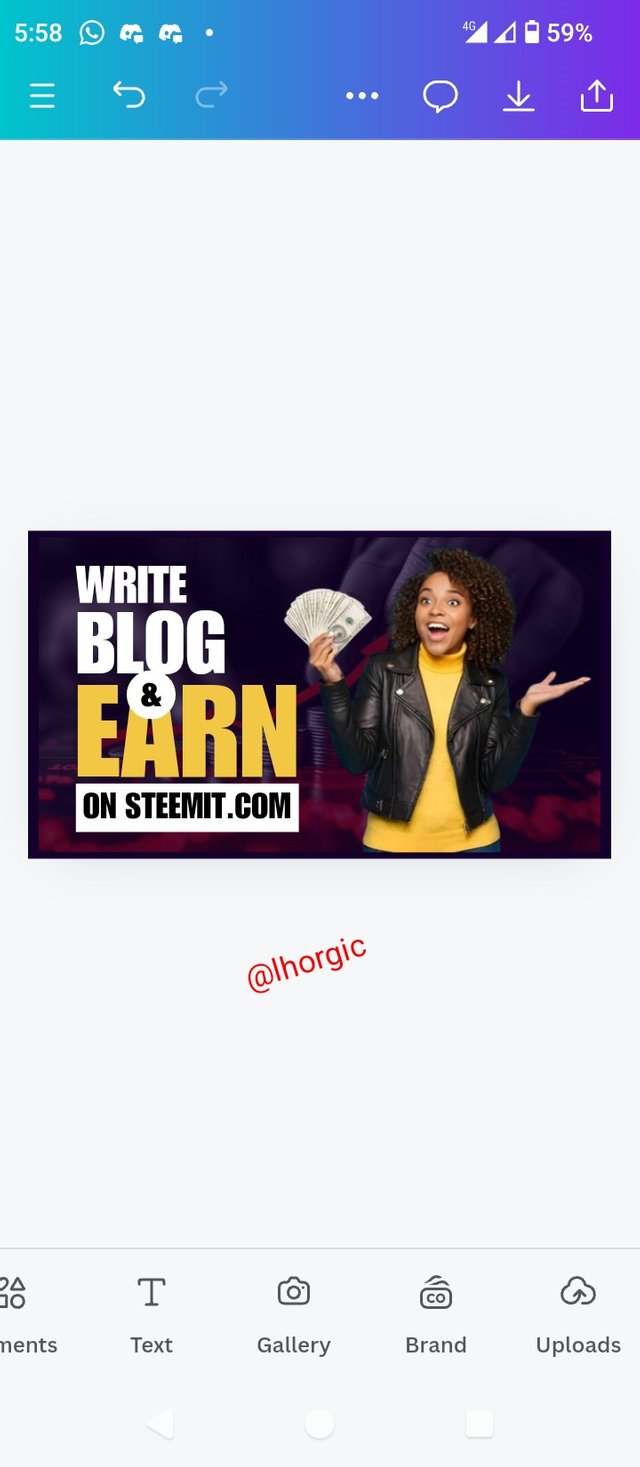
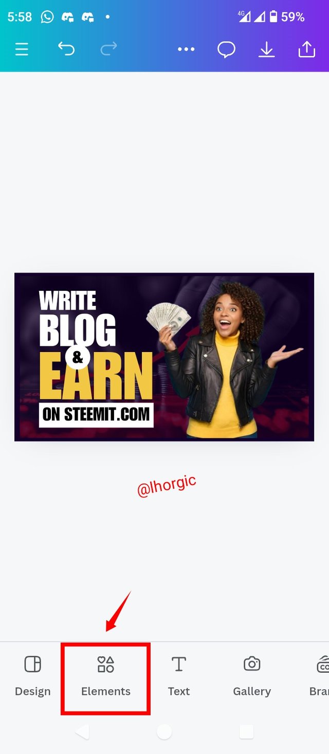
• Step 9: My image appears and then I resized it to taste. Afterwards, I selected Element so that I can introduce a shape needed for my design
 |  |  |
|---|
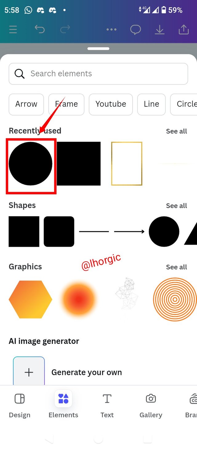
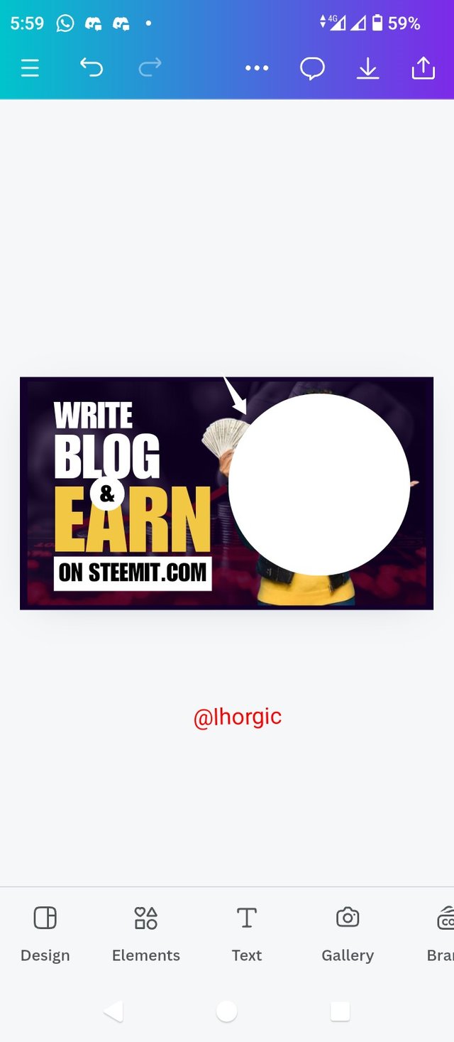
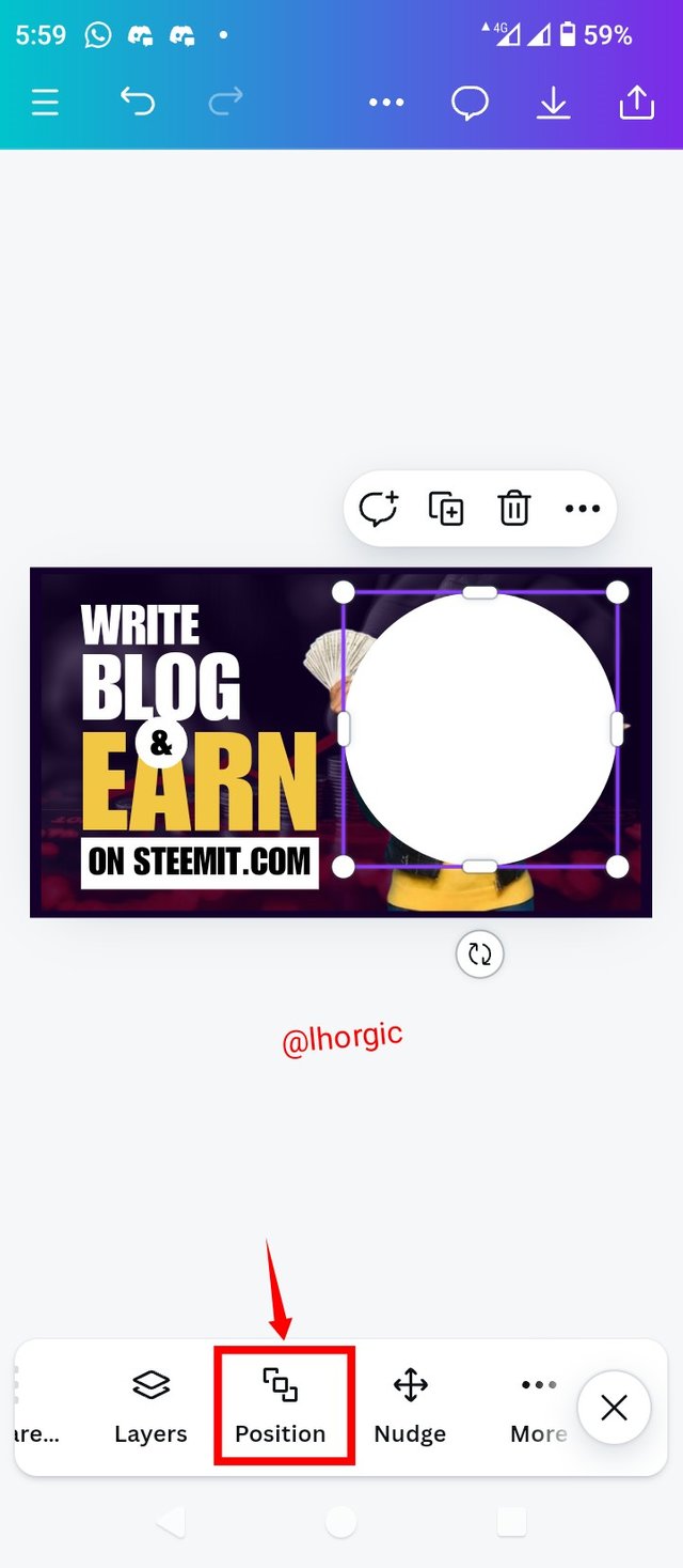
• Step 10: I chose the circle shape and when it appeared on the design, i position it over my image and then located Position Icon to position my elements.
 |  |  |
|---|
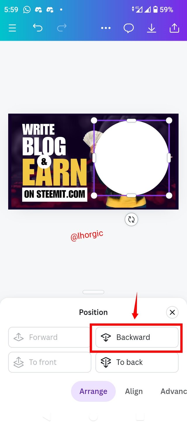
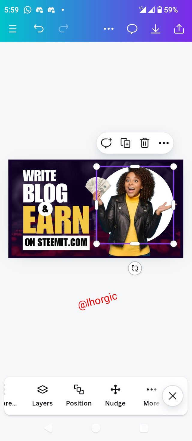
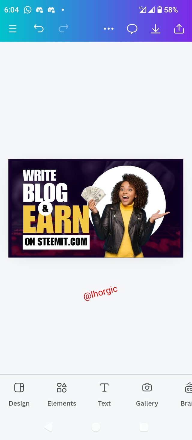
• Step 11: It gives you the option of choosing "back or backward", choose backward and send the circle shape to the back of our image to give it a nice effect. Ensure you do not over click backward lest the circle end up going behind the background. Also do well to position your elements well to your taste.
 |  |  |
|---|
 |
|---|
Replicate the design above using the following guidelines below
a. You are free to use the same colour and typeface or any other you feel like using, just ensure you use a very good colour combination.
b. Briefly talk about the principle you engaged in your design.
c. Be as detailed as possible, this would be your leverage over others.
 |  |  |
|---|
 |  |  |
|---|
• You title should be "SEC20/WK4: Graphic Design Hands - On practical 1"
• You can publish your homework task anywhere you deem fit and in any language.
• You're are to use the special tag #graphics-s20wk4 among other relevant tag like #country and your #steemexclusive.
• Plagiarism/AI generated content will not be tolerated. The penalty would be absolute disqualification.
• You're encouraged to continue with your club status, however it will not be taken into account for your grading & assessment.
• Invite 3 of your friends and don't forget to leave valuable comments on their posts.
• Use the burnsteem25 tag only if you have set the 25% payee to @null.
• Feel free to upvote and resteem this post if you want to.
• Participation schedule is between Monday, September 30 , 2024 at 00:00 UTC to Sunday, - October 06, 2024 at 23:59 UTC.
Outstanding Students will be rewarded with a sumptuous upvote for participating. A total number of 5 entries would be selected to get this compensation weekly from SC01 & 02
However, kindly bear in mind that upvotes are not guaranteed just for making an entry.
Regards
@lhorgic❤️
My entry:
https://steemit.com/graphics-s20wk4/@kouba01/sec20-wk4-graphic-design-hands-on-practical-1
thank y friend for the course
HERE IS MY PARTICIPATION
https://steemit.com/graphics-s20wk4/@arinaz08/sec20-wk4-graphic-design-hands-on-practical-1
Here's my entry link:
https://steemit.com/graphics-s20wk4/@hudamalik20/sec20-wk4-graphic-design-hands-on-practical-1
My entry
https://steemit.com/graphics-s20wk4/@alexanderpeace/sec20-wk4-graphic-design-hands-on-practical-1
https://www.steempro.com/hive-145157/@sergeyk/sec20-wk4-graphic-design-hands
My participation link:https://steemit.com/hive-147599/@muhammad-ahmad/sec20-wk4-graphic-design-hands-on-practical-1
This is a great space of knowledge. Thanks for organizing this great contest, I'm glade I'll take part.
My entry
https://steemit.com/hive-183369/@solaymann/sec20-wk4-graphic-design-hands-on-practical-1
My entry : https://steemit.com/hive-103393/@walictd/sec20-wk4-desain-grafis-praktis-praktikum-1