"SEC20/WK4: Graphic Design Hands - On practical 1"
I'm really happy to take part in the SEC20/WK4: Graphic Design Hands-On Practical 1 contest, organized by @lhorgic it's helping me understand graphic design better, especially after learning about typography and design basics.
I'm excited to create my own design using Canva and apply what I’ve learned. This challenge is a great chance for me to improve my skills and get more creative , So let's start 🤗🌸🤍.
In this contest, I learned the basics of graphic design and how to apply different principles to create an attractive design. Through the exercises, I gained valuable knowledge about choosing color combinations, arranging text, and adding effects. Here's how I created my design step by step, following the contest instructions but adding my personal touch.
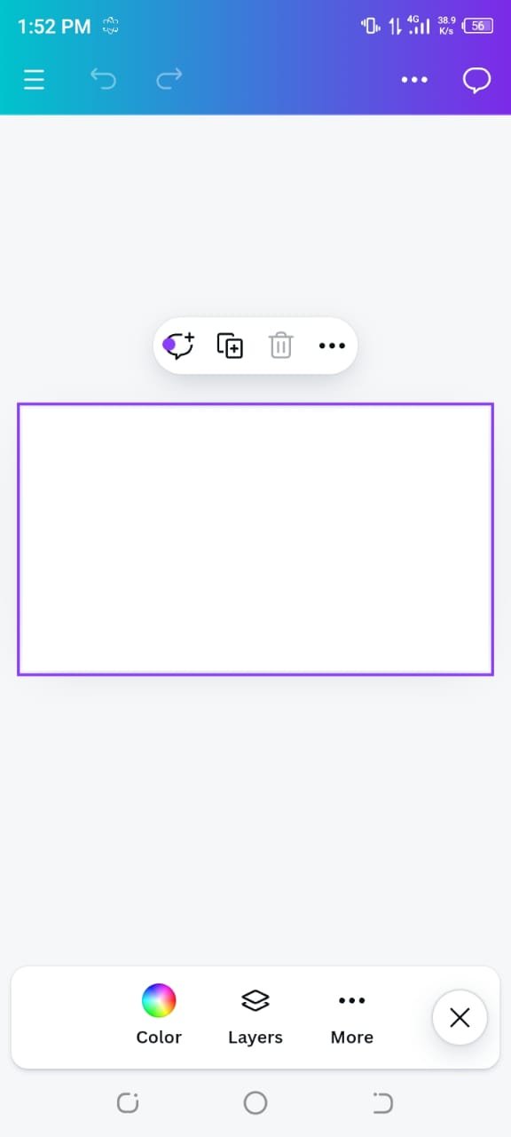
I launched the Canva app and selected the Instagram post template with dimensions of 1800 x 1800 pixels.
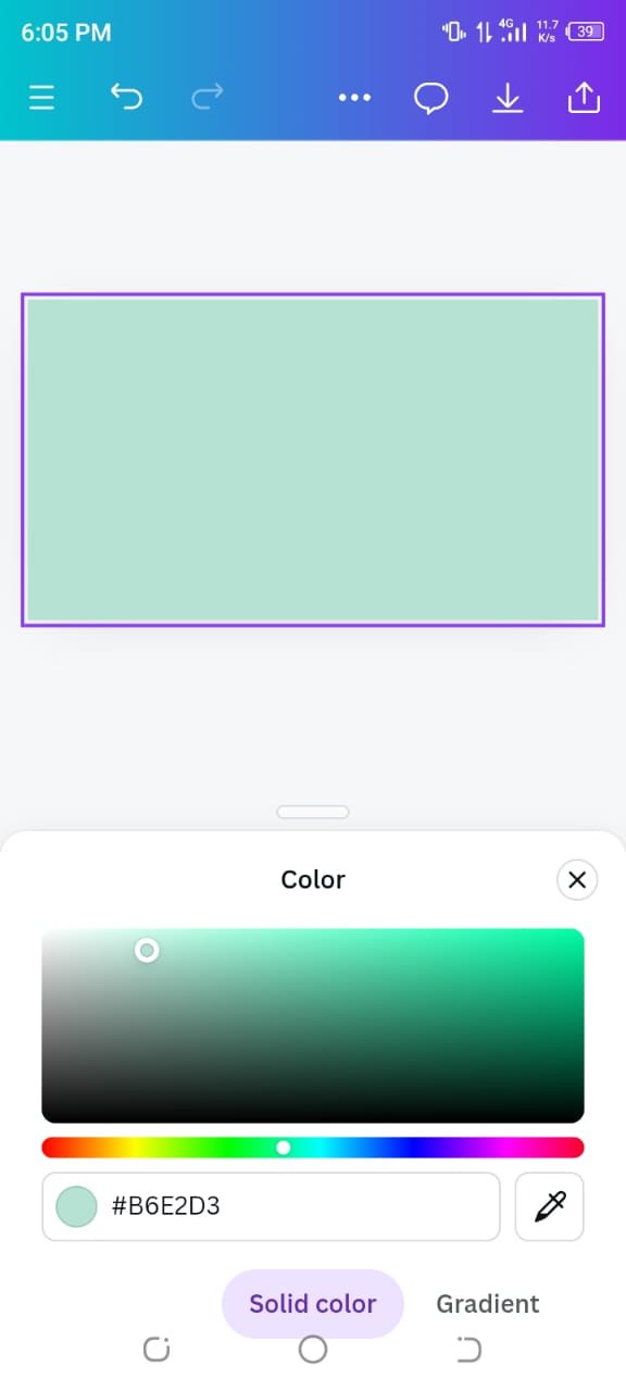
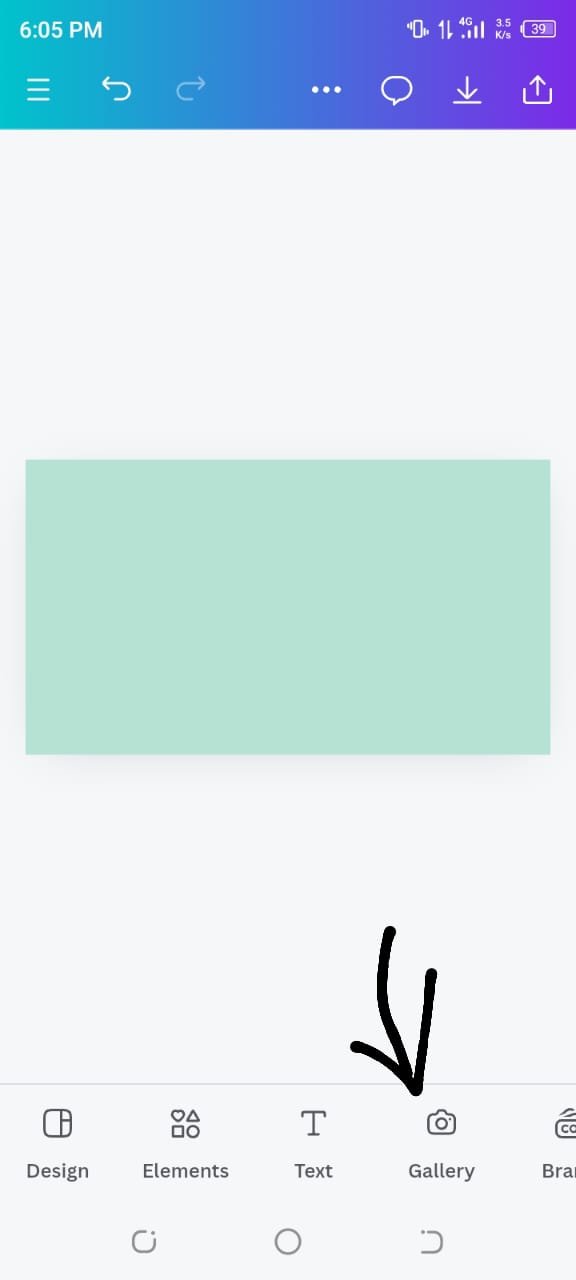
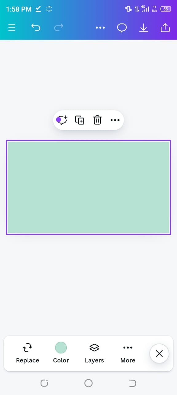
For the background, I chose a light blue color using the hex code #B6E2D3, which I thought complemented the overall design theme well.
 |  |
|---|
 |  |
|---|
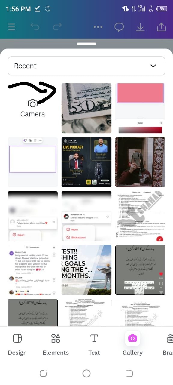
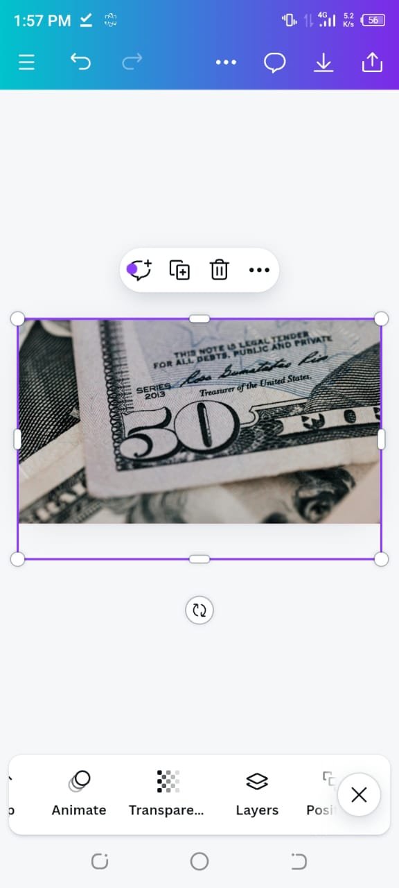
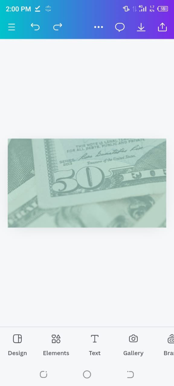
Next, I wanted to add a dollar currency related image, so I downloaded an image of dollars from Pexels. I uploaded this image into Canva, then used the Transparency tool to set the transparency to 30%. Now my image is blend smoothly with the background, yaa giving it a soft and professional look.
 |  |
|---|
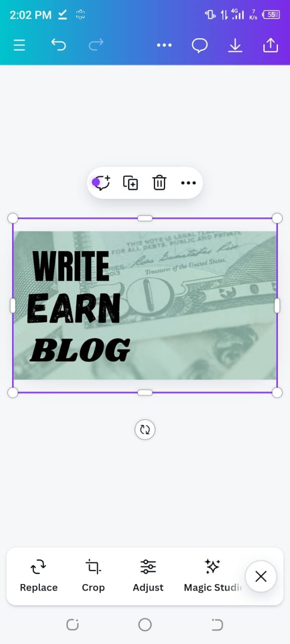
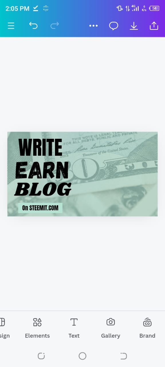
For the text, I followed the example from the contest, but I added my own font choices to make it unique:
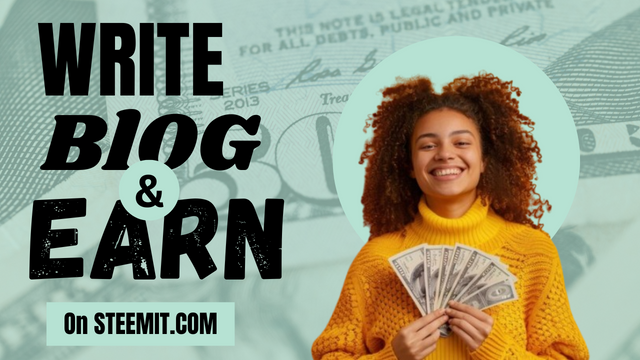
- The first text I added was "Write", which I set to Anton font.
- The second text, "Blog", was styled using Shrikhand font.
- For the third text, "Earn", I used the Gagalin font. I made sure to emphasize this word by changing the color to stand out from the rest of the text.
 |  |
|---|
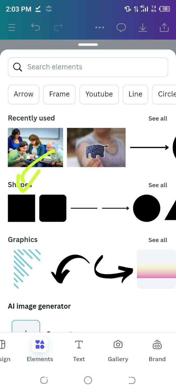
To give the text more structure,I clicked on elements then I added a Square element and convert it into rectangular shape below the text and wrote "on STEEMIT.COM" on it.
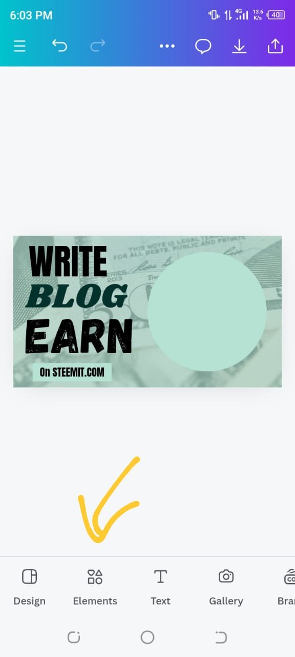
I then clicked on Elements, where I chose a circle shape to add emphasis to the image we have got from contest post ..
 |  |
|---|
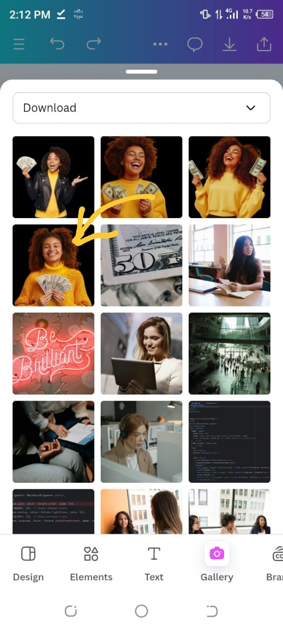
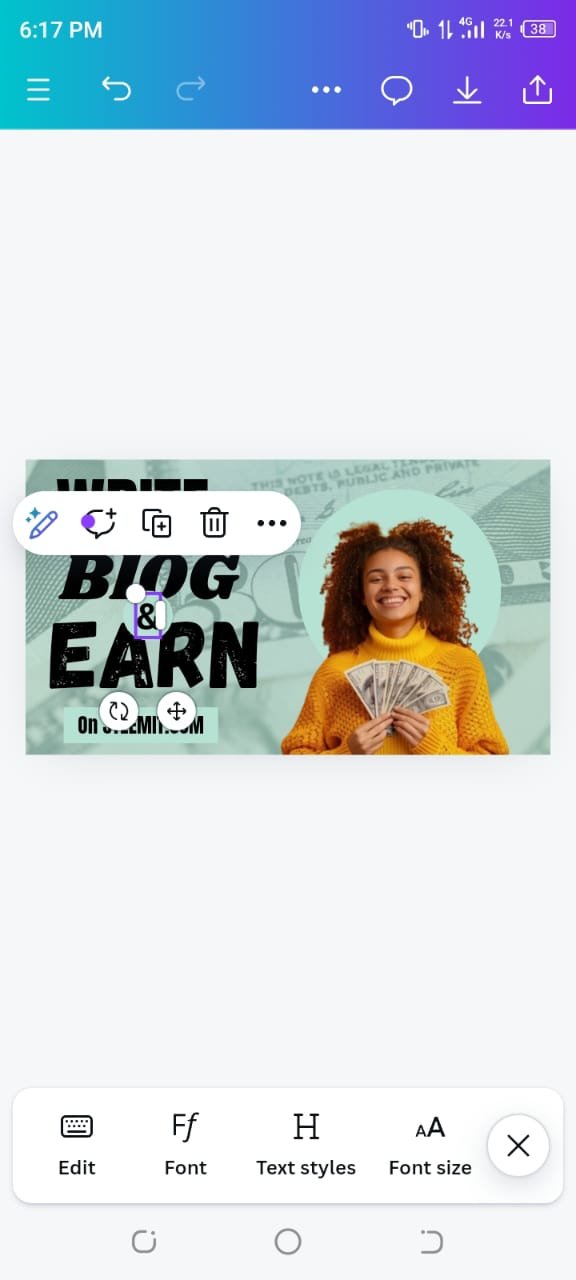
For the final touch, I uploaded a pre made image provided by the contest post, resized it, and positioned it on the circle shape. I also added another circle for the "&" symbol to complete the "Write Blog & Earn" message.
 |  |  |
|---|
I clicked on the Position tool to make sure all the elements were aligned perfectly set it as forward . I adjusted the layers of the circles and shapes to achieve a professional look.
So this was my first attempt at creating a graphic design on my own, and I am quite happy with the result. Through this contest, I not only learned how to use Canva effectively but also gained a better understanding of color combinations and text hierarchy.
I am excited to continue improving my skills as I progress through the course and hope to create even more engaging designs in the future.I hope you all like my design, and I am looking forward to receiving feedback🤗🌸🤍.
That's it from today's blog I hope you will like it. With best wishes ❤️. Now I like to invite @abdullahw2, @mile16 and @norat to participate in this amazing contest.

Upvoted! Thank you for supporting witness @jswit.
Upvoted. Thank You for sending some of your rewards to @null. It will make Steem stronger.
Thank you so much for your support 🤗💞💐
Your designs are fantastic dear. I love the way how you used different fonts and the blue background color is so impressive and attractive which can grab users' attention to it. You have learned a lot in the contest which shows that you are a topper. Can't wait to see more of your designs. Keep up the good work dear.🌟🤗
Ooh wow the design made by you is looking very pretty and thank you so much for mentioning me in your post. I wish you very good luck 🤞
Thank you so much for your appreciation 🤗🌸.
Wow, this is fantastic! @hudamalik20 I love how you detailed your design process using Canva—it's really inspiring to see how you applied the principles of graphic design, especially with typography and color choices. The light blue background is such a calming touch, and I appreciate how you blended the dollar image seamlessly; it adds a nice depth to your design.