"SEC20/WK4: Graphic Design Hands - On practical 1"
How are you all? I hope that you are fine and will be enjoying your life. This is Muhammad Ahmad and today I am participating in the contest organized by @lhorgic about graphic design today's lesson is practical which I like the most. In which we had to make an attractive thumbnail. So without wasting any time let's get into it.
Step:1
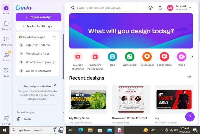
Open your Canva by searching Canva or you can easily go to Canva by clicking this and after that, you have to log in to your account. As I am logged in. I am using the free version of Canva so I am not able to do many things in Canva like background remover etc and much more but we can do it very easily by searching in Google Background Remover then there we should select an image which we want to remove the background and thus the background will be removed.
Step:2
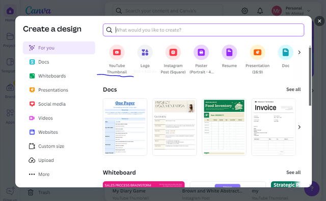
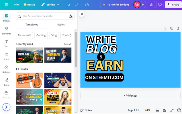
Now you have to make a thumbnail so for that you have to choose the size. I am simply choosing the Youtube Thumbnail which is approximately the size of the Steemit.This thumbnail can easily fit on Steemit Thumbnail in a sense. You can also choose any size of your own but choose according to what you are designing.
Step:3
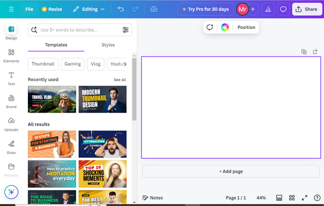
Now after clicking on the YouTube thumbnail, this interface will be opened and here we will fully design our thumbnail.
Step:4
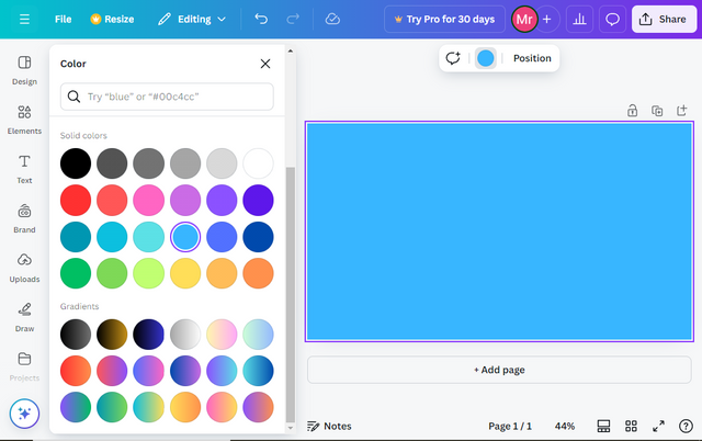
I clicked the Background colour and chose any random colour because it would be easy for me to design it on white text, white fonts would not see properly with the naked eye That is why I chose the Blue colour which also looks very good.
Step:5
In this step, I have done alot of work As you can see I have typed the text and beauty it alot through the art of Graphic designing. At first, I simply wrote the text by clicking on the text option then I wrote the text and alligned it to the page as I wanted to from which it will look attractive.
Step:6
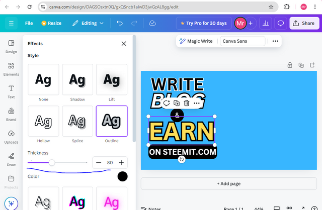
You all can see carefully that in this text I have worked alot I have applied alot of effects you can see the outlines which look very cool and also I have Italic the blog which looks quite attractive. These options are easily available with the text then I make a rectangular component by clicking on Elements and then searching for rectangular shapes and then I choose it and after that I write Steemit.com on it which beautifies it more.
Step:7
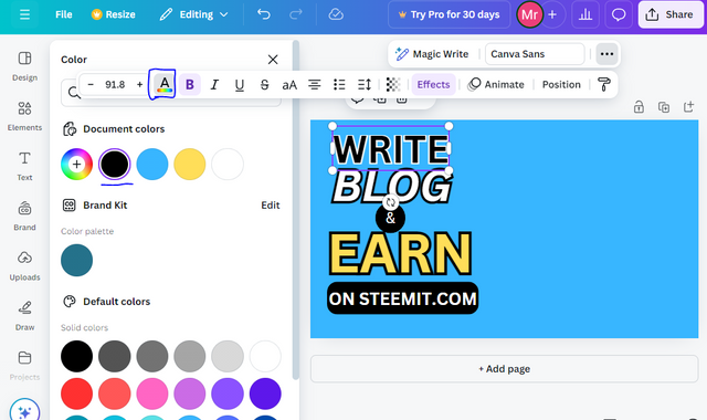
Also, you can see that I have given different colours to different texts by clicking on the colour option and then selecting the text and then choosing the colour hence the colour will be applied then. I have also chosen the outline colour for the text like for some text I have selected white colour while for some I have selected the black colour outline which looks very attractive and I hope you all will like it too.
Step:8
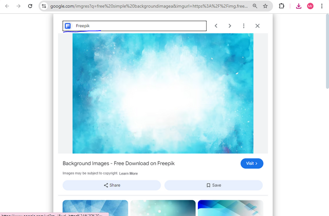
Now it's time to choose a good background for my thumbnail. I thought alot about what should it be like I have tried alot by changing different colours to the background and applying different colours but it was not looking quite attractive then I came to the point of picking a free thumbnail so for that I searched alot and then come to the conclusion with this background.
Step:9
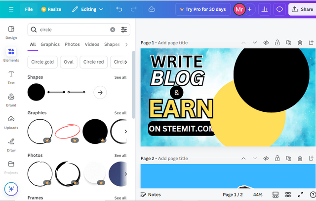
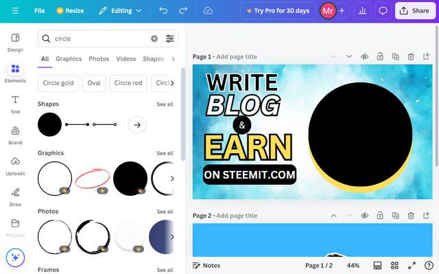
Now I have selected 2 circles of different colours by searching for them in the elements section as I told above. I took 2 circles of the same size and different colours one is black and the other is yellow.
Step:10
In this step, I arranged both circles very carefully and I did this for my picture background. This will be the background of my picture which I will add here. In another step, you will come to know what I want to say.
Step:11
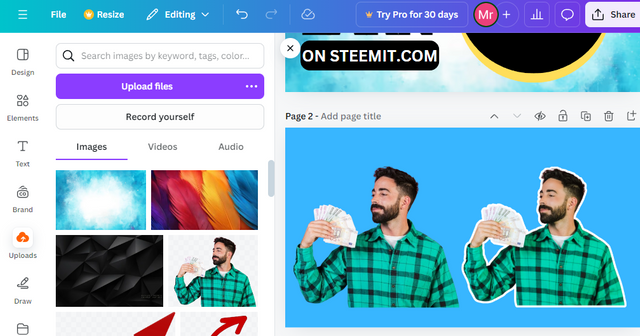
I have taken a free image from the free website then uploaded it to canvas if I directly added it to my thumbnail then it would not look attractive so I edited this image alot by increasing the saturation, contrast and brightness etc and much more. Also, I have made a white outline to the image which makes it more attractive.
Step:12
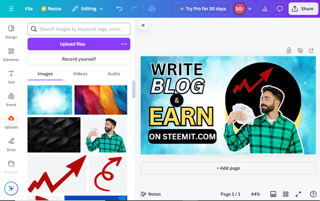
In this step, I have carefully added the image and adjusted it well. Which is looking very great. Then I thought I am talking about like earning so an idea came to my mind to add an arrow which shows increase so for that I downloaded a free arrow PNG from the free website and then removed its background as I told the method to it above. Then I adjusted it.
This is the final look of my thumbnail which is looking very awesome. I hope that you all will like this as it took about 5 to 6 hours of mine to edit this. This is the first thumbnail which I made so beautifully and after learning about that, now I will make my thumbnails for steemit posts very effectively. All the images are taken through screenshots on my computer and are designed on Canva. I would like to invite @ruthjoe @lirvic @max-pro and @bonaventure24 to participate

👌 wow i must confess that your entry is very inspiring it seems you're a good graphic designer.
Thanks for the invite i will try my best to participate.
Thank you, brother, Yes brother I have done the full course in Graphic Designing and I know all about Adobe Photoshop and Adobe Illustrator in these two tools I design my thumbnails and all more but you know Canva is very easy to use and safe and a lot of our time. That's why I like Canva alot. I am waiting for your great entry brother.
Alright my brother, now wonder your entry was just exceptional.
I am rooting for your win 🏆
Thank you brother for the good feelings.May you got the same!
Smiles 🫂
Have a nice day
Beautiful, this is amazing I mean you put it at the right time because I was looking for a way and how to edit my photo using canvas. I have seen several photos edited on canvas and I admired it but I want to know more about how to use it to a edit my photo. Thank you for sharing.
Thank you dear that you learned from this.Its an honor for me. By the way, thank u so much for ur attention to it. If you're having any problems then let me know.
Stay Blessed!
Thank you so much dear for ur great support.
You did a great job following the tutorial. Bro you have made a very good effort. Your steps are very clear so that anyone can easily understand how to make it. The use of shadows is also very interesting. There is much more to learn about graphic design and upcoming lessons. Your presentation is very good. Appreciate your efforts.
Thank u brother.I am humbled.
Wishing u a happy liife.
The attention to detail, like experimenting with colors and shapes, really shows how much time you put into it. Great job on creating such an attractive thumbnail!