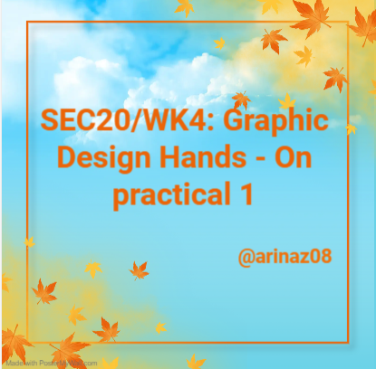
SEC20/WK4: Graphic Design Hands - On practical 1
Assalam-o-Alaikum!!!
Greetings to my all STEEMIT Members, Hopefully you all are great and enjoying your best life on Steemit. I am also fine ALHAMDULILLAH. Today I am going to take part in this engagement contest that is organized by @lhorgic
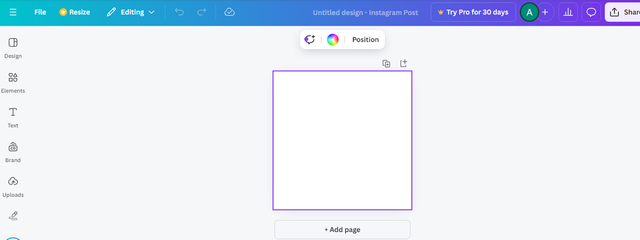
First of all we will open Canva . And then login our canva account. And when we will login then our name will show like this
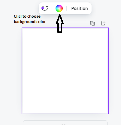
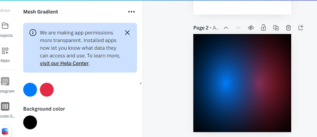
After that we will select the dimension. And then our layout will be show where we want to design. And then we will select background color. We can choose background color.
 |  |
|---|
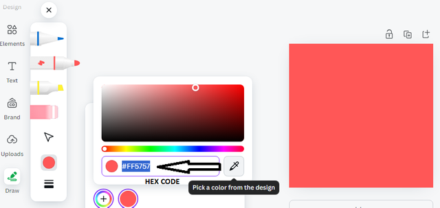
Here we will choose our own choice color combination. When we will click the color then there will also show hex code. And we will also use the image that we want to add on the back groyung., that image will be from your gallery or from any where what you want to add
 |  |
|---|
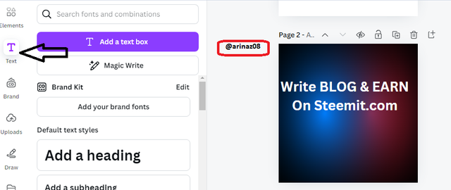
And now we want to write something of our choice inside it, so we will go to the text option and by going to the text option, we will give our desired heading and write whatever we want to write. Like in this picture I wrote write blog and earn in estimated.com so I first went to the touch screen and I clicked the add text box and then I clicked on the text box. If you want to write, you can write as you wish
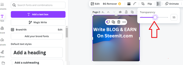
And now I've clicked on the transparency option there and from there I've done some editing like I can dial down the background colors if I want to light them down a bit and if we If you want to make them a little darker, you can do that, but I've lightened them a little to reduce the transparency a little to highlight the things we want to highlight above.
And now I've clicked on its font design so that I can customize the font size of what I've written, so I've done the calculations that we've been given in the practical work. to try and I've tried to do it exactly the same way I've done the font size and so on. And I also add font style. By my own choice.
 |  |
|---|
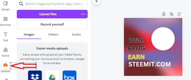
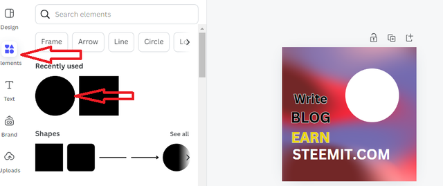
Yes, after that I clicked on the option of the element, now if there is an image in it, I want to add it, but behind this image, as shown in the practical, we have to make a cursor, so I I have taken an effect color and now I have clicked on element option inside it we have different designs which have different shapes so we have taken a circular as shown earlier we have People have to take their vinegar, so I've chosen the circle and I've moved the circle a little bit to the side and I've put white color inside it because in practice we had to do it that way.
And now it's our turn to edit the image, so I have to edit the image, so I have to edit the same image that we have shown in the practical, so we can choose one of these things. So I've chosen an image and along with it I've done some editing so I can make it more successful and beautiful I've edited its own font style a bit. And we decorated it a little bit with white color and wrote my username next to it so that you guys know how hard I am doing my own work.
 |  |
|---|
FINAL DESIGN

So I want to tell you here in brief which principals I have used, so let me first tell you that I have used the principal color scheme in which I have used the color scheme. The combination has been told to me and I have told the hex code that is used in it and after that we have used the combination with the text and how to use it we have typed the text. And for that we have used different font sizes and font styles that are used within the text itself, in addition we have used our principal of Elements and within Elements we have done a lot of new designing.
In which we have seen the shapes and designs, we have done some designing using these shapes and after that we move to the upload side using the principal of upload. You can upload any photo you want, whether we can take our own camera problems or we can also upload the ones that we have edited and decorated. I have tried my best to complete the practical using all the principals, I hope you all will like my work.
Special thanks to @lhorgic
Invite Friends: @ahsansharif , @dexyluz , @abdullahw2

Hello @arinaz08 hope your day is going wele you have shared a great step by step explanation of your design process.
I really like you’ve combined different elements and carefully chosen the colors and fonts. Your design is looking very professional and well thought out. Keep up the amazing work🤗🌸🤍
The design is looking for beautiful and comprehensive as you have used a balanced combination of colors. Best of luck 🤞
Thanks a lot for your nice review and appreciated me
Walaik um Salam dear, Your work is impressive. Your color choice is very good as I like it too. I appreciate that you describe it in detail each step. Wishing you all the best.Waiting for your other designs.🌟🤗
Kind Regards
Thank you so much for your appreciative words to me
My pleasure dear!
Thanks a lot @ruthjoe for your appreciation
This is impressive.. nice one mate. i am a new steemite trying to build up followers. I am following everyone that follows me. lets show some love guys
wow... your combination of designs is very good. It seems like something different. Your presentation is good because you have consistently explained your design in a way that other users can easily understand.
I wish you success in the competition
Wa Alaikum Assalam @arinaz08!
What a fantastic post! Thank you for sharing your step-by-step process of using Canva for design. It’s really insightful to see how you utilized different elements like color schemes, font styles, and shapes to create a visually appealing final design. Your detailed explanation of each step, along with the images, makes it easy to follow along and learn from your experience.