How to Understand Candlestick Charts
The more time I spend looking at cryptocurrency - the more I want to understand how to analyze the charts and how to make sense out of them. After all - I don't want to depend on all the internet gurus to tell me what I'm looking at and how to interpret it - I would much rather learn how to do it on my own. Since I love teaching and helping others, I would like to share what I learn with all of you.
Basics
There are many different types of charts used to track the movement of financial instruments likes likes, stocks, bonds, and crytocurrencies. Today I would like to share a tutorial with you about how read one of the most popular of these charts, the "Candlestick" charts. Candlestick charts can help you to see the direction of the market during a given time frame - for example - every 5 minutes or every hour, and even every day.
Learning how to read a chart is one thing - understanding how to interprete the data is a whole other topic. Today, I just want to share how to read the chart so that you know what you are looking at. In future posts, I will put up some videos on what to do with the data and how to use it - for now - let's just learn how to read the raw data that these candlesticks provide.
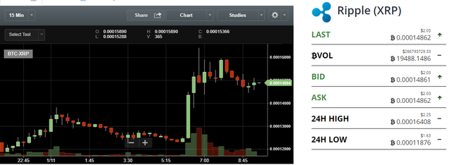
At first glance, they can look intimidating , but in reality - they are actually very easy to understand. If you don't know what a candlechart looks like - here is an example below:
The red and greens bars in the above chart are called candlesticks and they are used to show which way the market is moving. Each bar represents a period of time - in the cart above, our time frame is 15 minutes. So that means that each bar represents 15 minutes of trading activity. If it is green - then it means that it price has closed higher than what it opened at 15 minutes prior.
Lets break this down a little more and look at the candlesticks individually.
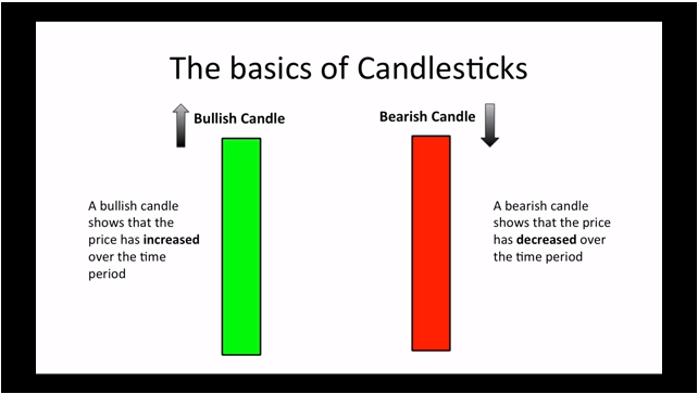
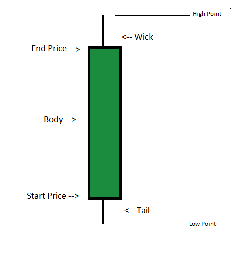
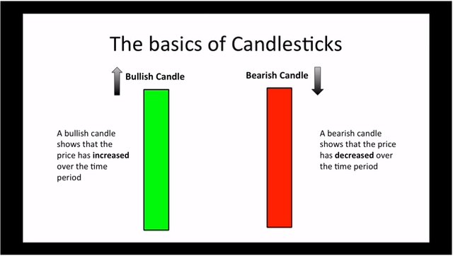
This is a bullish candle
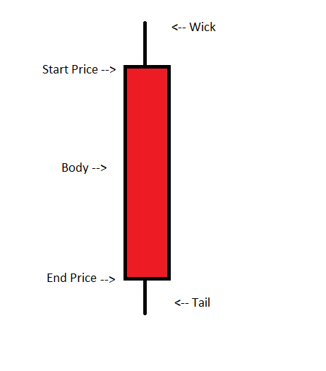
It is represented by the GREEN color of the body and it means that during that time frame it's price has risen. The opening price is at the bottom of the candle and the end price is represented by the top of the candle. The body can represent anytime frame - usually you can select the time frame when you are viewing charts - so whether you want to see the activity of the last 15 minutes or of the last few hours - simply choose how you would like to view it. The body has a wick and a tail - The wick represents the highest level that the price went during that period and the tail represents the lowest that it went .
This is a bearish candle
Here, the candle is red and indicates that during the time frame selected it ended lower than it started. In this case - the top of the candle represents the opening price while the bottom of the candle repressents the closing price. Becasue the it closed lower than it opened - it is red to indicate a drop in value. However, it still fluctuates above and below the opening and closing price so we see that it also has a wick and a tail.
Let's look at an Example:
Green Candlestick
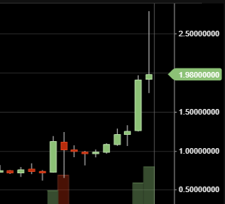
In this example each bar represents a 15 minute trading period. Let's look at the longest green bar at the right of the picture. It looks like it opened at around $1.25 and closed at just under $1.95 - this is represented by the green body which indicates that it was bullish during the time frame and means that its price closed higher during that 15 minute period than it started.
During that time, the price actually went higher than $1.95 and this is indicated by the "wick" that ends just shy of the $1.98 mark. During that time, the price did not go down below its starting point - so we see no tail. But look at the next short green candle. You can see that the following 15 minutes after that was also positive - but didn't experience as much of jump as the previous 15 minute period.
While we can see that it opened at just under $1.98 - it fell to close to $1.75 during that time and also rose well above the starting point but ended at $1.98. The candlestick charts are telling us that while it experienced a lot of movement during that period - it's price closed very close to it's opening price.
Red Candlestick
Now let's look at a red candlestick - notice that the 4th candle from the left - it is short but has a wick and an even longer tail. Notice that it opens at around $1.15 and closes just over $1.00 - it has experienced a drop during this period - indicated by the red candle. Looking at the tail, we can see that at one point, the price dropped down to what looks like $.75 before rising again and closing at just over a buck.
Keep Learning
Candlesticks are only one type of charting that is available - there are several other types of charts that provide different sets of data and I hope to start learning more about them and sharing them with you. I hope this inspires you to to get started in learning how to read charts.
If you would like to learn more about candlesticks and what they mean - take a look at the video below.

Please be sure to check out my others articles on real estate, investing , and cryptocurrency ( and some other random dog stuff)
I always upvote comments to my blog posts
This post has received gratitude of 2.39 % from @appreciator thanks to: @jorlauski.
You got a 2.73% upvote from @postpromoter courtesy of @jorlauski! Want to promote your posts too? Check out the Steem Bot Tracker website for more info. If you would like to support development of @postpromoter and the bot tracker please vote for @yabapmatt for witness!