Return to the Sage (Concert Venue) in Gateshead - (feel free to use in your own posts)
Introduction
Apologies for not being very active today but I had some engagements including some routine medical review appointments in Newcastle .
I also used the opportunity whilst I was there to visit a nearby cemetery and I have managed to nab a lot of gravestone shots for people to use in their Halloween posts.
There were also a lot of war graves which I hope might be useful for Remembrance Sunday which is also coming up. I'll hope to get them done and posted up shortly.
About today's photographs
People really seemed to like my architectural shots of the Sage in Gateshead which I posted last week.
The first few exterior shots were pretty good but the sky had quite diffuse clouds which looked OK but I thought I could get some more dramatic clouds if I went back.
Luckily that opportunity arose last Friday and I have managed to do some quick edits on the shots which I got. I have made these monochrome but if people really want I can also post up the colour versions too. As always use these in your own posts if you like (Steemit4free). Here is the SteemIMG album link so you can download them yourself.
Help me pick the best shot
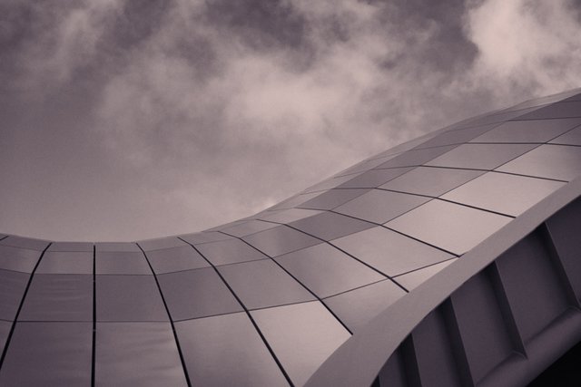
I really like these new shots and was considering entering them in some photography competitions. Some of these are quite similar because I couldn't decide myself which one to pick. I've tried to make them a bit more artistic too by focussing more on the curves of the building and the clouds.
What do you think and if I were to pick some competition entries which one or two photos would you pick?
Also do you prefer these to the original exterior shots from the post last week?
I don't want to enter more than a couple because these competitions tend to charge people per entry. Also if you enter lots of photos I think it makes you look like you don't have confidence in your work and can actually work against you.
The Photographs
1
2
3
4
5
6
7
If you like my work and aren't already, please follow me and check out my blog (I mainly discuss photography but I do other topics too) - @thecryptofiend
Camera: Nikon D800 with Sigma 24-70mm/2.8 lens.
Photo Credits: All photos are my own unless otherwise stated and free for you to use under the terms of Steemit4free
(Verification for me here: http://www.aapicture.com/about-me)
Some of my other recent posts
- The Face 2015 Photography Competition - I received a nice surprise in the post!
- The Only Piece of Art I have left from School and What Made Me Give Up Art for so Long
- New Graffiti from the Sage Gateshead (free for you to use in your own posts)
- More Architecture plus some Graffiti Too - The Sage Gateshead (free for you to use in your own posts)
- Dunstanburgh Castle IR shots (free for you to use in your own posts)
Are You New to Steemit and Finding it Confusing?
These resources may help:
- For a Quick FAQ - Try this
- To learn about Markdown (to help you post) - Try this
- Need to know Steemit Etiquette? - Try this
- Need some free images for your posts? Try Steemit4free - make sure to check which images it applies to.
- Need to talk to a human for help? - Try the chat
- Need Mentorship? - Try Steemprentice - here is a link that explains it, and here is the chat channel.
- Need a Free Image Host that works with Steemit? - Try SteemImg - it automatically produces markdown and html links for you, as well creating thumbnails and more.
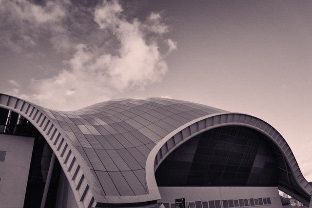
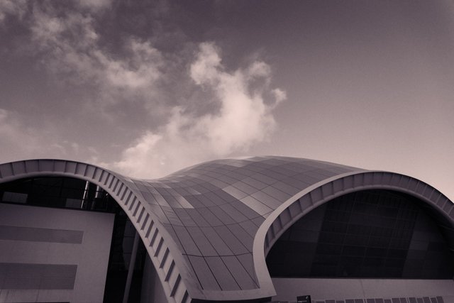
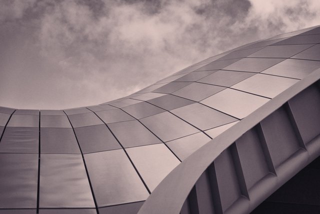
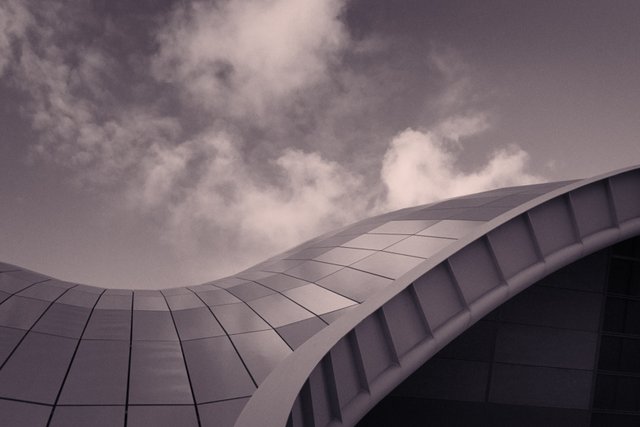
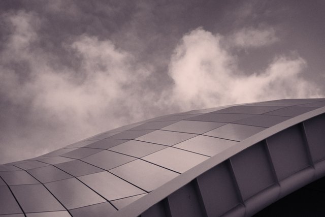
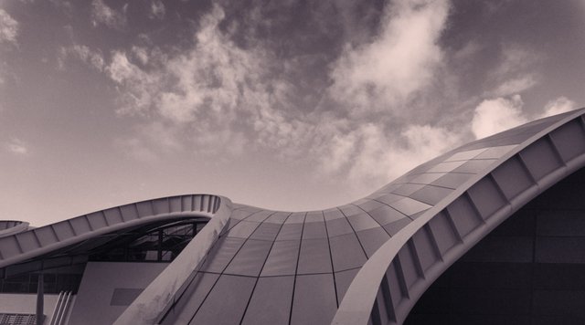
Number 4 and number 7 in my opinion. They all are good anyways. But if you forcr to pick between those two photos I'll preffer the #7
OK thanks for letting me know. I might go back and try to get some photos with my new lens when it arrives so I can get some wider angles.
Looking forward to seeing your cemetery shots, perfect for Halloween , I do like the last picture :)
Thanks:)
3 is my pick
Thanks:) I really like that one because of the minimalistic feel. I didn't bother with trying to fit the whole building in for that one. I think maybe I should try more of that next time.
I like numbers 4 and 7 best. Please don't ask my why. :)
Lol thanks:)
Agreed!
Very futuristic!
Steem On :)
Thank you:)
I like 7
Thanks. Anything in particular that you can put it down to?
sorry it took me awhile to respond, I forgot to check my replies! I like how 7 feels anthromorphic to me and the 2 "openings" in the swoop evoke possibility. hope that makes sense
I like 1 and 3. There's something about the roof tiles that catches my eye in those shots. They're sharply defined with a nice metallic sheen.
2 feels more muted and less satisfactory than 1. And 4 has an overly wavy look to some of the tiles. With 6 and 7, the angles of the building just don't seem that great to me.
OK thanks:) Yes I think the framing is a problem on some of the shots. It is a problem with not being able to get far enough away from the actual building at those vantage points - there is simply no physical way to do it and I just couldn't get enough into the shot. A wide angle lens would help and with that in mind I have ordered a 16-35mm which might be more useful than my current 24-70mm for these kind of shots. I may also try some actual closeups with a longer zoom. Thanks for the feedback.
Have you considered something like the iPhone's panoramic picture mode? Not sure how you'd do that with a regular camera but it might look cool for things like this where it's hard to fit the entire structure in the frame.
I hadn't thought about it. I've done panoramas before but the major problem is that you get a lot of distortion in the picture which is not as much of a problem for landscapes but with architecture it causes all the straight lines to become curved. Even thought the Sage is mostly curved there are a lot of straight lines in the supports and underneath the tiles which might look weird. I might still give it a go to see how it looks.