Bitcoin price overlay 2013-14 VS 2017-18 📉 SPOOKY 📈
Here you see BTC/USD price graph from mt.Gox 2013-14 in black, versus the coloured 2017-18 BTC/USD price graph from Bitfinex 2017-18.
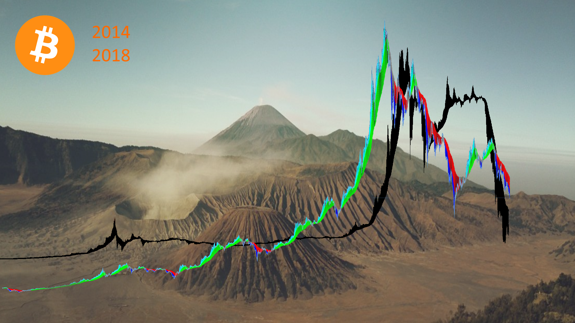
Of course price range is different, but the proportions is quite similar.
What if... Could we go back into the desert?
I don't think so but it is a scaring thought.
What do you think?
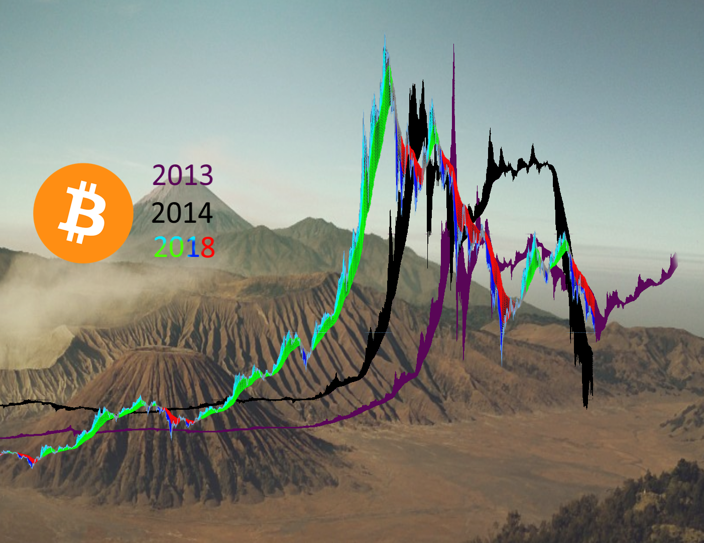
- Edit; here is 2013 also included, and it is quite much more similar

These are just my thoughts, not a trading advice.
If you have another view on this post your welcome to discuss and post your charts in the comments.
If you'd like my technical analysis on another coin, please ask in the comments.

Comments are highly appreciated, and please
upvote, resteem and follow me if you profit or otherwise enjoy my posts !
Support me using these services
Also check out these other posts:
It could easily go back into what you call a "desert". But all I see is great potential to collect coins. If you get into an hr chart these things are volatile which is a good thing it means you can trade and make profits. There is a small chance that this ecosystem fails really small, so in the long run we will be in a great position!
It is perfectly fine to trade in profit during the downtrend too because of the volatility.
As long as no emotions are involved, at least for me :)
Totally! Although I do get excited when I land a good trade, but then it is back to tech mind to make the next moves.
The tech is there no matter what the price is. Once enough people understand that these pennystock days are over, we'll add more than one 0 on BTC price the next few years.
Hello! I find your post valuable for the art community! Thanks for the great post! ARTzone is now following you! ALWAYs follow @artzone and the artzone tag, and support our artists!
Resteemed by @resteembot! Good Luck!
Curious? Read @resteembot's introduction post
Check out the great posts I already resteemed.
ResteemBot's Maker is Looking for Work
Thanks! Hope many like the Bitcoin price overlay 2013-14 VS 2017-18 📉 SPOOKY 📈
Very similar in the overlay. Doesn't surprise me much however, feels like we've been here many times before. That's why I just hold on and wait for the bounce off the lower support. Then it's back to the moon!
The overlay really tells there is seasonal variance but also similarity.
I sold some at 18,100 and they are 3x now. I regret not selling more BTC at the top, how many haven't :)
It is a little "my precious" yet we know it is volatile, and following the trend it is quite possible to trade pretty safe when we are inside the historic rythm and fibonacci levels.
Why do we fall..?
So that we can learn to pick ourselves up.
Your fallen bitcoins is usually picked up by someone seing it different.