How to Paint a Mountain Scenery | Step by Step Tutorial | Oil Pastels Artwork
Hello dear Steemians! Today I am going to share a detailed tutorial on how to paint a mountain scenery using oil pastels.
Tools and Materials
- Buncho oil pastels
- A good quality artblock that is durable
- Tissue to clean your fingers after smudging
- A mechanical pencil with 2B lead (to draw only so choose based on personal preference)
Step by Step Tutorial
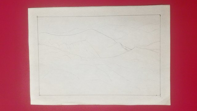
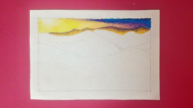
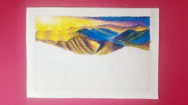
This is my basic drawing. Do take note that I drew some of the hilly areas as well so that it will be easier for me to identify those areas when I start painting. It helps me to know where the highlights and shadows of my artwork are going to be. It is just a matter of convenience.
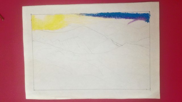
I began my painting with the lightest colour which is white. I wanted my sun to be shining brightly so I painted some white on the top left corner to protect that area. In case I accidentally smudge or paint other colours on it, I can just scrape it off and add more white on top to build the colour up. Then, I added some lemon yellow around the white area and then some primary yellow. I also painted the top right area which refers to the sky and some mountains in royal blue. If you are going to choose the same colours, be careful not to mix the blue and yellow because they are primary colours and will result in green which is a secondary colour. So, in order to still blend the two colours, it is best to add a transition colour which in this case is purple. A transition colour is a merging colour that helps to blend two other colours that you choose not to mix.
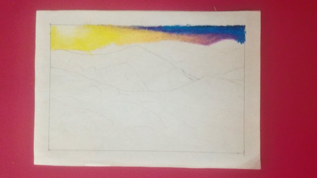
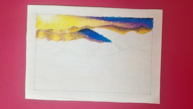
This is how it looked after adding transition colours. I added more than one transition colour, one being purple and the others were light purple and naples yellow (a very soft yellowish nude colour). I blended them with my fingers so that it will look soft and slightly misty.
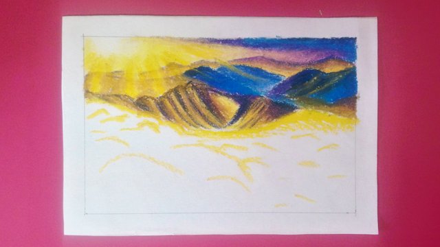
Then, I painted the furthest group of mountains with a yellow ochre (golden looking colour) pastel. I also added some naples yellow so that it won't look flat. Then I lined the mountains with purple to create more distance and at the same time to make them look distinct and not blend in with the background.
I painted the next group of the furthest mountains. I wanted some sun rays to fall on my mountains. Hence, I used a ruler to scrape out the parts where I wanted the bright sun rays to fall on especially the areas with purple. The reason why I scrape and not paint directly on top of the previous colour is because that will end up creating a muddy and dull looking colour. Oil pastel is a medium that can easily make your artwork messy if you layer too many colours especially contrasting ones like purple and yellow. Therefore, it is best to scrape out the previous colour in order to create an illusion of another colour on top of it.
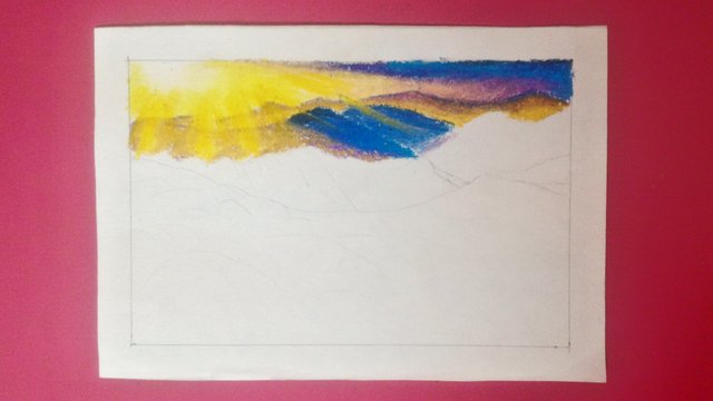
I painted another mountain. Then, I painted some yellow on the scraped parts and a small area of the mountain by pressing it really hard on my paper so that I can get maximum colour intensity and avoid the blue from mixing with the yellow to create green. This may work for small areas but it will be difficult and not look good on larger areas.
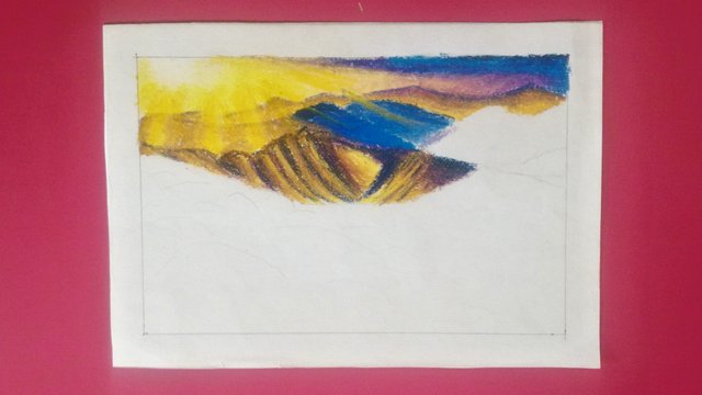
I painted the closest group of mountains. I mixed some dark colours with yellow ochre to create some shadowy areas on the mountains. I tried to implement some of the mountain painting techniques of Bob Ross, a very talented famous artist. If you like art, do look him up. There are many painting tutorials done by him on Youtube.
I finished painting the rest of the mountains. Now, half of the artwork is done.
As I usually do, I painted the highlight areas first to protect them. I didn't want a flat ground so I created multiple mini hilly areas.
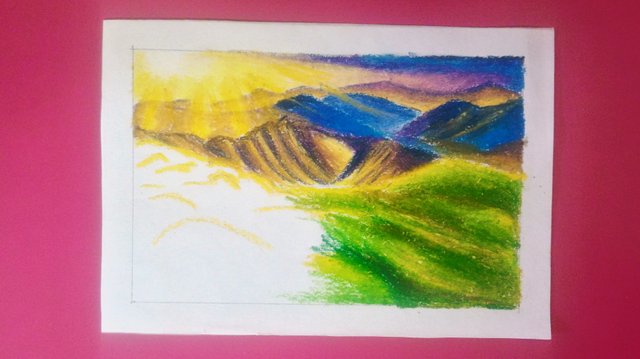
This is how it turned out after painting the green areas. At first I thought of painting it all green but then I thought that will result in green dominating my painting. So, I changed my mind. I mixed up a few shades of greens like olive, light green and grass green. You can mix the greens but keep in mind to not mix them too much because then it might end up looking too flat and the colours will all add up to form a dull looking shade of green.
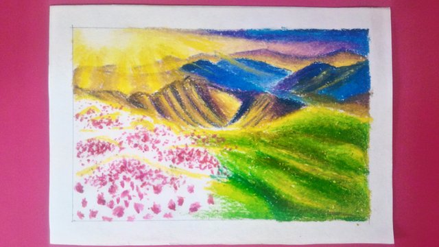
In order to avoid green from dominating my entire artwork, I chose to add some flowers. I used pink, light rose, magenta and red. I tapped my paper with the tip of my oil pastels to create the flowers. I used a few shades of pink to create little details of shadows and highlights. These can make or break a painting and often times people ignore them when it comes to small details.
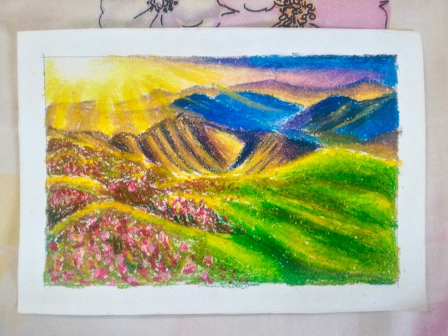
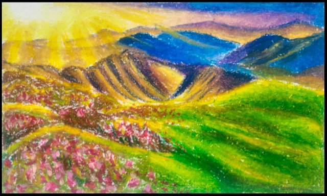
I added some green and dark brown on the rest of the white areas. This is my completed painting. It turned out to be more colourful than I expected it to be. I thought that it will look cool but it ended up looking warm which is my kind of artwork =)
This is my video tutorial with my voiceover. You will be able to watch me paint while listening to my voiceover guide. I hope that you enjoyed reading my post and I will be glad and happy to know if it is helpful. Thank you for reading and have a great day/evening ahead.

If you like this post, please upvote and leave your feedback below.
If you would like to see more posts from me, follow me.
Stay tuned! xx
Click the Images to View My Recent Posts:
Layered Leaves Digital Painting | My First Digital Artwork from Scratch | GIMP
How to Paint Hibiscus | Step by Step Tutorial | Oil Pastels Artwork
.png)
Sandy Beach Resort Review | Room and Resort Tour | Pulau Pangkor (Pangkor Island), Malaysia
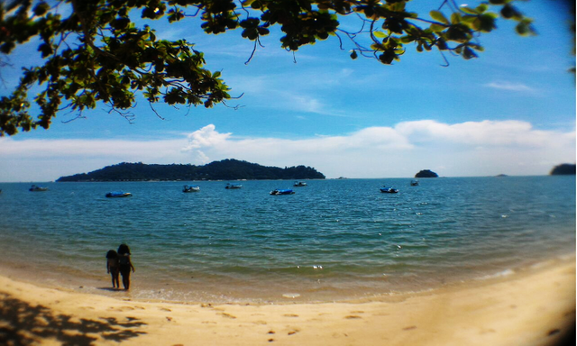
My Vacation in Pulau Pangkor (Pangkor Island), Malaysia
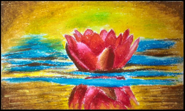
How to Paint Water Lily | Step by Step Tutorial | Oil Pastels Artwork
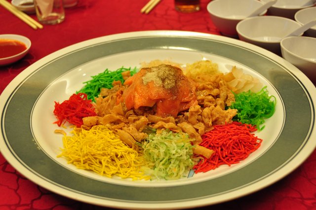
What is Yee Sang - CNY Prosperity Toss


Follow me: @yashny
My Dtube Channel: Yashny
About me:
I'm a chill, happy go lucky person. I am a feminist. I love food, art, books, numbers, psychology and occult science. I am in the process of healing and diving into spirituality. I think life is a gift and we should appreciate the little things of life more. Everything that I post is a little piece of my life. I believe that everyone is carrying their own cross, so don't judge anyone and be kind!
♥♥♥♥♥♥♥♥♥♥♥♥♥♥♥♥♥♥♥♥♥♥♥♥♥♥♥♥♥♥♥♥♥♥♥
Thank you for your support and encouragement
♥♥♥♥♥♥♥♥♥♥♥♥♥♥♥♥♥♥♥♥♥♥♥♥♥♥♥♥♥♥♥♥♥♥♥
If you would like to see more posts from me, follow me.
Stay tuned! xx
Click the Images to View My Recent Posts:
Layered Leaves Digital Painting | My First Digital Artwork from Scratch | GIMP
How to Paint Hibiscus | Step by Step Tutorial | Oil Pastels Artwork
Sandy Beach Resort Review | Room and Resort Tour | Pulau Pangkor (Pangkor Island), Malaysia
My Vacation in Pulau Pangkor (Pangkor Island), Malaysia
How to Paint Water Lily | Step by Step Tutorial | Oil Pastels Artwork
What is Yee Sang - CNY Prosperity Toss
Follow me: @yashny
My Dtube Channel: Yashny
About me:
I'm a chill, happy go lucky person. I am a feminist. I love food, art, books, numbers, psychology and occult science. I am in the process of healing and diving into spirituality. I think life is a gift and we should appreciate the little things of life more. Everything that I post is a little piece of my life. I believe that everyone is carrying their own cross, so don't judge anyone and be kind!
♥♥♥♥♥♥♥♥♥♥♥♥♥♥♥♥♥♥♥♥♥♥♥♥♥♥♥♥♥♥♥♥♥♥♥
Thank you for your support and encouragement
♥♥♥♥♥♥♥♥♥♥♥♥♥♥♥♥♥♥♥♥♥♥♥♥♥♥♥♥♥♥♥♥♥♥♥
Thank you for your support and encouragement
♥♥♥♥♥♥♥♥♥♥♥♥♥♥♥♥♥♥♥♥♥♥♥♥♥♥♥♥♥♥♥♥♥♥♥
thanks for drawing nice scenery. i enjoyed seeing it.
Thank you for your feedback. I am glad that you like it! xx
It is always great to see how you artists work starting from nothing and ending up with something creative and beautiful. I enjoyed your thought process breaking up the green so it wouldn't dominate the painting. I look forward to more work and seeing how it is done.
Thank you for your feedback and I'm glad that you enjoyed reading my post. I prefer my artworks to be balanced which is why I chose to add pink and magenta (complementary to green) flowers. I will post regularly and will give my best to create more quality posts like this =)
Hey @yashny, cool piece of art. The whole process reminds me a bit of BOB Ross. I don't know if you know him but you should check him out. Out of something, which you cannot really see in the beginning becomes something extraordinary beautiful.
Keep up the good work,
M
Thank you and yes, I do know Bob Ross and he is so talented! I mentioned him on this writing here:
You are right. I didn't expect it to turn out as good as it did =) Thank you for mentioning him, it would have definitely been helpful to me in case I didn't know him. He creates beautiful nature paintings and makes the process look so effortless.
Hello @yashny and congratulations for the nice step-by-step tutorial. These are always welcomed and very helpful to many users. I always love to see how an artist works, how an artwork is built from scratch. you did a great job detailing every step! Keep up the good work and steem on :)
Thank you so much for your warm comment ♥ I am glad that you like my tutorial. I tried to make it as simple as possible so that people who read will be able to paint it for themselves.
My pleasure! You did a great job, that's how tutorials should be, simple so people can understand every step. That's how people can learn and maybe earn one day, who knows?
Yes indeed! It is great to share what we know because sometimes the little things we share can impact someone in a major way =)
Thanks for sharing this beautiful piece of art @yashny. I guess the balance between brown and green, the flowers and sun perfectly symbolizes Spring :) I must say I can't wait to see more green in my environment. It really gives a lot of positivity to everyone.
Also looking at your end result, it indeed looks more warm than cool. I guess that's perfectly fine. Some warmth and positivism is definitely needed in these difficult days actually.
Thank you for the warm comment! Yes, the artwork is warm and warmth gives a sense of comfort :) A green environment certainly does radiate positivism. I hope that things get better and the difficult days get by faster for you =)
I hope so too @yashny! Thanks for sharing your work!
You're very welcome and thank you for supporting my work!
AAAAAAAAAH I love this, @yashny! I tried to work with pastels once last year and I got discouraged so much because I didn't understand how to work with them . __ . But now, after going through your post, I am more encouraged again !
Beautiful picture, the undulating landscape is done wonderfully, I love that glow of the sun that seems to touch the ground everywhere :)
Always so nice to see the step by step presentation, as well <3
Great tutorial! Congrats for Curie, as well <3
Thank you so much @veryspider! I am so happy to know that you are encouraged and might try using oil pastels again. I myself wasn't very keen on using oil pastels at first as they get messy and learned most of the techniques from trials and errors. I did create many messed up artworks before too lol :D Thanks for the encouraging words ♥
When I saw the first photo, I thought, "this must be very difficult to do. After I saw the 2nd and third, I thought, "doesn't look so difficult". Then I gave it a try, after 2 minutes, I realised this is just superb. Either i'm really bad at art or you are incredibly amazing because mine was just disappointing, I had to throw it away.
Wow it makes me so happy that you actually tried and attempted to paint! That is great! What really matters is you tried and you are not alone. I have made paintings that didn't turn out the way I wanted them to be and it is a part of the learning process. I am still learning new things in art every day and sometimes it is through mistakes. I hope that you don't give up. With some practice, you will be able to produce great art too!
Hopefully, it will get better. I just hope it gets better before I decide to give up.
Sure it will. I have had days of throwing some artworks too =) You can do it. All the best to you ^^
Great tutorial.
It is a neat way of seeing how colors impact each surface and how how they progressively blur and blend.
Oil pastels provide a classical touch
Thank you for your feedback. Yes, they do and that is one of the reasons why I am inclined to it =)
Love this! Such a pretty landscape I love oil pastel artwork have you tried using a bit of paint thinner? It basically turns it into a oil painting
Posted using Partiko iOS
Thank you for sharing the tip! I have not, but I would like to learn more about it. Does it work as a solvent to blend the colours better? Also, do I need to use a special kind of paper if I choose to use paint thinner?
Beautifully done. I really like how detailed you wrote the creation process here, you explained nicely why you made the decision for each step and the colours you chose to paint the area. The video tutorial is really lovely too.
Congrats for the curie vote :).
Thank you for your feedback. I'm glad that you took the time to comment on little details and my video as well. It helps me to know that I am creating my content right :)