Steemit Home Page Redesign Part 1
Lets build a new Home Page for Steemit!
Intro
So I was on a radio show about a week ago on @mspwaves #mspwaves with @ma1neevent and @poeticsnake and met with @aggroed on the show. It came up in conversation since Im a Sr. UX Lead Designer for the studios here in Hollywood Ca, would their be time available to work on a few ideas to help improve the current site for easier usability for new users and equally logged in returning users.
After taking a first stab in this process. I started brainstorming on what or how would it be easiest to have new users and returning users check out the site.
First Stab
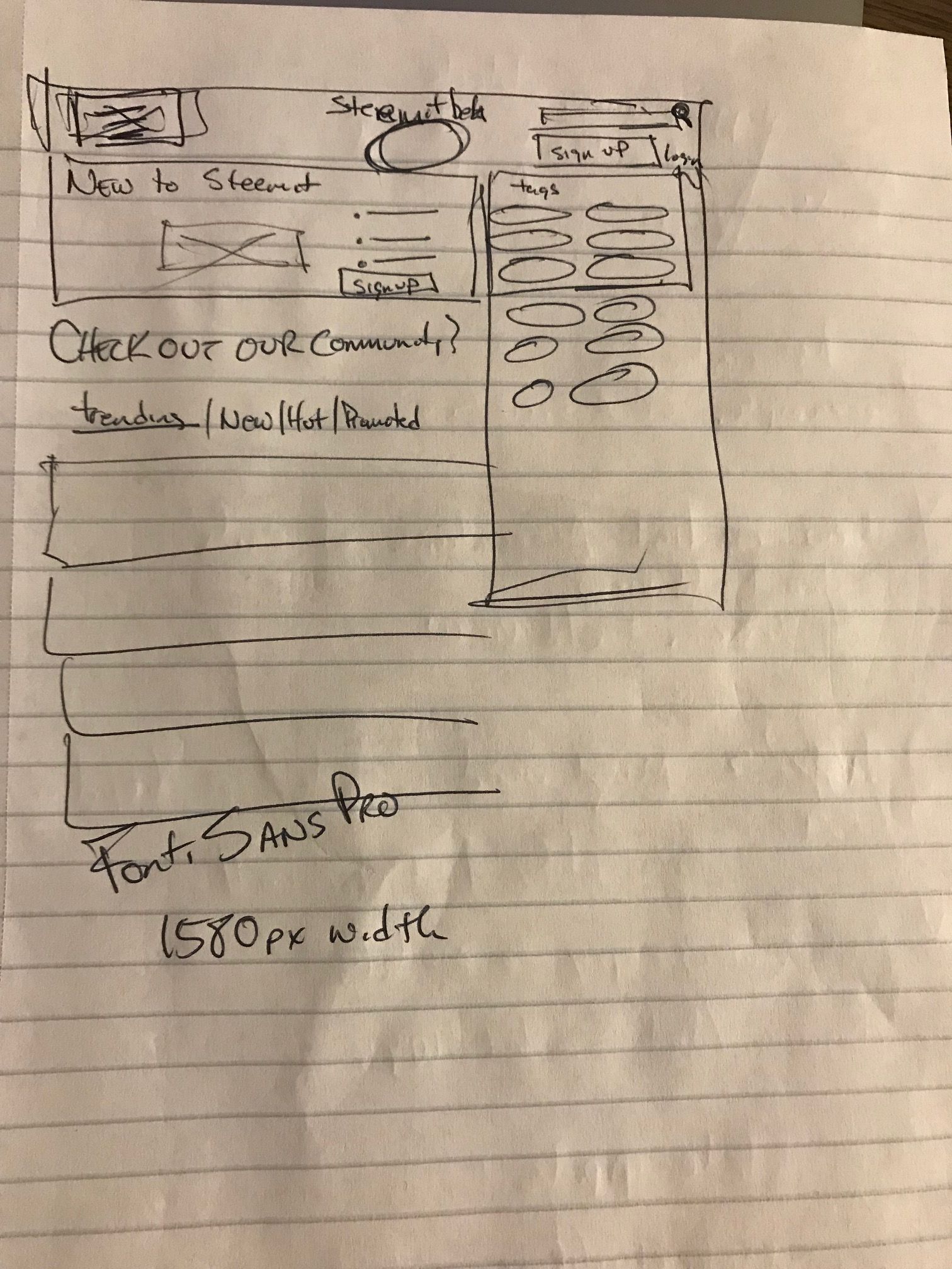
So I started by getting rid of the 3 column set up and forcing a much more digestible above the fold design. I wanted to surface the on boarding tools into a banner splash screen with CTA buttons inside it. Next I wanted to surface as many if not all the tags so people could get into the content quickly. There are a few communicative conflicts with the POST button on the current, forcing a user to register after crafting a post. thats a bit misleading so for me I wanted to surface joining as quick as possible. We want users right ? haha
First Stab - Logged In
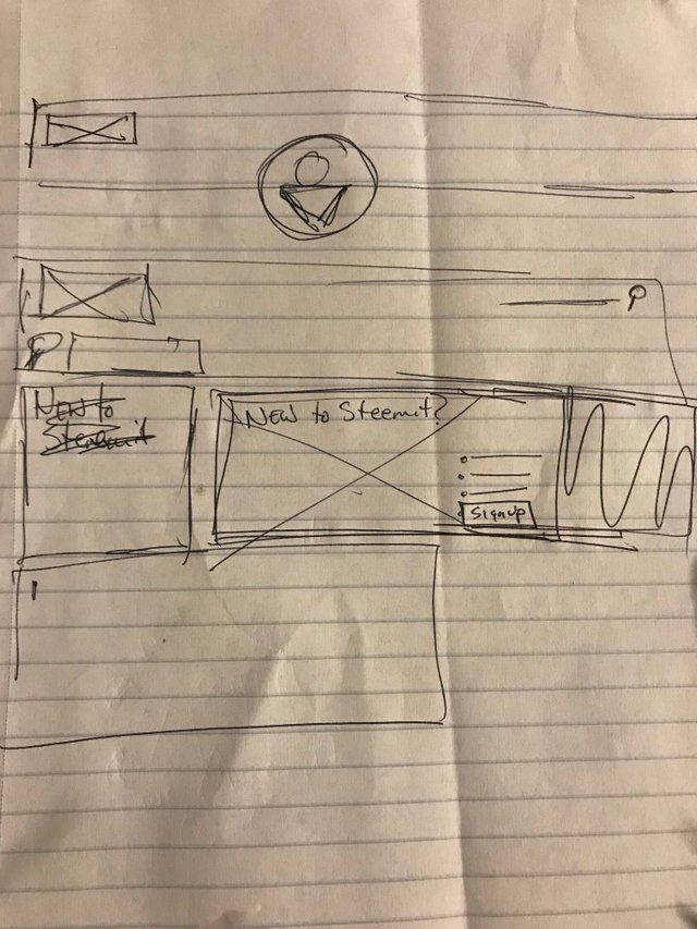
Here I wanted a user to feel personalized. I needed to add in some personalization. Increase the Avatar photo, and pull the smart tags drag / drop window to the top. I have a feeling that Im going to use realistically the same tags that Im interested in, and for me having that above the fold and at the top would be ideal.
Next Stab - Wireframes
Here I am starting to build out the sketches into more refined UI that has balance. After building this in sketch and then really fine tuning the wire as shown above, I added solid icons to help the reader read faster and become engaged in the UI. I pushed the tags up above the fold for easy scanning, and have removed the smart tags feature until you are logged in as a user.
I moved the burger menu to the left which is more standard for web and responsive mobile. Surfaced the search tool more prominent for easy use and added messaging of what you could commonly search for for easier usability.
For the logged in user, I've heightened the value of having a personal dashboard or landing page. Increased the avatar image a bit, added the icons for familiarity. Added the smart tags feature to allow easier search and providing a shortcut.
For me the design needs to be easy. Easy to use, Easy to maneuver and to keep the user engaged.
For my first stab, Id love to hear your comments.
How much did that excite you? did we seem to make some motion in this steemit ocean? If you'd like to check out Part II i finished it a few days back and it can be found here
Click on Steemit Home Page Redesign PART 2 here

@theUXyeti - This is me! Hilarious, funny, ex reality tv guy, loves app and web UI, competitive card player, scuba instructor, dart thrower, MTG player, WSOP player, gamer, hearthstone mechanic exploiter, sports handicapper, Geek of all trades.
How to find me
Steemit: www.steemit.com/@theUXyeti
Discord: TheUXyeti or TheUXyeti#5698
Dtube Channel:

@dtube / #dtube - gotta follow these guys for all new videos coming out everyday...

@adsactly / #adsactly - a great group of steemians paving the way for learning, educating, teaching, listening and talking humor and all kinds of great things in a community where i can add my uniqueness and feel like i fit in too. Add these guys.

@minnowsupport / #minnowsupport - a great discord server with great steemians helping everyone learn the platform by encouraging advocacy to all members new and veteran by assistance through education and onboarding in this great place via @aggroed vision
@thealliance / #thealliance - another great group to belong to. a good team to upvote and resteem your posts. Check these guys out as well.


Give it up for @originalworks @dorabot @msp-creativebot @msp-lovebot @msp-shanehug @discordia @curie @lovejuice @minnowsupport @msp-africa
I really like the wireframes that you came up with and I agree that there needs to be better use of the above the fold space. What really caught my eye was your use of the "most favorited tags" space and I think it would be awesome to do it in a more reddit style with those tags going along the top of the page. What are your thoughts about that?
Always awesome to steal what others do for functionality lol. Screen shot me an example. Would love to see
Yea here's the basic idea:
Tags across the top banner of the page. Something along those lines might make the jump from Reddit to Steemit a tad easier.
Ahh i see something like a sticky header. Sure that makes sense. If our base is migrating from reddit that makes sense. Great insight! I’ll add it to my 2nd pass and we will do an easy A/B test. I’ll create 2 versions and u pick the one u like better.
I like the direction this is headed. My one criticism would be around the tags section. It takes up almost a 3rd of the screen and seems very out of place. I think there has got to be a better way to surface the tags information without it using so much real estate
Agreed after the post i looked at that area too and felt it could extend down and be shortened to 4 tags width or a lesser column there. The issue I’m having is the page is just a wall really with no other features but tags, so I’m trying to understand what other features are best to surface for users. But agreed i saw that also. I’m looking forward to the next iteration and everyone’s comments.
I love seeing the community give their feedback on what they see as rooms for improvement in the form of prototypes and drafts and not just talk.
But why is half your post a signature with all groups you are associated with? It just looks silly.
I’ll be posting a revised wireframe with more explanation. I was going to mock it up but realize there are many comments that are helping shape my wireframes for build. Between my current Sr ux role here at the studio and scuba teaching on the weekends i didn’t have as much time as i thought to prep a more informative post. But i wanted to get my work out there quickly to here where the ui was lacking. Now i know and with your comments about the footer that helps me too. I’m a month new! Still trying to understand how to post and to not leave anybody out. Thanks!
I get you. Just wanted to give my honest opinion, although a bit blunt perhaps ^^
Keep it up!
im going to work on the revise 2nd version after work today and try to have it out tonight or tomorrow. Thanks for the comments. you make me a better designer for the target user. Ive only been here a month. would love the continued support and comments. Ill add you as well. thanks :)
Eh it’s just a rush footer i put in today. Sorry for that. Just happy to support all kinds of great communities
Some great ideas here. If you need a hand working up the wire frames, give me a shout.
Awesome! You do ux? Ui? I’m trying to find like interested ppl in the community! Thanks! I’ll add you and awesome
hey, post it on utopian.io to contribute directly to the steemit GitHub! Also, check my contributions, maybe we can merge some features! Great job!
love this idea! i just learned about utopian.io - can you post or work on UX related projects on it?! this sounds right up my alley!! im a UXer too :D
Hi! Of course you can, check my submission, utopian gives a lot of opportunities for open source collaborators! Just check out the rules...looking forward to seeing your contributions
awesome! i will definitely do a deeper dive this next week into it. its predominately for posting ideas though, is that right?
it's predominately for code contributions, but there is the suggestion category in which you can suggest UX treatments. There is also the Task Request in which sometimes you can find devs asking for ideas...
I can tell you i had the hardest time trying to figure out how to even use the ui there and even though it was simpler to use i hate the required github requirement. I couldn’t seem to figure out how to upload a post sadly. I just couldn’t figure it out man! Lol
oh well :) what can I say...maybe give it another try if you want to contribute and get incentives on open source software, it's worth it. About your design up there I don't like that 1/3 of the layout is taken by tags, that are really the most useless feature that could be automated and easily hidden.
When it asks for github address required what do i write in there
steemit/condenser
Thanks I’ll try that. Is that the full address
Hey that is pretty darn good for a first stab.
I think this is needed. The "beta" is long overdue for an overhaul...or actual new release of the website. I think getting rid of the beta will bring in more users. That word, for some reason, makes people think, "hey, I will come back when it is ready...because beta is for beta testers and this is not ready yet..."
Some sprucing up of this site and some marketing could go a long way. Thanks for posting. Cheers.
I definitely want all of your comments. all people respond. what you like what you don't like. My goal here is to put a line in the sand initially. I want to see how close or far we are from a redesign. I won't nail it on the first stab. ever lol... but I certainly can take your criticisms and build on this in Part 2. keep it coming. love all the comments. helps us craft a better UI moving forward.
This is really cool to see back end designs coming to life so to speak. I would suggest a very simple inerface, unlike Facebook with their mesmerizing color scheme, with 100 thumbs, buttons and drop down menus to nowhere.
What you have really looks clean and user friendly...yeah got to remove beta from the platform.
Great share
K
Awesome. Great comments from everyone. I’m def seeing some ui adjustments for round 2 thanks
Hi @theuxyeti, I just stopped back to let you know your post was one of my favourite reads and I included it in my Steemit Ramble. You can read what I wrote about your post here.
Join us on Thursdays for Pimp Your Post Thursday at 11am EST or 7PM EST in the Steemit Ramble Discord or:
If you’d like to nominate someone’s post just visit the Steemit Ramble Discord
So awesome! I left a comment on your post and am so grateful for the repost to get my design work seen and to have great community friends like you! Thank you
Hello! I saw on here you wouldn’t mind comments.
Now I’ve been on here a few months, I’ll tell you about my UX of the current site and see if it helps inspire.
Hot/Trending/New/Promoted - for me, some of the least important places to go on Steemit. Trending is nigh on static, Hot starts to get full of the same people, New is really poor for signal to noise ratio and I never click on Promoted. Why is this, more often than not it is because:
Popular tags - too full of high volume noise to be of any use. I’ve had to either seek out niche tags or go develop niche tags to get some sort of readability.
—
I also crave algorithms that feed me on point articles. Show me stuff I might like based on upvote history, who I’m following, what they’re liking. I don’t care if ta over seven days old either as I’m looking for good writing and people, not just stuff to upvote. Something like an intelligent news feed. I honestly would not miss New/Hot/Trending/Promoted whatsoever.
The box about favourite tags is a great start and really points toward personalised experience.
Great comments! This sparks great categories for curated content! Nice
Yeah, that looks pretty dope. As-is feels really clunky. You get used to it, but for new users already on the edge because this is new tech a more engaging interface is so needed. Curious to see how this develops.
Thanks! Yea I’m stoked by the responses. Already want to start round 2 but we’re in Laguna beach today
Work hard, play hard :)