Graphic Design Class 7 |Logos & Typography Combination.

What is a LOGO?
Tips for Designing a Logo
(a) Logo design must be clear, simple and easy to interprete and connected with.
(b) When designing a logo for your brand/business, do well to select the right types,Symbols, colours that best conveys what the brand stands for.
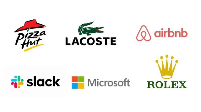
(c) Another unbelievable fact that some unprofessional graphic desiners struggle with is that not all logo should contain an image of what you do. For example, Apple produce phones and other nice gadget but do you see phone in it logo? Do you see the image of a computer in Microsoft logo? Be flexible as a graphic designer.
(d) Don’t just design a logo for the sake of designing, do something professional, it has a way of attracting potential prospect that looks out for competence.
(e) Your logo should convert a story about your brand...although not all the time.
There are many other important tips you need to know and you should carry out a personal research and don’t limit your knowledge to what is being taught here, this will make you extraordinary.
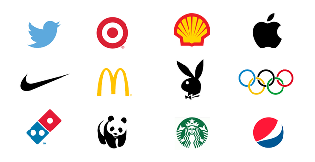
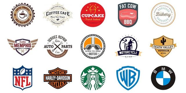
Logo recognition and it types.
- Pictorial logos.
Pictorial mark logo is a type of logo that shows what the brand of business stand for. They don’t always include text, it only contains image such that when the image is viewed, you can guess and be 95% correct about what the brand represents.
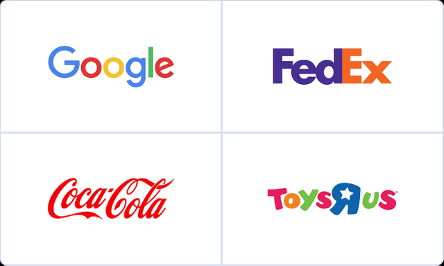
- WordMark Logos
This logo type goes straight to the point, it captures the name of the brand in text/types either in full or abbreviated, according to research, it is one of the best logo type that has a strong and lasting impression on your audience. The only thing a brand should carefully do when choosing this logo type is to carefully consider the “font” to be used.
- Abstract Logos
This type of logo is the type you create with the intent of conveying something you want it to covey, it doesn’t really follow a concept that is already in existence, its more or less like birthing your thought. But you need to be strategic about it so that the audience don’t misinterprete your brand.
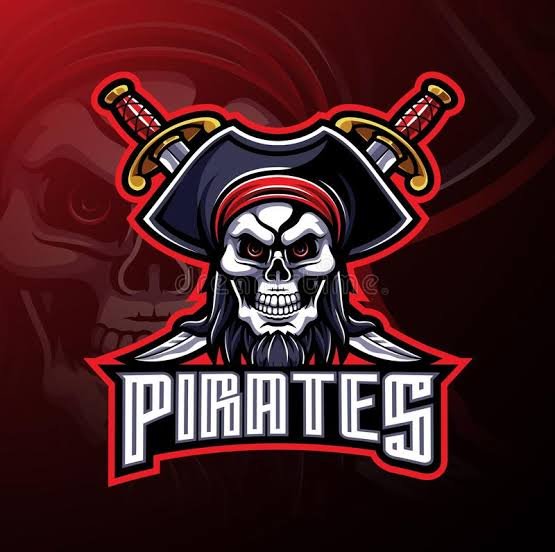
- Mascot Logos
This logo is a type of logo that capture images of human or non-human entity. This is done to the end that people can easily connect with them, you can see logos like this used in sport industries, restaurant, service companies etc.
- Combination Logos
This type of logo combine two or more of the type of logos discussed already. For example combining abstract with wordmark or mascot, imagery with wordmark. You just have to be sure what you want for your brand.
- Emblem Logos.
This is a type of logo used by government agencies, schools, crest for organizations etc and it is characterized with a geometric shape, text, colour , imagery and symbols. They are known to contain more information that viewers can easily connect with when compared to other logos.
Type combination
- Serif font
- San serif font
- Script font etc.
Like I said earlier, fonts can also be combined to produce very nice design, its not compulsory you use just one font throughout your design, as a good graphic designer, you should be flexible enough such that you can manipulate the rules and still produce something great.
Combination Patterns
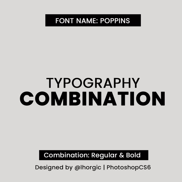
- Font weight Pattern combination
You do this by combining font taking into consideration the weight which could either be light, medium , regular , bold , italics etc. A single font (font with family) can be expressed in these aforementioned weight i.e poppins. Lets see some examples below.
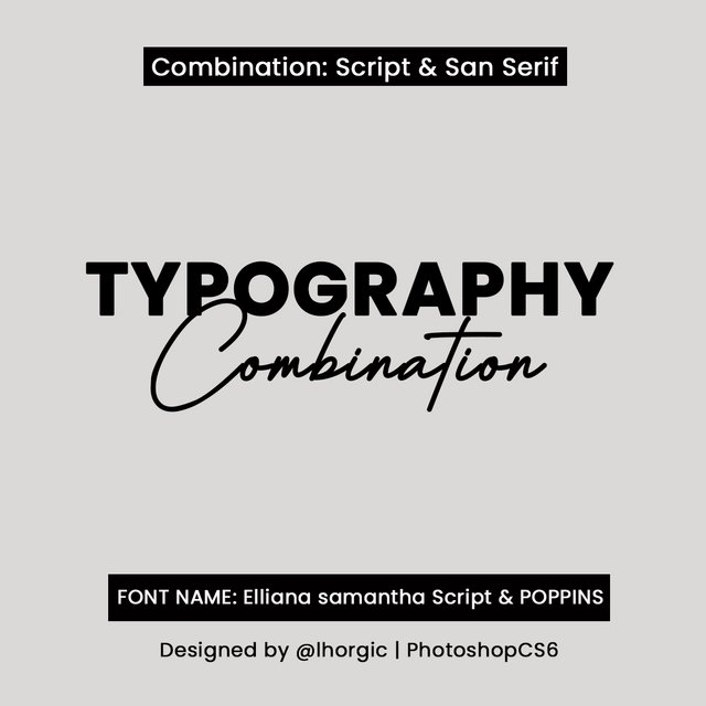
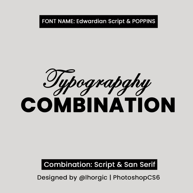
- San serif / Script
You can combine san serif and script font…but mind you care should be taken when using both, don’t use complete capital letter for your script font, it wont really look good. Small letter is fine with the first letter in the upper case.
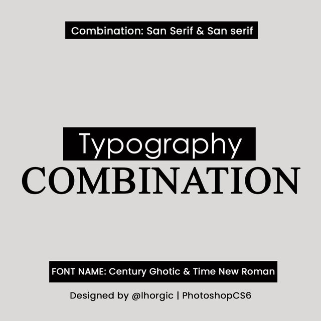
- Serif / San Serif
These tow also works fine too, just be very strategic with it and make sure you look out for font that best match using these pattern.
- Other Type Combination
You can check other combinations here
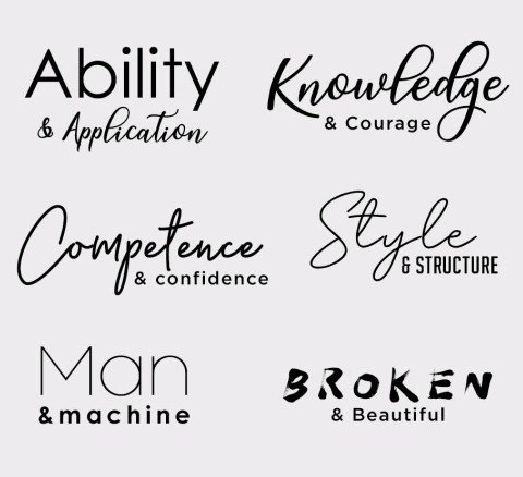
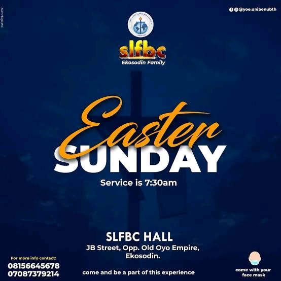
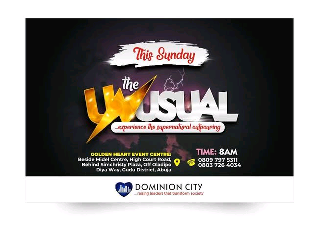
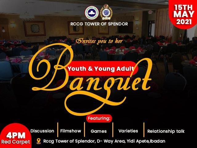
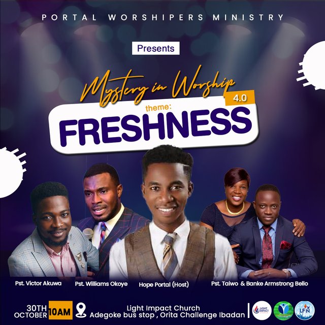
Example of Designs.
Conclusion.
Homework
- Give a detailed explanation on your understanding about Logo
- Pick a very common logo and get the meaning behind all of it components (colour, symbols ,type etc)
- Design a simple flier showing your understanding about Type combination.
RULE FOR HOMEWORK.
Give your post the title ; Graphic Design Class 7 | Logo & Typography Combination
- Your assignment must be submitted in steem.skillshare community
- Tag me in your post and drop the link to you task in the comment section.
- Plagiarized content will not be considered
- Deadline for submission is 3rd of October.
- Use hashtag #lhorgictask among others
Special regards
Cc: @atim1234
Cc: @niglys8
Cc: @printskill
Cc: @milakz
Hi sir, this is my assignment.
https://steemit.com/hive-197809/@masrull/graphic-design-class-7-or-logo-and-typography-combination-by-masrull
Amazing!
Almost felt like i was reading an interesting educative story. Well done @lhorgic
I got enough value!
@niglys8,my amiable Design App Teacher,thanks for this encouraging comment.. trust me,am looking forward to your next lecture..
You're welcome @lhorgic
Smiles!
Wow... interest lesson sir.
Always giving us the opportunity to be original with our work.
my assignment dropping soon🤗
@dibie,Am glad you got value...will be expecting your entry
He did a great job and an excellent explanation, congratulations!
Thanks @daytona475... I really appreciate this wonderful comment
i love this topic so much.
Thanks dear student...will be expecting your entry
Hello here is my entry
"GRAPHIC DESIGN CLASS 7|LOGO AND TOPOGRAPHY COMBINATION. — Steemit" https://steemit.com/hive-197809/@n-chris/graphic-design-class-7-or-logo-and-topography-combination
My entry for this class
https://steemit.com/hive-197809/@hazmat/graphic-design-class-7-or-logo-and-typography-combination
My entry sir
https://steemit.com/hive-197809/@dibie/graphic-design-class-7-or-logo-and-typography-or-or-assignment-by-dibie
Here's my assignment post Sir,
https://steemit.com/hive-197809/@stanleynnah/graphic-design-class-7-or-logo-and-typography-combination-10-of-the-reward-goes-to-steem-skillshare
Thanks.
Hello sir please kindly see my assignment link below:
https://steemit.com/hive-197809/@madilyn02/graphic-design-class-7-or-logo-and-typography-combination