Graphic Design Class 7 | Logo & Typography Combination
Graphic Design Assignment
Having read the lecture by our Design Science Teacher @lhorgic on the topic of Logo and typography combination. I will be answering the assignment questions accordingly.
1 GIVE A DETAILED EXPLANATION ON YOUR UNDERSTANDING OF LOGO

I would define a Logo as a business identifier. Things such as texts, images and colors are used to create a symbol telling people about your business, such that at a glance people can easily tag that symbol to your business.
It provides a visual interpretation of what you do, and serves as a symbol of your organization concept.
Logos come in different forms, styles and are of different types. Although different, they all serves the same purpose for an organization. One logo might be telling me this business is all about food, another logo will tell me a business is about clothing. But at the end of the day the logo is telling me something about that particular business. So in this sense the interpretation should be clear to whoever is viewing it.
There are different types of logos and they have classifications depending on what kind of design format they are in.
•WORDMARK LOGOS
These logos literally do not beat around the bush, because they tell the entire story using only texts. The logo is the name of the business and is very easy to understand by the audience. Brands such as Coca-Cola and others use the wordmark type of Logo. The only thing a designer needs to be conscious of is the type of fonts, size and color used.

Image Source
Anywhere I a see Coca-Cola logo I already know it's related to a beverage drink because this is what the brand has been known for.
•LETTERMARK AND LETTERFORM LOGOS
The lettermark is almost the same as the wordmark because they both involve used of letters. The difference to note between them is that while all the letters of the business name are needed in the woodmark type, in the lettermark logo only a few letters are chosen and used for the Design.
Letterform logos on the other hand make use of just a single letter for the design, this is perhaps the most simplest of Logo designs. An example is the Facebook logo with a single letter f.
.png)
Image Source LETTERFORM
The famous logo for Facebook.
.jpeg)
Image SourceLETTERMARK
Above image shows popular logos like Cable News Network CNN and Hewlett Packard hp. Only some letters were used from the organization name.
•PICTORIAL LOGOS
These kind of logos like the name suggest are made using pictorial forms, they do not include any form of text. The pictures tells you what brand it is. Anywhere I see a social media platform with a the bluebird, what comes to mind is Twitter.
.png)
Image Source
Tweeting is the sound made by birds when they communicate, this has become symbolic with the social media platform for communication known as Twitter.
•COMBINATION LOGOS
This type of Logo Design like the name suggests contains a representation of both pictures as well as texts. Both are used to create the design
.png)
The KFC logo contains both texts and image representation in the logo.
•EMBLEM LOGOS
This type of logos contain a representation of some imagery whether it is living or not. It is almost like the combination logo because they can also contains texts.
One major difference to spot between an emblem and combination logo is that emblems tend to be more designed in a compact manner with all the details usually around one place.
.jpeg)
Examples are logos of Starbucks or the BMW.
•DYNAMIC LOGO
This kind of Logo is sort of a newer style because the same logo is redesigned with things such as colors depending on when it is being used. Popular among this is the MTV , the logo is always changing depending on it's usage.
Others types of Logo include mascot, abstract and signature logos.
2 PICK A VERY COMMON LOGO AND GET THE MEANING BEHIND ALL OF IT'S COMPONENTS (COLORS, SYMBOLS, TYPE etc)
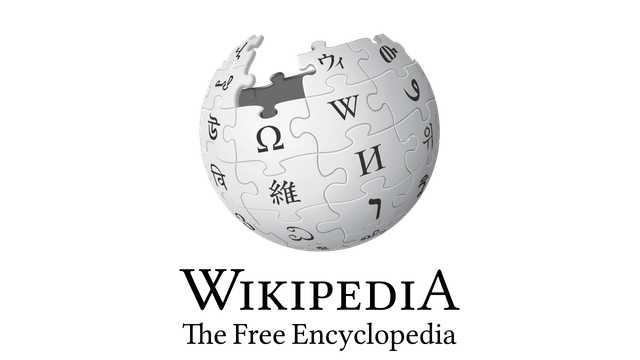
For this question I will be choosing the WIKIPEDIA LOGO, it is one logo that has always fascinated me because of its shape and what it represents. Wikipedia is a famous encyclopedia where information can easily be accessed.

Image Source WIKIPEDIA LOGO
On the Wikipedia we can see different symbols spanning across different subjects. The symbols are known as glyphs.
.jpeg)
Image Source FLATTENED VIEW
GLYPHS
The logo is looking like a jigsaw puzzle which has not been completed.
It contains glyphs from different languages and cultures, this shows the readiness to accept and cover all forms of subject across the world.
Glyphs from Latin, Arabic, Armenian, Japanese, Mongolian, Hebrew, Tiberian, cryrillic , Chinese , Korean and so on can all be viewed from the logo.
In the previous versions of the logo some had contained wrong glyphs but were later corrected to what we have presently.
Also the missing portion of the earthlike shape shows that although this aim is impossible because of evolving of the world, regardless it would continue to cover more topic around the world.
The world is constantly growing and evolving and Wikipedia main aim is to continue growing with it and keep evolving
COLOR
The color of the globe is a mix of white, black and grey. Previous versions contained colors such as red, yellow, blue.
THE FREE ENCYCLOPEDIA
Wikipedia has been known over the years as an encyclopedia that is free to use and covers a wide range of information online.
It can viewed in a number of different languages, cementing it's claim as a diversely rich source of information.The letters used to form the word THE FREE ENCYCLOPEDIA are sanserif fonts.
This logo is quite an interesting mix of knowledge on its own.
3 DESIGN A SIMPLE FLIER SHOWING YOUR UNDERSTANDING OF TYPE COMBINATION

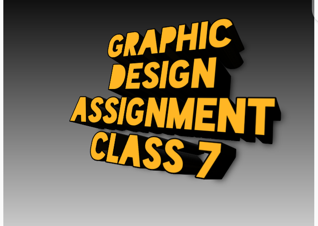
This flyer was designed using the PIXELLAB DESIGN APPLICATION
This was a wonderful and we'll detailed class as it gave me opportunity to do research on how and why some logos were designed the way they are. A wonderful lecture from the Design Science Teacher @lhorgic, i appreciate your efforts for sharing this with us.
CC : @lhorgic
@atim1234
@daytona475

.jpeg)

My Observation
In question 1,you did a good job in demonstrating your understanding about the topic. In question 3,I love your design,looks simple but you can do better.I believe in you. Weldon dear student.