Graphic Design Class 7 | Logo & Typography Combination

Hi everyone. This is the 7th class of the graphic design class initaiated by @atim1234. In this class I was able to learn the different logo types and typograghy.
Now i will be attempting the questions below
Question 1
Give a detailed explanation on your understanding about Logo
Logo
A logo is an image, shape, text, color or combinations of all four which depicts the purpose or name of of a business.
A logo is more than a mere symbol of identity. When a logo is designed well, it can tell the story of your business. It establishes emotional connection with the audience.
Logo helps to:
- Create first impressions and invite audience to interact with our brands
- Create brand identity and uniqueness
- Differentiate us from competitors
- Create a visual image whereby everyone will be able to remember us.
Components of logo
Color
Colors are core communicators of our message. They inform our audience about our intentions.
A logo color can contain a single or several colors but it's best to stay within two or three colour combinations. The color we choose will determine how our design will turn out so we need to choose the right color.
Images
The images we use for our logo can be a simple arrow, an icon, or even a picture. Whatever will tell about our company or product.
When using an image, we need to bear in mindtha our logo may be resized and much depends on the where we place them.
We also need to use something clearer and scalable.
Typography
Typography are letters we find in a logo. These letters are arranged in a consistent design. Like mentioned in the class and as we see around us, mist logos are built around a single letter, monogramy.
It can also be the full name of the company/business.
Tagline
Taglines are used mainly on abstract logos. Since the abstract logo doesn't actually tell our audience about our business but only conveys its value, taglines are added.
Example below:

Logos can be used in:
Business cards, websites, presentations, marketing materials, company communication etc.
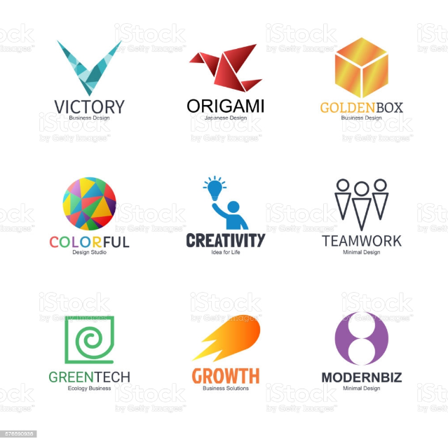
Types of logo
The main categories of logos are Image-based and Name-based logo.
Image based logos include
- Abstract logos
Abstract logo contains just a symbol . The images in this logo may not necessarily be real-life objects, it's a unique logo that convey the specific message of our brand.
Example below:
- Mascots
These are images or characters which gives a visual representation of our business. L
Advertisement centers around around this type of logo because people easily connect with them. Everyone including kids can relate to this type of logo.
Example below:

- Pictorial marks
These are logos which are made up of a graphic symbol and that represents real-world objects most at times. The pictorial marks can tell the story of a company. They are very easy to remember and they send a quick and clear message to viewers.

Other image based logos include: Brand marks, combination marks, Dynamic marks etc.
Name based logos include:
- Monograms
Monograms are the type of logo that are made up of only typography. They range from 2-3 letters. They emphasize the name of the company they are representing.
They give a brief narrative of a company purpose.
Example below

- Letter forms
This type of logo uses a single letter to convey a clear message.
They should be beautifully well for them to convey our message. Since it's a single letter, it needs to be bold and very beautiful.

- Wordmark logos
This consists of the stylish form of the company name, monograms or initials. It conveys a clear message of what the company represents.
Example below

Question 2
Pick a very common logo and get the meaning behind all of it components (colour, symbols ,type etc)
Logo of twitter

Twitter logo is a pictorial one. This logo is very easy to understand as everyone can easily tell it's a bird.
It conveys the message of twitter in a single image, You tweet, and so the bird tweets.
The size and color of the image makes it eye-catching to the audience, also it's simplicity helps the audience to know that twitter is easy and straightforward.
Question 4
Design a simple flier showing your understanding about Type combinations
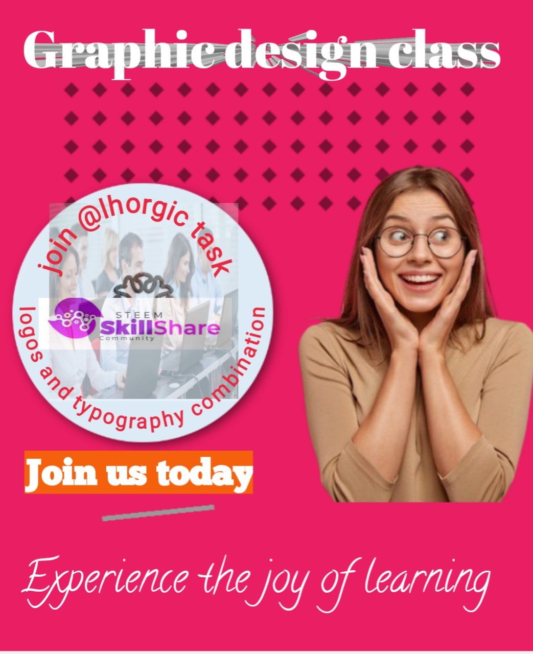
For this flier I have used the Serif and script fonts.
My color combinations are pink, white and orange color in one if the fonts background.
Thanks so much @lhorgic for this lesson. I must tell I benefitted a lot and the lectures are very easy and concise.

My observation
I love your detailed presentation,it shows you really took your time to explore this topic. Your design is not bad however knowing how to position your types and elements is key..I know as we proceed with this class, we will discuss the "principle of Proximity" which helps define how close our types & other element should be in a designed. Kudos dear student,I believe in you!