Photo contest: post processing #3- results
Привет/Hello/Servus/Saludo, друзья
Photo contest: post processing #3

The post turned out to be quite voluminous. I tried to collect in it the maximum amount of information on post-processing, which were contained in the contest posts. I hope this is justified.
The original text (RU) without the use of auto-translation is published in a separate post.
EN
It's time to take stock of our small event. I specifically avoid the word "competition", because the main thing is not a competition, but participation, discussion, exchange of experience, conversation of people who are passionate about photography and try to get a result that is more than just pressing the shutter release button of the camera and the phone.
This is the main task that I set myself. At the same time, simple compliments have no special value. "Wow, how beautiful!"... it doesn't carry any useful information. I would like to hear the continuation of this phrase. What exactly did you like about this photo, which solutions of the author are successful. I consider constructive criticism, expressing opinions on the merits, and paying attention to important or interesting points to be the most valuable in the comments.
Together with the authors' posts, such comments can bring a lot of useful things for everyone.
Our dear participants:
@michelangelo3
@weisser-rabe
@rut-ru
@esthersanchez
@manuelgil64
@qwerrie
@ty-ty
@lllll1ll
Let me remind you, the theme of this stage of the competition was: "It is necessary to process these photos in monochrome."
At the same time, cropping, working with light and shadow, and other image characteristics are not canceled.
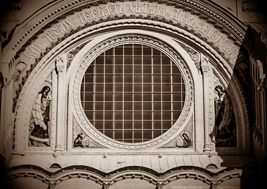
The first job was a post @michelangelo3.
For the main photo for post-processing, he chose #1 from the suggested ones. I recommend reading his post in full, I will only focus on individual details.
The shadow on the right annoys me, the picture is surprisingly symmetrical, I copy the horizontally mirrored part of the left side over the right area with the shadow.
The author really achieved almost perfect symmetry (if you do not take into account some shadows of the semicircular arch), however... to the detriment of documentary...in fact, the images of the archangels are not the same. Now it's definitely not a photo, but we got a beautiful image for further work.
To convert to black and white, I use a "Mono Mixer", with which the color channels can be adjusted individually.
This is an important point of converting a color image to monochrome. Adjusting each color channel individually allows you to make a more precise adjustment of the image.
The threshold value is useful for setting the black point, it is located in the left area of the image.
And this is another important point in post-processing. Finding and setting the black and white dots makes it easy to find the desired contrast in the image.
Applying a brown tone using a new layer...(I didn't know this method in my practice, now I know. In LC, you will not be able to use this trick, there is no work with layers in it. But there is a possibility of separate toning of light and shadow, or you can use a ready-made preset. In any case, you get monochrome).
And, of course, pruning.
Unfortunately, the author used only one of the proposed photos. But if you read the comments to the post, you will be able to find (or you won't be able to)... the Easter bunny. It has nothing to do with the competition, but it really enlivens communication.
This is also a post-processing option 🖐️ 😊
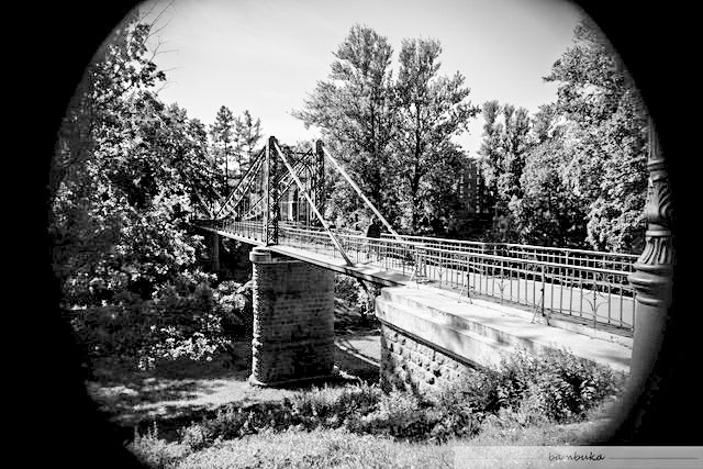
The second job was пост @weisser-rabe.
I like his thoughts on finding a creative solution to the task.
Here I am. Still without a clue about it, but with the idea of doing something completely different from this snapshot. Two possibilities come to my mind...
Unfortunately, the author used only one of the proposed photos. His attention was attracted by the view of the old bridge among the greenery. Nevertheless, he did creative work on post-processing and presented two options at once.
At first, he imagined himself as a night hunter...inversion of an image into a negative... Yes, it's very similar to nocturnal animal traps.
Then he became more serious...although...I can't say that.
With the greyscale photo, perhaps a little glossy look can be achieved? Some glamour for a postcard or travel guide? For that I need again some altered contrasts and some filters: a slight blur, especially vertically and a supernova effect.
A supernova has lit up over the bridge 🖐️ 😊 For greater importance, sharp shadows from a new light source are needed.
Our third participant @rat-ru and here is her post
The option with a balcony and people on it was chosen as a competitive work.
I decided to focus on framing. In the center of attention is the person whose gaze is caught in the lens. This is the most interesting part of this picture.
I couldn't agree more. A person's gaze is always the first to attract attention in any photo, even if we are not aware of it.
I checked how the image will look in the aspect ratio grid. The main figure (for which everything happens) falls on the line of thirds.
This is also an important point for searching for a composition during post-processing. The similarity of using the "golden ratio". This is one of the most common rules. However, there is an opinion of professionals that sometimes it is very useful to ignore the rules. The set goal solves everything.
Working with light and shadow, contrast gave the result in the noir style. An interesting solution.

=======================
Monochrome is often applied to architectural objects.
In processing, I used: pruning, removing garbage items, vignetting. I decided that sepia is the most suitable color for monochrome here, as an option for imitating old black and white photos.
The result is a rather contrasting monochrome.
=======================
The original photo from the very beginning offers the opportunity to observe the surroundings in the likeness of a telescope.It was logical to add sharpness after converting to a black-and-white image.
That's all.
I wiped the lens glasses and turned off the colour ... that's all 🖐️ 😊
The fourth participant was @esthersanchez and here is her post
Well, as the first photo I chose this. I like it because of what I think I can do with it, with monochrome processing.
This is a photo with a balcony and people on it.
...lightened the image to the highest level (100%), and then increased the sharpness...cropped and aligned the image...correction against light to lighten dark places...changed the image size, applied a defocus filter and added a vignette
As a result, it turned out to distinguish people from the general background and focus the viewer's attention on them. Photography even has a touch of mysticism.
=======================
For the second one, I did something different: I cropped, lightened and resized the image to work only with the part I wanted to highlight.
In my opinion, this is a very good start. Cropping an image can determine the entire further course of post-processing. For example, darker edges can influence the choice of light and shadow balance, and after pruning at the end of post-processing, it may turn out that the left part is lighter than originally planned.
Then I put the image in black and white, and then flipped the colors, outlined it and lightened it a little...finished with this image, giving it a sepia color and adding a little brightness and vignettes
Unexpected move with image inversion...something reminded me of night camera traps... if it weren 't for sepia 🖐️ 😊
An interesting result for architectural objects, it will be necessary to experiment
=======================
After improving the color [...I resized the image and improved its color...]I wanted to try a tool that removes the color of the objects you choose in the image manually, and I applied it to the bridge, which is the main attraction of the image, and left the rest in color.
Also an unexpected creative technique...the purpose of its application is not entirely clear, but it is a rather expressive version of post-processing.
The name of the fifth participant of the race is @manuelgil64 and this is his contest post.
If I understood correctly, then #3 was chosen as the contest photo
I managed to find a filter called "INDIE 1", and after adjusting the volume of the blur, I managed to get an image that reminds me of a spring print in a certain way, and where are the elements present in the graphic composition
The idea of using ready-made filters is also justified if you just want to "improve the appearance of the photo." Moreover, by choosing the right filter, you resort to a more fine-tuning of the image.
Then I proceed to crop the image... (4:5)...I apply a black and white filter and continue to adjust the contrast, brightness, light volumes and shadows... I decide to apply a sepia filter... and after adjusting the brightness, contrast, light, shadow, hue and blur levels, I get the result...
And again, the use of a ready-made filter is supplemented by a refinement of the setting. This is exactly what should be done with filters in my humble opinion.
=======================
...I crop using the Picsart application, keeping the original proportions, trying to center the circle and eliminating the elements located at the bottom, and then apply a high dynamic range (HDR) filter
The HDR filter made it possible to make the image more contrasting and expressive. If it's in your image editor, then it's worth trying it out.
I change the sharpness, structure, values of light, shadow and brightness before applying a black and white filter.
You can try these settings directly in the monochrome image. Sometimes this will prove to be a more effective approach.
i also processed the image in a key close to sepia
The author presented two versions of monochrome. The second one can be viewed in his post.
=======================
First I crop the photo to emphasize the presence of the person. Then I apply an HDR filter and immediately change the parameters of light, shadow and brightness, among other things, trying to lighten the image as much as possible and, thus, try to give visibility to the railings, balusters and decorative elements present in the building. In addition, I slightly adjust the horizontal, by about 1 °, taking as a basis the lower edge of the floor on the left side of the photo.
We see an already tested approach to post-processing. However, I will note one important point. Alignment of the "horizon". On this occasion, I left my opinion in the comments to the author's post. I recommend looking there.
Then I apply a black and white filter in the Snapseed application and change the parameters that are necessary to highlight two human figures.
Sixth application I came to the contest from @qwerrie
Photo #1 was chosen as the contest photo
I will create two copies of the original image and convert each to black and white with different settings to get a lighter and darker version. I will save them as layers in my file with the appropriate name.
We see the work with layers. This is not available in all image editors. But if you have Photoshop installed, then it's worth a try. I have to, too...
Next, the author describes in some detail the processing algorithm using layers and settings of each of them. I advise you to read more about his post.
Setting up each layer separately, mixing layers, correcting the result is quite a lot of work, but you can get really serious post-processing.
you must remember that "the best is the enemy of all good," as they say... extra perfectionism can cost you ... a lot.
I have already heard this somewhere (from one of the above-mentioned participants). Apparently this is a good wish. But the author goes further.
I set the 'Feather' parameter to 15-20 and highlighted the specified shaded area with low contrast, in which less detail is visible. Then I used the "Dodge" tool on a darker layer to make the midtones lighter. The key to the success of this operation is to create a selection with smooth, not cut edges and use a soft brush with low pressure
Yes, the picture was taken in sunny weather with harsh light and shadow. This led to a more "heavy" right side of the photo. The author @michelangelo3 solved this problem radically... he completely replaced the right shadow by mirroring the left half on it.
@qwerrie acted more humanely and only lightened this shadow by preserving the documentary nature of the photo. Further, the author points out some additional processing capabilities and talks about some "pitfalls" that can damage the final result. I recommend that you carefully read the reasoning after reading the post.
=======================
I didn't zoom out, just made a square crop. I also added vignetting and a bit of grainy noise to give the final image a more "analog" feel.
A simple solution that gives a good result. But it all depends on your task.
=======================
I decided to leave the image as it is, not to crop all the darkened areas where the lens itself has already cropped the image : P Moreover, I made the vignetting even denser and more uniform, well distributed.
The picture was taken with the lens of the ACS 1-22-1. On a full-frame matrix, it leaves a large area uncovered by light - a vignette (not just corners, but whole zones).
The author decided to give them more expressiveness by softening the borders of the vignette and the image.
Now imagine that you are looking at the bridge with an old monocle...
The final contest entry came from @ty-ty
The first thing I need is an idea...
In my opinion, the entire post and, accordingly, the entire post-processing is based on this phrase. This is the highlight of the program.
"Pictures from the Exhibition" is also a famous piece of music by Modest Mussorgsky, and on the way to this connection I came across a musical procedure - a variation. In order to create a certain order and get a series of paintings combined together for an imaginary exhibition, after some preliminary experiments, I based each of the three paintings on the principle of variation, I call them: rotation, alienation, parquet.
The light that paints pictures and the sound that creates music are based on mathematics or, more precisely, vibrations. Frequency variations create the wonderful world in which we live.
details are lost in this long process of perception (from an "objective" point of view), while other ("random") details gain weight and significance or even enter only into my imagination...I don 't feel special !proximity to the technical details of digital photo post-processing...Technically, therefore, I would just like to suggest - anticompetitively -: play! Experiment! As you can see, I only worked with cutouts and their repetitions, and also overlaid several colored sections or replaced colors with others
I tried to find in this quote the pieces of the mosaic of the author's reasoning. I recommend looking into his post and putting the mosaic into a complete picture. In addition, here I give only one option for each photo. There are much more of them in the post.
rotation
alienation
parquetisation
@lllll1lll did not apply for participation, but in the comments she left her post-processing options and reflections that are worthy of attention.
The square at least somehow makes the first photo a story. I wanted to put a sniper scope marking on this white jacket, but then I got lazy. Let it stand like that.
Laziness will save the world... and the square is a photo? 🖐️ 😊
=======================
And with a bridge, it is good without processing in b-w, but pruning places accents in the architecture of the object.
Cropping to the desired format using the "thirds" rule is also post-processing. It all depends on the goal.
=======================
I will show my post-processing options in a separate post. This post turned out to be too big already. But I hope it's justified.

Thanks to the support of @steemcurator01 (my thanks for the curation), the contest post received an author's reward of $45,213. Half of the reward of $23 is divided equally between 7 participants. Thus, each participant receives a participation fee of $3.2.
Taking into account the support of competitive posts from WOX (my thanks to @xpilar for the curation), a good result.
In addition, $0.6 will be sent to @lllll1ll as a reward for non-competitive participation.
The winner of this stage will be announced based on the results of the audience vote. The voting and its rules will be announced in a separate post.
I ask each of the participants to clarify exactly what result of their processing they submit to the competition. Please send this option (photo) in the comments to this post.
The next round of the contest will be announced in a separate post.
============================
For those who have reached the end of the post.
I haven't decided yet which topic of the contest should be next.
I accept suggestions from both participants and those who are interested in the issue of post-processing.
If your proposed topic is accepted for the next stage of the competition, the author of the idea will receive a fee of $ 1
100% SP (manual translation to SP)
#club100
The time has come to build our own steem power


SUBSCRIBE Here to join WORLD OF XPILAR Community
Regards, @bambuka
Thanks a lot!
thank you for participating :)
Hello, dear @bambuka!
For me it is a nice detail and a pleasant surprise that my work has been taken into account and have been awarded for it, something for which I am very grateful, moreover.
On the other hand, the image I have chosen to participate is the first one I edited.
Thank you once again!
accepted :)
Thanks!! ^-^
Спасибо за упоминание и оценку моих трудов :)
🖐️ 😊
This is my contest entry.
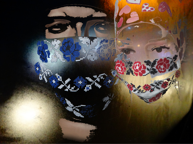
An interesting result. Which of the three suggested photos did you process this way?
The background image is a photo of the city at night, taken through the cloudy glass of a bus in motion, and the faces are two photos of two mannequins in the window of a store that sold medical masks during the pandemic. From these two photographs, I removed everything unnecessary and superimposed them on the background image.
It's all great... have you read the rules of this contest? :)
This stage of the competition has already been completed and now there is a vote to choose the winner.
You will be able to participate in the next stage.
And the task of this stage of the competition was to process the three proposed photos in "monochrome" mode.
Sorry, I was in a hurry and didn't see this, I thought it was about any photo editing, it won't happen again.
Everything is fine, don't worry :)
It's just that each contest has its own rules and deadlines.