Photo contest #3 by bambuka / Fotowettbewerb #3 von bambuka
Deutsch im Anschluß...
@bambuka has once again called for a competition. Under the keyword "photo post-processing", there have already been two rounds in which I was not involved. For reasons: I have no idea about it! Seriously - I can improve contrasts or change the brightness, maybe even shift a colour saturation. And that's about it. Ah yes, I'm also quite good at cropping ;-))
But in my opinion, this is about more professional methods to give photos that certain artistic something. Well...
https://steemit.com/hive-185836/@bambuka/photo-contest-post-processing-3
As in the first two rounds, originals from @bambuka's collection were presented for creative processing. This time with the option of choosing from three very different initial motifs. And that's where I come in. Unfortunately, I can't do that much with city impressions or architectural photos. I had tried it with the - I was just about to write: Leningrad (am I that old?) - St. Petersburg photo. But I couldn't get it... Later I found out that I just don't like cities and therefore I am totally blocked for their surely existing beauty. Today, however, there is a snapshot of a pretty elderly bridge in the green!
There I am. Still without a clue about it, but with the idea to make something completely different out of this snapshot. Two possibilities come to my mind...
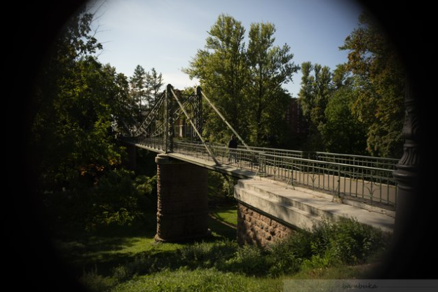
First, I'll take the original photo from the tender post:
Due to the already existing vignetting, I am spontaneously pushed in a certain direction: Let's see if the idea is any good!
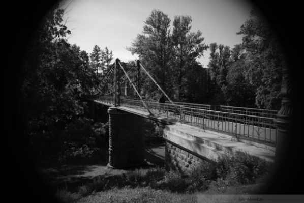
First, I translate the photo into greyscale. I use GIMP and get the following black and white image:
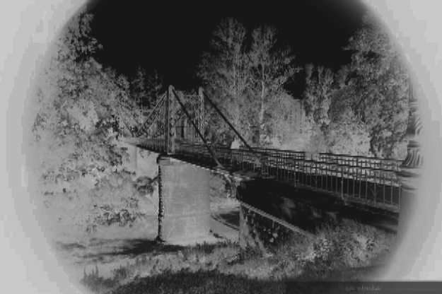
And now I imagine that all this had not happened in broad daylight, but had been taken at night with a night vision camera. In the field of wildlife observation I have already seen impressive shots of camera traps. To create this impression, the colours, in this case already the grey tones, have to be inverted. The result is not very impressive and not very recognisable. So here the things I can actually do are still required: Adjusting contrasts, brightness and sharpness. I am satisfied when it looks like this:
At the same time I realise that it's just a trivial gimmick - so I'll try something else!
With the greyscale photo, perhaps a little glossy look can be achieved? Some glamour for a postcard or travel guide? For that I need again some altered contrasts and some filters: a slight blur, especially vertically and a supernova effect.
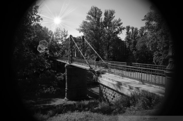
Voilà! I think I like it. You guys like it too?
Deutsche Version:
@bambuka hat einmal mehr zu einem Wettbewerb aufgerufen. Unter dem Stichwort "Foto-Nachbearbeitung" gab es bereits zwei Runden, an denen ich nicht beteiligt war. Aus Gründen: ich habe keine Ahnung davon! Ernsthaft - ich kann Kontraste verbessern oder die Helligkeit verändern, vielleicht auch 'mal eine Farbsättigung verschieben. Und das war's dann auch schon. Ah ja, im Ausschneiden bin ich auch ganz gut ;-))
Hier geht es aber m.E. um eher professionelle Methoden, Fotos das gewisse künstlerische Etwas zu verleihen. Nun...
https://steemit.com/hive-185836/@bambuka/photo-contest-post-processing-3
Wie in den ersten beiden Runden wurde Originale aus dem Fundus von @bambuka vor- und zur kreativen Bearbeitung frei gegeben. Dieses Mal mit der Auswahlmöglichkeit aus drei sehr unterschiedlichen Ausgangsmotiven. Und da komme ich ins Spiel. Mit Stadtimpressionen oder Architekturfotos kann ich leider nicht so arg viel anfangen. Ich hatte es versucht mit dem - ich wollte gerade schreiben: Leningrader (bin ich schon sooo alt?) - St. Petersburger Foto. Aber ich kam nicht heran... Später fand ich heraus, daß ich ja einfach Städte nicht mag und darum für ihre sicher vorhandene Schönheit total blockiert bin. Heute gibt es aber einen Schnappschuß von einer hübschen älteren Brücke im Grünen!
Da bin ich dabei. Immer noch, ohne eine Ahnung davon zu haben, aber mit der Idee, etwas ganz anderes aus dieser Momentaufnahme zu machen. Zwei Möglichkeiten schweben mir dabei vor...
Zunächst übernehme ich das Originalfoto aus dem Ausschreibungspost:
Durch die bereits vorhandene Vignettierung werde ich spontan in eine bestimmte Richtung gestoßen: Mal sehen, ob die Idee etwas taugt!
Als Erstes übersetze ich das Foto in Graustufen. Ich verwende GIMP und bekomme folgendes Schwarz-Weiß-Bild:
Und nun stelle ich mir vor, das wäre alles nicht am hellichten Tag passiert, sondern des nachts mit einer Nachtsichtkamera aufgenommen worden. Im Bereich der Wildbeobachtung sah ich schon beeindruckende Aufnahmen von Kamerafallen. Um diesen Eindruck zu erwecken, müssen die Farben, in dem Fall bereits die Grautöne, invertiert werden. Das Ergebnis ist wenig eindrucksvoll und nicht besonders gut erkennbar. Hier sind also noch die Dinge gefragt, die ich tatsächlich kann: Kontraste, Helligkeit und Schärfe anpassen. Ich bin zufrieden, als es so aussieht:
Gleichzeitig wird mir klar, daß es sich nur um eine belanglose Spielerei handelt - ich versuche also noch etwas anderes!
Mit dem Graustufen-Foto läßt sich vielleicht ein wenig Hochglanz-Optik erzielen? Etwas Glamour für Postkarte oder Reiseführer? Dafür brauche ich wiederum etwas veränderte Kontraste und einige Filter: eine leichte Weichzeichnung, vor allem vertikal und einen Supernova-Effekt.
Voilà! Gefällt mir. Euch auch?
20% of the proceeds go to @wox-helpfund ;-)) / 20% der Erträge gehen an @wox-helpfund ;-))
Fotolack-Effekt... interessanterweise ist mir diese Idee nicht in den Sinn gekommen, ich muss es versuchen :)
Die starke Vignettierung des Originals resultierte aus der Verwendung eines Crop-Objektivs auf einem Vollformatsensor.
Du hast die Sonne hinzugefügt, es ist interessant, aber... die Schatten der echten Sonne sind andere, sie befindet sich links im Rahmen :)
Aber die Lösung ist originell.
Vielen Dank für Ihr Engagement, @weisser-rabe
Эффект фото-ловушки... интересно, мне не приходила в голову эта идея, надо попробовать :)
Сильное виньетирование оригинала получилось от использования кроп-объектива на полнокадровой матрице.
Ты добавил солнце, это интересно, но... тени от настоящего солнца другие, оно находится слева в кадре :)
Но решение оригинальное.
Благодарю за участие, @weisser-rabe
The camera trap effect... interestingly, this idea did not occur to me, I should try it :)
A strong vignetting of the original came from using a crop lens on a full-frame matrix.
You added the sun, it's interesting, but... the shadows from the real sun are different, it is on the left in the frame :)
But the solution is original.
Thank you for participating, @weisser-rabe
We support quality posts anywhere and any tags.
Curated by : @petface
Nice to see you ;-))