# WoX photo challenge .:. Post processing #3
Today I participate in 'Post processing' challenge again. (If you are fond of the subject, and wanna jump on this, check more details and rules for the contest here). Your task will be to process one proposed photo and tell: what you did, how and why. I invite everyone who is interested in this topic to join, you can practice and study the attempts / approaches of other participants to learn new techniques, tools and approaches.
NB: all the photos this post is based on, were taken by @bambuka (obviously).
Сегодня я снова участвую в конкурсе на тему пост-обработки фото, который ведет в сообществе World of Xpilar мой друг @bambuka. Вашей задачей будет обработать одно предложенное фото и рассказать: что вы сделали, как и зачем. Приглашаю присоединиться всех, кому интересна эта тема, вы сможете поупражняться и изучая попытки / подходы других участников научиться новым техникам, инструментам и подходам. Использованные в посте фото сделаны @bambuka.
index to the post

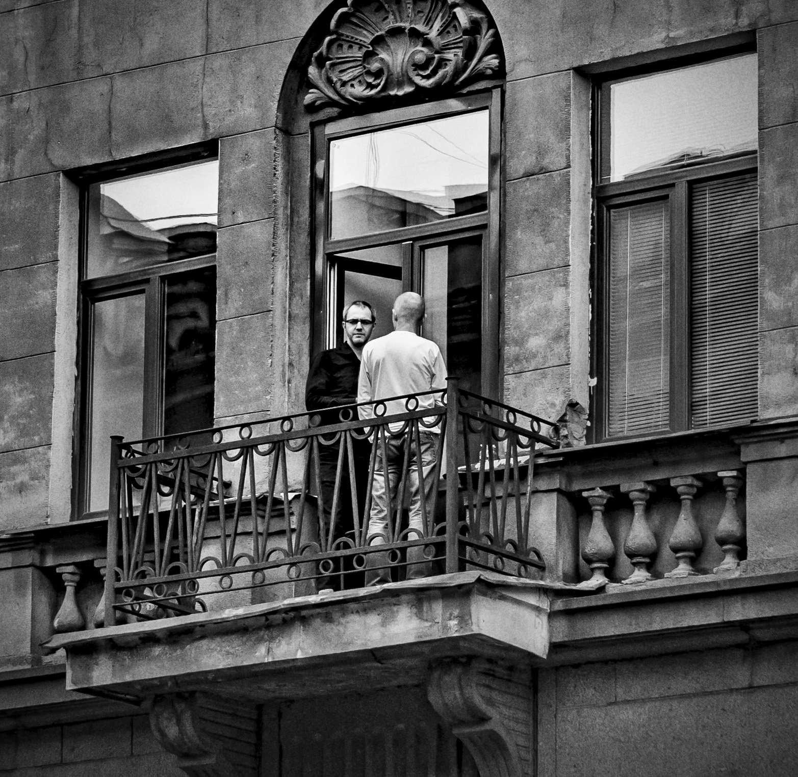
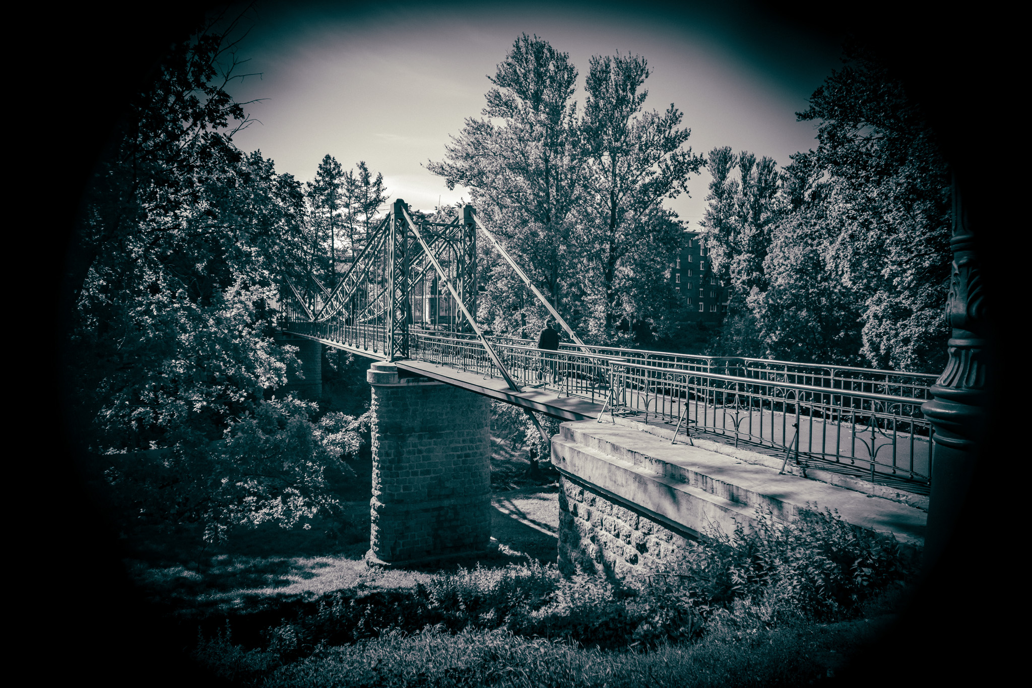
Below is the original jpeg file that was suggested to work with. Actually, @bambuka suggested three images to choose from: a landscape (photo with terrific vignetting, which I immediately discarded as plain & uninteresting); an underexposed #streetphoto of shady people on a balcony - which caught my attention; but I chose the third one: an (overexposed) historical architectural photo of a Christian church - it promised to be challenging and interesting job to do.
The task was to process the image to monochrome (using any instruments you like).
The source files were provided as .jpegs, which determined my strategy and of course made the work more difficult and the path more long and full of tricks.
Here's how the image would look like if we applied a non-intelligent, "direct" color-to-gray conversion: it is non-contrast and sluggish, doesn't look cool at all. We have to look for a less straight solution, that will benefit more to the image.
All in all, I made two attempts. Lets start from the 1st one.
✪ ✪ ✪
Take 1: intricate playing with .jpg in Photoshop
I will create two copies of the original image, and convert each to black and white with different settings, to get a lighter and a darker versions I will keep them as layers in my file, named accordingly.
⯮ 🅢🅣🅔🅟 ➊
I make a copy of the background layer, increase the density of midtones,
Apply photofilter with 'Warming 85' setting:
Next, I apply "Black & White" filter with 'High Contrast Red' setting:
Mark this layer as 'Lighter' copy.
⯮ 🅢🅣🅔🅟 ➋
Now make a copy of original image, convert it with "Black & White" filter using 'Maximum Black' setting, mark the layer as 'Darker' copy.
Now the file contains 4 layers: original; its plain desaturated copy (for comparison purposes); darker and lighter copies - for further editing.
I uploaded the .psd file (60Mb), so that you can download it and try further steps yourself.
⯮ 🅢🅣🅔🅟 ➌
Next step I mix those "half-stuff" B-W layers.
I move the lighter one up and choose 'Pin Light' setting for this layer.
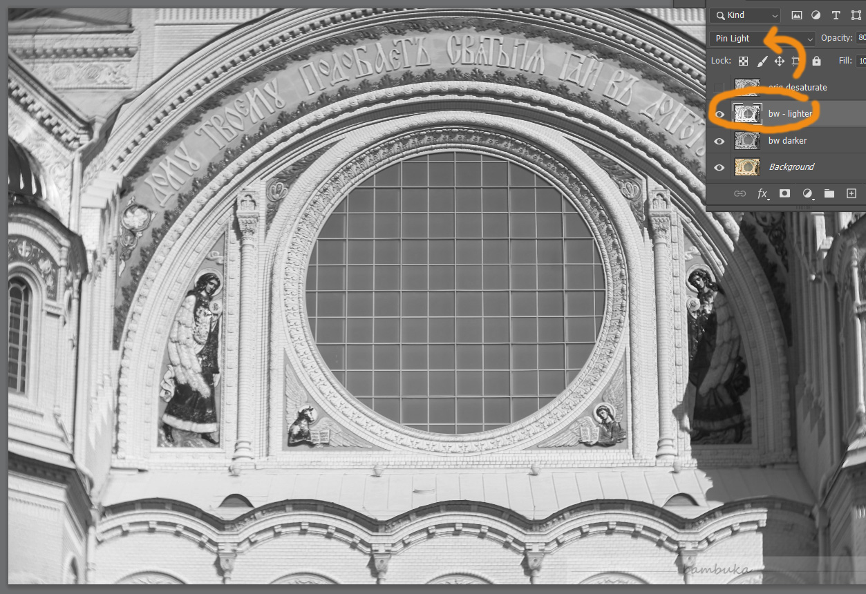
NB. What is important: this mix has far more rich detalization, texture and nuances are much more visible in the 'lights' area of the image -- comparing to the 'reference' desaturated straight-forward grey layer (see the pic below).
On this stage you also can affect the severity of the current effect we use, adjust the 'degree' of its influence, using the typical Photoshop mechanism. Lets loosen the 'lighter' layer ... its 'Opacity' (default 100%) can be changed to 75%, 50%.... adjust it until your eyes tell you the optimal result has been reached.
⯮ 🅢🅣🅔🅟 ➍
Now basically the result is reached, but more manual tweaking is still possible, if you have more time on your hands and still not 100% satisfied with the result.
NB: At the same time, you should remember that 'the best is an enemy of all good', as they say... an extra perfectionism may cost you... a lot.
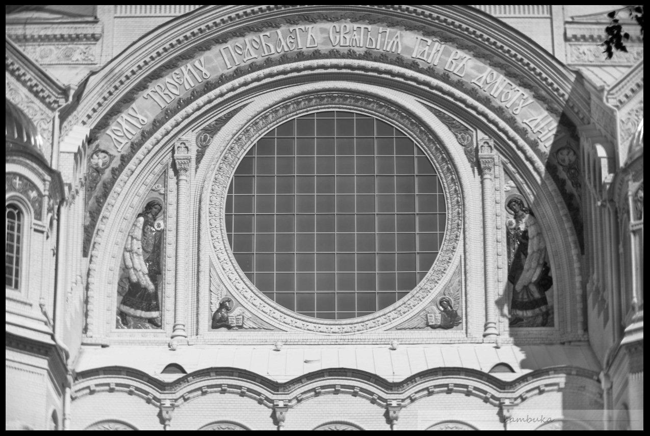
Look at the shady parts of the image (this wall was shoot under a pretty contrast sunlight, and the shades do not benefit to the image too much). We can try to fix it (to some extensions). It is important that I did not merge these two layers together, and still can apply edits separately.
I set up 'Feather' parameter to 15-20, and made selection of said shady low-contrast area, that has less details visible. Then I used 'Dodge' tool on the darker layer, to make the mid-tones lighter. Making selection with smooth, not hard-cut edges, and using a soft brush with low pressure are the keys to success of this operation.
Result after Dodging (click for the hi-res version).
⯮ 🅢🅣🅔🅟 ➎
If you consider the overall contrast is still not good enough, there is a simple two-click way to raise it dramatically, with quite spectacular results, but I dont recommend using it for this certain image.
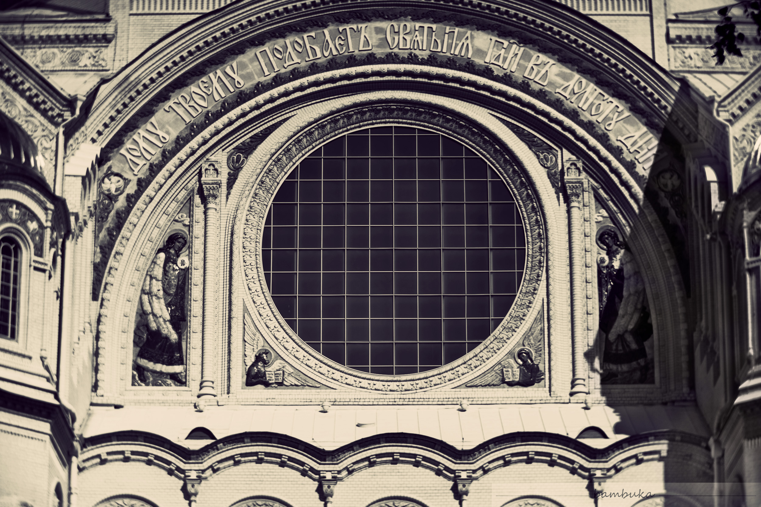
Now merge both layers. Make one more copy of this layer, and change the mixing mode from 'Normal' to 'Overlay'.
The result is intelligent and powerful growth of the image contrast and, more important, it will gain more relief and visual depth. If the picture has rather "flat" and inexpressive look, such a simple operation will benefit it greatly.
There is a sufficient 'contra', tho: this operation will inevitably kill all the delicate details in the 'lights' area, making the image over-exposed.
So, beware.... and thats why I will not be doing it in this job.
⯮ 🅢🅣🅔🅟 ➏
One more facultative step that you may or may not gonna venture into... and more manual tweaking, for exactly same reason: the image has dark areas with less visible details, that can be improved (and, frankly speaking, they should be...)
Again, we make a selection (with smooth, unsharp, not cut pixel-to-pixel borders).
...then we use 'Curves' (Images > Adjust > Curves) Photoshop service to make selected area lighter. (Depending on a certain image, curve's shape may be different).
Important: we apply the curve to the bottom layer, lying under the overlay layer. After this, merge both layers.
⯮ 🅢🅣🅔🅟 ➐
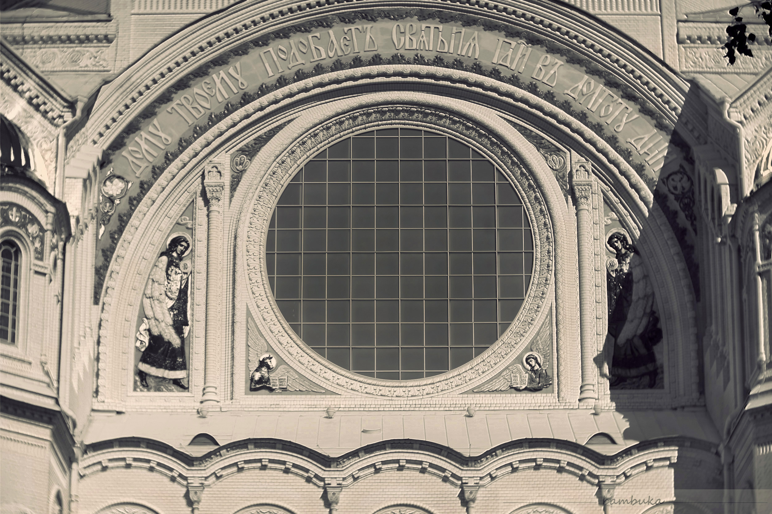
A very unnecessary and facultative step, which totally depends on your artistic vision and decisions, maybe depends on the certain tasks that you may have within a bigger project: tinting!
We can provide to the greyscale image some gentle color grading, tinting that may benefit to its look. That is super easy, a lot of image processors can help you with that, there is simply a load of ways to do that, no need to focus on this step in details, how exactly I did it.
Ok, since I have my file opened in Photoshop, I used its photo filter with 'Warming (85)' preset. That is the simplest and fastest option.
It finally happened!!!! Here is the final image that I am happy with, that I gonna apply for @bambuka's contest. I really proud with all the details, and the stuff. I guess I nailed it! What do you think?
NB: below is the alternative version with 'Overlay' step implemented, you may compare them both and make your own conclusion why I do not consider this version to be the best.
There are many grades of perfection, but remember the best is the worst evil of the good.
Take 2: no need to tinker your dated jpegs anymore
After the job was done, @bambuka updated this quest with .raw files! Using them as source would make a totally, completely different story and definitely worth adding 'Take 2' to my post. But probably I will keep it for the next round, haha! Best wishes, and Steem on.
✪ ✪ ✪
upd.
Conversation with @rut-ru told me I did not read the quest conditions carefully, and according to the guides I should edit all three images given. So, I add to the post two more b-w edits. These were done in Photoshop with Camera Raw filter, using the .raw files.
I did not downscale it, just made a square crop. Also I added vignetting and some grainy noise, to give more 'analogue' feeling to the final image.
I decided to leave the image as is, do not crop all the darkened areas where the lens itself already have cropped the image :P More to it, I made the vignetting even heavier and more uniform, well-spread. That lead me to the basic idea of how the image should look. The result you see in the picture above: it is adorable vintage style. Of course, not only the Sepia tints give us the taste of vintage.
@bambuka -- you will not believe, but I DONT SEE your comment either.
касательно конкурса: все равно что в бензиновый двигатель залили высококлассное ракетное топливо: вроде и круто, а не получается ехать... всмысле, выхлоп нулевой. если ты мне позволишь такую аналогию. такшта... овчинка выделки не стоит (на моем конце, я имею в виду). времени угрохана прорва -- как всегда в случае с редактированием трудных картинок. тут же не прямо из пункта А в пункт Б, тут пробуешь разные варианты, как проехать. - а результат ... ыыыыы. нерентабельно в общем.
и тебе вот опять непонравилось. в прошлый раз - теней маловато и объема нету, а теперь вот белый слабоват и не такой как надо. да ну.
Haha, hooray, something fell off yesterday, and today it was fixed :)
I even have a post that disappeared yesterday and a comment here, thank the vocalists.
Exhaust cannot be zero by definition. Excellent results. But you're not waiting for a cuckoo and a rooster dialogue :) I think real feedback is more valuable. Personally, I may not have enough white, it may seem too much to someone. Everyone has their own opinion and one of the tasks of this event is to collect different opinions.
So, you're getting upset for nothing :)
хххххххххххххххххххххххххххххххххххххх
Ха-ха, ура, что-то вчера отвалилось, а сегодня починили :)
У меня даже пост появился, который вчера пропал и коммент здесь, слава вокерам.
Выхлоп не может быть нулевым по определению. Отличные результаты. Но ты ведь не ждешь диалога кукушки и петуха :) Более ценной я считаю реальную обратную связь. Лично мне белых может и не хватило, кому-то может показаться и многовато. У всех своё мнение и одна из задач этого мероприятия - собирать разные мнения.
Так что, ты зря расстраиваешься :)
Great tutorial @qwerrie...photoshop is a powerful tool.
Yeah. Decade ago or more I could say that I know it (well, more or less...) but not now, no way! just some bits here and there, haha 😉 Glad you enjoyed it. It really can be useful in some certain (very harsh) situations, when the image is ruined or you dont access splendid .raw file format sources...
And TNKS a lot for the compliment! I appreciate it a lot, especially from a power-user like you are.
Хороший выбор, грамотная постановка задачи, отличный результат! Здорово! Самое главное, заинтриговали предложенным алгоритмом и задачей.
а вы пользователь Фотошопа?
Нет. О слоях имею представление, они были в Фотопэинте, который у меня когда-то был, и есть в GIMP. Но особой потребности в слоях у меня пока не возникало.
Да, безусловно всё зависит от потребностей. У меня есть потребности в реставрации изображений, но это по работе. А так, телефоны сейчас уже научились так хорошо снимать, и главное обрабатывать по паре кликов, что перекрывают большинство потребностей. Тут без вопросов.
Есть такое. Фотоаппараты кропнули, а смартфоны улучшили.
Congratulations, your post has been upvoted by @dsc-r2cornell, which is the curating account for @R2cornell's Discord Community.
Your post is manually rewarded by the
World of Xpilar Community Curation Trail
STEEM AUTO OPERATED AND MAINTAINED BY XPILAR TEAM
https://steemit.com/~witnesses vote xpilar.witness
⯮ 🅢🅣🅔🅟 ➌
⯮ 🅢🅣🅔🅟 ➍
⯮ 🅢🅣🅔🅟 ➎
⯮ 🅢🅣🅔🅟 ➏
⯮ 🅢🅣🅔🅟 ➐