Online store on Steemit blockchain| Step five | HTML + CSS + JS + Bootstrap 5
Hello, friends!

Let's talk about design today. And I'll show you what I added. I'll show you the design right away. So that below it was already possible to speak in detail.

Let's start by connecting css and js. There are two options. These are files that are stored on your hosting and edited only by you. And the second option is connecting via cdn, which in my opinion is less secure. Since you do not have access to this file, but the developers of this file do and they can make changes without your asking.
What css connection styles have been added?
Bootstrap5 has been completely added and styles that are not included in Bootstrap5 in separate files. Which will most likely be merged into one file in the future.
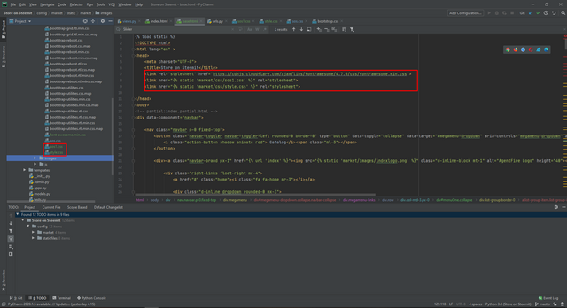
Separate styles will be responsible for the left panel and the top one. And Bootstrap5 for content generation. Since it has convenient solutions in terms of optimization for different devices.
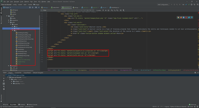
Also at the very bottom we can see js file connections.
Let's take a look at the structure of the top menu.
It includes:
Logo
Catalog
There will be more search
User panel
By clicking on the logo, we will go to the start page of the catalog.
But if you click on the catalog button there, we are waiting for the main menu with a submenu.
Main menu:
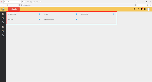
Submenu:
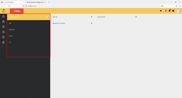
Now the menu is filled in manually and this is not correct. Everything should be filled in automatically as you add menus and content. And we'll do that in the next lesson. And for us, the menu items will already be added by the Django library.
Let's take a look at the catalog button code.
It is written in html and css.
html
<button class="navbar-toggler navbar-toggler-left rounded-0 border-0" type="button" data-toggle="collapse" data-target="#megamenu-dropdown" aria-controls="megamenu-dropdown" aria-expanded="false" aria-label="Toggle navigation">
    <i class="action-button shadow animate red"> Catalog</i>
</button>
css
body
{
   padding: 0px;
}

.animate
{
   transition: all 0.1s;
   -webkit-transition: all 0.1s;
}

.action-button
{
   position: relative;
   padding: 1px 40px;
  margin: 0px 10px 10px 0px;
  float: left;
   border-radius: 10px;
   font-family: 'Pacifico', cursive;
   font-size: 20px;
   color: #FFF;
   text-decoration: none;
}

.blue
{
   background-color: #3498DB;
   border-bottom: 5px solid #2980B9;
   text-shadow: 0px -2px #2980B9;
}

.red
{
   background-color: #E74C3C;
   border-bottom: 5px solid #BD3E31;
   text-shadow: 0px -2px #BD3E31;
}

.green
{
   background-color: #82BF56;
   border-bottom: 5px solid #669644;
   text-shadow: 0px -2px #669644;
}

.yellow
{
   background-color: #F2CF66;
   border-bottom: 5px solid #D1B358;
   text-shadow: 0px -2px #D1B358;
}

.action-button:active
{
   transform: translate(0px,5px);
  -webkit-transform: translate(0px,5px);
   border-bottom: 1px solid;
}

/* Remove unde
a:hover {
  text-decoration: none;
}
/* Remove Bootstrap button outline */
button .focus, a .focus {
  outline: 0;
  -webkit-box-shadow: none !important;
  box-shadow: none !important;
}
button:focus, a:focus {
  outline: 0;
  -webkit-box-shadow: none !important;
  box-shadow: none !important;
As you can see there are 4 colors. You can also create your own button color and add it simply to the styles or use the available options.
I will not post the code for the main menu of the catalog, since it is quite large and you can easily find it in my repository. Let me just say that I am very pleased with the result.
Let's take a look at the side menu now. Which will serve us in the future for some quick solutions. It also has a main menu and a submenu.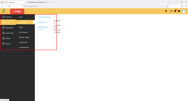
You can also find the code for this menu in my repository.
Search has not yet been added visually and is also not represented in Django, but in the next releases we will definitely make it and launch it.
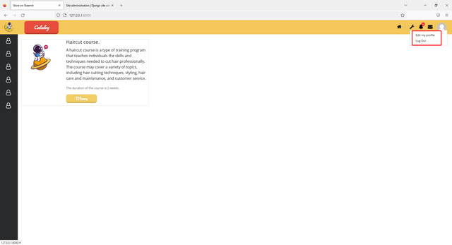
Now let's look at the user panel and if we click on the profile picture, then there will be two items that we will change and I think there will be more items.
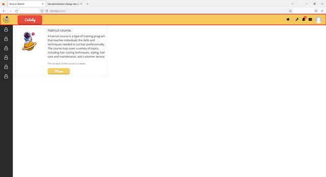
And now we smoothly move on to our content block. Which will be done in grid style.
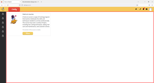
So far, we have one post that was created by hand and was not generated in the Django library and is not in the database. But we will fix that soon.
What do we have a content card?
Title
Picture
Short description
Course time
And more button
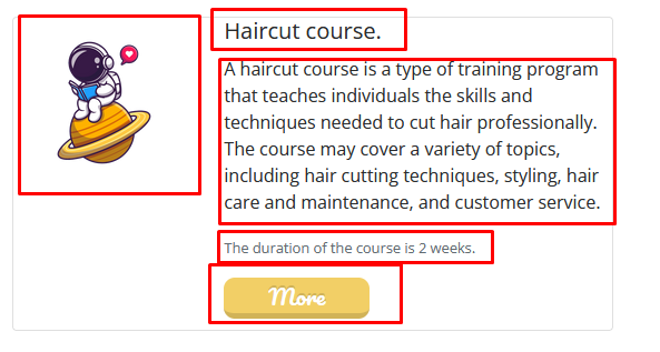
The details button will take the user to a separate product page where he can get acquainted with all the course information.
What do you think of the design? How do you color?
@rme , @rex-sumon , @shy-fox , @hungry-griffin, @pennsif
The project is being created in partnership with @steemit-market.
Above may be wrong. Since I wrote the code from memory and then corrected it. But git will have no errors.
Link to the git.
You can get acquainted with the project here.
This is the first part: Step one
This is the second part: Step two
This is the third part: Step three
This is the third part: Step four
To be continued...
Sincerely, your @HardPhotographer
Upvoted! Thank you for supporting witness @jswit.
This post has been featured in the latest edition of Steem News...
What do you think of the design?
this is an amazing design concept
Thanks a lot! I'm very pleased. Let's see how others like the design.