Graphic Design made Simple #lesson 14 - Hands-on Practical session.
 |
|---|
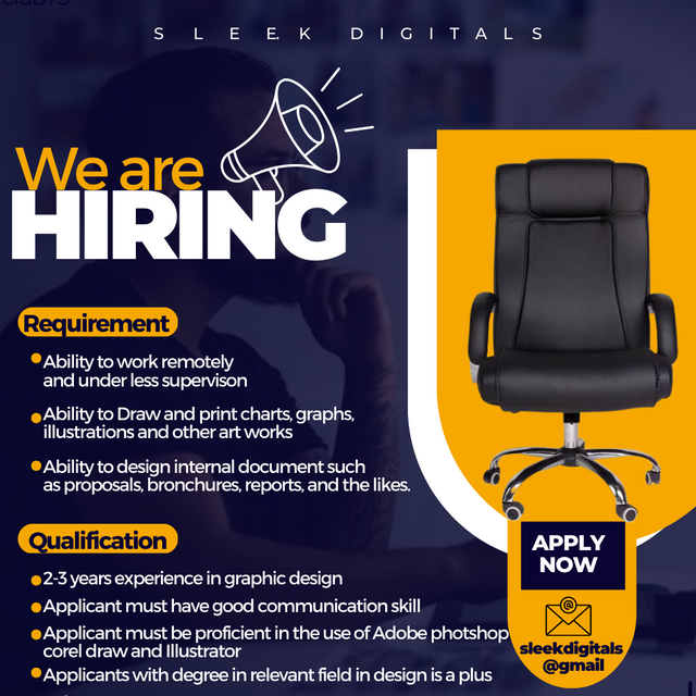
Wai wai wai wait! Just before you start thinking about applying, What you see there is just a design and nothing more...lols. Sleek digitals is not looking for graphic design. What I did up there is just for fun and for learning. Welcome to my blog once again guys. Of course I believe you're viewing this not just because it caught your attention but because you want to learn.
I was just scrolling through the internet few days ago and then saw something something of this nature by an organization who wanted to hire and I was like....can't I just do something like this for this week's lesson? I feel designs like this can be used by businesses or organization to fill vacant positions in their firms.
Well I've never done something like this before and am sure many of us here haven't as well but I decided to attempt and boom! It gave me the result you see up there. As usual, .not gonna leave you in the dark as to how I made the design, am gonna be showing you in this post. So grab a cup of something and journey with me...
As usual, we would be building form scratch, choose your template and then wipe it clean before getting into the design.
- Step 1
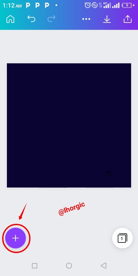
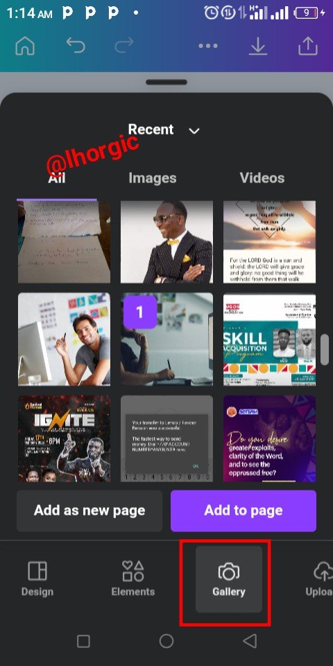
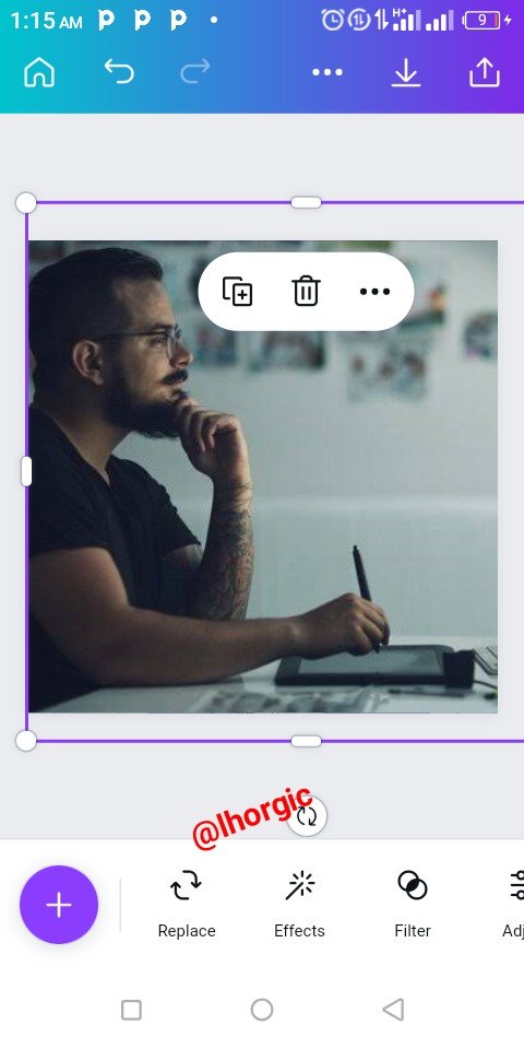
I decided to make my default background blue this time. You can always change the colour to whatever. I clicked on the "+" button as usual to bring in an image I want for my background effect and when it came in I resized just as seen in the images below.
Note: You resize by dragging the tip of your element.
 |  |  |
|---|
- Step 2
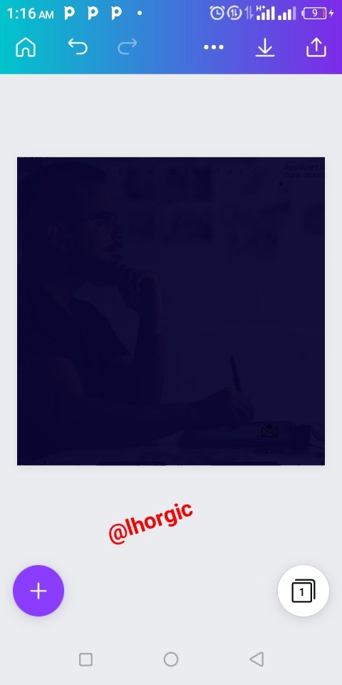
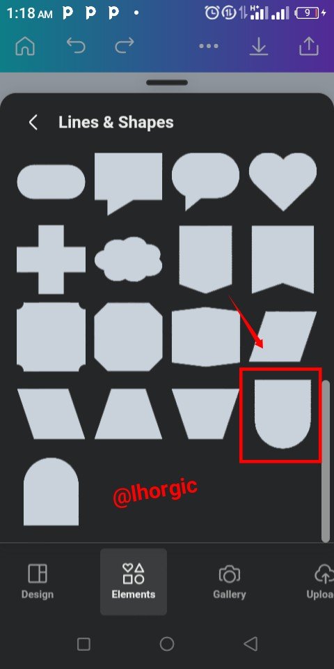
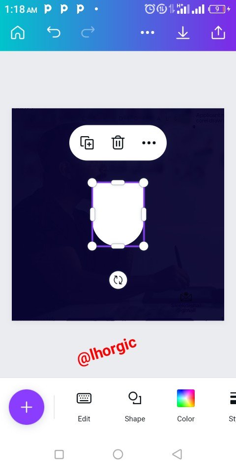
I used the transparency tool to make image faint into the background. Be flexible with yours, I reduce mine to 6%, I believe by now you should be able to use that tool. It's is the reason I didn't capture it to reduce the number of screenshots. Afterwards I brought in the shape you see in the screenshots below using the "+" icon .
 |  |  |
|---|
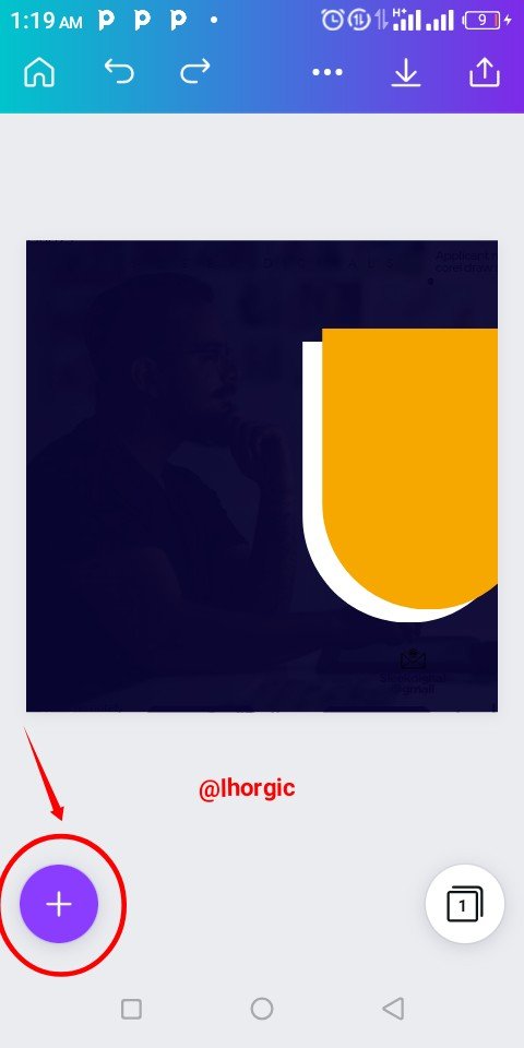
- Step 3
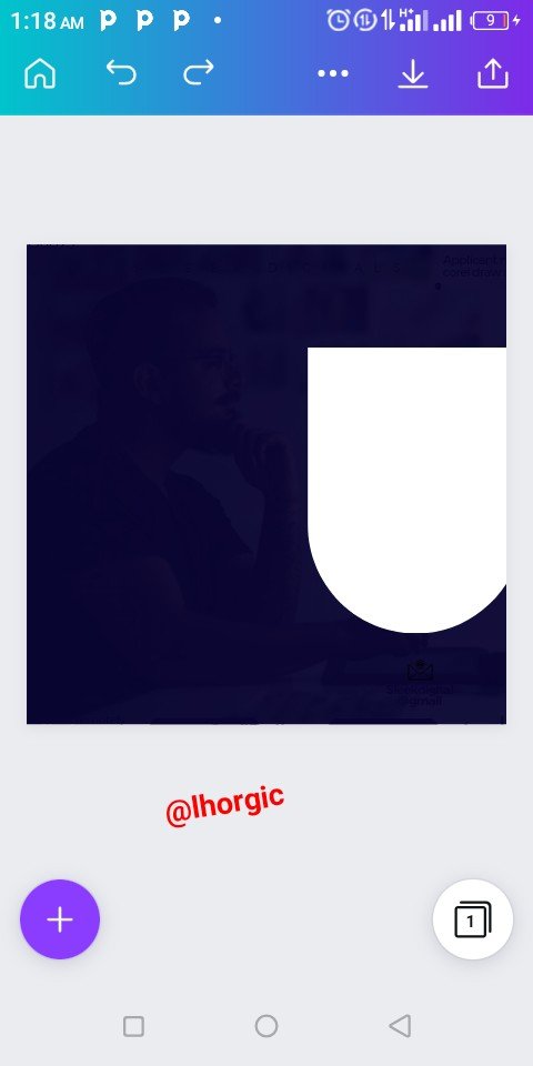
I resized the image after it appeared, I also duplicated it and change one of the colours before positioning it just as seen in the image below.
 |  |  |
|---|
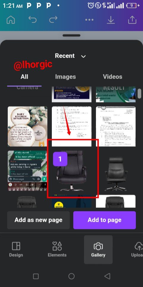
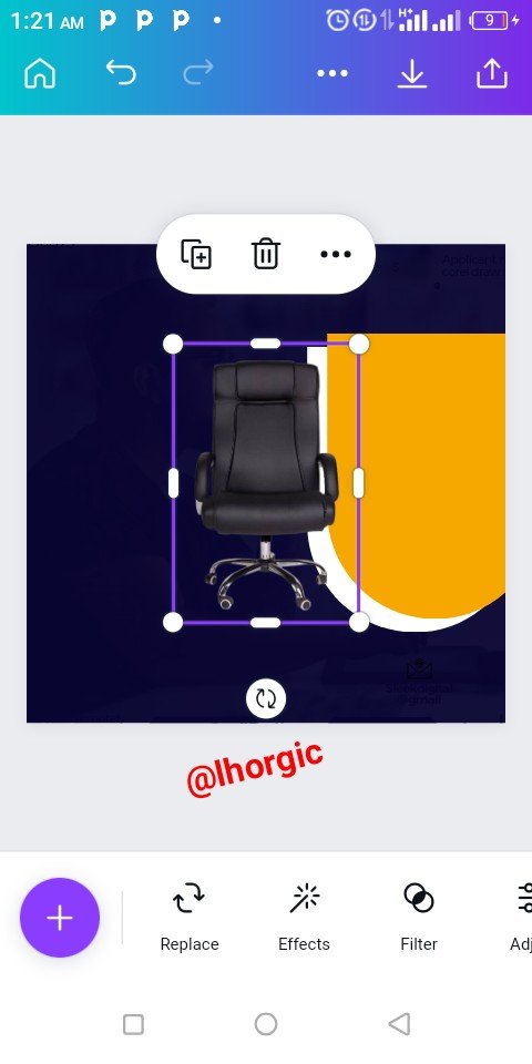
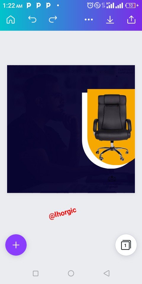
- Step 4
Here, I brought in my "Executive Chair" image (using the "+") which I already saved in my gallery. I then resized and positioned it just as seen in the screenshot below.
Note: Use remove.bg site to remove background from images.
 |  |  |
|---|
- Step 5
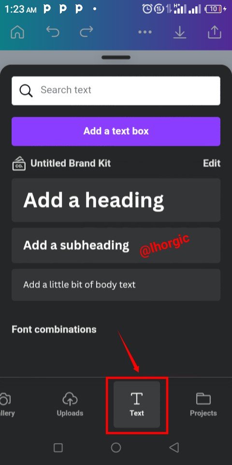
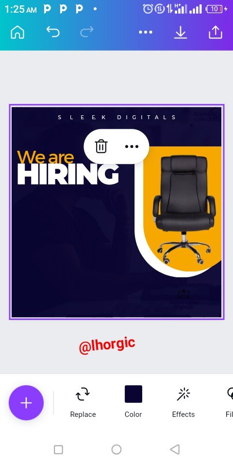
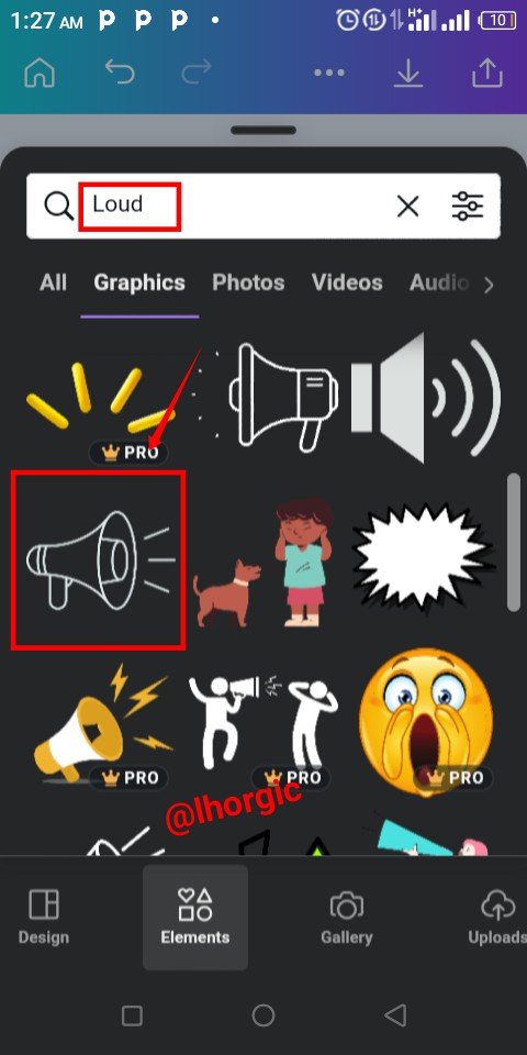
I brought in my text via text tool, the font used is Montserrat (classic and semi bold). I needed a publicity icon, so I used the key word "loud" to search on canva. I got something that will work well just as seenjust as seen below and then selected.
 |  |  |
|---|
- Step 6
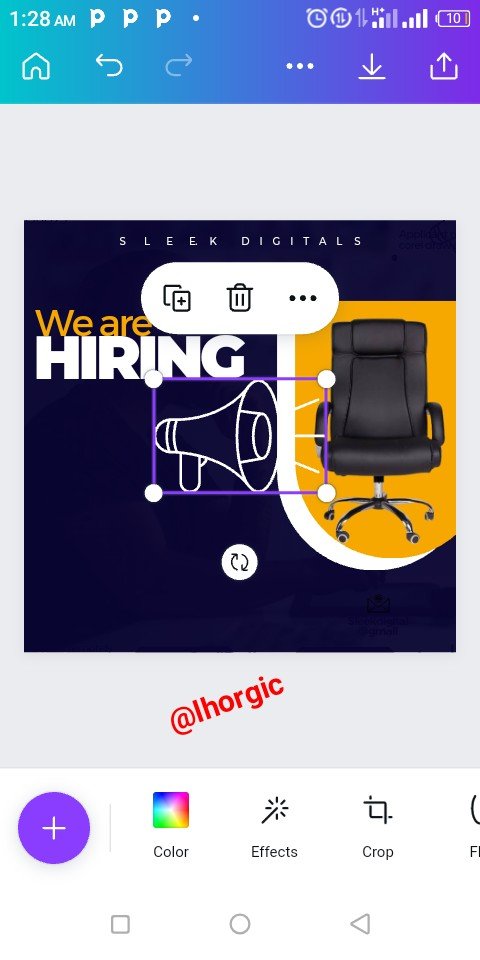
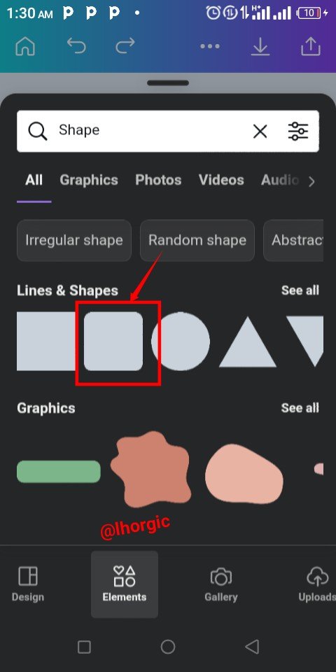
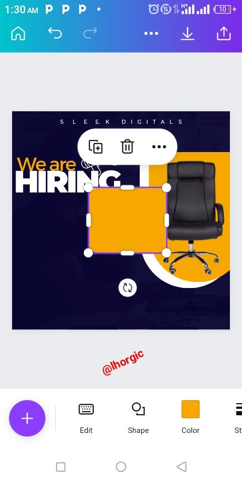
I resized my publicity image and then brought in a curved shape rectangle, which I resized by reducing in the next step.
 |  |  |
|---|
- Step 7
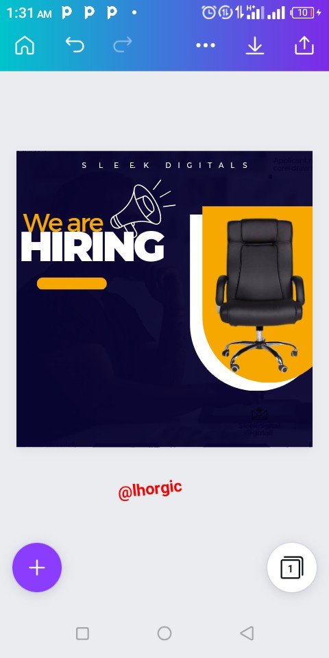
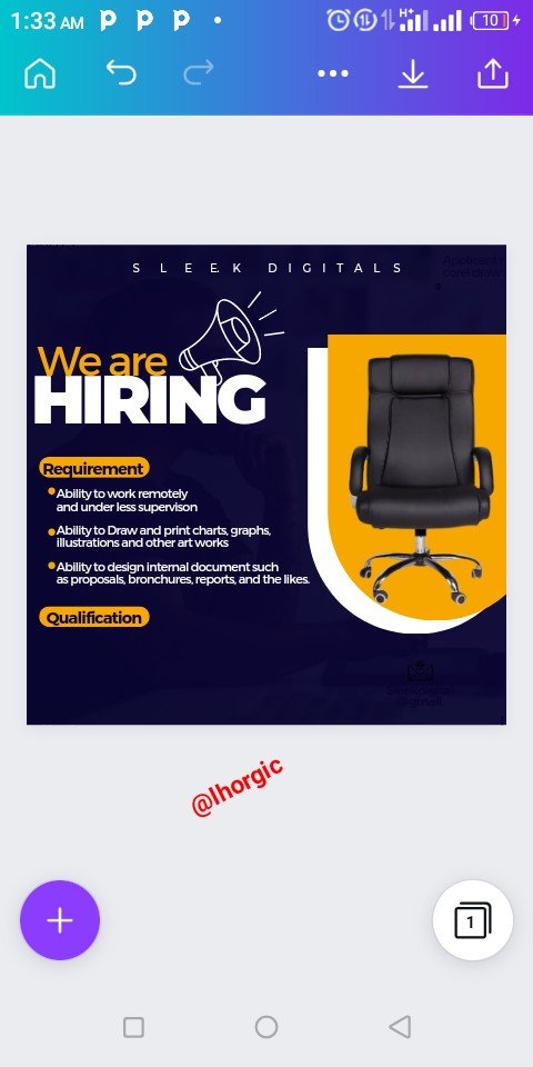
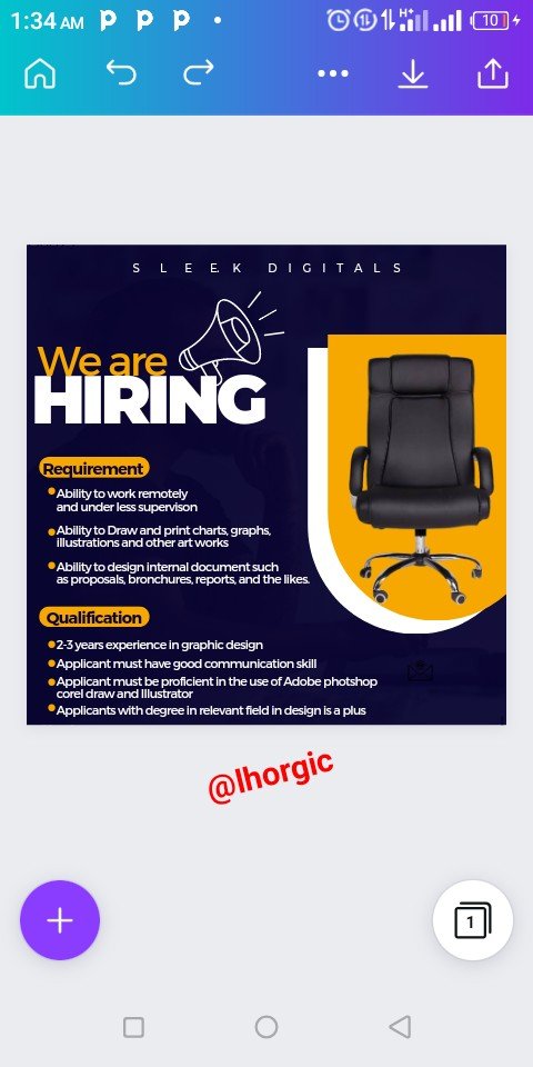
After reducing the shape to my desire, I started putting in relevant information and positioning them simultaneously. I repeated this as you can see in the screenshots below.
 |  |  |
|---|
- Step 8
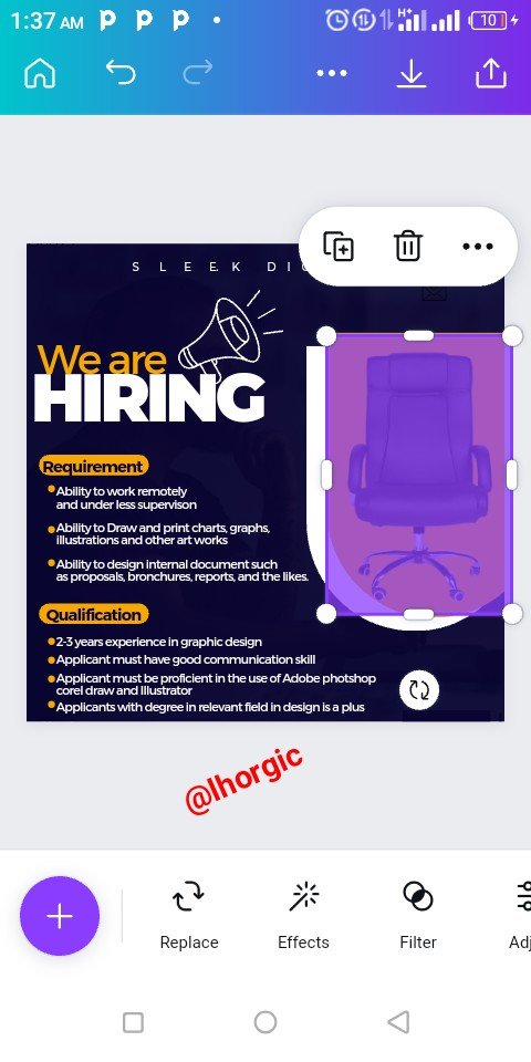
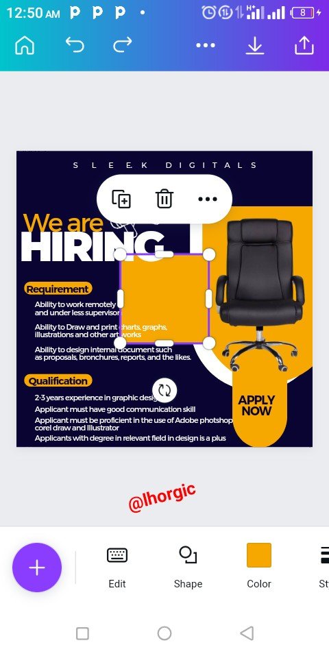
Here, I duplicated the highlighted shape because it's needed along side a rectangular shape. The rectangular shape is used to accomodate our "Apply now" which the duplicated shape is resized to house bother the rectangular shape and the text Just as seen.
Do well to also take not of the colours used for the elements.
 |  |  |
|---|
- Step 9:
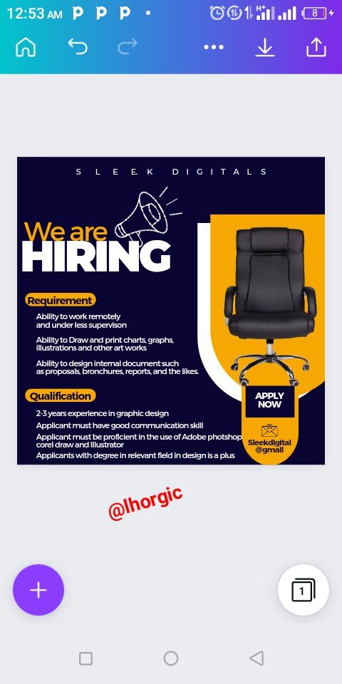
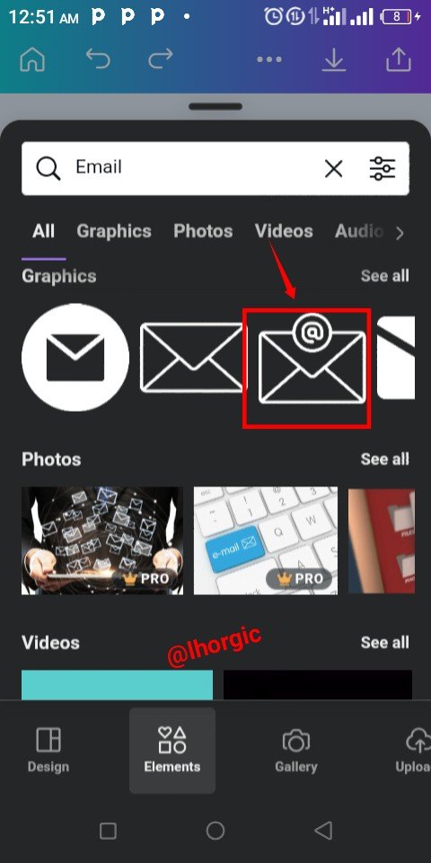
Since It a call for applicants, they would need to submit an application, so I decided to use an email which then warranted me to search for an email icon under elements using our usual "+" . From my search you can see the one I selected coupled with the email address where the application should be submitted.
 |  |  |
|---|
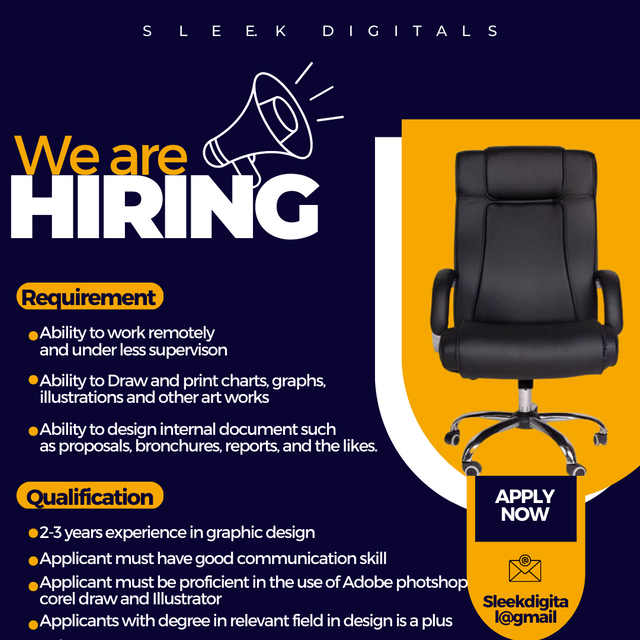
Here is our final design for this lesson. I have two here. The difference is that the background image of the designs are more obvious than the other. This is due to the transparency percentage used.
 |
|---|
 |
|---|
This is where I will be wrapping up our lesson for today. I really appreciate you for coming this far with me. I trust you got value from this lesson. Feel free to share your thought on today's lesson. If there is anything you would love me to add to improve the lesson, be free to share in the comment section.
If you missed the previous posts on this beginners class, kindly check them out here.
G101 introduction post.Lesson 1.Lesson 2.Lesson 3.Lesson 4.Lesson 5.Lesson 6.Lesson 7.Lesson 8.Lesson 9.Lesson 10.Lesson 11.Lesson 12.Lesson 13
Graphic Instructor
@lhorgic♥️
Cc: @ubongudofot.
How did I miss this really? Thanks for the compliment my dear friend. This is quite encouraging.