Graphic Design made Simple (G101) #lesson 7
 |
|---|
Hello friends, trust you're good. Welcome once again to our beginner's Graphic Design class. I must say am super glad, I've been seeing the impact of this class, some of the people following these lectures have been utilizing some of the tips I share here. Some of these people even tag me in their post.
This alone makes me feel am not wasting time...lols. Of course I would still go ahead with the lectures even if I don't get these things because I know it's adding to the platform in one way or the other. So thanks for the support guys.
That's being said, we will be doing pure theory today. Today's subject is kinda broad. I can't capture all in this post. I hope to tidy it up next week. We will be looking at "Colour in Graphic Design". Enjoy friends!
- Introduction
- Colour Theory
- Colour Classification
- Colour Schemes and combination
Colour is an important aspect of design. It speaks expressly and can determine if your design will be given a second look or not. Have you ever looked upon a design that was a total eye sore? Well one of the obvious problem with that design is the colour choice, some colours are actually combined dangerously... lolz
Colours help you draw the needed attention for your design or repel your viewers even before the content of your design is checked at all. Colours like yellow are attention getters. I don't know if you've observed my theme colours for this lesson. Yellow/orange couple with a navy blue as background colour. It comes out super cool.
It's amazing how colours can can influence emotion and perception. It also Influences mood. Come to think of it, why are certain kind of bulb used in brothels and club houses and other types used in places of worship... Now you get my point...smiles.
 |
|---|
Colour theory can be defined as the art and science of manipulating colours. You need to understand the concept of colour and how it works to be able to get the best when working on a design. Colour theory helps us understand how human interact with colours, especially your viewers.
It also helps us understand how to combine or mix colours in such a way that it comes out appealing and embraced when viewed. It is also important to mention that colours communicates. They pass clear message and signifies certain things.
Colour theory also capture in it scope how colours can be produce/reproduce, tone, hue(d) and tinted. We will touch on these things even as we proceed with this lesson.
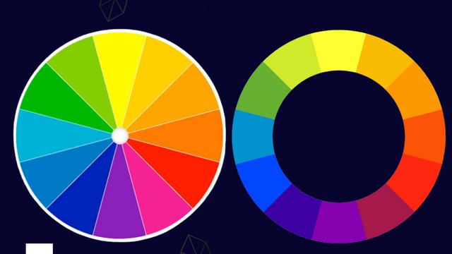
There are three basic classification of colours this can also be seen in the colour wheel. Just before you ask me what a colour wheel is, let me save you the energy..lol
 |
|---|
Just as the name implies,a colour wheel is a wheel-like object containing all kinds for colour which helps us make good choice when it comes to picking colours for a design project. There is a way and manner of making selection on that wheel. We will be discussing that later in subsequent section.
Back to our classification, we have 3 basic classification of colours, namely;
 |
|---|
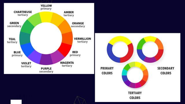
- Primary colours.
Primary colours are those fundamental colours we already know, they are just three (3) in number, they are, Red, Yellow ,Blue
- Secondary Colour.
These are colour that were produced as a result of mixing two or more primary colours together. They are also three in number, they are; Green, Orange , Purple
- Tertiary colour.
Just as the name implies, you can call them advance colour, they were gotten or produced by mixing primary and secondary colours. Example of such colours include; blue-green, red-violet etc.
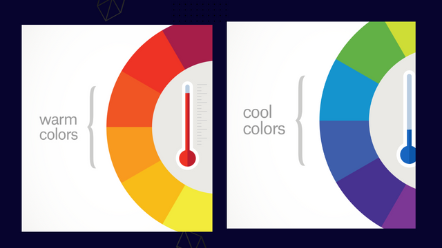
In this section we will be looking at the classification of colour from the stand point of how it is perceived or seen. Some colours are dull, warm, cool etc. I will help with the grouping.
I would also like to add to these colours what they represent or stand for. You remember I mentioned earlier that colours signifies and communicate certain things. So let's go.
- Cool colours.
| Blue | Green | Purple |
|---|---|---|
| Authority | Growth | Luxury |
| Prosperity | Nature | Royalty |
| Reliable | Fertility | Honour |
| Strength | beginnings | Creative |
| Sadness | Envy | Spiritual |
 |
|---|
- Warm Colours
| Red | Yellow | Orange |
|---|---|---|
| excitement | Cheerful | Enthusiasm |
| Fiery | Attractive | seasonal |
| Love | Caution | Energetic |
| Danger | Hopeful | Change |
| War | Cowardly | Affordability |
 |
|---|
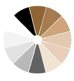
- Neutral Colours.
| White | Black | Gray | Brown/beige |
|---|---|---|---|
| Innocence | Elegance | Formal | Friedly |
| Purity | Mystery | Professional | family |
| Cleanliness | Magic | sophisticated | Comfort |
| Sterile | Evil | Depressed | Dull |
| Cold | Death | Moody | Dirty |
In this section we will be discussing the relationship colours have with each other and how they can be combined to come out beautiful. In my opinion, this is where many miss it. They create designs with conflicting colours.
You can actually get your colour right by using the various formulas for selecting colours on the colour wheel. Another way of getting it right with colour is by observation and exposure. Always check out what other pro designers are doing. This will help inform your colour choice. Let's get into this...
- Analogous colors
 |
|---|
These are colours, usually three,positioned next to each other on the colour wheel. The main colour is usually in the middle. A very good example is the red, orange and yellow. You have to be skillful in using these colour formation. One of the colours will definately dominate, taking the lead, one will support the leading colour while the other will accent.
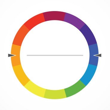
- Complementary colors
 |
|---|
These are colours that are opposites on the color wheel. Colure red and green, orange and blue facing each other are very good example. The reason why you would consider such colours which are directly opposite each other is because there is a sharp contrast between these colours.
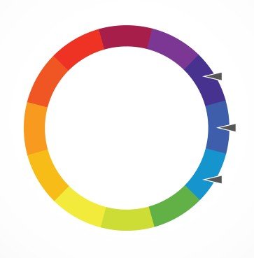
- Triadic colors
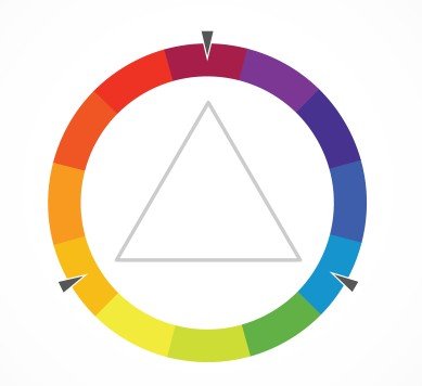 |
|---|
These are colours that are evenly spaced around the color wheel just as seen in our reference image. One characteristic about the formation is that the colours involve are mostly very bright and dynamic.
Other colour schemes includes, split complementary, Tetradic & square. You could check out those combinations on your own.
This where we will be drawing the curtain for today.
I really appreciate you for coming this far with me. I trust you got value from this lesson. Feel free to share your thought on today's lesson. If there is anything you would love me to add to improve the lesson,do to share with me.
If you missed the previous posts on this beginners class, kindly check them out here.
G101 intro post. Lesson 1. Lesson 2. Lesson 3. Lesson 4. Lesson 5. Lesson 6.
Graphic Instructor
@lhorgic♥️
Cc: @ubongudofot.
We support quality posts anywhere and any tags.
Curated by : @lhorgic