Graphic Design made Simple (G101) #lesson 4 - Hands-on Practical session.
 |
|---|
Hello friends, I trust you all are good. Trust me,I have missed y'all but am glad am here again for another beautiful lesson. Welcome to out beginner's graphic design class. Today we will be taking a break from the theoretical aspect of the lecture as we will be having a "practical break". This came as a result of a feedback I got from the last class.
I would love to engage you and show you how I make most of my beautiful fliers. I believe this will make the class more interesting because you can start implementing the knowledge gotten from the practical session even as we continue with the principles and theories.
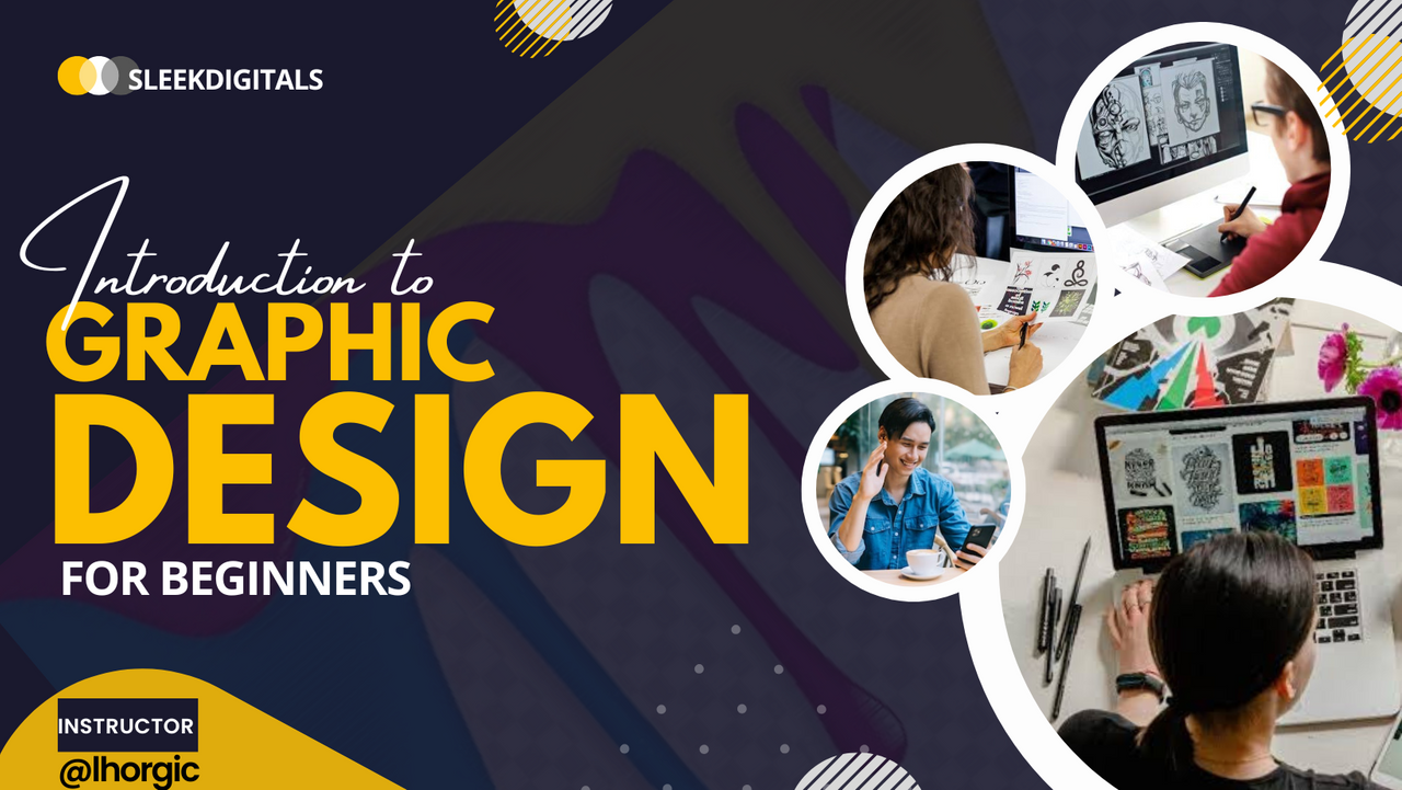
So I though of what design we cod use for our practical then I remembered our cover design, maybe some of us thought it was download somewhere (lol)...well you're wrong.
So I will be walking us through the Making of the cover design. Am sure you would like to know how I came about the simple yet top notch design. Let's reproduce the design with some touch of uniqueness. Below is the cover design.
 |
|---|
Note: The design app we will be using for this practical is Canva. Canva is used by most users on the platform hence my choice for this practical session.
Step 1:
Open your canva app, click on the + to create a new project and then choose custom size and set your size. We are using the 16:9(inches) dimension for this design This is as seen in the images below.
 |  |  |
|---|
Step 2:
You're automatically shown different template/design with that size to pick form. Locate the one I highlighted below. This was what I manipulated to give us that awesome design.
Note: you can build from the scratch but it's more easier to tweak a template.
 |  |
|---|
Step 3:
Delete the unwanted text just as highlighted , edit the bolder text in yellow by inputting Graphic Design then resize. You resize by dragging text by the tip/edge
 |  |
|---|
Step 4:
Add your "INTRODUCTION TO" which is likely to appear in uppercase. Change the font to "Amsterdam four". The "Ff" icon is used to choose the font of your choice.
 |  |  |
|---|
Step 5:
Go and reset the Letter case of the "Introduction to"just as seen below. Stylish fonts do not look good in designs when typed in upper case.
 |  |
|---|
Step 6:
The arc-like rectangle is then resized and positioned. Kindly note that the shape already exist in the template. Just resize by dragging the tip/edges of the shape and then position it properly just as seen below.
 |  |  |
|---|
Step 7:
You're going to be duplicating the image in the circle shape using the "+" icon just as highlighted for you. Duplicate into 3 more and then arrange by dragging the image to our desired position.
 |
|---|
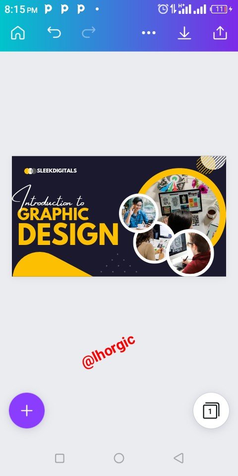
Step 8:
Since we are not interested in the template's image, we can then replace it with ours. Be sure to have your image ready in your gallery. So click on each of the image and replace, you will have to do this over and over again until all the images there are replaced.
 |  |  |
|---|
Step 9:
Finally we have the design below. It looks good already but then in the original design, we have a faint image In the background. I would be showing us how I did that in step 10
|
|---|
Step 10:
First click on the main blue background of our design then Click on the "+" button just below your workspace and then select from your gallery the image you would love to use as the fainting background image then click "Add to page". This automatically brings it into the picture just as seen below.
 |  |  |
|---|
Step 11:
Do well to enlarge it and then locate the "Position" icon just as highlighted by scrolling below your workspace. The position icon helps to push the image to the back since it's covering every other elements and character in our design. Keep clicking "backward" it it goes to the back.
 |  |
|---|
Step 12:
As you can see our image is now behind every other elements in the design. Now you need to locate "Transparency" just below our workspace and then adjust the parameter to 20 to give the image that fainting and complementing look.
 |  |
|---|
Step 13:
Boom! The design is ready!
 |
|---|
You can now proceed to download your design. The download icon is just at the top right corner of your screen.
This is where I will be wrapping it up for this lesson. I really appreciate you for coming this far with me. I trust you got value from this post. Feel free to share your thought on today's lesson. If there is anything you would love me to add to improve the lesson, be free to share.
Reproduce the design with your unique touch. You can tag me I will sure be dishing out rewards to those who attempts. Also kindly note that it's not compulsory, the task is just to help speed up your learning.
Special mention:@franyeligonzalez @fonjougiresse
@ruthjoe @xkool24 @sahmie @chukwu10 @badmus-official @richy20
Did you miss the previous lessons? You can check them out here.
| G101 introduction post | Lesson 1 | Lesson 2 | Lesson 3 |
|---|
Graphic Instructor
@lhorgic♥️
Cc: @ubongudofot.
Wow,thank you for this great lesson as I am really happy to learn more about this graphics design stuff.
Should we make a post for the homework task,or should we share our design below the post.
Making a post about it is not a bad idea. It gives you a better chance of getting support (booming) in addition to the reward.it will also help you document your process which will serve as future reference. Do well to tag me and your friends who would love to up their design game. Thanks for the feedback, am glad you got value.
Okay,thanks for the lesson.
Should we edit this your design or should we pick other templetes with thesame seize from Canva.
Thank you for this great lesson,you have really really doke well to sacrifice your time for all these lessons.
I will be looking forward for another lesson and I really want to learn how to customize my own size and shape so as to create templates for others to design with.
Once again thank you @lhorgic for this great lesson.
Canva seems to be a bit limited when it comes to creating customized shape. There are alot of regular shapes you can maximize, moreso you can manipulate these shapes to build your customized shapes. It's all about creativity, just keep following and trying the practicals. It won be long before you understand how all these works.
Yeah,thanks you so much.
Wow! This is very similar to the one from my preferred app, Pixellab. But, the difference being that Pixellab is offline and does not come with very useful templates such as this, meaning you have to produce your design and templates from scratch by yourself.
It's amazing how you do all this wonderful works with such ease. Thanks inviting me, I've learnt something useful from this. More successes brother.
Thanks @sahmie, I appreciate your input once again. Pixellab is a great tool, I hope to branch into that someday and show people how to maximize that as well. I wouldn't even mind if you decide to show us some tips and tricks someday...smiles.
Thanks once again.♥️
😉😉😆
Bro do you download the customised shapes or it is already in Canva?
Wow linking the theory with the practical. I'll try and Let you know
All the shapes are in the chosen template , I didn't add any new or customized shape to it. You can take your time to go through it. You would see what am saying, the only thing I think I did was duplicating the already existing shapes. Thanks for the feedback.
Okay bro
Great delivery. I got my points. 👍
Thanks for the awesome feedback sir. Am glad you got something from the lesson.
Yes boss!!! Added advantage... Keep it up, Sir.
Thank you so much for sharing this educative lesson with us here, we appreciate your effort in the community, just keep it up!