Graphic Design made Simple (G101) #lesson 6
 |
|---|
Hello friends... Welcome back! Am happy to be here again. I trust you have been looking forward to this week's lesson. Look no more, it's here. Welcome once again to our Graphic design class for beginners. Yea! For the past two weeks, we have been working on practicals just to acquaint ourselves with the things we have learnt so far.
Today we will continue with our theories but then, it also going to involve some elements of practical to make the lesson more effective. The topic we will be looking at today is ALIGNMENT just as you have seen from the cover image. Kindly journey with me as I unravel the subject for today.
Introduction
What is Alignment.
Types/Forms of Alignment
Usage and Example
The word alignment is not an uncommon word, most of us must have heard this words over and over again but in a different context. For some, the first time you heard the word, you were actually dealing with a car, probably you were in a mechanic shop while for others, you knew the word while preparing a text documents.
The Interesting fact is that the concept of alignment also cut across graphic design, permit me to say that it's an integral part of design. The same way it functions in the two example I gave (cars & docs)earlier , is also the way it functions in design. Let's delve in a little deeper.
 |
|---|
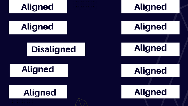
Alignment can be defined as the manner at which visual elements are arranged in such a way that they look very orderly and in sync with one another. This arrangement is done in such a way that none of the element in the design work is out of bound.
It is as though all the arrange elements is guided by some invisible line which shows how far they can be positioned or stretched.
The borders or edges of the workspace or area is also taken into consideration when doing the arrangements.
The principle of alignment in graphic seems to be overlooked by many. This principle seem very subtle but difficult to go unnoticed when not properly followed. It is the reason why many graphic design look cluttered and unorganized.
My goal is to make this lesson as sime as possible and less cumbersome. For this reason I will limit the types or forms to just three (3), they are actually more but this 3 are basic and fundamental, at least for a beginner. Let's check them out.
- Right Alignment.
Just as the name implies, our elements are positioned or arranged on the right hand side of our workspace or canvas. I will be using the word xAlignment"to illustrate this below.
 |
|---|
As you can see, the word "alignment" was positioned to the right hand side.
- Left Alignment
Here the elements are positioned or arranged to the left side of our workspace or canvas. I will also be using "alignment" to illustrate this as well.
 |
|---|
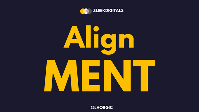
- Center Alignment
Here elements are positioned at the center of our workspace or canvas just as seen in the image below.
 |
|---|
Now that you know this, it is then expedient that you have a mental picture of the position you want your design to assume even before starting the design. Do you think your design will come out well by aligning your design to the left, right , center? Always ask yourself this question before you begin. It makes the work easier.
Now when aligning your text to the right or left you have to complement it with other elements like images (usually). You would observe that the arrangements created a vacant space to both the right and the left alignment pattern. Adding an image to the design makes the design work complete and more appealing. Let take a look at some examples below.
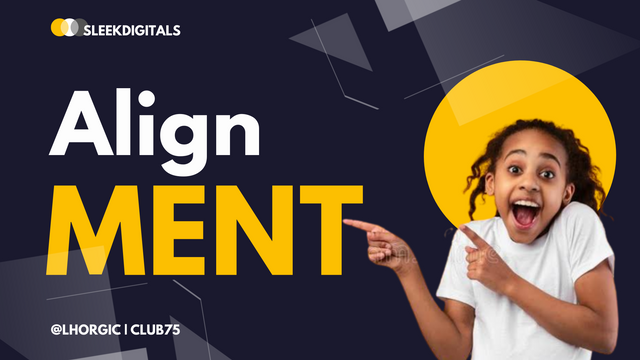
- Right aligned text + Image
 |
|---|
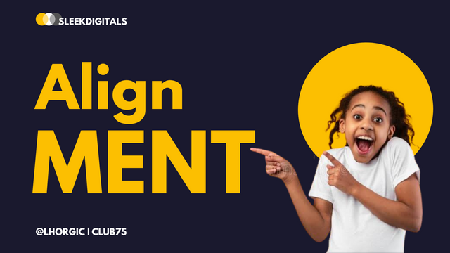
- Left aligned text + image
 |
|---|
As you can see from the images above, we just complemented our aligned text with image which made it look beautiful. Although we still have some touches to add to it to make it come out very professional. However the message about this subject matter has been passed.

Engage this principles and step up your design game. Permit me to draw the curtain at this juncture.
I really appreciate you for coming this far with me.
I trust you got value from this post. Feel free to share your thought on today's lesson. If there is anything you would love me to add to improve the lesson, be free to share.
If you missed the previous posts on this beginners class, kindly check them out here.
G101 introduction post
Lesson 1
Lesson 2
Lesson 3
Lesson 4
Lesson 5
Graphic Instructor
@lhorgic♥️
Cc: @ubongudofot.
This is really a good and nice lesson,am really benefiting a lot with the lessons you drop here.
Thank you so much.
Am glad you're friend. Keep learning and practicing.
Thank you so much.
Not out of sight, still following your leads on this subject.
You are doing great, boss.
Smiles... Thanks boss, your comment is a big motivation. Am glad you're getting value. Thanks once again sir.