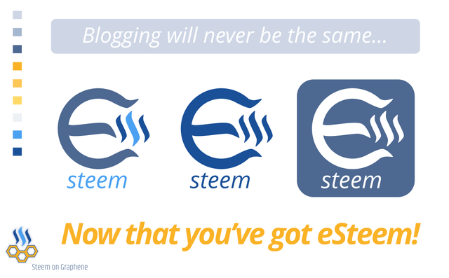
Blogging will never be the same, now that you've got: eSteem!
@good-karma has just published the latest version of the Steem App for Apple and Android. Tried the Open Sourced App, updated it, and I like it. And recently there was a contest announcement for a new eSteem logo. And I gave it a go. Allready replied with my idea, got a response, and now I would like your feedback too.
The idea is that the 'E', from eSteem, has a suggestion to a money sign, with the use of parts of the Steem logo. Also it looks like a magnet, standing for attention that is drawn in by Steem. Also it hints towards A Tesla coil, the energy inbetween symbolised by the Steem(It) logo. With the deeper link to Tesla and Innovation. En when seen from the side it looks like an 'M', connecting to monetizing with the help of the eSteem App. (Font used Open Sans)
A
This was my initial reply and @good-karma asked if I could turn the middle part upside down.
Resulting in this:
B
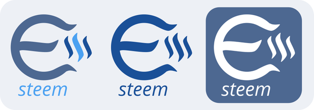
Had to move the Steem logo to the right for this and it is not my favourite one.
And what about you?
And while you're here give @good-karma a visit and follow, he's doing some cool eSteem coding!
The images in this post are cc-by-sa @oaldamster
EDIT: Thanks for all your feedback! Came up with these:
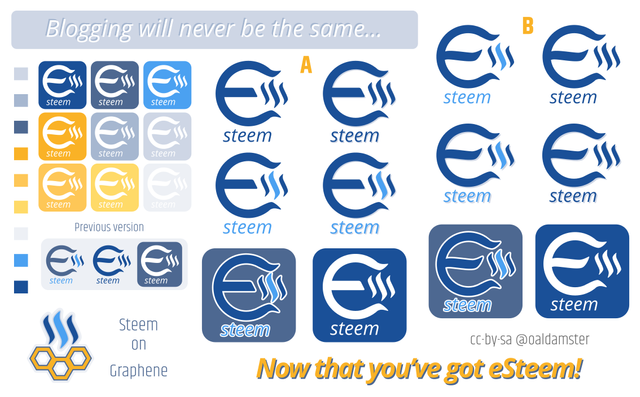
CLICK HERE For a full size image.
NOTE: The Steem Backed Dollar that is coming from the payout, for this post, I will donate to the Pirates for kids dot NL foundation. Also, I let @good-karma know that I do not want the prize, should my design be chosen. Because my contribution in this is completely voluntary, supporting open source developement of eSteem.
UPDATE:
@good-karma send me the prize in SBD (THANKS!). I will use part of it for the donation to the Pirates For Kids dot NL foundation. And the rest that is left after that, I do not yet know.
And if you want to stay up-to-date with the latest news about eSteem, follow @good-karma.
And a new Android version is out! https://steemit.com/esteem/@good-karma/esteem-android-update-1-2-0
Steem on!
Looks more like logo for Euro currency to me. Not criticizing. Just my opinion.
Up to a certain level I agree with you on that. And I do appreciate your open feedback, thanks!
The first edition is definitely "Euro", but the second is "smiling whale" )
And which one would you prefer @svamiva?
Conserning that case I'm ready to follow the majority )
I don't think this need the upturned part in the middle I think the middle line in the E might look better straight Still great work well done
Thanks Karen, wanted to do something else with the use of the Steem(It) logo. But I'll give it a go with a straight middle line too.
You go for it, It will all come together
It did. :-)
Looks great well done
The logo is awesome Sir and This is my first comment or post like guys called on steemit, I heard about steemit by accident and I don't understand why such idea in not known yet in the world, I believe it's a great system but need more advertising
Thank you @theodoros and welcome to SteemIt!
It is indeed a marvolous idea and more are welcome to join in. Marketing has been done much in the very compatitive world of 'cryptos' and I think you've got a point there.
You could write a post using the 'introduceyourself' tag section.
Have a good time at Steem(It)!
Great job. I choose B because I think E at picture A look like a euro.
I also looked at esteem for android. I have installed it on my tablet. I like it.
Pfff dat engels maar goed. Je logo's zien er echt goed uit. Ik ga dus voor B.
En wat super dat je het doet voor een goed doel.
Ben een paar dagen weggeweest dus ga me nu maar is even weer verdiepen in steemit.
Om te beginnen maar even kijken naar esteem wat ik net heb geïnstalleerd. Het zag er in iedergeval goed uit.
Succes verder!
Thanks! Think most agree on B. That one also looks like it has a smiling 'whalefish' in it.
Maybe you could do a post about your experiences with eSteem?
{NL} Dankje! B is denk ik meest favoriet bij de meesten. Ach, het is niet zoveel, ook al zijn er nog een paar uur te gaan, maar denk ook dat ik nog een deel van de prijs er bij doe voor hun.
Goed weekeinde en veel succes en plezier met SteemIt via eSteem!
Great, mate! I like your ideas and would like to see more of your design work! Keep them coming... Thanks for sharing!
You're welcome, will have another go at it.
And I think #eSteem should get more attention!
I like the magnet idea - it's like saying "I'm a crypto -money magnet " and yes it's true ahahahaha ! Het lijkt inderdaan een beetje naar de euro maar ik zie meer van de C daarom had ik dat eerst bedacht - Crypto -currency magnet. Mooi gedaan!
Thanks Ivy! That is something in there absolutely.
And I even started to see a fish / whale in in it, one sad, one smiling, now that even makes me go for version B. :-)
It is either there or it is time to go to bed for me...
{NL} Ja, zit zeker iets van een Euro in, in advertising / product marketing is het van belang dat mensen snel een associatie hebben met het een beeldmerk. Dus vind ik het prima als die koppeling er is.
En dank nogmaals, hoop dat het ook wat goeds doet voor de eSteem App van Good-Karma.
Nu tijd om te slapen hier in Winschoten.
Good night!
I like the darker background on the right... but perhaps the color is a little drab? How about the middle blue color on the steemit logo?
It can be used with the Steem(It) blue, will try that tomorrow.
Thanks for the feedback.
Not my taste, looks like an indian thing. Upvoted for the effort tho.
Thanks for the upvote and the honest feedback.
I like the smiling whale version b. And I feel that the Steemit logo should be bigger somehow. Great design!
Thanks for your feedback Anca, tried several sizes, but somehow it took things out of perspective. Also I like it to be a kind of Tesla coil static electricity thing buzzing. Do prefer the smiling 'whalefish' too. :-)