Portrait Painting Tutorial- A Walkthrough of the "Cereal Killer" Oil Painting Series

If you want some tips on picking the best photo then check out my previous post: Picking the Best Photo For Your Portrait Painting
So....You might be wondering what this "Cereal Killer" series is all about. I had some cereal boxes sitting around that I had planned on making into stencils to spray paint, but at the time I had been doing more Oil Painting than Spray Painting. So I decided I would use them to do some small practice paintings.
I find that doing small paintings allows me to try new things and to learn more in a shorter span than a larger more involved painting where there is more pressure to succeed and more supplies used. This is how the "Cereal Killer" series was born.
The name came from the obvious Cereal Box Canvas, but also because I thought that I was butchering the portraits while focusing on getting out of my comfort zone and not being as concerned about the outcome as I would in my larger Surreal works. My main focus was to improve my painting speed, try thicker paint applications, not blend my paint together, and experiment with different mediums in the paint. I only intended to do a couple of these, but as it turns out they were kind of a big hit on social media with friends, and I have had several people ask me to paint portraits for them because of this, and others ask me how I do it. So I would like to share a little bit about the process.

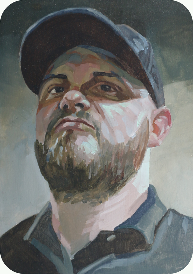
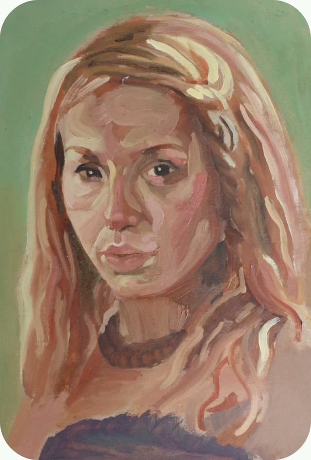
All of these are oil paintings on the back of cereal boxes( mostly Cinnamon Toast Crunch, Captain Crunch, and Fruity Pebbles). The sizes are between 5"x 7" and 8"x 10". Each one of these paintings took about two hours if you don't include the time it took to do the drawing. So all in all somewhere between 3-7 hours. I put gesso on some of these and painted straight on the cardboard on others.
Also I have decided I might continue this series. So make sure you are following me on Facebook so you can watch live videos of the process


No matter what type of art you are trying to create you should keep in mind, "It's going to look like crap at first for most of us." I have to remind myself of this all the time, whether I am starting a new piece, or even a new area of the same piece. It is a little discouraging to look at your canvas and see that it isn't looking right. Most people stop there and say, "See, I can't do this." and then they are done with it.
If I stopped when I realized my piece of art looked like crap I wouldn't have a single painting to show. Most people who quit never even get through the entire process.
Sometimes I even have to step back and look at pieces that I have already finished and remember that they looked like crap in the beginning, middle, and some almost right up to the end. That is why I have always said that my stubbornness has been the key to improving.

Once I find the right reference photo I prep my canvas, or in this case cardboard. If you aren't sure how to choose the best photo then look through one of my earlier posts: Picking the Best Photo For Your Portrait Painting. When working on paper or cardboard it is easy to custom size your surface to match the proportions of a particular image. Some I make taller or squattier. It just depends on what photo I am working off of.
Here is where I cannot stress enough the tremendous help of technology in visual aids. To experiment with the composition of a portrait all you have to do is pull up the picture on your phone hit edit and crop the photo as many times as you need to so you can experiment and get the composition just like you want it. This is way more convenient and accurate than pre-smart phone methods. Once I have the photo framed up just how I want it I just cut down the cereal box to match those proportions.
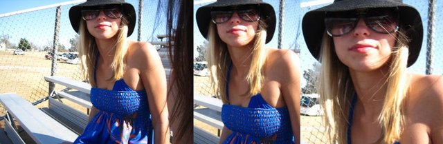
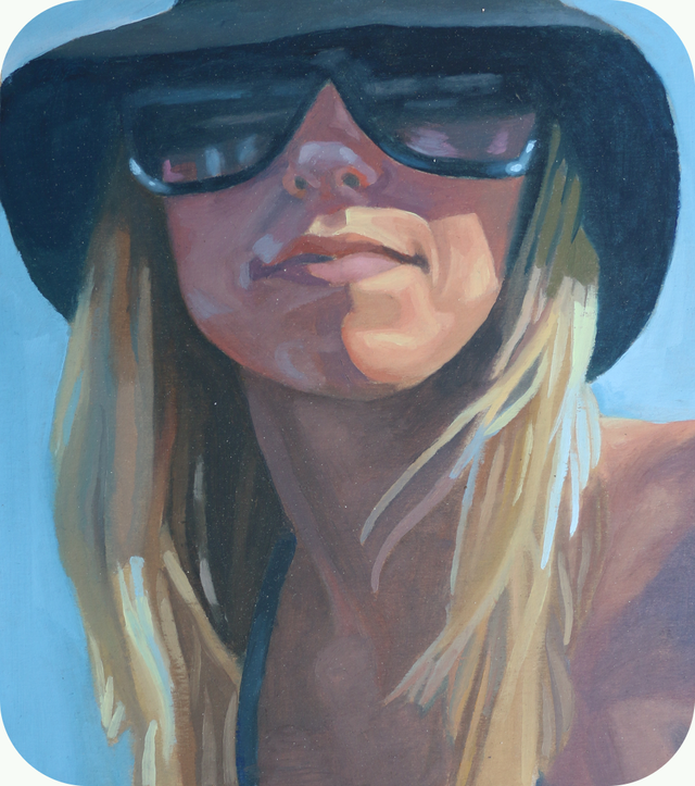
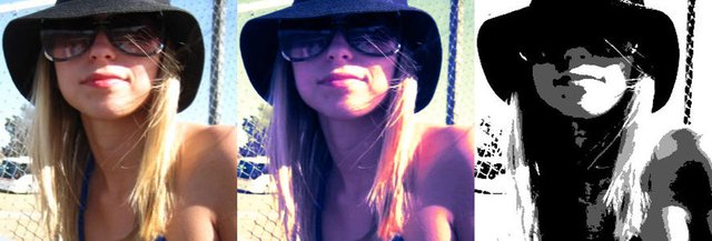
Above is the example of the photo I used for Karlie's portrait. The first photo is how I found it on Facebook. The second photo is how I originally cropped it and intended to paint it. After I started drawing it out I realized that, to fit that all on the back of a cereal box, her head would be much smaller than I wanted to paint it. So, in the third photo, you see that I decided to zoom in on the face and go with a more square composition.

I usually tape the cardboard down to some type of backing. I use a large clipboard. You can use a piece of wood or whatever. This is just something solid to press against that keeps it in place on the easel as well as keeping the cardboard or paper from warping as it gets wet. It also gives you a nice clean border afterward. Taking off some of the adhesive is a must. Otherwise you will spend all your time painting only to tear it when you remove the tape. I always stick it to my clipboard a few times and smash it down well and peel it off before trying to tape down my paper or cardboard.
Now that I have the right photo framed up just how I want it, have my cereal box cut down to matching size, and I'm all masked off, it is time to translate the photo it into a drawing. This is arguably the most important part of the process. It has been said that a good drawing can save a bad painting, but a good painting cannot save a bad drawing. So take your time on this.
If you are worried about having an overworked drawing from having to constantly correct mistakes then start off on a piece of paper and transfer your drawing with tracing paper to start your painting with a nice clean drawing. Make sure you get everything in its proper place. Take your time, measure, and compare. If you aren't confident in your drawing skills just yet then it might help you to grid it out.
I'm not going to take a whole lot of time covering how to draw here. I will save that for another tutorial for those of you interested, but here are a few examples of how I approach drawing. It is really more about your observation skills and sticking with it than it is hand eye coordination. Beyond looking and noticing aspects about the photo is the skill of visualization. I visualize a picture in many different ways while I am drawing.

Below are some mental tools that will make your drawings much more accurate with less struggle. This isn't a comprehensive list, just something to get you started. For those of you interested I will do a tutorial on more of these in a drawing specific post. These examples are not necessarily ordered steps that you do, but more of ways to think about what it is that you are looking at throughout the process.
There are many ways to go about drawing. Some people, when drawing a portrait, will just start with an eye, work it until completion, and then move out from there. I use to draw this way and it is exactly why my drawings, a lot of times, seemed "rigid" to me. Other times I would find that I started in the wrong place or the wrong size and ended up with not enough room, or a lot of extra space. There isn't any control of your overall space. Some people can operate this way, but most can't. I don't suggest even trying to learn that way.
The "best" way is to work from the largest most inclusive shapes or masses down to the smallest and from general to specific. What I mean by that is your first marks should be shapes or masses that contain the entire image and give an idea of the overall axis or direction of the whole. It is the package that everything is going to go in.
From there you draw the large shapes or masses that fit together in that package. Then you focus on the medium size shapes or masses. Once you have those all lightly penciled in you can make the adjustments to get everything right in relation to each other. Once it is all in it proper place, you add the details and refine it all.
That is a general overview of the process. When you do it that way, everything fits together better as far as proportion and location, and has a nice sense of unity. These examples will help you get all those shapes together.
Using the visualization techniques here, if you aren't already, should give you an almost instant boost in ability, but nothing will improve your drawing more than actually looking at the reference photo. You should spend more time looking at your reference than you are your drawing. You should be refreshing and comparing with each mark. This will improve your skill more quickly than anything. You should be in a constant state of comparison.
Visualization is your most important skill for securing the desired outcomes in art. Here are some visualizations you can put into practice today and almost instantly improve your drawing

This something I wish I would have learned much sooner. When you are looking at your reference photo try to imagine it already drawn out. When you look to your blank page or unfinished drawing, try to imagine it already drawn out right there looking at you. Really see it. Sometimes this makes something you are struggling with jump out at you so obviously you will want to kick yourself.

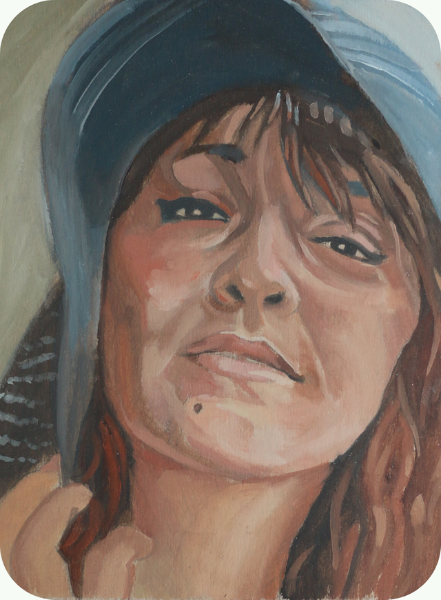
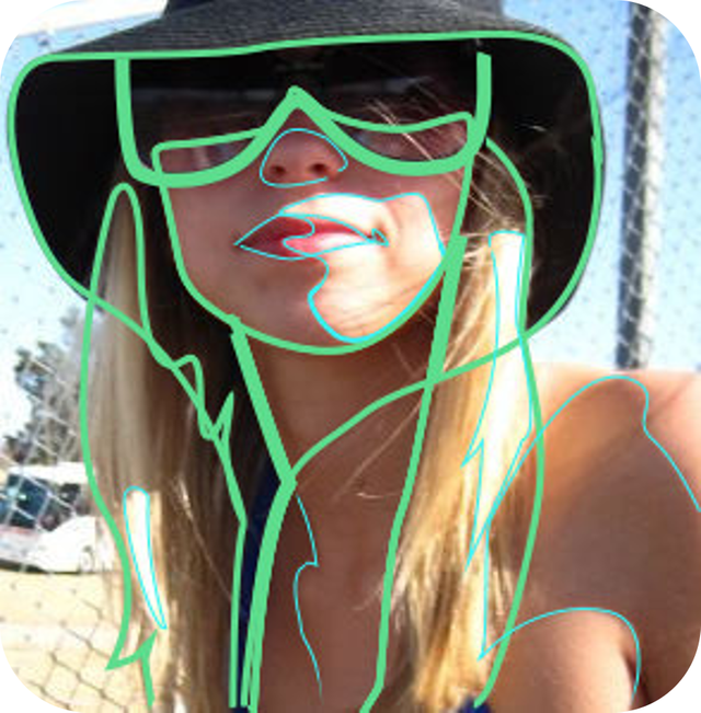
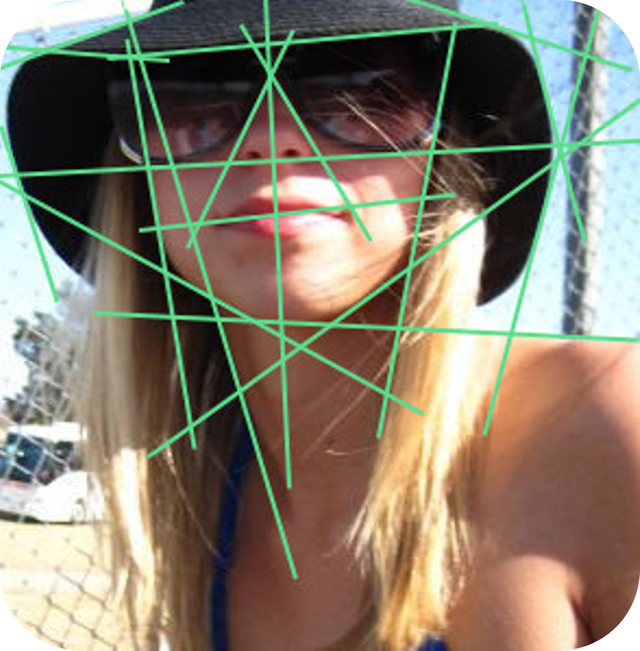
This picture is really an example of two things, positive and negative space, and what I mentioned earlier as far as drawing your largest most inclusive shape first. So get the container that everything is going in marked down.
Positive and negative space is largely ignored by beginners. Most people are only concerned with the subject they are drawing and miss out on some very important information in the surrounding space.
The negative space can give you more insight to what is going on. So when you are trying to draw the outline of your figure, or the contour of any shape, look at both your positive and negative space.
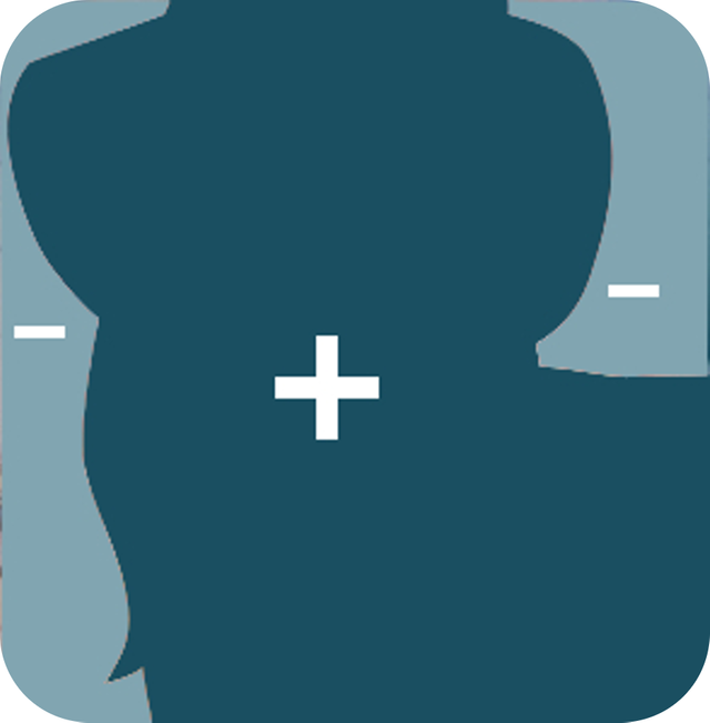

It is extremely easy to misjudge the curves in a shape. One of the ways to help you more accurately analyze the curve of a shape is to look at both the positive and negative space and focus on the curves that are concave. If you are looking at the positive space and the curve you are analyzing is convex then focus on that curve from the negative space. I have noticed for some reason it is easier to make accurate observations from the space which invades. I think what I am saying is more clear in the picture than in words
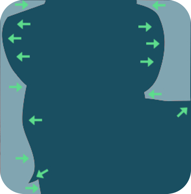

The goal here is to look for the largest simplest shapes that are visually apparent. This is what I mentioned earlier about drawing in your largest shapes (green) inside the overall shape. You will notice that I wasn't concerned about crossing over boundaries created by nearby shapes or even continuing/connecting lines and patterns where they didn't exist.
You can see it in the way I continued the shadowed shape of her hat all the way down to the strap of her dress, crossing her neck. You don't necessarily have to draw that line all the way across her neck, but you should visualize these types of continuations. It tends to get you closer without measuring. I did the same thing on the the medium shapes (blue) from the shadow of her shoulder crossing over the boundary of the hair.
That is what you are drawing, these abstract shapes that create the illusion of what you are looking at. You aren't drawing hair, or a face, or any of these things. You are drawing abstract masses of value. This is a really important point, but I am going to leave that alone here and cover it in a drawing specific post
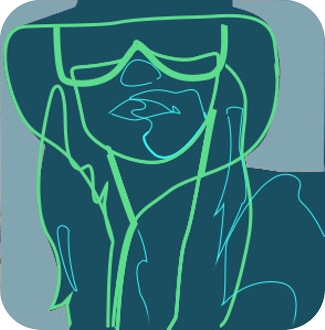
This is just to show the same shapes from the previous image overlaid on their overall containing shape rather than the busy reference photo.

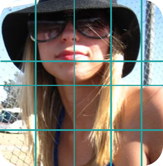
Visualizing horizontal and vertical guidelines help keep everything in the right place in relation to one another. This image obviously isn't an even grid. These are just some guidelines up next to key elements of the portrait. Imagining these guidelines does a fairly decent job, but if you really want to be accurate, hold up your pencil or some other straight edge and check to see how a particular shape or feature falls in line. Referencing one point in relation to the object you are currently focusing on drawing is good, referencing 2 is better, but referencing 3 will get you pretty much spot on.

Don't worry, no math here. Horizontal and vertical guidelines are good for more than just referencing location. They are a huge help in determining the slope of a line. It is not necessary to know the degree of the angle, but you should start to develop a sense for it.
You may think, "Well I know which way that line is headed." Yeah, it seems pretty straightforward right? I can't tell you how many times I have drawn a line at what was obviously the wrong angle. If you are relating the slope to this shape over here or that line over there and something is already wrong then you can get out of whack pretty quit. Also the tilt of your head. The Tilt Of Your Head. When in doubt, refer to an absolute (horizontal or vertical)
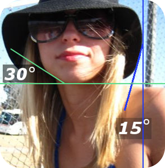

This shows the reference interpreting the curves as angles. A lot of people think that this is a much more accurate way to draw, and that is hard to argue with. breaking a complex curve down into several angles gives you more specific points of reference where drawing the curved line by itself makes it easier to exaggerate or put the peak of the curve in the wrong place.

The first thing I do is look at the photo and try to start visualizing it painted on my canvas, or in this case, cereal box, in a few different ways. I study the photo and decide what color world it is in, and if that is how I will paint it. This makes it easier to mix colors and have a harmony throughout the piece.
Limited Color Pallet
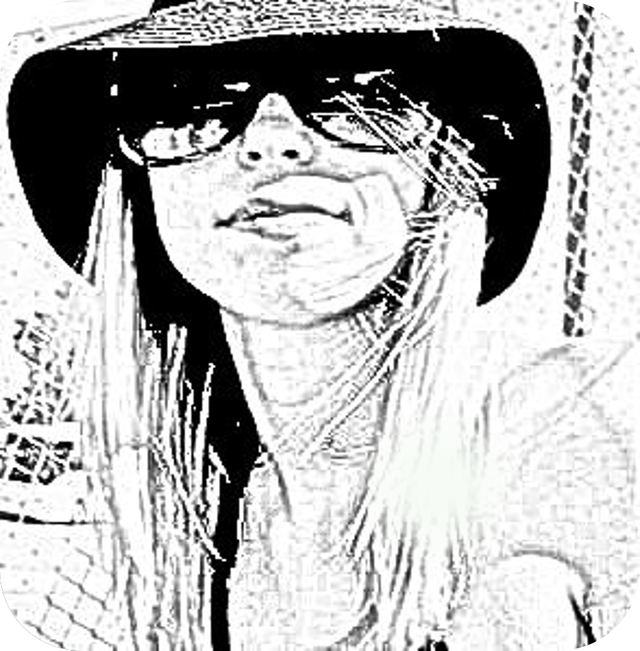
It is easiest to work with a limited palette, otherwise you can find yourself struggling to balance all the colors that you have incorporated. To help me visualize how to get started on my palette I try to think of the photo being over saturated with color. When I exaggerate the colors in my head it helps give me a better idea of exactly where to start mixing my colors. In the second photo above you can see an example of an over saturated photo, and although the painting, in the end had much more natural color, it was this type of visualization that got me going.
For the most part I stuck with using pthalo blue, cadmium red light (or what I call orange), and lemon yellow. The brownish colors you see in the final painting are a muted purpley color from mixing the blue and orange. So I essentially decided that the shadows would be mixed of mostly blue and the highlights of mostly yellow/orange.
Defining Values
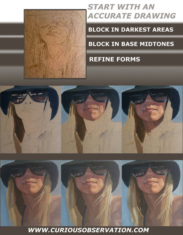
Then I look at where the shadows and light are falling , how it creates the range of value, and start making decisions on how specific am I going to be with the range of value. I think of it a little bit like a photo that has had the posterize filter run on it to begin with, only so many levels. This helps me see how to start placing my darkest values down in masses or blocking it in. Ideally you move down from blocking in all of your darkest values to your midtones or base color all across the entire canvas and then come back and refine shapes. You can see an example of the posterized visual in the third photo above.

Covering the entire canvas first helps you to better visualize what color world you are in as far as having a good balance. It is extremely difficult to balance all your colors when you still have the white of the canvas poking through at you. Your eyes evaluate the total visual field or area of focus and your brain doesn't know the difference between the colors you are putting down and the colors that are already there.
I got away without having to do this in this painting because my color pallete was very limited and the cardboard that I was painting on was pretty much the same color as certain parts of the hair anyway. However, in the case of a white canvas it will make all of your colors lie to you.
Color is contextual, in that your perception of a color can change greatly depending on what colors are next to it. So, in general, it is best to work the entire painting, and then come back and refine forms. Below is an example of what is known as color constancy.
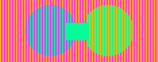
These 2 circles are actually exactly the same color, but because of the different colored bands passing over the top of each one they appear different.

Once you have your canvas covered, go in and start to refine all of the forms by cleaning up boundaries and making them more clear and precise while adding in the highlights and tonal variation in general that give the piece dynamic. Pinning down important highlights and adding in subtle color variations should your main focus here.
I step back and give it a good look. If I think it is done I will walk away from it for 15 minutes or so, and come back to see if any thing jumps out at me. If nothing demands I keep going then I take it down from the easel. If it isn't super wet I will untape it and sit it somewhere to dry while I admire the nice crisp border that has appeared from beneath that wildly paint covered masking tape. If it is still pretty soaked from using a medium or the paint is just caked on incredibly thick I will leave the tape on to keep it from warping once it is free of the tape.

If you enjoyed this post I hope you upvote, resteem, and follow me. Comment with any insights, suggestions, questions, or complaints.

Photo Realism- Why I Am Done Simply "Recording" Images
Fluid Paintings Round 3 (with video)
W.I.P.- Oil Paint Portrait I am Working On
Migraine Madness- A Series of Oil Paintings Portraying Migraines
Fluid Paintings Round 2 (With Video)
Abstract Explosionism- Painting With Guns (With Video)
Fluid Paintings Round 1 (With Video)
Picking the Best Photo for Your Portrait Painting

 |
 |
 |


Really cool work! Good how-to as well.
I've always thought that being able to draw and paint was such an asset. I'm in visual arts as well, but I'm more into visual fx, motion graphics and compositing for film and tv.
I recently started getting into concept art / speed painting and there's a guy called Jama Jurabaev, his works is like absolute beast mode engaged. I think you would really like his stuff. Give him a search.
The guy works for ILM (International Light and Magic) one of the top top top visual fx houses on the planet. He's also got pretty good tutorials.
Anyway, looking forward to checking out more of your work. Keep an eye on my blog too as I upload animations or concept art from time to time.
Keep up the good work!
CC
Thank you. I will check that guy out. I followed you. Looking forward to seeing more animations
Awesome artwork!
Thank you!
Wow! How much material in one post! I'll post in your blog to put into practice your advice... :)
Thank you. I hope it wasn't too long, and thank you for the resteem as well.
I'm glad you found the information useful. I will probably do another tutorial post more geared towards drawing and visualization before too long.
It would be just as interesting for me! Please create more and share with us your lessons!
great effort and fabulous job... i loved how you've detailed the entire process.
This gem of a post was discovered by the OCD Team!
Reply to this comment if you accept, and are willing to let us promote your gem of a post! By accepting this, you have a chance to receive extra rewards and one of your photos in this article will be used on our compilation post!
You can follow @ocd – learn more about the project and see other Gems! We strive for transparency.
If you would like your posts to be resteemed by @ocd to reach a bigger audience, use the tag #ocd-resteem. You can read about it here.
Thank You.....and yes I accept.
That was a very comprehensive tutorial! You could have maybe made five separate posts out of the one. Quality work.
Thank you. It's funny you say that. I had intended to add quite a bit more, but i felt it would be too long for anyone to want to read.
I made the section about choosing a solid reference photo a seperate post. I also left out some visualizations and a chunk about visual perception.
I think I will do a more comprenshive list of visualizations in its own post before too long.
On this platform, people do read. That is one of the great things about it. Rather, I see that you are new to the platform and don't have a larger following yet. I wouldn't want to see such great content receive only a few votes.
Great post..!!
Thank you
If you are interested in Art, you can check my Intro post, #Namaste from India, as well as other posts, where you can see a lot of paintings.!! Just have a look...
Congratulations @art-mess! You have completed some achievement on Steemit and have been rewarded with new badge(s) :
Click on any badge to view your own Board of Honor on SteemitBoard.
For more information about SteemitBoard, click here
If you no longer want to receive notifications, reply to this comment with the word
STOP