How Colour Can Change the Feel of a Photograph
Introduction
Colour by it's absence, presence or shifts in hue can subtly shift the mood and tone of a photograph. Modern photography opens up a whole host of different choices in terms of processing. The palette we have available to us is so vast that it is often difficult to decide how to process a photo. I often process the same photo in multiple different ways so I can compare them side by side.
Despite having them right next to each other I still find it hard to decide which is my favourite. The following is the same basic photograph processed in slightly different ways. Technical details for the photo are at the end.
The Photos (Model is Rachelle Summers)
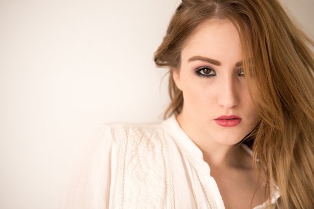
1) The original shot. Normal colours.
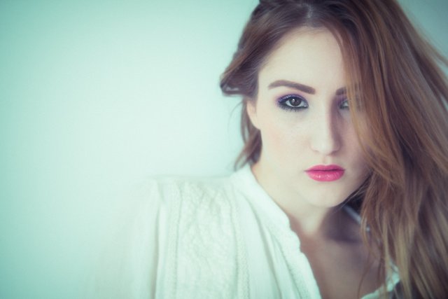
2) The same shot edited in Nik Colour Effex Pro and Photoshop to add more of a blue tint. A subtle lens blur and haze was also added.
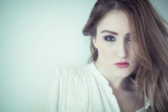
3) Less colour. This is a merging of the original shots with a reduction in saturation levels. It looks more realistic I think but the colours are markedly less striking than no. 2.

4) No colour. A monochrome version of no.2 - by completely removing colour from the photo the feel changes completely. The B&W conversion was done in Nik Silver Effex Pro.
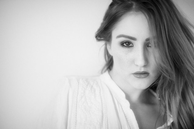
5) The same as no. 4 - however extra contrast has been added in photoshop by using dodge and burn effects around the hair and eyes. This helps to increase the "framing effect" of the hair and draws the viewer's eye more towards the face particularly the model's eyes.
Technical Information:
- Nikon D800 Camera
- Sigma 70-200mm/2.8 lens
- Settings: 1/80; f/2.8; ISO 400; at 160mm focal length
- Window light to camera left and hand held foldable reflector.
- Natural light only no flash used.
- Adobe Lightroom CC, Photoshop CC, (Google) Nik Color Effex Pro and Nik Silver Effex Pro plugins.
Please let me know your thoughts in the comments. I think for me my favourite versions are no. 3 and no. 5. As always I love the mono version and I prefer the contrast enhancement that helps to guide the eye in 5. I also feel in the colour versions the more subdued colour of 3 is more appealing to my eye.
Thank you for reading:)
You can see more of my work @thecryptofiend - hope you enjoy.
(Verification for me here: http://www.aapicture.com/about-me)
Hello thecryptofiend, we would like to inform you that you have been chosen as a featured author by the @robinhoodwhale initiave. We are currently in alpha testing, if you would like more info join robinhood chat on steemit.chat or pm @repholder.
Great Explanation - Keep on Steeming!
Thanks it is an honour:)
Great post thecryptofiend, love the photo.
Thanks mate:)
Thanks) Great small guide)
You're welcome, glad you like it:)
Great post! People don't realize how incredible important post processing can be to the overall feel of a photo.
It makes a big difference. You can't turn a crappy photo into a good one but you can change the feel for sure.
I always play around with filters :) makes a big difference
Yes I agree.
Beautiful model
Thanks:)
Hi! I like the natural photo, and the last one))
Thanks for commenting:) Hope all is going well with you?
yes, thank you :-)
Great:)
this is like an intensive summer course of english, lol
This post has been linked to from another place on Steem.
Real-Time Update of RobinHood Whale Project 罗宾鲸火贴实时更新 01-09 by @laonie
Real-Time Update of RobinHood Whale Project 罗宾鲸火贴实时更新 26-08 by @laonie
Real-Time Update of RobinHood Whale Project 罗宾鲸火贴实时更新 25-08 by @laonie
Learn more about linkback bot
I like this!
This will make it a lot easier to find related posts.
I actually made a post about it; no links to related posts on the pages, and this kind of solves that ... I like it!
And it's good for SEO!
Steemit took of like a rocket in Google
and those extra link-backs will make it even better!
#3 is my favourite for sure, I really like the mood of the colour of that one
Thanks it is my favourite too from the colour photos.
The third one is my favorite. She looks stunning!
Thank you:)