Bridge Sketch
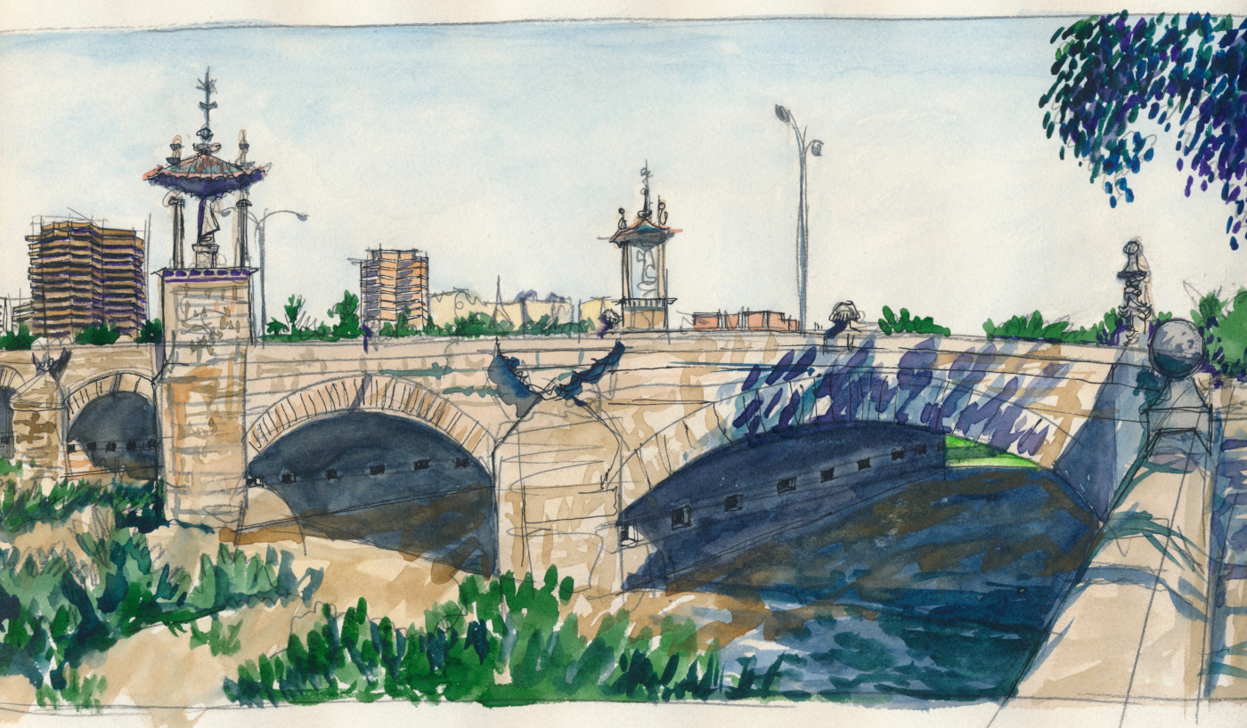
Bridge – Watercolor, pencil – 7 x 12 inches.
Hello, dear Steem friends and art lovers of WOX. Here's another special post, featuring one of the pieces from my sketchbook, just for you.
The waters of the river Turia used to run through the heart of Valencia, Spain, before emptying into the Mediterranean Sea. Even the presence of statues of saints under the baldachinos on this bridge (and on several of the other 17 bridges) did not prevent a disastrous flood in 1957, which killed more than 80 people.
Within a few years, the city had diverted the river, but it took nearly thirty more years to turn the ancient watercourse into a 6 miles-long urban park. The statues of the saints now overlook lagoons, bicycle paths, picnic areas, soccer pitches, and even a baseball diamond!
Want more sketches? See the other posts in this #steemexclusive series:
I love painting of bridges, especially the shadow of the bottom of bridge and to show the contrast between the sunny side and shadow that is dropped by bridge. Often I make my watercolour messy because I want to do dark of shadow but it is difficult to choose the right colour. I heard about blue and violet but if the bridge is stone bridge with beige colour what you will choose for shadow?
You post is nominated for „Visual Art“ Support Program, @booming account upvote. Only the posts that are not cross posted, original and posted from Xpilar community page and using tag #art-venturehave priority. If your post gets approval, then you get upvote within few days. Good luck!
Hello stef1 and thanks for your question. In general, there's no hard and fast rule for shadow colors. The most important thing is to get the value right, that is, the the degree of darkness of the shadow relative to the light of the bridge (or whatever might be creating the shadow.) If you catch the value accurately, you can use almost any colors you want in the shadow areas. The Impressionists played a lot with colors in shadows. When you study them you'll see that they often combined greens, blues, oranges and even pinks in some shadows. Sounds counter-intuitive, but it all works if you remember that shadows are full of light, just light of a lesser value than the bright parts. So in general, any colors will work, so long as you get the values right.