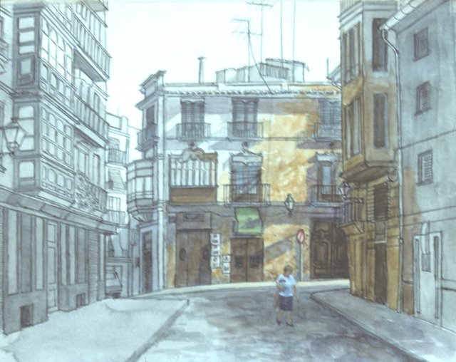
Calle de Caballeros

Calle de Caballeros – Pencil and watercolor – 8 x 11 inches.
Happy Wednesday, dear friends of Steem and WOX. I am back with another exclusive post for you, featuring a selection from my sketchbook. I hope you enjoy it.
This street corner in El Barrio del Carmen, one of the oldest neighborhoods in Valencia, Spain, has changed drastically since I drew it many years ago. The façades of the buildings on both left and right are now hidden by tall trees, and the dilapidated building at the end has been turned into posh flats.
The biggest change however, are the crowds of tourists which roam the streets buying postcards and t-shirts and taking selfies. The woman is only a memory in a sketchbook.
Previous posts in this #steemexclusive series: one, two, three, four, five.
You post is nominated for „Visual Art“ Support Program, @booming account upvote. Only the posts that are not cross posted, original and posted from Xpilar community page and using tag #art-venturehave priority. If your post gets approval, then you get upvote within few days. Good luck!
Thank you so much for your ongoing attention to and support of my work, @stef1. It means a lot.
such a nice painting I must get my watercolours out again.
Thank you! And that sounds like an excellent idea... Would love to see what images come of it.
yeah I like doing portraits in ink with a watercolour overlay but feel I am in a more acrylic phase now and hard to go back
I love this one, mostly because I am always struggling to show the perspective like the building on the left how you showed that it is getting smaller towards the center showing that they are far ahead, that is the best skill that I need to practice. Are you going to add more colours to the left?
Hola stef1, I'm delighted you like the image and I apologize for again taking so long to reply. You're right, creating the illusion of depth and space can be difficult, but keep practicing and you'll get the hang of it. There are a lot of good books on the subject. One of my favorites is "Keys to Drawing," by Bert Dodson, which deals with perspective and other problems we all encounter in making art. It might be a good addition to your library. In relation to your question, no, I didn't add any more colors to the left of the drawing because at the time I was interested mostly about the structure of the buildings. Here's a photo of the final painting, however, in which I unified all of the elements of the street corner and also changed the figures.