LOGOCREATION - Mini INKSCAPE SKILLS: LINEE DRITTE e Strumento UNIONE + "BIM BOOM BAM" Logo [ITA-ENG]
You can find the ENGLISH translation after the Italian text.
Tutti i diritti sono riservati.
È proibito ogni riutilizzo dei contenuti presenti in questo post – e dei loro derivati –, fatta eccezione la diffusione senza modifiche attraverso canali media e social media.
Le informazioni tecniche che trovi in questo articolo sono frutto di esperienze o ricerche personali. Approfondisci sempre con altre fonti ed esperienze per avere un quadro più completo sulle possibili tecniche o scenari.
Alcune delle informazioni/immagini che trovi in questo articolo potrebbero avere carattere goliardico: non ritenerle uno strumento di offesa perché non sono assolutamente state concepite o diffuse con quel fine, ma solo per alleggerire un post che potrebbe rivelarsi troppo tecnico.

Ciao!
Oggi torno con un altro episodio del mio spazio dedicato alla costruzione di graphic design e all'uso di Inkscape. Di solito tratto sia la creazione di loghi ipotetici a titolo di esempio sia l'utilizzo del programma di grafica vettoriale Inkscape. Oggi mi soffermerò sulla parte che assomiglia a un tutorial, andando poi ad applicare il tutto al logo ipotetico creato nel precedente appuntamento.
Vediamolo più nello specifico.
Strumento LINEE DRITTE in Inkscape
Questa volta voglio focalizzare l'attenzione sugli strumenti più semplici nella modifica di vettoriali, vale a dire lo strumento UNIONE. Sì, perché Inkscape ha una sezione che permette di agire sugli elementi vettoriali creati in precedenza, agendo su più elementi allo stesso tempo. Il caso più semplice è appunto quello dello strumento "Unione". Questa utilissima azione permette – come dice il termine – di unire più elementi vettoriali in un unico elemento grafico. Per fare un esempio della sua utilità: unendo più elementi assieme, ci basterà impostare il colore una volta soltanto, e tutti gli elementi (in precedenza singoli) assumeranno quel colore in contemporanea. Lo svantaggio principale: purtroppo sarà molto più difficile separare l'elemento finale nei suoi elementi di partenza. Ma andiamo per gradi e vediamo come utilizzare questo strumento.
Per prima cosa, ho creato una scritta e l'ho trasformata in un elemento vettoriale. In un PRECEDENTE POST ho mostrato in dettaglio come poterlo fare.

La mia idea era di rivisitare questa scritta creando delle spigolosità abbastanza geometriche. Ho così creato dei rettangoli e altre figure di contorno, facendo toccare i bordi di queste figure ad alcuni nodi spigolosi della scritta iniziale.

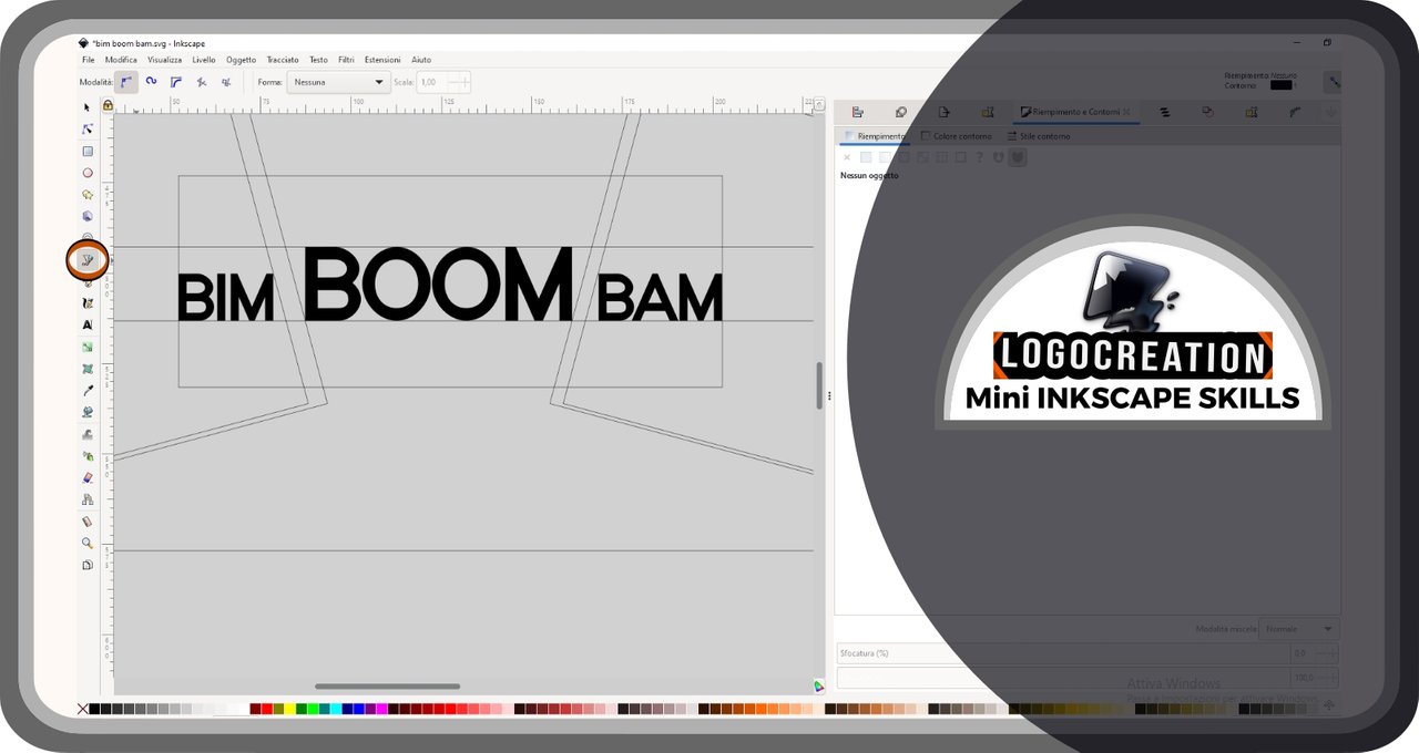
Qual'era la mia intenzione? Semplice: creare delle forme o degli elementi da unire successivamente alla scritta iniziale, usando le forme viste sopra come "guide"; lo scopo era avvicinarmi il più possibile al modello che avevo ideato nella mia testa. Perciò ho selezionato il pulsante mostrato sulla colonna più alla nostra sinistra, a circa metà colonna. Sto parlando dello strumento di "Disegno di tracciati e linee dritte": lo puoi trovare nell'immagine sottostante contornato da un doppio cerchio rosso e nero (le forme dal contorno rosso-nero e le altre frecce che vedrai sono il modo che userò per evidenziare le zone a cui prestare maggior attenzione).
Ho quindi usato questo strumento per creare il primo rettangolo (che vedi riempita di giallo). Questo strumento – in breve – si utilizza così: dopo averlo selezionato nella colonna sulla sinistra, posizioniamo il cursore all'interno della pagina Inkscape; clicchiamo con il tasto sinistro del mouse per creare un primo nodo; a questo punto spostiamoci e clicchiamo un'altra volta per creare un secondo nodo e ripetiamo l'operazione quante volte vogliamo. Tra ogni nodo e il successivo creato comparirà una linea di unione.
Una volta terminata la creazione dei nodi dovremo effettuare un doppio clic con il tasto sinistro del mouse: quello che avremo disegnato diventerà un elemento vettoriale unico formato dai nodi e dalle linee ottenute. Per creare una forma chiusa (come un triangolo o un rettangolo) dovremo posizionare l'ultimo nodo esattamente sopra il primo nodo creato (con un doppio clic del tasto sinistro del mouse).

Io ho poi utilizzato la funzione "DUPLICA": clic con tasto destro del mouse mentre il cursore è puntato sopra la forma da duplicare; quindi clic con tasto sinistro sopra la voce "Duplica". Comparirà un elemento copia che potremo spostare dopo averlo selezionato. Infine, ho utilizzato uno degli strumenti "RIFLESSIONE" (in questo caso, orizzontale): lo puoi trovare evidenziato nell'immagine qui sotto, in alto, all'interno di una delle righe più a ridosso del bordo della schermata; un pulsante che è contrassegnato da due frecce orizzontali adese ma dirette in senso opposto. Selezionando un elemento e cliccando con tasto sinistro sopra quel pulsante, l'effetto sull'elemento vettoriale sarà quello visibile nell'immagine sotto: ci saranno due copie speculari che potremo spostare dove vorremo.

AZIONI SUI VETTORIALI: Strumento UNIONE in Inkscape
A questo punto entra in scena il vero protagonista di questo episodio. Per prima cosa, selezioniamo i due elementi: strumento selezione, poi clic con tasto sinistro sopra la prima figura, poi clic con tasto sinistro sul secondo elemento, MA TENENDO PREMUTO il TASTO MAIUSC della tastiera.
Rechiamoci ora sulla barra in alto e clicchiamo (tasto sinistro del mouse) sopra la voce "TRACCIATO"; sul menù a discesa appena aperto, clicchiamo sulla voce "UNIONE".

A questo punto, ripetiamo l'operazione, selezionando assieme la scritta "Boom" con l'elemento formato dai due rettangoli. Se vuoi, puoi anche effettuare gli ultimi due step assieme, andando a selezionare tutti quanti gli elementi (selezione del primo, poi selezione del secondo premendo MAIUSC, poi selezione del terzo premendo MAIUSC, e così per quanti elementi vorrai unire assieme).

Il risultato finale è questo:

Logo "BIM BOOM BAM"
E adesso passiamo alla parte meno impegnativa: la creazione del logo finale. Il logo a cui avevo pensato era destinato a un servizio di assistenza caldaie, giocando su uno dei concetti più importanti in questo settore: il rischio, purtroppo a volte attuale e tragico, dell'esplosione di caldaie difettose o non ben controllate.
I primi passi li abbiamo visti in precedenza. A questo punto ho aggiunto due stanghe oblique di colore giallo dalle fattezze spigolose.

Ho poi cambiato il colore delle stanghe provando diversi abbinamenti, ma questa modifica era soltanto provvisoria. Ho invece deciso di rielaborare la scritta, rendendo le lettere molto più grasse di quelle inizialmente utilizzate. Ho anche modificato alcune zone per rendere la grafica delle parole più accattivante. In figura ho provato a indicare le zone con delle frecce (modifiche sulla B, sulle O, sulla M, ecc):

Ho quindi creato un pittogramma con cui addobbare le semplici parole, centrandolo orizzontalmente poco sopra gli elementi testuali del logo. Era impossibile non aggiungere poi una scritta descrittiva dell'attività, poco sotto la dicitura "Bim Boom Bam".

Ho infine creato una doppia sagoma bianca e nera intorno alla scritta principale e ho aggiunto delle zone di colore, dalle sfumature di rosso agli estremi e una specie di occhio arancio all'interno della parola "Boom". Il risultato è quello che trovi qui sotto, spero che ti piaccia

E anche per oggi abbiamo concluso. Spero che tu abbia compreso dove trovare gli strumenti con cui intrecciare le forme vettoriali che utilizzerai. Se hai domande, usa pure la sezione commenti. Io ti saluto e ti lascio i link dei miei precedenti post:
Ciao!
Below, the ENGLISH translation I previously published on Blurt.
All Rights Reserved.
All the uses of the contents herein - and their derivatives - are strictly prohibited without the explicit consent of the author, except for dissemination without modification through media and social media channels.
The technical information you find in this article is the result of personal experiences or research. Always delve further with other sources and experiences to have a more complete view of possible techniques or scenarios.
Some of the information/images you find in this article may have a joking nature: don't consider them an instrument of offence because they weren't conceived or distributed with that purpose, but only to lighten a post that could prove too technical.
Hello!
Today I'm back with another episode of my space dedicated to building graphic design using Inkscape. I usually discuss creating hypothetical logos as examples and using the vector graphics program Inkscape. Today I will focus on the part that resembles a tutorial, then apply everything to the hypothetical logo created in the previous appointment.
Let's get started right away.
STRAIGHT LINES in Inkscape
This time I want to show one of the simplest tools in vector editing, namely the UNION tool. Yes, because Inkscape has a section that allows you to act on previously created vector elements, acting on multiple elements simultaneously. The simplest case is certainly that of the "Union" tool. This useful action allows - as the term says - to join multiple vector elements into a single element. To give an example of its usefulness: by joining various elements together, we will only need to set the color once, and all the elements that were previously single will take on that color simultaneously. The main disadvantage: unfortunately, it's much more difficult to separate the final element into its starting elements. But let's go step by step and see how to use this tool.
First, I created a text and transformed it into a vector element. In a PREVIOUS POST I showed in detail how to do this.
My idea was to revisit this writing by creating some fairly geometric edges. So I created rectangles and other contour figures, making the edges of these figures touch some sharp nodes of the initial writing.
What was my intention? Simple: to create shapes or elements to be joined later to the initial textual graphic, using the shapes seen above as guides; the aim was to get as close as possible to the model I had created in my head. So I selected the button shown in the column to our left, about halfway up the column. I'm talking about the "Drawing paths and straight lines" tool: you can find it in the image below surrounded by a double red and black circle (the red-black outlined shapes and arrows you'll see are the way I'll use to highlight the areas to pay more attention to in each phase).
I then used this tool to create the first rectangle (with yellow filling, in the image). This tool – in short – is used like this: after selecting the button in the column on the left, we position the cursor inside the Inkscape page; click with the left mouse button to create a first node; at this point we move and click again to create a second node and repeat the operation as many times as we want. Between each node and the next one created, a union line will appear.
Once we have finished creating the nodes, we will have to double-click with the left mouse button: what we have drawn will become a single vector element formed by the nodes and the lines obtained. To create a closed shape (such as a triangle or a rectangle) we have to position the last node exactly above the first node created (with a double click of the left mouse button immediately after).
I used the "DUPLICATE" function: right-click while the cursor is pointed over the shape to duplicate; then left-click over the "Duplicate" word. A copy element will appear that we can move after selecting it. Finally, I used one of the "REFLECTION" tools (in this case, horizontal): you can find it highlighted in the image below, at the top, inside one of the lines closest to the edge of the screen; a button that is marked by two horizontal arrows joined but directed in opposite directions. By selecting an element and left-clicking over that button, the effect on the vector element will be the one visible in the image below: there will be two mirror copies that we can move wherever we want.
ACTIONS ON VECTORS: UNION Tool in Inkscape
At this point, the real protagonist of this episode comes into play. First, we select the two elements: selection tool, then left-click on the first figure, then left-click on the second element, BUT HOLDING DOWN the SHIFT KEY on the keyboard.
Now let's go to the top bar and click (left mouse button) on the "PATH" item; on the drop-down menu that just opened, let's click on the "UNION" item.
At this point, we repeat the operation, selecting the word "Boom" and the element formed by the two rectangles. If you want, you can also perform the last two steps together, selecting all the elements (selection of the first, then selection of the second by pressing SHIFT at the same time, then selection of the third by pressing SHIFT at the same time, and so on for as many elements as you want to join together).
The final result is this:
Logo "BIM BOOM BAM"
And now let's move on to the less demanding part: the development of the creation that we started previously to reach the final logo. The logo I had thought of was intended for a boiler assistance service ("Assistenza Caldaie" in Italian language), playing on one of the most important concepts in this sector: the risk, unfortunately sometimes tragic, of the explosion of defective or poorly controlled boilers.
We have seen the first steps previously. At this point, I added two oblique yellow rods with angular features.
I then changed the color of the latest additions, trying different combinations, but this change was only temporary. Instead, I decided to edit the textual graphic, making the letters much fatter than those initially used. I also changed some areas to make the graphics of the words more attractive. In the figure, I tried to indicate the areas with some arrows (changes on the B, on the O, on the M, etc.):
I added a pictogram to decorate the simple words, centering it horizontally just above the text elements of the logo. It was impossible not to add a descriptive text of the activity, just below the wording "Bim Boom Bam".
Finally, I created a double black and white shape around the main writing and added areas of color, from shades of red at the edges up to a sort of orange eye inside the word "Boom". The result is what you find below. I hope you like it.
And that's it for today. I hope you've understood where to find the tools to weave the vector shapes you'll be using. If you have any questions, feel free to use the comments section. I'll say goodbye and leave you the links to my previous posts:
Bye!

What a fantastic graphic designing!.
You told us step by step how to use tools. How to make the logo. It is very appreciated that you have skills and moreover you have courage to tell everyone about your skills. Not everyone does this. Graphic designing take a lot of time to learn the tools to make the logo.
Handsup for you ☺️
Yeah, it needs time, I think like each other working activity. Enjoy you like my post, so I reached my goal :)
Thank you for stopping, greetings from Italy and I wish you a nice week :)
Welcome 🤗
Congratulations! Your post has been upvoted through steemcurator06.

Good post here should be . . .
Curated by : @𝗁𝖾𝗋𝗂𝖺𝖽𝗂
Thank you dears :)
The clubstatus hashtag is #club5050
club50 is a typo but I will have a look 👍
Ok, thank you :)
Thank you, friend!


I'm @steem.history, who is steem witness.
Thank you for witnessvoting for me.
please click it!
(Go to https://steemit.com/~witnesses and type fbslo at the bottom of the page)
The weight is reduced because of the lack of Voting Power. If you vote for me as a witness, you can get my little vote.