LOGOCREATION - Mini INKSCAPE SKILLS: Strumenti SFUMATURA [ITA-ENG]
You can find the ENGLISH translation after the Italian text.
Tutti i diritti sono riservati.
È proibito ogni riutilizzo dei contenuti presenti in questo post – e dei loro derivati –, fatta eccezione la diffusione senza modifiche attraverso canali media e social media.
Le informazioni tecniche che trovi in questo articolo sono frutto di esperienze o ricerche personali. Approfondisci sempre con altre fonti ed esperienze per avere un quadro più completo sulle possibili tecniche o scenari.
Alcune delle informazioni/immagini che trovi in questo articolo potrebbero avere carattere goliardico: non ritenerle uno strumento di offesa perché non sono assolutamente state concepite o diffuse con quel fine, ma solo per alleggerire un post che potrebbe rivelarsi troppo tecnico.
Ciao!
Oggi torno con un altro episodio del mio spazio dedicato alla costruzione di graphic design e all'uso di Inkscape. Di solito tratto sia la creazione di loghi ipotetici a titolo di esempio sia l'utilizzo del programma di grafica vettoriale Inkscape. Oggi mi soffermerò sulla parte che assomiglia a un tutorial, andando poi ad applicare il tutto al logo ipotetico creato nel precedente appuntamento.
Iniziamo subito.
Strumenti SFUMATURA in Inkscape: i GRADIENTI
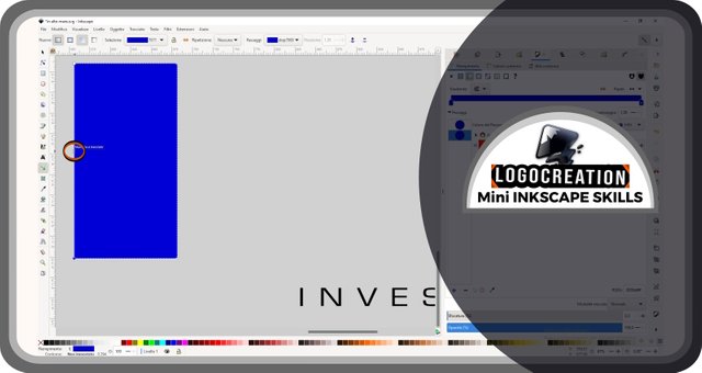
Questa volta ho pensato di introdurre gli strumenti utili per creare e modificare delle semplici sfumature di colore. Per prima cosa, apriamo la suite Inkscape e creiamo un rettangolo come quello che vedi nella figura sotto (le forme sono state spiegate in un post precedente linkato sul fondo di questo articolo). Una volta creato, selezioniamolo con lo strumento selezione. Come ogni elemento che evidenzierò, trovi circondato questo pulsante da un doppio contorno circolare di colore rosso e nero.
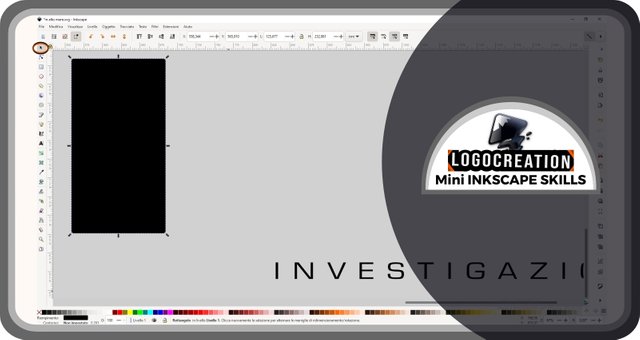
Apriamo poi la finestra dei riempimenti. La puoi trovare in basso sullo schermo, alla tua destra: è contraddistinta dall'icona raffigurante un pennello davanti a una struttura triangolare. Spostiamoci sopra il cursore e clicchiamo con il tasto sinistro del mouse.
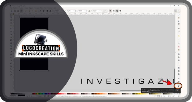
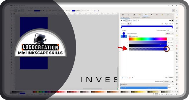
A questo punto comparirà la finestra dei riempimenti. Oggi vedremo soltanto il riempimento interno: per iniziare a modificarlo, dobbiamo selezionare la dicitura RIEMPIMENTO (a volte già selezionata in automatico) che si trova nella zona evidenziata nell'immagine qui sotto.
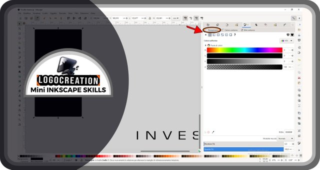
Ben visibili in questa finestra, ci sono:
- delle piccole icone raffiguranti immagini varie;
- una casella con il metodo colore, quello che in figura è indicato come HSV; cliccando su questa casella, sarà possibile modificare questo metodo, utilizzando per esempio un RGB o un CMYK;
- delle barre colorate, che possono cambiare a seconda del metodo colore che vorrai utilizzare;
- altre icone e altre barre (più in basso) che oggi non ci serviranno.
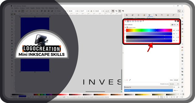
Nel caso dell'immagine qui sopra, le barre colorate definiscono la tonalità di colore che vogliamo utilizzare, mentre l'ultima barra regola la trasparenza di quel colore. Al loro interno, ci sono delle piccole strutture triangolari di colore bianco: queste strutture (definite MANIGLIE) sono quelle che ci permettono di variare le proprietà del riempimento. Cliccando infatti su questi piccoli frammenti (e mantenendo premuto con il tasto sinistro del mouse), possiamo spostarli a destra o a sinistra, così da modificare il colore di riempimento secondo la tonalità che la barra ci mostra. Nel caso della barra trasparenza, l'aumento di trasparenza viene sancito dallo spostamento verso una specie di bandiera a scacchi (sempre più nitida verso l'estremità alla tua sinistra, che corrisponderà a una trasparenza pari al 100%).
Ma abbiamo parlato di SFUMATURE. E dove li troviamo, gli strumenti per creare queste benedette sfumature?
Li possiamo trovare esattamente in questa sezione, tra quella serie di icone poco più in alto, all'interno della finestra riempimenti. La seconda icona – quella con un piccolo quadrato colorato per metà di bianco e per metà di grigio – è quella che cerchiamo: dobbiamo cliccarci sopra con il tasto sinistro del mouse. Questa icona è segnalata nell'immagine qua sotto, grazie a una freccia.
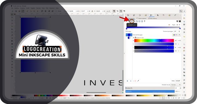
Fin da subito, cambiamo nomenclatura: in queste suite, e in molte altre similari, questo tipo di sfumatura viene definito GRADIENTE (poiché rappresenta una gradazione progressiva di colore).
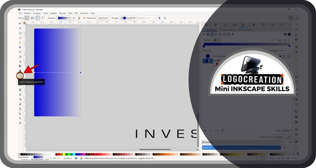
Arrivati fin qui, noteremo che il rettangolo che abbiamo prima selezionato assumerà un colore sfumato: dal colore di riempimento iniziale che avevamo scelto, fino al colore di sfondo della pagina vuota di Inkscape. Perché? Semplicemente, la sfumatura inizialmente applicata è formata da un unico colore che diminuisce la propria trasparenza (fino a zero) andando da un'estremità all'altra della figura. E se non ci piacesse? Tranquillo, vediamo come modificarla.
Nella colonna più alla tua sinistra (a metà circa), troverai un'icona con un rettangolo al cui interno si trovano due quadratini bianchi più piccoli che fanno da estremità a una linea. Questo strumento permette di MODIFICARE I GRADIENTI, alterando le tonalità e le proprietà dei colori che vogliamo utilizzare. Se clicchiamo con il tasto sinistro del mouse su quel pulsante, vedremo comparire ben due maniglie alle estremità della forma rettangolare a centro pagina: una maniglia bianca rettangolare e una blu ovalare.
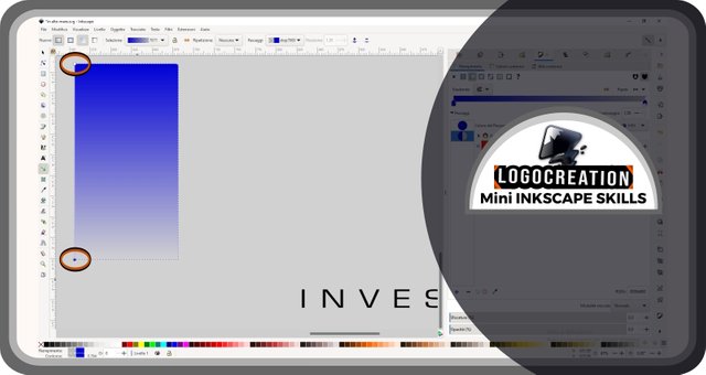
Selezionando le due possiamo apportare alcune modifiche:
- se selezioniamo e teniamo premuto, possiamo spostare la maniglia;
- se selezioniamo rilasciando la pressione, possiamo poi modificare le tonalità.
Nell'immagine sotto puoi vedere il risultato dopo che ho spostato le maniglie, cambiando la direzione del gradiente.
Possiamo poi selezionare la maniglia ovalare, che è solitamente quella corrispondente alla massima trasparenza. Una volta fatto ciò, rechiamoci nella finestra riempimenti sulla nostra destra. Spostiamo quindi le maniglie triangolari (le strutture di cui abbiamo parlato qualche paragrafo fa) della barra trasparenza, fino a rilasciarle sul colore pieno (la zona dove non è visibile la "bandiera a scacchi").
A questo punto potremmo cambiare colore, ma io voglio mostrati come ottenere un effetto più particolare: miscelare più colori in una stessa figura.
Torniamo quindi al nostro rettangolo, assicurandoci di avere ancora attivata l'icona della modifica dei gradienti. Spostiamo poi il cursore sulla linea che unisce le due maniglie del rettangolo ed effettuiamo un doppio clic su una zona a nostro piacimento, che verrà contrassegnata da una specie di "X" poco prima del nostro clic. Mi raccomando: questo clic deve essere fatto sul segmento che unisce le due maniglie e mai al di fuori.
In questo modo, comparirà una nuova maniglia. Io ne ho volute creare diverse e a diversa distanza. Questo a cosa sarà utile, potresti chiederti: ogni maniglia creata ci permette di associarvi un diverso colore, permettendo così di creare più gradienti differenti tra una maniglia e la successiva.
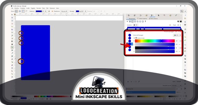
Sempre nell'immagine sopra, ho evidenziato la finestra riempimenti a destra, poiché - ogni volta che vogliamo agire sulle maniglie del rettangolo - dovremo: selezionare la maniglia rettangolare presente sulla figura creata, spostarci sulla finestra riempimenti, e cambiare la posizione delle maniglie triangolari sulle barre orizzontali. Succederà ciò che ti mostro adesso qui sotto.
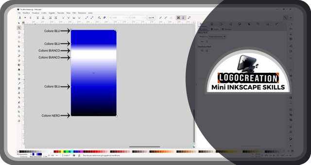
Nell'immagine sopra ho indicato il colore scelto per ogni maniglia, permettendoti di osservare il risultato di questa scelta. Naturalmente tu potrai sbizzarrirti quanto vorrai e cercare gradienti ben più accattivanti.
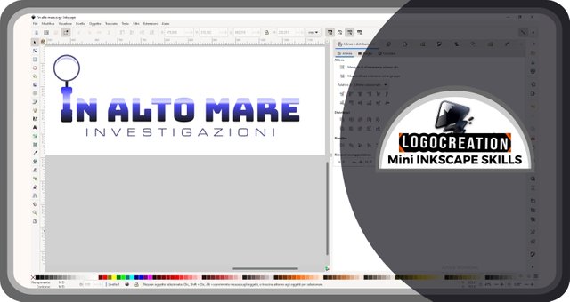
Io ho utilizzato il mio gradiente sul logo ipotetico mostrato nel mio ultimo episodio, il logo "In alto mare". Questo perché ogni figura potrà essere l'obbiettivo del nostro gradiente, che sia una figura astratta, una scritta o un altro oggetto. L'unica eccezione è l'impossibilità di colorare delle foto o altre immagini create al di fuori di un programma simile a Inkscape, poiché non appartengono alla classe che difiniamo "grafica vettoriale".
Ecco qui il risultato, spero ti piaccia.
Con quest'ultima immagine, ti lascio ai tuoi spazi. Spero che tu abbia apprezzato e che gli elementi di base per l'uso di gradienti possano esserti utili in futuro. Se hai domande, usa pure la sezione commenti. Io ti saluto e ti lascio i link dei miei precedenti post:
Ciao!
Below, the ENGLISH translation I previously published on Blurt.
All Rights Reserved.
All the uses of the contents herein - and their derivatives - are strictly prohibited without the explicit consent of the author, except for dissemination without modification through media and social media channels.
The technical information you find in this article is the result of personal experiences or research. Always delve further with other sources and experiences to have a more complete view of possible techniques or scenarios.
Some of the information/images you find in this article may have a joking nature: don't consider them an instrument of offence because they weren't conceived or distributed with that purpose, but only to lighten a post that could prove too technical.
Hello!
Today I'm back with another episode of my space dedicated to building graphic design using Inkscape. I usually discuss creating hypothetical logos as examples and using the vector graphics program Inkscape. Today I will focus on the part that resembles a tutorial, then apply everything to the hypothetical logo created in the previous appointment.
Let's get started right away.
GRADIENT Tools in Inkscape
This time, I thought I'd introduce useful tools for creating and editing simple gradients. First, let's open the Inkscape suite and create a rectangle like the one you see in the figure below (the shapes were explained in a previous post linked at the bottom of this post). Once created, let's select it with the selection tool. Like every element I will highlight, you'll find this item surrounded by a double circular outline in red and black.
Let's open the fills and stroke menu. You can find it at the bottom of the screen, to your right: it is characterized by the icon depicting a brush in front of a triangular structure. Move the cursor over it and click with the left mouse button.
At this point, the fill and stroke window will appear. Today we will only see the internal filling: to start modifying it, we must select the wording FILL (sometimes already selected automatically) which is located in the area highlighted in the image below.
Visible in this window, there are:
- small icons depicting various images;
- a box with the color method, which in the figure is indicated as HSV; by clicking on this box, it will be possible to modify this method, for example using RGB or CMYK;
- colored bars, which can change depending on the color method you want to use;
- other icons and other bars (further down) that we won't need today.
In the case of the image above, the colored bars define the color tone we want to use, while the last one adjusts the transparency of that color. Inside them, there are small white triangular structures: these structures (defined HANDLES) allow us to vary the properties of the fill. By clicking on these small fragments (and holding down the left mouse button), we can move them to the right or left, moving the fill color towards the shade the bar shows us. In the case of the transparency bar, the increase in transparency is confirmed by the movement towards a checkered flag-like area (more clearly visible towards the end to your left, which will determine 100% transparency).
But we talked about GRADIENTS. And where do we find these blessed gradients?
We can find them exactly in this section, among that series of icons just above, inside the fills window. The second icon – the one with a small square colored half white and half gray – is the one we are looking for: we must click on it with the left mouse button. This icon is indicated in the image below thanks to an arrow.
Once we get this far, we'll notice that the rectangle we first selected will take on a shaded color: from the initial fill color we chose, up to the background color of the empty Inkscape page. Why? Simply, the initially applied gradient is made up of a single color, of which the transparency decreases (to zero) going from one end of the figure to the other. What if we don't like it? Don't worry, let's see how to change it.
In the column furthest to your left, you will find an icon (about halfway down the column) with a rectangle inside which two smaller white squares act as the ends of a line. This button is a tool that allows us to EDIT GRADIENTS, altering the gradient and properties of the colors we want to use. If we click with the left mouse button, we'll see two handles appear on the rectangular shape in the center of the page: a white rectangular handle and a blue oval one.
By selecting the two handles, we can make some changes:
- if we select and hold down, we can move the handle;
- if we select by releasing the pressure, we can then modify the shades.
In the image below, you can see the result after I moved the handles, changing the direction of the gradient.
We can then select the oval handle, which is usually set on maximum transparency. Once this is done, let's go to the fill window on our right. We then move the triangular handles (the structures we talked about a few paragraphs ago) of the transparency bar, until we release them on the full-color area (area where the "checkered flag" is not visible).
Now, we could change color, but I want to show you how to get a more particular effect: mixing multiple color shades in the same figure.
So let's go back to our rectangle, making sure we still have the gradient editing icon activated. We then move the cursor on the line that joins the two handles of the rectangle and double-click on an area of our choice, which will be marked with a sort of X just before our click. Please note: this click must be done on the segment that joins the two handles, and never outside.
By doing this, a new handle will appear. I wanted to create several and at different distances. What will this be useful for, you might ask yourself: each handle created allows us to associate a different color with it, thus allowing us to determine several different gradients between one handle and the next.
Still in the image above, I highlighted the fill window on the right, since every time we want to act on the handles of the rectangle, we will have to: select the handle on the created figure, move to the fill window and change the position of the handles on the horizontal bars. What I'm showing you below will happen.
In the image above, I indicated the color chosen for each handle, allowing you to observe the result of this choice. Naturally, you can indulge yourself as much as you want and look for more captivating gradients.
I used my gradient on the hypothetical logo shown in my last episode, the "High Seas" logo. This is because each figure can be the target of our gradient (using the method we saw together), whether it is an abstract figure, a writing, or another object. The only exception is the impossibility of coloring photos or other images created outside of a program similar to Inkscape, since they do not belong to the class that we call "vector graphics".
Here is the result, hope you like it.
With this last image, I leave you to your own space. I hope you enjoyed it and that the basics of using gradients will be useful to you in the future. If you have any questions, feel free to use the comments section. I greet you and leave you the links to my previous posts:
Bye!

Thank you, friend!


I'm @steem.history, who is steem witness.
Thank you for witnessvoting for me.
please click it!
(Go to https://steemit.com/~witnesses and type fbslo at the bottom of the page)
The weight is reduced because of the lack of Voting Power. If you vote for me as a witness, you can get my little vote.