Making of a comic - Backgrounds
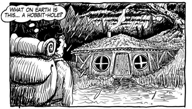


This is part of an ongoing series about how I make my comic about Phill from GCHQ. If you are interested in reading the actual comic you can find it here (it's still a work in progress but at page 35):
https://phillfromgchq.co.uk
And the earlier chapters of this series can be read here:

Introduction
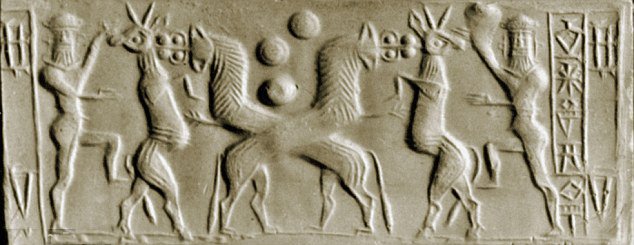
In semiotics there have been a lot of work that tries to create models that minimizes a narrative to its atom - one model could be this: The hero goes out in the world, solve a problem, gains some vital experiences, and returns home. This one is probably going to fit the story about Phill from GCHQ quite well! It also fits the Hobbit and the epic of Gilgamesh and Star Wars...
But there is of course more to it. Sometimes you will read a story just for the beautiful language - even though there is much more to his art Gabriel García Márquez is such a writer - sometimes you will be intrigued by the strange and wonderful world depicted - like in Frank Herbert's Dune - and in comics you have: the drawings.
The background and when to use it
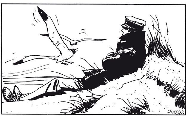
One of the cartoonists I have learned most from is Hugo Pratt. His stories are vague and dreamlike, and the drawings are marvellous - especially the albums he made in the seventies. One of the thing he was good at was minimizing the backgrounds without loosing the sense of location... that is... in his later works he seemed to get tired of drawing and more interested in his strange esoteric stories, but that is a bit besides the point here.
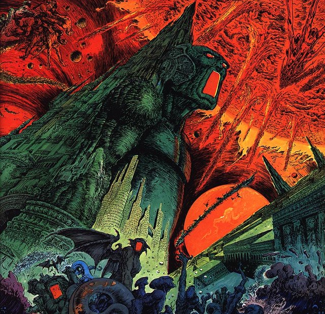
On the other hand. Landscapes can be great images to draw, and interesting for the reader. Just take a look at this marvellous detail from Yragael Urm by Phillipe Druillet.
But there is one important rule I use when I work: don't do both complex backgrounds and characters studies at the same time. I take it in steps, the comic strip is build for exactly that. Look at this sequence.
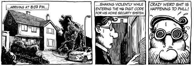
I try to only show as much as necessary while remembering that the reader never should forget where the story is happening.
Helping tools
So how so you go about making these backgrounds? it can be one of the most demanding and time consuming tasks when making a comic.
Depth
The most obvious answer is of course... draw it. But to draw a landscape you need to know a bit about how to achieve depth in an image. The first one is very simple... big things are near and small things are far away.
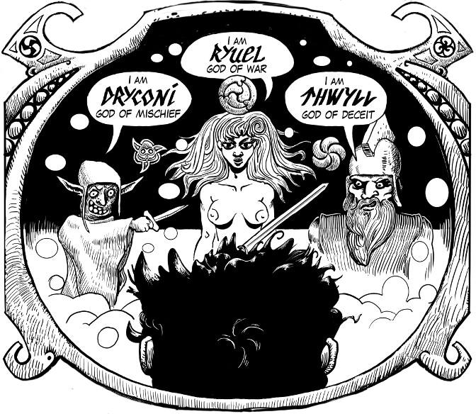
Then there is the set-piece approach. The Chinese painters never developed a true perspective but got along with having overlapping mountains where the ground in between was often covered in fog. An elegant approach that is easy to use.


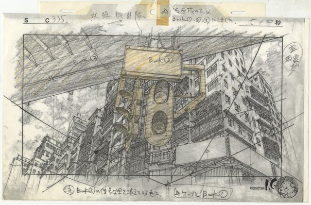
Then there is of course real perspective, a time consuming and meticulous task that I mostly avoid :) Below you can see a drawing used for the background of the fantastic 1995 anime Ghost in the Shell.
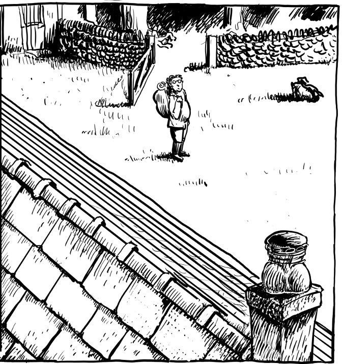
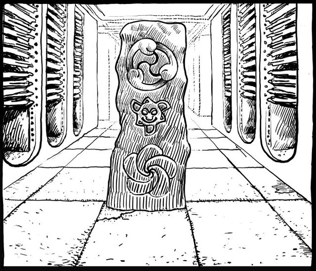
But there are many small things that can create depth. I have been teaching painting, and one of the things that was hardest to understand for the students was how differences can create depth - mostly line width, light and darkness and cold/warm colours- and how the they can be reversed. Light in the foreground and dark in the background, but also the complete opposite. The human eye understand many things in contrasts. Below you can see an examples.
From image sources
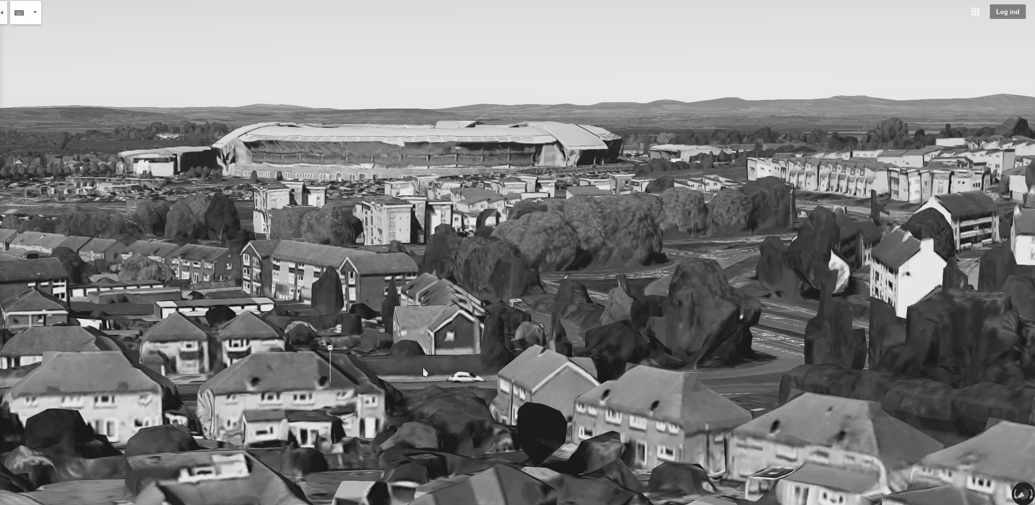
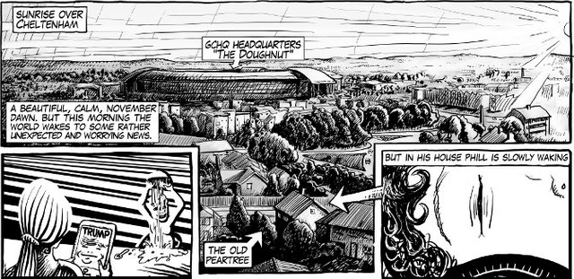
Another much easier approach is to simply take a photo and put is on the light-table or into the computer. There is not that much to be said about it, but instead I can reveal a simple but clever trick, namely using the fabulous Google Maps to find specific aerial views.
3D graphics
The third way of doing it is to use models, and with the invention of 3d-graphics it is something that is becoming more popular. I have used it in the past, but not for the Phill from GCHQ-comic. So instead I have borrowed some screen-dumps and a traced image from @platonicsironic, a young comic-artist here on Steemit that you ought to check out.
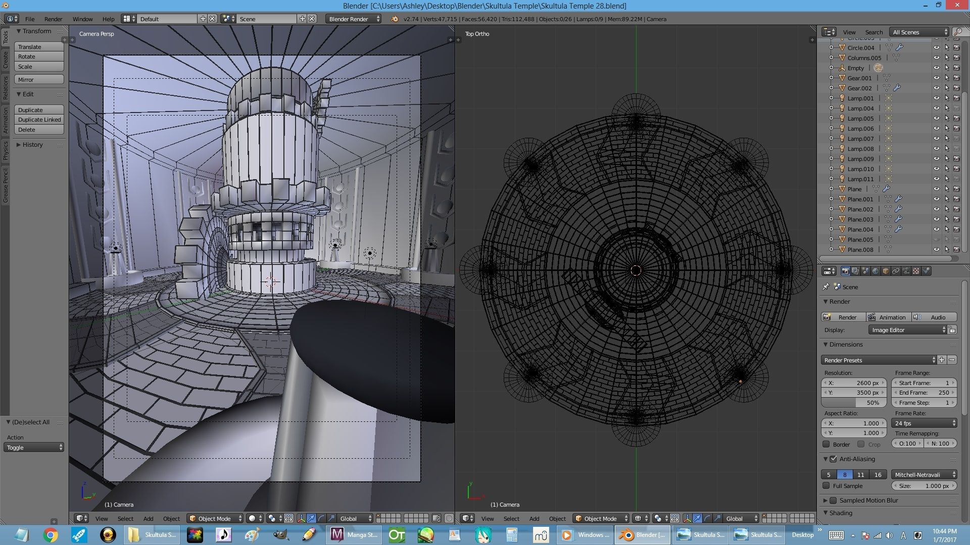

My experience with using this technique is that the simpler the geometry the better. Windows and other details should be added in free hand to give a less stiff look. So just using boxes and other simple geometry is more than enough, and it also makes the work-flow much faster.
Other uses for the background
It is important to show where the scene is taking place, but the backgrounds are of course used for many other things too. Not least giving the comic some atmosphere!


I have for this post lend images from the following sites:
http://culturebox.francetvinfo.fr/
http://cosmology.com (where you can discover is God is an alien!)
https://zothiqueelultimocontinente.wordpress.com
Wikipedia
http://www.altertuemliches.at
And thanks to @platonicsironic for letting me use the Blender-screenshot and the trace. Go check out the blog!


That was a fascinating look at some of the details you take into account.
I doubt I will ever draw but I loved learning more.
My son (10) struggles with perspective but your use of the image with the thick and thin line will demonstrate it quite well for him I hope.
Perspective is an art, and it contains some many difficult things- I hope he keeps working on it -it's a fantastic tool and the more work you put into creativity the more you will get back later! Good luck to him.
Thanks a lot for this great post! I was waiting so long for this, and now I finally missed it by two days...
Anyways, I guess, it doesn't really matter, cause the value of your 'making-of' posts is just timeless. (I'm hoping that steemit will allow to vote for posts after the 7 day period one day).
I'm not sure, what you think about it, but maybe I should also translate your 'making-of' series into german to make it available to the german Phill-fans as well?
If you like to you are more than welcome to translate it! I am happy for any of the translations being made. It all adds to the interest for the comic.
Great, thanks! It's also a good way to fill the gap until the next page of Phill is published ;-)
Yes, I am still so fucking weak - but I am slowly thinking of the next pages...
I hope you will recharge soon and I just put the first making-of online!
Resteemed @katharsisdrill! This is such an amazing post. One of the most personally relevant blogs I've come across on Steemit since I joined. I'm a comic book artist and I struggle with backgrounds all the time.
Thanks! I come from painting and to me the biggest problem was making the characters look consistent :)
We really should try to collect all the comic and illustrator resources here on Steemit so we could support each other better. too many is not really getting enough in my opinion. I have been ill for the last 3 month and probably will be for some month to come so I haven't really had the strength. But it is on my todo-list.
Great post. I've been reading Making Comics by Scott McCloud (guy is a genius) and he is convining me of the importance of spending time on backgrounds. Although, he prefers to call them environments, encouraging a shift in thinking away from just 'the stuff behind your character', and towards the creation of a believable world that they inhabit. This is the world we need to be able to capture in a convincing way to draw the reader in, create mood, give necessary story information, and so on. That said, I'm like 99% of artists in that I struggle with finding the enthusiasm for environnments and I've found that using cool reference material, particularly well composed shots from movies and photographs, as a great way to start fleshing out the world around the characters.
I had actually in an earlier version of the post called it environments half of the times (must be visible in the blockchain somewhere), but I changed it to be consistent.
I have never read McClouds book, but I love reading poetics - there is always something to be gained by confronting yourself with the ideas of colleagues.
I guess that I must be the 1% then because I love making the big environmental drawing - but I have been a painter for the most of my life too. I have had a very steep learning curve with the Phill comic, and the way I have chosen to do it makes it necessary to have as much story as possible on each page. When you just post one page a week it needs to have the story moving on each page - so I never really got to do the slow paced manga-style pages - but they are on my todo-list - Sadly I am in the middle of my first action packed sequence so it probably has to wait a bit.
Whoo, wow, that's a lot of info!
The part about not having character studies with complex backgrounds - this is especially good to note, because in the peice that you referenced from me (THANK YOU SO MUCH, YOU'RE TOO KIND-- ; w ;), I actually struggled with the shading and contrast for a while, because the character kept looking as though he was swallowed up by the background LOL.
Like, you're supposed to notice the character right away? But in some of the versions he seemed to just fade into the cogs huhu <x3;;
Also I don't care if tracing photos is cheating, drawing a city by hand sucks LOL!
Had to do that once because I was working for somebody else, and they were pretty impatient about the pages, despite wanting lots of panels and detailed backgrounds.
Kept trying to explain that it would go way faster if he'd give me a break from drawing pages to do a 3D reference, but he just carried on about how we had a contract, I'm like dude I know, but I'm spending so much time on the backgrounds the characters look horrible gfchfvhh
We had a lot of communication problems, and I wound up getting replaced :v lol.
I got a lot better at drawing backgrounds because of it, though! XD
((Thanks again for featuring me!! That's just so awesome of you sffxhhdDFCXFfvdc I'm gonna geek out about it to my friends! XDDD
I think that clarity is very important. I always look for ways to do complex things without sacrificing that. It's not always I succeed sadly :) And I use every way of cheating if I can, but of course if you are forced to do backgrounds by an evil tyrant with a contract I can see the predicament. You always learn from such stressful situations.
And no problem with trying to promote your things - it was a good example and I think that artists should help each other (normally we all fight and some uncreative bastard scores all the money.)
So were there any hobbits or was it just an evil plot to attract Tolkien fans?
It was an evil plot to make you rad the comic: http://phillfromgchq.co.uk/ Sadly I have no Bulgarian translation yet...
Well, I do understand a bit of English, having studying at an American University :) Btw, love the Morris J drawing - they used to know how to make interesting car designs back then!
I kind of suspected that you were not foreign to English :) And I like the Morris too - had to come up with something British that could match the VW-camper of the Freak-brothers.
Richard Corben style, some of them
Yes, maybe, I hadn't thought of it, but I do like Corben!
Very good post :) I like B&W ... And this story here is good :)
Thank you very much!
you are welcome :)
love this :)
This is awesome.
Up-up and shared