Making of a comic - style & stalagmites


One of the most important decisions when you get going on a large continuous project is the decision of which style you are going to use. But for most artists it does not seem to be that relevant at all, because they intuitively already have a style that they groom and refine. So the many small decisions an artist make are not necessarily that conscious. The sense of style can be likened to the sense of fashion were most people in a second can tell if another person is hot or crap. Not so with me. I sometimes overlook when people have gone from long to short hair.


In my artistic career it has been a recurring issue. Art dealers have pulled out their hair, art collectors have been alienated, and art historians have been confused. This is one of the reasons I like to be an anonymous artist on the internet. I can isolate one part of myself. Katharsisdrill is for example an aspect of me, that is freely embracing kitsch, comic, and commercial crap. But because of this I have developed a systematic sense for creating a project based on predefined rules.
Underground
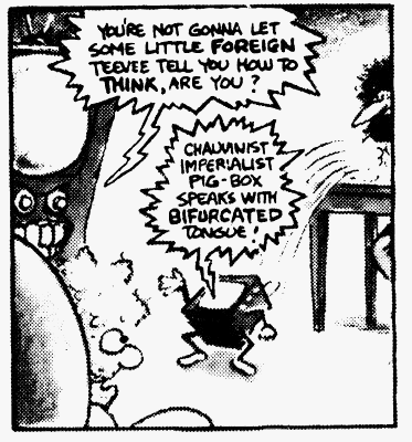
When I originally started my comic-project, one of the main goals was not to be too rigid on the rules. I have an almost pathological perfectionism, and therefore (I guess) I have always tried to make unfinished or cryptic or over-simplistic works (There are many other complicated reasons for this, but... hey). So the first three pages of Phill from GCHQ was just an experiment based almost solely on me reading Gilbert Sheltons The Fabulous Furry Freak Brothers.

One of the things that fascinated me in Shelton's comics was the lack of a stringent way of drawing. Shelton uses all manner of cross-hatching, but sometimes he uses grey-tones, and he even has some photo mixed op in selected episodes. Reading Freak Brothers gave me a feel of freedom, and from that feeling I just started without much consideration.
The rules
Still I made the following rules:
- The pages shall be readable both as a vertical printed page and on the horizontal computer-screen
- The pages shall be in 256 colour grey-scale
- Everything shall be hand-drawn (except the text) including the frames.
- The pages shall not be overly clean. Erasing by hand should be preferred to erasing by mask.
- In general each page shall be consistent in it's style like a work on it's own
- The pages should rather be too complicated than too simple.
For more about 1 - 2 read the first instalment of this series here: Making of a comic - Format and colour
Rules number 3 and 4 was about countering some of the things I have seen in computer graphics. The use of computer effects and spiffy tools sometimes gives a overly clean, and sometimes an inattentive expression. Of course there is also some coquetry involved. You can compare to all the young musicians reinventing acoustic.
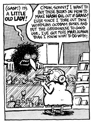
The two last rules (5 and 6) are about the serialised nature of the comic. Right now I publish a new page every Thursday, and my readers should have more than just a nice drawing while they wait for next week's episode. I prefer to have many details, hidden clues, and strange security advices.
Had it been another project I might have gone the exact opposite way.


I made some extra rules for both texting and storytelling, but I will go over these separately in a later post.
This is the second post in a series about the creation of the comic about Phill from GCHQ.
You can read the first post here:

Thank you so much!
Your post has so much value for me! As I'm trying to figure out which steps and considerations will lead to the next level, your postings about your 'making of' are a real goldmine.
I'm glad they can be of use. I'll have some time tomorrow for your "package" :)
Awesome ideas. Keep it up!
Thanks :)
Nice post @katharsisdrill, thank you for sharing your style guide/rules and behind the scenes material.
Thanks!
It's interesting to me that you are consciously choosing a style to draw your comic on Steemit. And I agree with you said, computer tools add an inhuman feel to our art whenever we use them. This aspect in itself it's not a bad thing, I believe, if that is what we want to create. However it's important to have this knowledge so we can make the decision what kind of drawing we want to create.
Thank you for sharing me this link :).