Making of a comic - Format and colour


I do have quite a few series running, I know, but here's another one about how I make my comic about Phill from GCHQ as I thought that it could be interesting to know about design decisions, research, storytelling etc. etc.
So in this first instalment I want to write about the first basic decisions you have to make when you initiate a comic.
Formating
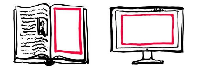
A very important thing to consider is the format. You have to choose height and width according to the media you want to present the comic in. For printed comics the upright portrait format is definitely the best as it give more stability (which is the reason it is used for the majority of books.) Traditional screens for TV and computers on the other hand have the landscape format making them more apt for movie viewing.

So when making a webcomic the landscape format is the obvious choice. You can see it used her in the brilliant, but very NSFW comic Oglaf.
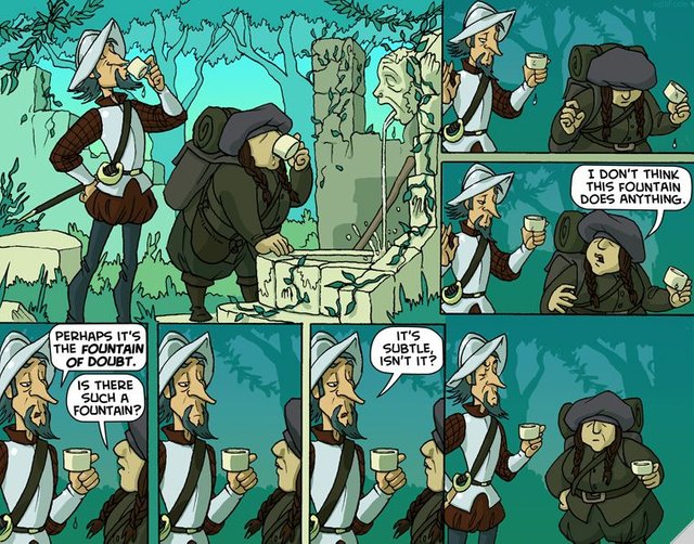
If you, on the other hand, plans to make it a printed book later you have a hard decision ahead of you.
Colours
Web based comics are always shown on a colour-screen so whether to use greyscale or colour does not really matter. The choise therefore mostly depends on aesthetic decision. When printing you can still save a bit of money by making it in black and white, but in today's automated print-shops print in black/white is often just an annoyance as everything is printed in the standardised CMYK. You will probably still be able to find a smaller off-set print-shop that can make you a good deal on a black-white print in a small edition, but it is not a priority as it was before.
In the past it did mean quite a lot, and many comics were made in black and white simply to save money.
The decisions taken for Phill from GCHQ
For My comic, Phill from GCHQ I choose to use only black and white simply as stylish decision mirroring my works of late, which have been without colour, and as an hommage to the above mentioned comics.
As for the format I have chosen the upright portrait, even though it is a webcomic. The reason for this is that I wanted the freedom to create more complex page structures, and that I probably will have it printed at some point (when it is finished for example :) in the classic European comic format known from TinTin & Spirou et Fantasio.
I have though made some restrictions on my use of the page as you can see in the template below.
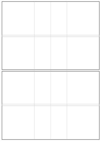
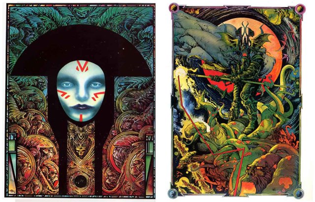
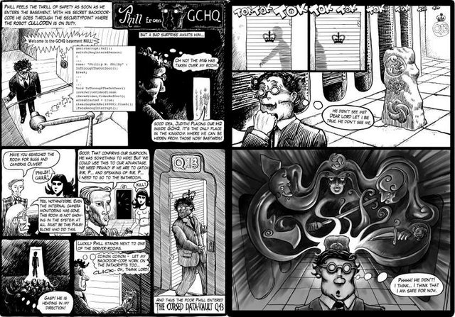
I will only let a frame cover two rows (and in general the two in the top and the two in the bottom.) This way it will be possible to see the connected frames as two landscape formats that can be scrolled between. A full page composition like these two wonderfully crazy pages by Philippe Druillet is therefore out of the question.
You can see an example of me using this principle in the two pages below. There's an upper and a lower block that in reality are two landscape formats.
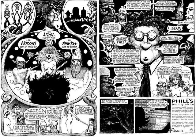
And here you can see two pages where I have been playing a bit around, placing the two connected frames in the middle.
That's it for now. Please consider supporting me on Patreon and remember to share the comic on other social media.


Great post, I hope more in depth look at the comic pages posts end up being made.
I got an interesting link that your post reminded me of from another Steemit user just posted last month https://steemit.com/comics/@bryan-imhoff/webcomics-steemit-cryptocurrency-blockchain-and-cats
I will at least keep this up. Right now I am using most of my time on Phill, so it does feel quite natural, and I will have all images right at hand.
And thanks for the link - I actually missed that post.
Great article! I love the insight into your formatting. I'm amazed when artists point out the grid rules they've been following all along that I've not noticed. However I think that's the sign of a good layout. When it serves the story invisibly, that's something to be commended.
I can't remember who said it, but I recall an artist remarking that with comics, the more you learn, the slower you work. Rather than speeding up production, learning more about the form leads to every page becoming a new puzzle of layouts, pacing and design. Things a novice may not even consider become painstaking endeavors. I think only the rarest artists, like Eisner or Kirby, either push through that wall or have such a natural aptitude that it looks effortless.
And a great comment! thank you :)
It might be true that when you start to consider all the complexities it might slow you down. I think I will get to this in one of these making of a comic-posts. The whole puzzle metaphor is well picked.
Such an interesting read and you have amazing talent! My skills end at stick figures lol. Great post!
Thanks! Some talent maybe and lots of work :) I just read your post on altruism, and I always saw this in terms of frugality, making things grow... could be a kind word, or a well kept garden, or a wild growing garden for the neighbours children to play in - but also all kinds of work. When people like what they do and can see that it actually transcends their own needs. Your skills is obviously writing with a little introspection and a smattering of rant. I grows on you :)
Very interesting to read the thought process behind landscape or portrait compositions. Something I hadn't given much thought too, but I will now!
I'm glad you could use it. With all the time we spend before a screen, it is definitely worth to look at how you best accommodate the people who shall look at your creations. It is also worth noticing that many web-pages, Steemit included, actually have a centred column that often works well with the portrait composition.
Super advice, thank you.