Making of a comic - text & lettering

Introduction
These last days I have people asking me, if they could translate my comic about Phill from GCHQ, a thing that I am both thrilled and glad about. The honorable @shortcut has already finished page 1 and page 2 of the German translation.
So this time I will go into quite some details on how I have lettered Phill and how you can go about it if you want to translate it into other languages. I guess it will also be possible for other cartoonist to use some of my methods or at least consider them. As Phill from GCHQ is only made with open source software, the technicalities will revolve around the vector application Inkscape and the drawing application Krita.

Hand drawn lettering vs. computer lettering
An often overlooked aspect of comics is the text, but as soon as you begin making one it shows how important the decisions concerning text are. The traditional way, and the most valued, is the hand lettered comic. Before computers was mainstream the only way to do it was by hand, and when translating a comic you needed a hand letterer as well as a translator.
Today most comics are lettered on computer, as the process i speeded up considerably, making it possible for the author to alter text on the fly, the translator to do the layout himself and much more. For Phill I also choose computer-lettering as I have never learned the art of lettering (I plan to learn it though).
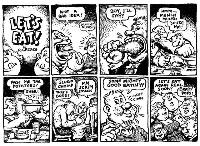
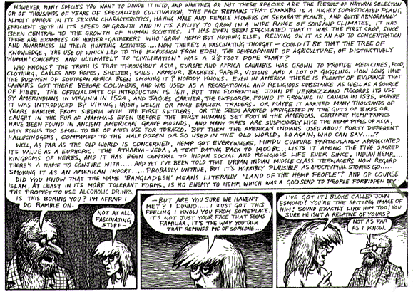
Below you can compare the handlettering of Robert Crumb
To the computer lettering of webcomic creator Minna Sundberg
The handlettering is much more expressive, while the computer lettering of Minna Sundberg seems stiff. Sundberg also uses the good disciplined large text-bubbles (that is a dream for translators), while Crumb makes sure he block out the text-bubble space. If this were to be translated into Greenlandish with it's very long words, it could be a problem.
Notice also that Crumb uses the traditional All caps, while Sundberg uses normal text with lower-case letters.
Text density and readability
The basic function of text is to be readable, but as in all art basic function is not always in the artists interest. When I started working on Phill from GCHQ I was inspired by the ragtag crowd of so called Underground cartoonists, and style, readability, and decency was not the primary concern of these artists. Instead they cultivated an art where digressions, provocations, and limitlessness was the main thing. Below you can see a strip by British cartoonist Peter Loveday that not keep to any traditional comic-rules, especially not the one about being short and clear.
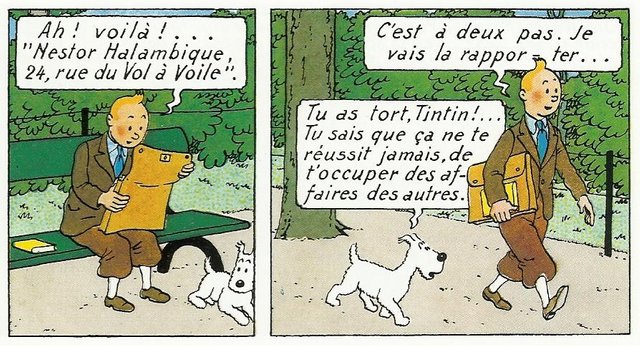
Try to compare to Tintin by the master of clean, Herge
So when lettering Phill I have sometimes made the text clutter a bit and made very text-heavy pages. Nothing near Peter Loveday, though.
When lettering becomes drawing
Hand lettering gives a wide range of possibilities for the cartoonist, and equally a wide range of headaches for the one lettering to another language. Below is one of the most blatant examples that I know of. First you see a page from Moebius's Le Garage hermétique, and below the heroic effort of Tore Bahnson in the Danish version.

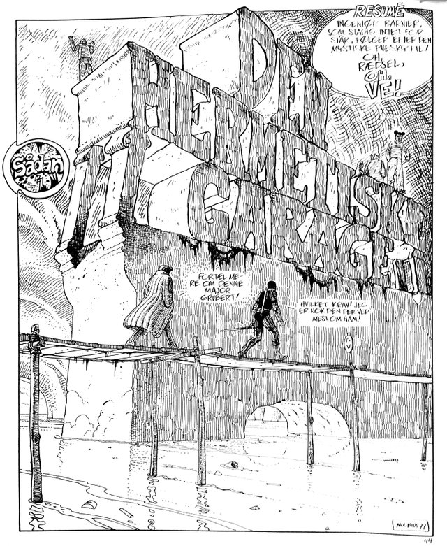
As you can see the title is here a part of the composition, and Tore had the choice either to let i be in French (which I probably would have preferred), or to make a whole new upper part. This suddenly makes you a part of the drawing process!
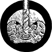
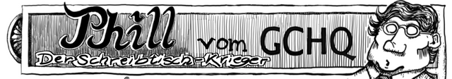
As for translating Phill from GCHQ there is a lot of titles like the one above, although not as dominating, and usually in its own frame. You can see some examples below, and of course on the Phill from GCHQ-website, itself.
Programs and fonts
Phill from GCHQ is made with free open source applications that run on all major platforms (Linux, Windows, and Apple), so everybody should be able to get going without any investments. There is also some special fonts, that I use and will supply to translators. It is first and foremost the Laffayette Comic Pro
The most important program, when it comes to lettering and translation, is Inkscape. For the translators of Phill I will send them the Inkscape files which consists of two layers. One with the image and one with the editable text.


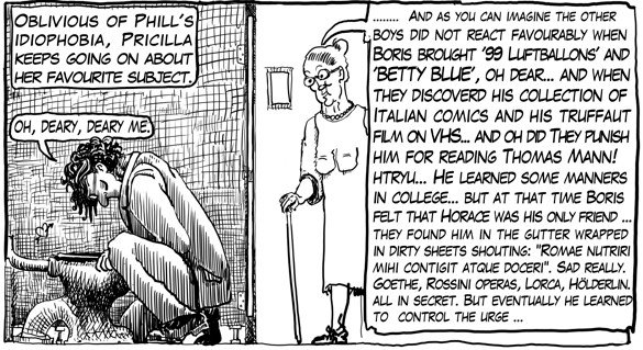
By choosing the text-tool you will be able to edit the text directly. I try to keep the text between 8 to 9 points with 9 being the "ideal" size, but I have discovered that by varying the size, the text get a more hand-drawn feel, and of course it also makes it easier to fit in the text in the bubbles. I also makes extensive use of spacing and kerning. (see here for an explanation:) going as far as -0.6 sometimes. Below you can see an example where I have deliberately made the text smaller and smaller as to imitate a fade out, while Phill is engulfed by his anxiety attack.
Inkscape overview for the translators

Krita and editing titles, sound-words and the like.
Inspired by the style of Moebius, Robert crumb and Gilbert shelton I do draw the title quite often on the pages. I have worked a lot with lettering (just not comic lettering) and do this in free hand. Below you can see two examples.
When it comes to translate these you are in the same situation as Tore Bahnson with the Hermetic Garage. Either you let it be or you redraw. As the whole comic is made in the splendid, free drawing-application Krita you could use that, but photoshop would be equally good, if that is what you are familiar with.
Sound words will mostly be able to just be left like they are as the general sound of the letters might somehow work in multible languages... I looked a little bit on the Welsh language and am not sure it works in all circumstances :)
Hand lettering - the real deal
Last is an example of a professional letterer from New Zeeland giving a demonstration of comic hand lettering.
And... a big thanks to @shortcut who already jumped into the fray, and @vcelier who consider doing the translation in French
I have used images from my own comic, my own copy of Moebius' Jerry Cornelius' Hermetiske Garage, the websites Rightearleft & Stendekk, and the works of Minna Sundberg
very good information, thanks for share
Thanks for this very interesting post again. I'm so excited to be part of this and I hope many translators will follow!
Here is a short preview of my approach of the header from page 3. It's far from being perfect, but I had so much fun playing around with krita, that I hope you don't mind.
I'm glad that you just jump into it. That's how things are getting done, adn great that you even work on the drawn text - to me that is just really a bonus.
nice post. I did a graphic novel some time ago and had to choose between handmade lettering and fonts. I chose a font, but in the end it was not a good choice ^^
No, handmade is always the most beautiful. I'm still glad I did not pursue handlettering in this project. Especially now people are beginning to translate the pages.
Great post UPvote / Resteemed
Thanks :)
Very interesting. Information that I will share!
@kus-knee (The Old Dog)
Thank you!