Trial & Error ― Painting With Oils #WIP
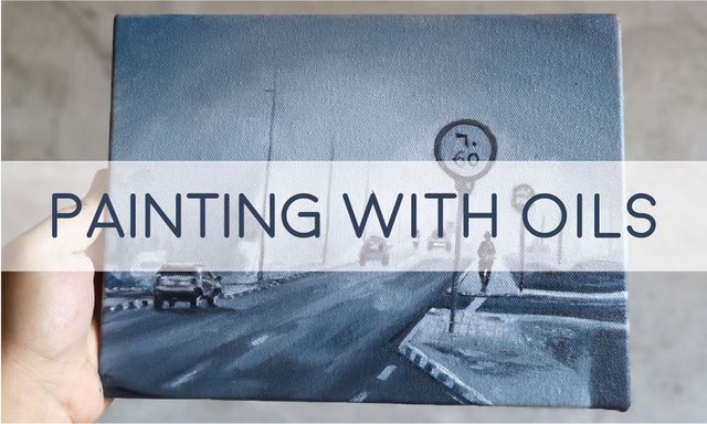 A WORK IN PROGRESS
Hello there!
It is Sunday and I am having the best feeling in the world ― painting with oils! If I remember correctly, the last time I used oil is in 2015, just before I went to Dubai. It was a still life I painted from life which I later gave to my cousin @maryelsalatan.
For this post, I will (again) highlight the mistakes I made throughout the process.
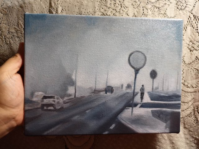
If you are curious about the reference, you can click this link. It is my most favorite photograph and memory of Dubai, taken in early morning of December 2016.

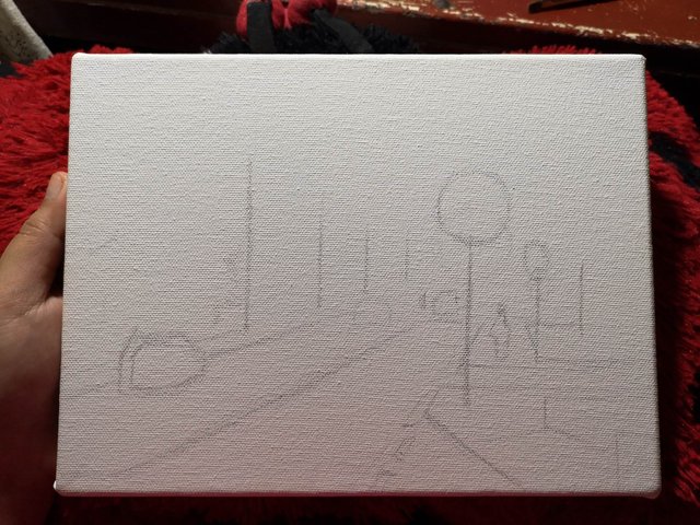
When faced with a black canvas, my first initial reaction is, "How will I start?" I am one of those people who still get intimidated by a white surface, probably because I still lack the knowledge and skill of an artist most professionals have from years of practice and training.
My favorite solution? Underpainting.
Technically, underpainting is often a monochromatic representation of your values. It is an initial layer of paint which serves as your foundation as you subsequently add more layers of paint.
If you want to know more about it, kindly read the links below:
- "Dead Coloring," or Underpainting
- What Color is Your Underpainting? The Monochromatic and Two-Color Methods
- Underpainting: Why You Need to Do It
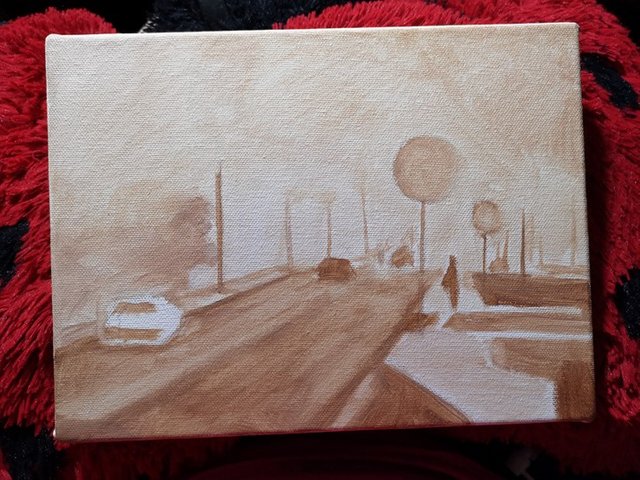
Now, what I am familiar of is cool and warm underpaintings which is basically values of gray and brown. If you saw my reference photo, it is a foggy morning which shouts cool a lot because of how I edited it, and it clearly represent the feeling I had back in that morning.
Unfortunately, your girl got too excited and started doing the underpainting using raw umber and titanium white ― a warm underpainting. For the record, it is still okay to use that, but if your style is all about representing the best atmospheric aspect of a painting, then it is best to know which underpainting to use and work from that.
Please be guided that I used oil over acrylic in this painting mainly because I want to paint right away as soon as the underpainting dries, and acrylic is perfect for that.
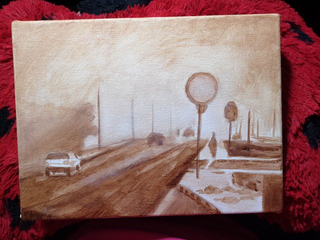
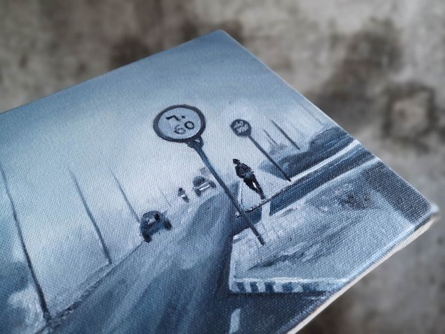
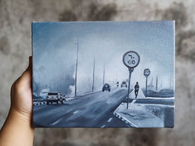
Another mistake I hated with all my being is wrong proportion. This has always been my problem as I get way too impatient with drawing. The result? Unflattering perspective that I had to correct in my first layer of paint.

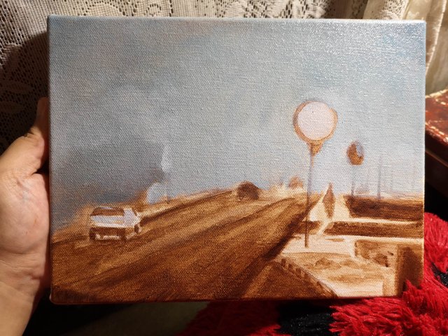
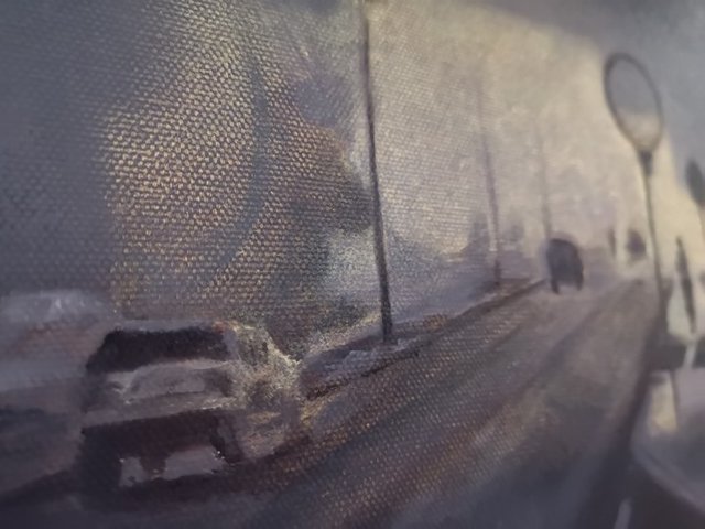
COLORS USED: Pebeo Titanium White, Winsor & Newton Phthalo Blue, and Ivory Black.
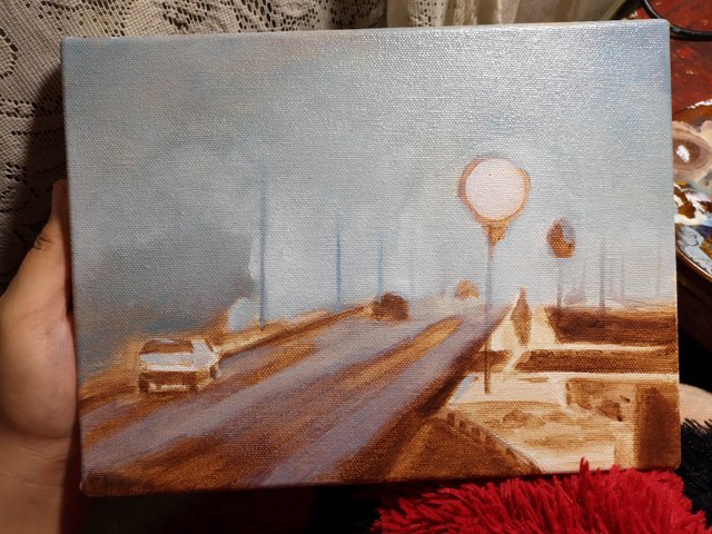
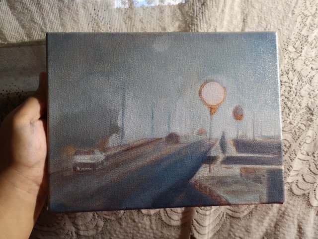
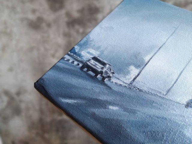
I started painting the background which is just a gradient of cool gray, the center being the lightest. I added a bit of medium to the paint for it to glide on smoothly, making the transition as seamless as possible. Followed by the foreground in which I just splatter deeper shades of gray using the underpainting as guide for my values. Then I proceeded painting the subjects which are cars, road signage, and a person.
I admit getting way too ahead, realizing mistakes a little too late. I spent a good 3 hours just correcting my perspective, proportion, and values; and yet they still look warped and, uhm, ugly. This realization almost made me stop, but again, I remember the words of a good friend, he said, "done is better than perfect."
I continued with detailing despite the imperfection. After adjusting it to my heart's content, I took the painting out to dry so I can work on the second layer of colors later in the evening. I believe it'll dry quite quickly because I made sure I was doing the fat over lean principle in oil painting.
What do you guys think about the painting? Help mes by commenting down below. I am always open for any constructive criticism, specially that I am only a self-taught artist.
Also, please be reminded that my thoughts are purely based on my observations and early learning in painting, and in art in general. If I have given false belief, please do enlighten me.
Cheers!

Click this link to join our discord channel.

This is such a beautiful WIP~ I think you captured the feel of the photograph, a kind of mixture between the loneliness of the road and that time in the early morning before everyone really got going... the watery effect on the sidewalk is also very nicely done <3
i await for the finished painting \o/
Foggy Dubai is the most beautiful, believe me. Maybe because it's a very different feel in the mountains. :) Thank you, @veryspider! Hopefully I can continue it today!
You've already captured the mood of the piece so beautifully. I'm so interested to see what your next layer will be. I always want to stop when I'm working before I'm finished as I don't quite know where to go with it next! Following you and looking forward to seeing more of your work. E x
Hey! Thanks a lot, @eveningart! I will try to correct very visible mistakes in my next layer, so I am only hoping for the best, lol. And truest, that's a technique I do as well. Stopping and starting a new one, and then coming back to finish an old painting with new eyes. ✨
That's a very good idea- 'new eyes' - it's always a week or two after stopping something that I begin to see the changes I should have made. Have fun with it, E x
In general I think your perspective is good..
The first problem you ran into with this is that your trying to fit a scene (original picture from link posted) that almost appears to be a 16:9 ratio onto an 8x10 canvas. Your perspective would have to accommodate or be adjust for this. To further frustrate you, where you plotted your horizon line is a bit high in my opinion.. that is if you are trying to duplicate what your seeing. It's just fine where it is now, the road would just have to be a bit wider at the bottom of the painting.
Nice thing about art is that there aren't any "mistakes", but rather "artistic representations". lol. I feel you on this. I get through a lot of work laying stuff out and painting it in and then BAM!!! I see the flaw (in my eyes) that ruins it for me. Uggggg...
Looking good so far though. I would make the vehicle in the foreground about the same height as the person on the right hand side of the painting in order to help correct that proportion issue you referenced.
Looking forward to seeing where you take this!
Obviously my opinion is just that. I don't have any formal training either, so my thoughts have no backing to them other than from my own trials and errors. Take them for what they are worth. I am drawn to foggy/mist scenes like this one. I think you nailed that thus far.
Yay! Thanks for these, @bdmillergallery. Let me point out stuff in bullet because I'm kinda distracted now, lol.
Thank you so much! I appreciate feedbacks a lot. ✨ See you around!
I cant help you with the critisism here, as I am (like you) a self taught artist with absolutely no education and knowledge about best used techniques.. I do find your painting amazing. So just keep doing what you're doing :)
Practice is everything to us self taught ones eh? Thank you, @anouk.nox! And allow me to add, I have practiced Bargue Drawing, and it helped me tremendously with my values and proportion in portraiture and figure drawing. You can check out THE DA VINCI INITIATIVE in YouTube. They have a free tutorial that's basically everything you need to know to start Bargue Drawing. :) I hope it'll help you as much as what it did to me. Cheers!
I am amazed by your work. Do more! <3
Appreciate this, @michellpiala! Thank you! ✨
Please upvote: https://steemit.com/free/@bible.com/4qcr2i
This post was shared in the Curation Collective Discord community for curators, and upvoted and resteemed by the @c-squared community account after manual review.
Thank you again, @c-squared!