Further Improvement over Styling and Formatting in Steemit

Styling and formatting features on Steemit has improved a lot over the last few months (at least since I joined in August 2017). However, it's still too basic and there are hundreds of other editing and styling features that would make posting more exciting, reading more interesting and Steeming more encouraging.
Here are some suggestions:
1.) Text Color - there's a very good reason why black and white TVs are no longer in circulation. The best presentations, marketing ads and best selling magazines make use of the good color shades and combinations. Let's learn from the mistake of the giants before us like Henry Ford who refused to use different colors for Ford cars other than black until it was too late.
2.) Shapes & Lines - allowing to insert basic shapes and lines would help tremendously in improving posts aesthetics. It may not be used as often as text but people won't start getting creative unless features like these are made available.

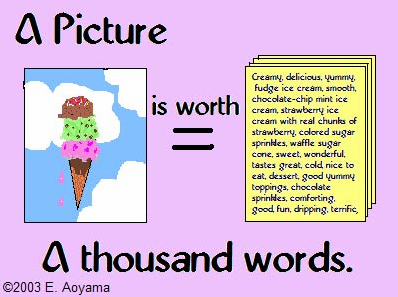
3.) Icons and emoticons - This one deserves a separate mention owing to the fact that the younger generations use more and more of them in their daily conversations including blogs and posts. The cliche "a picture is worth a thousand words" is still true to this day.
4.) Inline Text Resizing & Formating - Currently, you can adjust the size of the text by adding 1 to 4 "#" character before the text. This, however, adjusts the text size of the whole paragraph and not just the selected words or phrase you want to highlight. Being able to bold, underline, change the color or size of a word or phrase within a paragraph would be very useful.
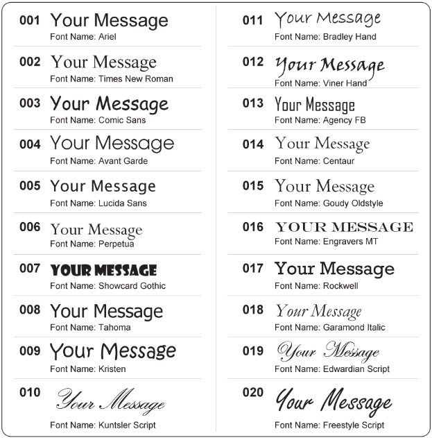
5.) Text Style & Fonts - Having the ability to choose the style/font that resonates with the writer is very important. Sure, we don't need hundreds of available styles as we are not in calligraphy class. About 10 to 15 font style should do the trick.

6.) Background color & design - I'm a little bit hesitant to mention this since I saw work colleagues using awful background color & design in their outlook email messages. But when cautiously and judiciously applied, it makes writing more enjoyable and seductive.
Writing is an Art. And when it comes to art, it's important not to hide the madness. - Atticus.
P.S. I think the above quote would look nicer with a different font and text color. Don't you think so?
If I missed anything, pleas chime in!
See Also Previous Posts:
50+ SITES with FREE PHOTOS for your Steemit POSTS
Awesome SITES with FREE online COURSES
TIPS in FORMATTING and STYLING your POST on STEEMIT
Digital Currency Past Present Future – Lessons from the Past
Digital Currency Past Present Future - Companies that Accept Bitcoin as Payment
Digital Currency Past Present Future - Bitcoin is on the RUN. Next Stop $8,500
THINK OTHERS WILL LIKE IT - RESTEEM
SOMETHING TO ADD - COMMENT
WANT TO SEE MORE - FOLLOW.
This Post has Resteemd and upvoted by Steemit Viral Good Luck !
Resteemed by @resteembot! Good Luck!
Curious?
The @resteembot's introduction post
The @reblogger's introduction post
Get more from @resteembot with the #resteembotsentme initiative
Check out the great posts I already resteemed.
Resteemed by @resteembot! Good Luck!
Curious?
The @resteembot's introduction post
The @reblogger's introduction post
Get more from @resteembot with the #resteembotsentme initiative
Check out the great posts I already resteemed.
This wonderful post has received a bellyrub 3.28 % upvote from @bellyrub. Please make sure to vote for my pops as a witness @zeartul,Here
This post has received a 0.76 % upvote from @buildawhale thanks to: @sandalphon. Send at least 1 SBD to @buildawhale with a post link in the memo field for a portion of the next vote.
To support our daily curation initiative, please vote on my owner, @themarkymark, as a Steem Witness
post was resteemed by @wayforhappiness