Kill Time At Work With Recreational Math: Make Your Own Bell Curve
This is the second in my series of killing time at work using math (here is my first).
There are a few prerequisites for this post:
- You like recreational math.
- You work at a computer and have access to Microsoft Excel.
- You are bored out of your tree.
- You don't want to get caught slacking off.
In this post I am going to show how you can create a Bell Curve from fundamental statistical principles.
The Bell Curve equation has this form (taken from Wikipedia):

but we are not going to simply plot this equation. That would be too easy and boring and it would simply not kill enough time.
Summation of Many Random Events
At the heart of every bell curve that you find out there will be at least one random function buried inside the process that has made the thing that you are measuring.
So let's get started.
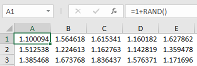
Create this equation which is some small deterministic bias plus some random value. The bias can be any size and you can multiply or divide your random value by whatever you want. In this case the bias is just 1 and the multiplier is also just 1.

Copy this equation over across a row. In my case I have 25 cells in the row (up to cell AX).

Now sum them up in the 26th column (cell AY). This simulates the addition of random events effect.
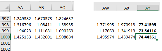
Copy this entire row over a large number of rows. In my case I did 1000 rows. This should give me a nice statistical sample.
We need to bin the values in column AY to make a statistical distribution.
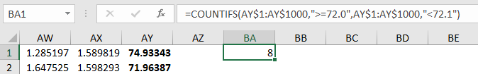
So here is the clever bit. Use the COUNTIFS() function to count up how many cells are between two values. In this case I am making it examine the AY column from row 1 to row 1000 and I am counting everything between 72.0 and 72.1.

Actually the above equation wasn't that clever. In it I had to type in the range for each cell. In this improved equation I reference the two cells to the right and use their values as my range (columns BB and BC).
This way I can increment the values in columns BB and BC however I want and not have to retype the COUNTIFS equation over and over again.
Cells BA, BB and BC need to be copied down over a moderate number of columns to provide your statistical binning data column. You need to bracket the entire range of values that you find in column AY.
Plotting
I just want to plot BB as the range on the x-axis and the the value in BA as the probability on the y-axis. To make this easy I just copy them over to new columns like this (BB is mirrored over to BE and BA is mirrored over to BF).

It just makes it easier for plotting that is all.
Plot x (column BE) against y (column BF) and here is what I get:

Not bad for a first try. I think though that my binning is too fine so I will coarsen it up from increments of 0.10 to increments of 0.25. Like this:


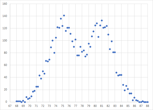
That's a little better. Now I need to add more rows to make it look a little cleaner and more like a Bell Curve. Let's see what 5000 rows will do.

I added 4000 more rows of 1 + RAND() and then I had to adjust my COUNTIFS function parameters (see above). This is the plot that I now get:

That looks much cleaner and more like a theoretical Bell Curve.
Convolution of Two Bell Curves
It's not yet 5:00 pm, that sucks. Okay, let's kill even more time.
The Bell Curve above could be the height of 5000 women measured out and plotted.
What would happen if you instead took 2500 women and 2500 men?
This is how I would simulate that.

Step 1: I would add a new column in A with just a random function in it. This will simulate male versus female. If the value is less than 0.5 it represents a female, if the value is greater than or equal to 0.5 it will represent a male.

Step 2: Now I have to modify the original 1 + RAND() function to something that checks the gender column (column A).
In this case I use the IF() function. If the value in column A is less than 0.5 then use 1 + RAND(). If the value in column A is greater than or equal to 0.5 then use 1.12 + RAND() (I tuned that 1.12 value to make my graph look 'pretty', that's all).
I copied that cell over the 25 columns and 5000 rows and this is what I get:
Not bad. I now have what is two Bell Curves that overlap each other which is what you would expect when there are two populations in the sample that you are measuring.

Closing Words
There is actually a serious mathematical side to this post. You are learning how random processes build a statistical distribution that you might find in the real world and you are creating another one that simulates the effects of combined populations. You are also learning some new Excel functions which is a good thing.
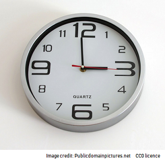
Well, at the very least I hope this helps you to kill time at work while looking productive until the minute hand hits 5:00 pm and you can bugger off to the pub.
Thank you for reading my post.
You may want to take a look at my STEM blogging style guide here.
You may also want to take a look at the Steemstem style guide here.
I like that recommendation ... Do not get caught lounging! Hahaha
If you are going to slack off be smart about it :)
Being A SteemStem Member
Nice work....i like the statistics but I as statistics student..i never come across this topic(how to cal.the range of bell and I also think the equation is exponential formula...
You really try because I learn something from it... Good work
In the Gaussian/normal distribution function formula, there is an exponential function.