INTRODUCTION TO CARTOGRAPHY - STATISTICAL SURFACE & POINT SYMBOLS
How is everything going today? Hope you are having a wonderful day. After a long time of long hours of work and continuous pressure, thankfully I found some free time so I took the time to visit the beach in order to relax a bit and refresh my spirit. Everything is fine as far as I'm concerned, I'm only worried about my mother as she has to undergo surgery. It's not a big deal though and hopefully everything will be fine, however that is another factor adding some psychological pressure to my already exhausted mind. I'm here to blog about Cartography though, so I won't waste your time. Let's get this started.
As promised in a previous Cartography post regarding the problems and obstacles Cartographers have to face while symbolizing volumetric data, this is the eighteenteenth part of this Introduction to Cartography series. This time I'm taking the chance to keep sharing general information regarding the process of map symbolization by focusing on the process followed in order to represent the statistical surface with the utilization of point symbols . We will talk about dot maps and the way point symbols are utilized to create precise depictions of mainly volumetric data. We will also discuss various difficulties and problems that Cartographers often have to face, so stay focused!
For those of you who are visiting my blog for the first time, please always keep in mind that this is an introductory series about the scientific field of creating 2D depictions of our 3D world with accuracy; Cartography. This actually means that I will keep doing my best to provide general information in a simplified manner so that nobody gets bored to death while reading this blog. There's always a high chance of learning a thing or two by reading through this blog, so stay tuned!
Symbolization Problems
As explained in the previous parts of this Introduction to Cartography series, the process of map symbolization can be a very diffcult and complicated task that demands the availability of theoretical knowledge related to various scientific fields. In the previous part of this series we elaborated on the symbolization of volumetric data, which is a rather complicated process, and shared a few words about the definition of the Statistical Surface. After making an introduction about the symbolization of volumetric data, we emphasized on the fact that such data appears, and therefore needs to be represented, in all types of geometric data (point, linear, surface). That is the primary reason why all sorts of symbols (point, linear, surface) are utilized in the symbolization of volumetric data; one of the main factors that increase the difficulty of designing a statistical surface.
The symbolization problems addressed in this blog refer to specific theoretical occasions where the presence of volumetric data on a surface of particular dimensions has to be depicted with the utilization of point symbols. This is the definition of a Statistical Surface, as explained previously. The precise placement of dots has always been used as a technique of representing the values of spatial characteristics that refer to a particular surface of interest. Every dot is obviously used as a point symbol that represents a value, which in return represents the frequency of appearance of a specific spatial element in the statistical distribution being mapped. What? In other words, information provided on the map memo board gives numerical answers to the question: ''How possible is it to spot this specific spatial element somewhere in this map?'' Hope this makes a lot more sense to you.
We should always keep in mind that the point symbols mentioned in the previous paragraph refer to spatial characteristics that can be described by an ordinal or ratio scale, however there are also cases in which a nominal scale will do the job as well. Another significant detail is the fact that the symbols used in dot maps do not vary in size; only the number of dots placed in a surface unit changes and that is the only factor shaping the final visual outcome. And this is the very reason why dot maps are the perfect tools for Cartographers that are looking to depict the geographical characteristics of a particular statistical distribution. At the end of the day it is all about the way the human sensory system works. Let's take a deeper look and share some more information about dot maps.
Dot Maps
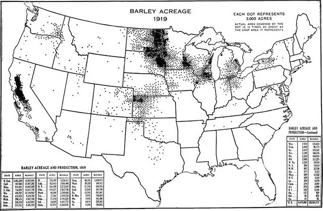
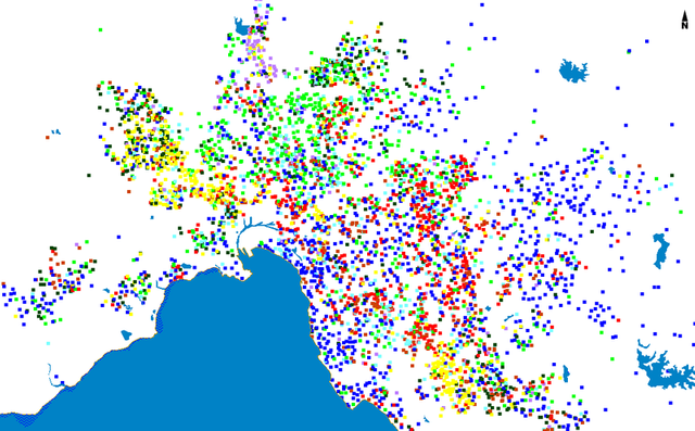
Dot maps are frequently used in order to assist Engineers in the creation of accurate representations of a specific geographical phenomenon or entity. Human population of an area of specific dimensions, land productivity, energy resources and major exports, land & undersea elevation, surface temperature and so on. However, with the utilization of some primary visual variables that we have talked about before in this series, such as hue and shape, Cartographers are often capable of creating dot maps that provide information regarding two or more different geographical phenomena and their spatial characteristics. That is thanks to our primary visual variables, each of which can be used to represent the value of a particular spatial characteristic of the geographical phenomena being mapped. It is safe to say that the utilization of multiple visual variables enables Cartographers to include several statistical distributions of geographical phenomena in the same projection.
All spatial data needed for the design and creation of a dot map are provided by measurements regarding the frequency of appearance of a spatial element on a surface of interest with known dimensions. Every single appearance of the spatial element being measured is represented by a single dot, however there are multiple cases in which Cartographers use a numerical character instead of a dot. This specific number is commonly referred to as the Unit Value of the (point symbol) dot it was used to replace. In order to come up with the proper number of dots that should be used in all surface units of the projection, Cartographers folow a simple method: the divide the number of appearances of a specific spatial element by the Unit Value of the dot. What? In other words, 6,000 square kilometers (km^2) of anything with a chosen value of 25 square kilometers (km^2) per dot would mean that we would have to use 240 dots in order to symbolize the production of whatever it was in the first place. Hope this helps.
The boundaries of reference that are frequently used in the creation of dot maps are the only entities with known geographical locations prior to the creation of the dot map. It might sound a little weird to you, however Cartographers have to make sure that the lines that make up the boundaries of the projection are filled with dots as well, in an attempt to create a rectangular frame that consists of linear elements that are mainly comprised of point symbols (dots). This happens due to the fact that there's a high chance that these lines will be depicted with white color in the end product and that is one of the most significant reasons why dot maps should only be used for statistical distributions with specific internal geometry.
Dot Size & Unit Value
In order to create an effective visual representation that enables the user to absorb information with efficiency, Cartographers have to choose the size of dots wisely, taking into consideration the map scale and the surface unit utilized. Different dot maps created with the utilization of the very same spatial data can provide entirely different visual outcomes depending on the dot size, which in return affects the number of dots that will be used across the entire map surface. If the dots used are very small, then our statistical distribution would seem rather sparse and therefore insignificant, whereas in case the dots used are very large, then our end product would convey the wrong message regarding the frequency of appearance of the particular spatial element studied and represented.
Again, blame it all on the way the human sensory system works, we are doing our best. Oh, I almost forgot, we should always keep in mind that the presence of large dots might affect the representation of other sorts of information negatively, due to the obvious fact that there's only so much space on a surface of finite dimensions. Efficiency regarding the symbolization process means that all the available space on the entire map surface has to be treated with respect; this means that we should always try to include as much information as possible so that the map remains readable. There's no reason to stuff more and more information in there and that's because all information will be wasted if the observer is confused.
The proper selection of the dot size is a very significant step, however the ability to spot and select the appropriate Unit Value of the dots is of equal significance. The total number of dots used on the entire map surface should be large enough to provide the observer and user with precise impressions, and small enough so that the statistical distribution being mapped can be described with the utilization of patterns. If you read between the lines, then you might realize that once again it all comes down to the way the human sensory system works. That is quite fair as far as I'm concerned, mainly because maps are not tools that were meant to be used only be scientifically qualified individuals; a good map should be easy to read by all citizens.
Thank you or your attention, that is all for now. We have now reached the end of the eighteenth part of this Introduction to Cartography series. Special thanks to all the wonderful people out there reading my posts. You guys give me the opportunity to make friends while I talk about what I love the most. Anyway, please do let me know in the comments below if you have any questions and I will provide answers. More stuff regarding my Introduction to Cartography & Geology series coming out within the next days, so stay tuned and follow me for more Engineering stuff!
PREVIOUS PARTS OF THE SERIES:
IMAGE SOURCES:
REFERENCES:
University Textbooks & Course Lectures:
- Χαρτογραφία Ι/ Cartography I -TSOULOS(National Technical University of Athens, School of Rural & Surveying Engineering, Course Lecture Notes)
Internet Links:
http://www.esri.com/industries/k-12/education/~/media/files/pdfs/industries/k-12/pdfs/intrcart.pdf
http://gistbok.ucgis.org/bok-topics/symbolization-and-visual-variables
http://www.workwithcolor.com/color-properties-definitions-0101.htm
http://webhelp.esri.com/arcgisdesktop/9.3/index.cfm?TopicName=Ways_to_map_quantitative_data


_(14780289532).jpg)


ο θαυμαστής εδω!!! :)))
Καλησπέρα Nick! :)
Dot maps are cool but didnt knw they take need this level of accuracy to make. Another great article bro, cheers!
Thanks for passing by and reading mate!
Have a great day!
This post has been voted on by the steemstem curation team and voting trail.
There is more to SteemSTEM than just writing posts, check here for some more tips on being a community member. You can also join our discord here to get to know the rest of the community!
Thanks for the support!