INTRODUCTION TO CARTOGRAPHY - SYMBOLIZING SURFACE DATA
Hello everyone!
How is everything going? I hope everyone is doing well. It's been a couple of hectic weeks and I already feel pretty exhausted, there's too much going on right now and I'm too busy at the same time. Taking some time to enjoy nature is one of my preferred ways of spending my free time, however there's no such thing currently. And that's because I have decided to start working on another engineering blog, so here I am with another part of this Introduction to Cartography series. I don't mean to waste your time though, so let's do this!
As promised in a previous Cartography post regarding the symbolization of linear data, this is the sixteenth part of this Introduction to Cartography series. This time I would like to take the chance to share with you some more general information about symbolization as a process of accurately representing the attributes and characteristics of geographical phenomena. We will be focusing on the way Cartographers depict surface data taking into consideration the map scale utilized. We will also talk about qualitative and quantitative surface data, so stay focused!
For those of you who have just tuned in, please always keep in mind that this is an introductory series about Cartography, which is the scientific field of gathering measurements and creating precise 2D depictions of our 3D world. This basically means that I will try to present general information in a simplified manner so that nobody gets bored to death while reading this blog. I always proceed to mention that there's always a high chance of learning a thing or two by reading through these posts, so stay tuned!
Symbolization Problems
As explained in a previous Cartography post, the spatial data utilized in the creation of different kinds of mappings can be divided into multiple categories, the vast majority of which include information that has nothing to do with geometry. What does that mean? It basically means that the largest parts of spatial data utilized in the creation of mappings refer to the attributes and characteristics of geographic phenomena and entities depicted. The data that describes the precise definition of geographical location equals a small percentage of the total volume of spatial data gathered through measurements and included in the creation of the end product. This is one of the primary reasons why the symbolization process is a rather complicated one, as strict limitations are placed by the lack of data or even by the availability of vast amounts of data in some cases.
Furthermore, the map scale is placing more limitations in the process of symbolizing the attributes and characteristics of geographical phenomena with precision. Maps are 2D depictions of 3D objects with limited dimensions, therefore the map scale determines the amount of information that can be included and represented in a projection so that we can achieve efficient communication between the map symbols and the observer without confusing the observer. Engineers love efficiency and when it comes to information there's a golden rule in science; the more available, the better. However that is not always the case in Cartography, as there is a certain point defined by the map scale beyond which adding more information to a map in the form of symbols will induce confusion and affect the end product's efficiency negatively.
And that's where the well known process of map generalization comes into play. All obstacles placed by the map scale utilzed can be overcome by changing the level of measurement regarding the spatial elements' characteristics. This is by far the most frequently used method when it comes to deciding which primary visual variables will be selected to describe and represent the spatial data included with the creation of appropriate and effective symbols. Changing the level of measurement regarding the characteristics of spatial elements enables Cartographers to utilize different visual variables, which in return makes it a lot easier to create effective symbols in order to represent any sort of information with efficiency. The symbolization process is rather significant and everything possible needs to be done in order to ensure that quality standards are kept high.
Surface Elements
There is a huge variety of cartographic symbols that were designed to serve the purpose of representing surface spatial elements nowadays. The vast majority of those can be perceived as a combination of surface graphical elements and primary visual variables, however there are also cases in which Cartographers utilize combinations between different primary visual variables in order to create symbols that describe many different chracteristics of the same geographical phenomena. Such symbols frequently consist of surface patterns which are mainly comprised of multiple straight lines in different formations, thus creating unique visual outcomes. The lines used in the creation of those patterns range in thickness between 0.3mm [3 x 10^(-4)m] to 0.3cm [3 x 10^(-3)m].
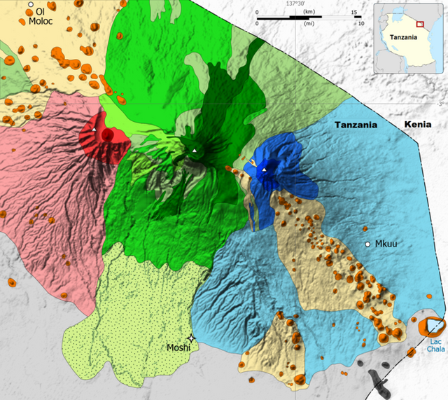
The values of the characteristics of certain geographical phenomena measured and calculated in various scientific fields nowadays might refer to specific points on the natural terrestrial surface and still be represented through the utilization of surface symbols. The primary reason for this is the way the human sensory system works, however the way we gather data and the methods of processing followed affects the outcome of the symbolization process as well. For instance, geological models used in the creation of geological maps are built taking into consideration scientific findings that refer to the core of samples taken from specific points on the planet's surface, yet this data is represented with the utilization of surface symbols. The values measured are described by a nominal scale which makes it easier to create visual representations.
Quantitative Surface Data
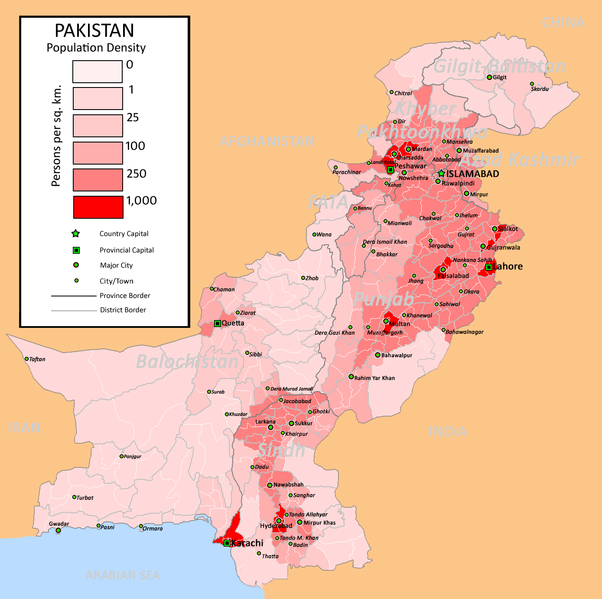
Quantitative surface data described by an ordinal or ratio scale can be effectively represented with the use of primary visual variables that are also used in the symbolization of linear data, as explained in a previous post. Intensity as a primary visual variable can be a rather useful tool in the creation of accurate representations of measurable quantities that refer to a surface of specific dimensions. The primary visual variable of saturation can also be used in the creation of symbols that represent measurable quantities which refer to a particular piece of land on the natural terrestrial surface. Even though saturation as a visual variable is highly effective, intensity is the primary visual variable that is most commonly used in the symbolization of quantitative surface data. The main reason is that saturation can only be used in the creation of colored maps.

Qualitative Surface Data
Different category, same story. Well, kind of. Qualitative surface data described by a nominal scale can be efficiently depicted with the use of some of the primary visual variables used in the symbolization of qualitative linear data. The creation of accurate and effective symbols with the utilization of shape as a primary visual variable gave birth to patterns. These are surface symbols that mainly consist of lines that range in thickness as mentioned above and can be used in order to represent quantities that refer to a surface of specific dimensions. The vast majority of these symbols are commonly used to depict particular spatial elements and therefore Cartographers are not allowed to use any of those in order to represent the existence of any other kind of spatial elements. It is worth noting at this point that secondary visual variables are utilized in the symbolization of qualtative surface data as well.
The utilization of secondary visual variables plays an important role in the creation of accurate representations of qualitative surface data, mainly due to the fact that it can provide Cartographers with the ability to effectively depict nominal differentiations with surface symbols. The most commonly used secondary visual variable is orientation, which can be effectively combined with any pattern in order to provide differentiation and assist Cartographers in the creation of a quality visual outcome. Let's always keep in mind that Cartographers frequently combine orientation with hue, which is by far the most significant primary visual variable as mentioned in the previous parts of this series. Advancements made in the field of digital technology throughout the recent decades has provided Engineers with equipment, methods and tools that demand the utilization of hue, which is considered to be the most efficient visual variable of all.
.png)
Alright people, that is all for now. This means we have reached the end of the sixteenth part of this Introduction to Cartography series. Special thanks to each and everyone of you who always support my work and make me feel so amazing with your kindness. Please do let me know if there are any questions in the comments below and I will do my best to provide prompt and detailed answers. I've got a lot of stuff regarding my Introduction to Geology series coming out within the next couple of days, so stay tuned and follow me for more Engineering stuff!
PREVIOUS PARTS OF THE SERIES:
IMAGE SOURCES:
REFERENCES:
University Textbooks & Course Lectures:
- Χαρτογραφία Ι/ Cartography I -TSOULOS(National Technical University of Athens, School of Rural & Surveying Engineering, Course Lecture Notes)
Internet Links:
https://www.engineersedge.com/manufacturing/_iso_surface_roughness_symbols_terminology_13090.htm
http://webhelp.esri.com/arcgisdesktop/9.3/index.cfm?TopicName=Ways_to_map_quantitative_data
https://help.rockware.com/rockworks17/WebHelp/maps_2d_symbols.htm
https://www.keyence.com/ss/products/microscope/roughness/line/roughness-symbols.jsp
Thank you for your attention!
Hope you enjoyed this post and did learn a thing or two.
Follow me and stay tuned for more engineering blogs.
Highest Regards
@lordneroo


This post has been voted on by the steemstem curation team and voting trail.
There is more to SteemSTEM than just writing posts, check here for some more tips on being a community member. You can also join our discord here to get to know the rest of the community!
Thank you!
φανταστικό!!!
Είσαι έτοιμος για το challenge;; σε πρότεινα.. :)
Έτοιμος φίλε Νίκο! Thanks!