The Blogger Guide to Steemit's Post Thumbnail - Optimized Layout, Specifications & Dimensions
In this Post, we're going to discuss some Beginner Tips to consider in order to get the most optimized Steemit Post’s thumbnail
Thumbnails are reduced-size versions of pictures that are used as display on Steemit’s Homefeed. In the age of digital images, visual search engines and image-organizing programs normally tend use thumbnails, a term also used by graphic designers and photographers for a small image representation of a larger image
Optimized Steemit Post Thumbnail
Images directly uploaded on Steemit will be optimized for display, so specification like Image Dimension are important for automated customization since a Thumbnail is generated from a picture, which makes it even more important to use one that is the right size
After playing around with Steemit’s Post, I discovered that some sizes or Dimension are a better fit as a Thumbnail
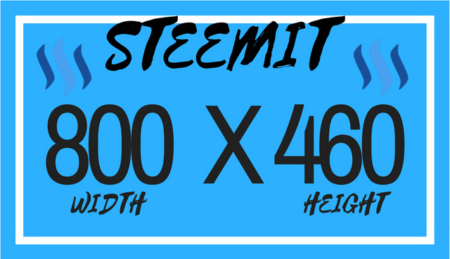
From my finding, the Size dimension of 800(Width)X460(Height), seems to be the minimum dimension to consider for a optimized Thumbnail. However it's not perfect, using photoshot to zoom in you'll notice that there is still a grey area boarder around the Thumbnail, there seems to be a 1 Pixel grey border using the hexadecimal color # EEEEEE.
The Grey Boarder may only visible on a large enough screen, or for those with a sharp eyesight. Many may not actually noticed this and I personally don't noticed a grey boarder on mobile devices as screen's tend to be to small to display such fine detail
It should however not be visible to the naked eye, by getting the dimension right you can minimize the shaded grey boarder
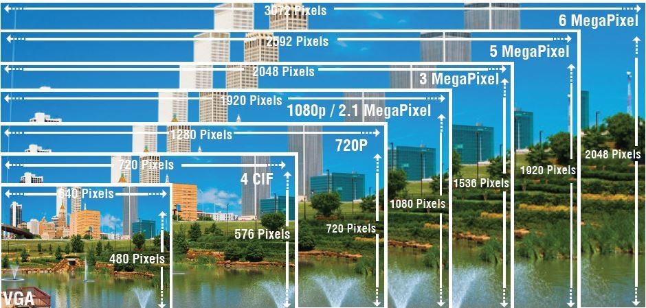
What about higher resolution images? In general, the larger the sensor, the larger your pixels, and the larger the pixels, the more light you can collect so usually the more pixel the better quality of the image. The more light you can catch, the better your image can be however since Thumbnails are generally small, you won’t notice such a big difference but I would definitely recommend using 1680 X 1292 dimension for larger Pictures
Steem Post Thumbnail Tips
- The First Image used in the Post will end up being your Post Thumbnail
- Thumbnail image should always be Horizontal
- Image under 800 Width will be displayed according to it’s Size
- Image above 800 Width will automatically become optimized to fit
- The thumbnail also has a 1 Pixel Grey border
- Editing your Thumbnail is possible, within 7 Day Post Period
- Transparent Images will end up with Grey Background (Use JPG. with white Background)
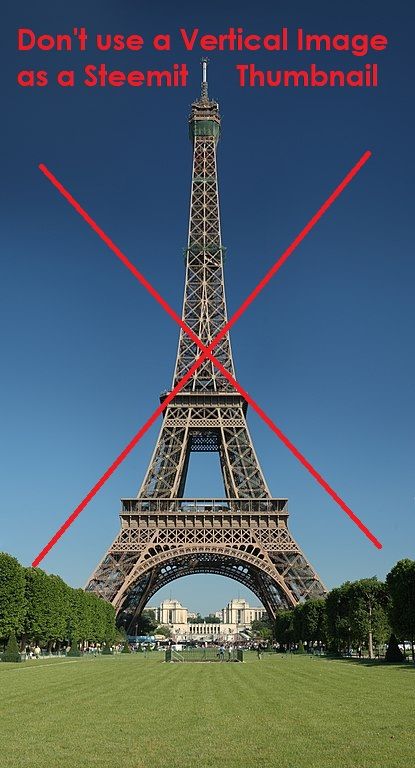
The thumbnail image should always be horizontal (meaning that it is longer than it is taller)
Because Vertical images tend to not show properly as a Thumbnail when displayed on Steemit’s homepage. When uploaded to Steemit, Vertical will be optimized to fit the Thumbnail resulting in usually a cropped out image.
While horizontal images aren't quite spot on, Vertical Image are likely to become a problem because as you’ll noticed by now on Steemit, is that Post Thumbnails will be adjusted to the height of the image accordingly, resulting in cropped out Pictures
From experimenting around, I noticed that higher segments of a vertical image are used as Display
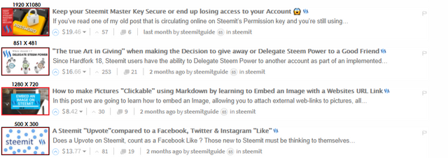
Steemit Thumbnail Result:

For those completely new to Steemit, the 1’st Image used in the Post will end up being your Thumbnail, this is by default setting. This makes your first picture the most important as it will become the image header, so make it count by editing it.
Note: If you rearrange 1st Image later on via Post editing, it will also automatically update the Thumbnail. This mean you can change your Thumbnail, if you decide to do so (for as long Post Editing is available: within 7day payout period)
Basically, if you’re planning on inserting an image, any picture that is automatically under 800 Pixels in Width will be posted without optimization. Meaning that any image that is measurement from side to side with less than 800 Pixels, will result in it being posted according to it’s size, so you’ll end up with exact dimension of your small picture, this applies to both the Post and Thumbnail
Hence why, small & low resolution images are displayed on Steemit according to their size unlike large images that get automatically optimized. Using small pictures as your Thumbnail will create empty/unused space in your Image which would be default turn to a grey shaded area
But if you insert a image more than 800 Pixels in width, Steemit Editor will automatically fit the optimized version but it does not crop or reduce the capacity of the image. For small screens, Steemit automatically downsizes larger images. This means that you don’t need to worry too much about end-result when cutting up the Thumbnail image, since Steemit will deliver a smaller image than your original to Mobile devices
Also, try not to use Transparent Images (PNG) because Steemit won't recognize it and will replace transparent background with a grey one. If you wish to feature a Transparent Image, just upload it with a white background by simply saving it as JPG. File format
Like it or not the thumbnail image on the Steemit Homefeed plays an important role on Steemit when it comes to grabbing the attention of many of the users
Don’t end up like some Users who treat Steemit like Reddit or Twitter, by posting content without use of Visual Content to capture the Audience attention. Not using any images will result in No Thumbnails, which makes your post less visually appealing on the Homefeed among the thousands of Blog Posts
The number of users is constantly growing as it’s bound to become the World most popular Decentralized platform that rewards it’s users, so it actually pays to know how to fully edit your Posts
Steemit thumbnails are like book covers of the online world. Our decision whether to click on a Post often comes down to its thumbnail: an eye-catching image draws us in, while a boring or blurry one puts us off.
.png)




%20%E2%80%94%20Steemit%20-%20https___steemit.com_%40steemitguide.png)
%20%E2%80%94%20Steemit%20-%20https___steemit.com_%40steemitguide.png)

%20%E2%80%94%20Steemit%20-%20https___steemit.com_%40steemitguide.png)
%20%E2%80%94%20Steemit%20-%20https___steemit.com_%40steemitguide.png)
%20%E2%80%94%20Steemit%20-%20https___steemit.com_%40steemitguide.png)
%20%E2%80%94%20Steemit%20-%20https___steemit.com_%40steemitguide.png)
%20%E2%80%94%20Steemit%20-%20https___steemit.com_%40steemitguide.png)
%20%E2%80%94%20Steemit%20-%20https___steemit.com_%40steemitguide.png)
%20%E2%80%94%20Steemit%20-%20https___steemit.com_%40steemitguide.png)
Great tips for posting, thanks for sharing 👌
Great useful info. Thanx!
Excellent post.. I was not familiar with this..so,thanks for sharing.
Resteemed.
Helful information.. Thank you for sharing it with us. @steemitguide
Followed and Upvoted...well done.
Really informative post !
Thank you so much for your effort my friend !!
Funny enough, yesterday I noticed a gray bar underneath my post thumbnails and was fiddling around with the dimensions to try to get it to cover all of it. I stumbled upon 800x470 so glad to see I was close haha.
Collected, thanks!!!
Thanks this was very useful information, something you can actually use, kind regards Gez.
A seriously kickass post @steemitguide. Think I've found my new 'go to' blog for post formatting :)