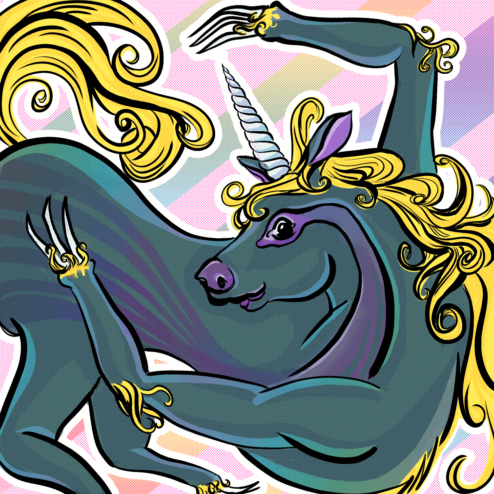
My Extra Crazy Almost Outta Time Slothicorn Art Entry

The Slothicorn Art Contest ends tonight and I almost missed it. I wasn't sure if I was going to have time to sit down and actually bang something out.
Here's my comic book styled slothicorn — it was digitally illustrated using a graphics monitor (paid for by Steemit earnings, I might add!) It's in response to this great idea and project spearheaded by @stellabelle : https://steemit.com/slothicorn/@stellabelle/win-this-crypto-survival-kit-in-slothicorn-s-first-art-contest
The beauty of this contest is to provide art that is creative commons licensed to be used by any one in any way at any time, so have at her, and wish me luck!
I need a drink. Can't wait to look through all of the entries now that the mad panic is over! Here's a gif showing the layers stacking up for this simple process. It's a bit messy, but it feels really amazing to have a reason to sit down and actually just produce a bit of art again, even if it's a bit sloppy. There are a lot of little things I'd love to change, but what else is new? Perfectly imperfect. I was seeing a lot of sloth based animals, so I ended up with... whatever this thing is. Sloth claws and nose and markings, and then all of its horsey limbs stretched out grotesquely; I ended up having to colour it super perky colours, as it was actually a little bit terrifying when I made it red and black.


This work is licensed under a Creative Commons Attribution 4.0 International License.
WOWEE, neato! I actually have made it into the top 30 for judging. The top 24 will be included in an anthology. If you like my weird nightmare hlothiscorse, would you go consider giving it your smallest vote? I would be so thrilled!
Click here to go to the contest and the comment where you can vote~
These photos and words are my own work, inspired by travels all over this pretty blue marble of ours. I hope you like them. 🌶️


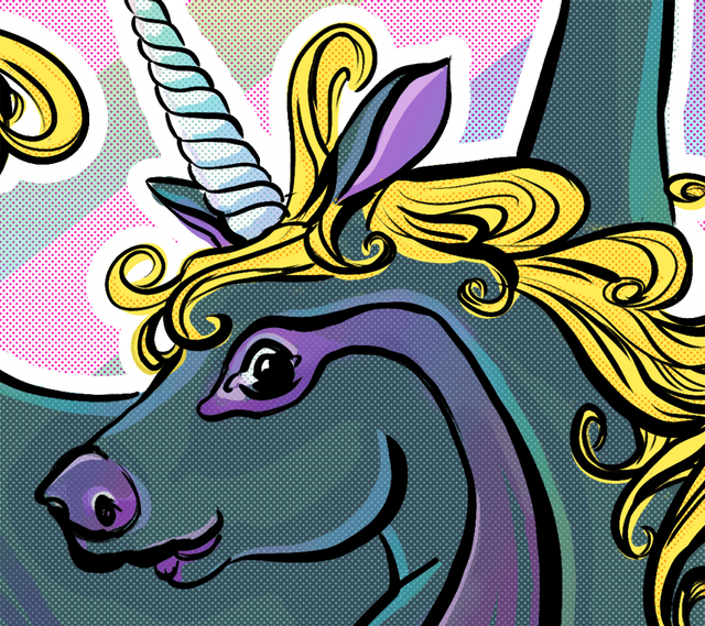
My favourite part has to be the comic book stylings. Am I the only one who noticed the half-tone dots? I wouldn't mind if they had been a lower line screen for larger dots. Dots that "grab your face" as my Greek designer acquaintance would say.
I totally agree; also, I just read that in a boisterous, Greek voice and it was amazing. It's partially why I included the closeup. When I was illustrating, they were huge to me, but when I was done, I realized they really got lost overall. Whooommp. Thanks for looking so closely~
I run into situations like that, good enough but could stand a little tweaking, I'm really glad most people aren't as observant as I am, I'd be ultra-self-conscious :D
Those look really nice! Awesome style and execution!
Mighty fine unicorn/slothicorn you made there. It's the type of unicorn Thunderbird would ride to the wrestling ring. I like the color pallete. Good luck in the contest!
thanks! Let's just not think about how it would probably immediately collapse given it has weird backwards bending legs ending in curvy claw bits and a spin in the middle, LOL
*here's the comment in the official voting thread if you're willing to toss a 1% at it to help me make it into the booklet <3 please only vote if you really want to see it place!
LOL. I upvoted you for the cause on the contest thread.
Best Slothicorn is only real Slothicorn.
Accept no imitations.
you called it! <3 waggghhhhh
It's a really lovely piece of art - I really like the pastel colors you used, it is a delight to the eye!
I like that you chose to make it without proportions to a real horse body but still - there is no doubt it is a horse, albeit a muscular one! and this Wolverine style paws are really cook too :)
thanks! I accept that I went a bit of a weird avenue to many of the other entries, but that's kind of just how I am, I suppose. I wouldn't normally do the candy colours, but I actually really like how it turned out. Sometimes you just need to stretch your comfort zone, like a creepy snorsicloth!
*here's the comment in the official voting thread if you're willing to toss a 1% at it to help me make it into the booklet <3 please only vote if you really want to see it place!
Awkward and beautifully graceful simultaneaously. Excellent work.
thank you lima~ it's much appreciated! I often find myself reflected int he things I draw. The derp face and awkward usually come from that~
*here's the comment in the official voting thread if you're willing to toss a 1% at it to help me make it into the booklet <3 please only vote if you really want to see it place!
With just a splash of purple and that’s makes it lovely
and soooo much pink!!
Its like you had me in mind or something <3
I love it he's a contortionist! Glad you made it in time!
yeah, the body makes no kind of sense, but I kind of became enamored with it being so sneklike! Canafam gonna rule that little booklet <3
Love your rendition crim! Most are sloths with a unicorn horn that I've seen so I love this direction! A true merging of the sloth and the -icorn ;)
it's a lot more corny, I think, but the sloth bits are there in spirit. And in the three foot long claws :D
oh don't think I didnt notice those lol.
Front half slothicorn or back half slothicorn? This problem gets more complex alllll the time.
or, be julia and just kill both versions~ :D