Photography Rules Are Meant To Be Broken #1 - Rule of Thirds
Rule of Thirds Vs Leading Lines
About a month ago I wrote a reasonably incoherent piece (https://steemit.com/photography/@colmedwardsphoto/the-only-ingredient-for-good-photography-is-a-good-camera-right) about beginner's mistakes. Beginner's mistakes are those things you sometimes think about fixing after 15 years. One of the comments asked me to discuss composition errors further, so I'm finally getting around to that. *
This is Part 01 of Probably 01.
When you're at the very start of your photographic education, you will learn two things.
People with very very expensive cameras and studios will tell you that gear doesn't matter.
You will learn the Rule of Thirds.
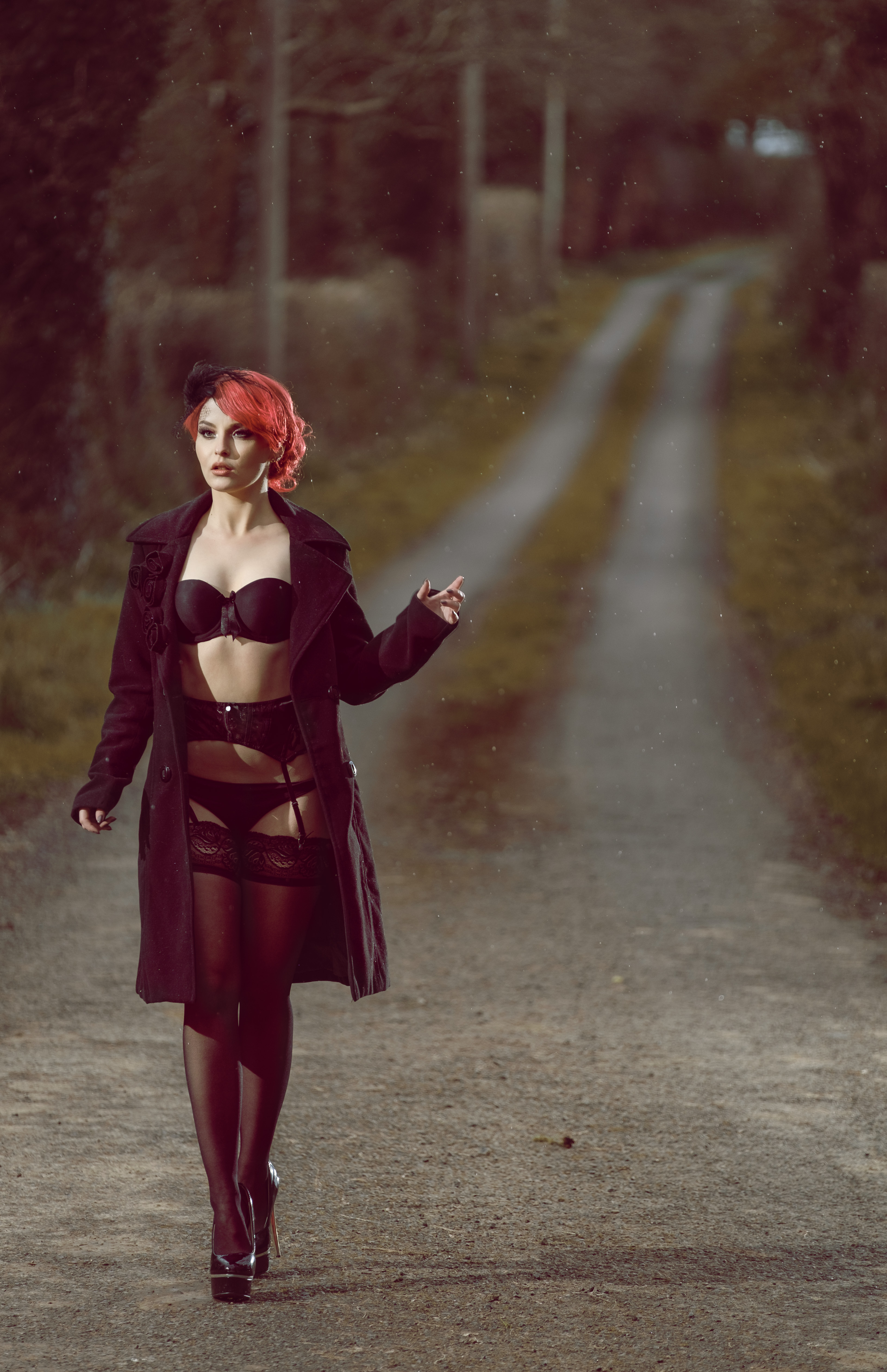
Be sure to click on the image to view full screen!
There's good reason for this, the rule of thirds is an very useful tool for achieving a well balanced composition, and it requires no special training or a talented eye - once you spend 10 seconds to understand it, you can immediately begin to use it.
The principle behind the rule of thirds is to imagine splitting up an image into thirds (both horizontal and vertical) so that you have nine sections. For me, I find it easier to visualise 2 horizontal lines and 2 vertical lines. The plan is to place the most important subject of your image onto one of those lines. Really important bits, like eyes, should rest where two lines intersect. (Landscape photographers often use the rule of thirds to know where to put the horizon in their photo).
Lets apply it to my image and see if we've obeyed the rule.

Success! The model is standing exactly on one the lines, and her eyes are slap bang where two lines cross each other. Throw in a bit of lingerie and what could possibly go wrong?
Damn you leading lines!!! Damn you to hell!
Leading lines are another important, but much less used (correctly), rule of composition. As the name suggests leading lines guide the viewers eye towards an important element of the image. Thinks roads, fenceposts, traintracks... At one point in July 2003, images of models sitting on traintracks quite possibly overtook porn as the most viewed thing on the internet. It was everywhere. It still is everywhere. It needs to be killed with fire. But I digress..
So, leading lines are great. However, if they're in your image unintentionally and you don't spot them, they can potentially ruin your image. Scroll back up and take a look at the main image. Where do your eyes end up?
So let's look at how leading lines ruined my image:

See how the road takes control of your eyes and forces you to look up the image and come to a dead-end in the the right corner? What's worse, there's nothing of interest in that area, and no more lines to bring your attention back to the model.
It gets even worse! Leading lines don't have to be roads or traintracks, arms and legs make perfectly good lines. In the western world at least, we read images from left to right, top to bottom. Our eyes will tend to enter an image from the left at the brightest point (in this case her chest). The contrast between the pale skin and black bra creates its own line, which naturally follows to her arm, and to her fingers - which are pointing straight up the road.

What hurts most about this, is that it is so easy to fix. If I had dropped down a foot to bring her head up to the level of the road, and moved myself a few steps to the left, the road would now create a leading line straight to her face. At this point her body would become a leading line which we would follow to her feet. Turning her toe back into the image would effectively create a triangle of lines...
...you're eyes would never be given an opportunity to come to rest, and the resulting image would have been so much better.
Hope this is of interest to someone out there, and would love to hear any feedback and questions :)
| Category | Model portfolio shoot |
| Settings | 1/180 sec, f/2.8, ISO 200 |
| Camera | Fujifilm X-T1 |
| Lens | XF 50-140 F2.8 R LM OIS WR @ 140mm |
| Location | Meath, Ireland |
| Model | Marta Misiak |
Emotion beats any composition rules, @colmedwardsphoto. You must know that. You took the wrong example… I guess intentionally, to provoke comments. Well done :)))
Haha, if I was good at provoking comments I'd be doing it all the time ;) Your absolutely correct though, emotion trumps composition 100%. I do wedding photography and if I valued the technical over the moment, I'd go out of business fast! I guess this was aimed at people interested at starting out in photography... the internet will tell you all these rules, and it's important to be careful what you listen to.
I wouldn't say the leading lines ruined anything!! Great shot in my opinion!
The model in lingerie prob eases the pain lol, but I think it could have been much improved. This was shot a few years ago, and it's more of a "what would I do differently now" kinda post. If we're not getting better, what's the point, and if we're not sharing the knowledge...what's the point ;) Thanks for the comment @jasonrussell :D
Honestly with a shot as good as that, traditional rules matter a whole lot less. Stunning work dude!!
Cheers @davekavanagh. I never really liked this shoot tbh, but it was a good learning experience.
Rules exist to be broken sometimes :P Cool and insightful explanation of the rule of thirds and leading lines.
Exactly right @vikisecrets ;) This shot obeyed the "rule" and suffered for it. Still, it's easier to break the rules when you already know them :D
The rule of thirds is too simplistic and as this proves, not only can, but must be broken. A rule of more universal application (not just in art) is the Golden Mean. But one would simply choose the best composition by gut feeling, at least I do. It is a matter of having a 'good eye' rather than being weighted down by a bunch of rules. Of course one has to know the rules first in order to decide to break them - like the inane art teacher rules of grade school (color between the lines).
Check your "Be sure to click on the image to view full screen!" - it is a broken link. The proper URL would be this, for Full Screen - it works every time and I use it often. Going to the large size, I feel for your model: she must have been freezing her ass off in the drizzle rain, and looking closely, one can see her goosebumps.
Upvoted and resteemed
Yep, I'd agree fully with going by your gut... if it looks right, there's probably a good reason that it IS right. I've tried applying the golden mean into my photos, but I admit my eye likely isn't good enough to see the pattern in everyday things. I do see the benefit in rule of thirds in some landscape photos and other situations, but if you stick to it as a rule, things will quickly get boring and predictable.
Also, thanks for the heads-up about the link!! Oops :\
Man this damn good photography.
Hey thank you @rifkan! Just checked your blog, man those chicken brocolli noodles are making me hungry!!
Actually there is no problem with this shot. Model's figure is quite outstanding by itself to catch an eye on her. And the road line goes in two ways - from model to the corner, but then - back from the corner naturally following the widening - it feels like running water, eyes follow this dynamics, and it brings them straight to the model's feet, and then - up to the top of her figure. So you've actually got your triangle.
Hi @transformed.god, after reading your comment I had another look at the photo, and I can see the triangle you're talking about, and I appreciate you highlighting it. I guess that brings up another topic, how people will look (or read) an image differently. To be honest, it's been a long time since I took any real stock in any of the composition rules. I wonder if it could be a case of "photoshop brain" also? In that I know the image so well, I only see the flaws and not the good.
Nice work chap!
Thanks boyo
A veces la técnica es avasallada por el resultado y este depende de cada interpretación, el abrigo abierto y lo que muestra la modelo es el PUNTO DE INTERES, veremos los otros planos cuando nos cansemos de deleiternos con la pálida piel de la chica, luego llegamos a otro punto, la MIRADA PERDIDA hay algo muy arriba y a su derecha que nos indica un camino al frente, pero por otra parte está otro detalle importante, su MANO IZQUIERDA señala el camino avanzado, ese largo, angosto y difuminado sendero de dónde vengo. Tu autocrítica es muy buena y tus argumentos técnicos, pero la fotografía es muy buena, no olvides que cuando calificas tus fotos enmudeces tu trabajo y limitas su capacidad de expresión, la fotografía o la obra debe hablar por si sola.
Hi @cruzbracho, thanks for commenting. I hope google translate has given me the correct translation ;) I do (very much) agree that the work must stand on it's own. However, I also believe that self-critique, and allowing others the opportunity to critique is important for advancement. Provided you use it constructively and don't get too upset lol. Besides that, I simply enjoy talking about photography :) Gracias!
Good read. Good explanation of leading lines. As to the discussion of Emotion vs Composition, I'd say that in a model shoot or something studio based, try to find a mix. If you can control it, do. If you can't, don't try. Think wedding and events and such. These are things that are only going to happen once, with real and raw emotions. Don't try to recreate and stage these.
Hey @lyon.photography! Thanks for your comment and apologies for the slow reply! Tbh I didn't really want to get into emotion V staged, at least not for this post. I have a slightly different view on weddings (my main photography). IMO weddings are the most contrived and staged event possible lol. I'll stage and pose the bride and groom whenever possible. Couples looking for candid shots won't hire me and that's cool. Corporate events etc are a different beast though.