Photography 101 - Lesson 3 – Using One Predominant Color for Impact
In Lesson 1 of Photography 101, I covered the different ways an image can have IMPACT and in Lesson 2, I covered how using The Rule Of Thirds can create IMPACT.
In this Lesson 3 I'm going to show how using one predominant color in an image can create IMPACT.
Have you ever noticed how a particular image of a sunset or sunrise will stick in your mind? It's likely because of the emotional response you experienced from the predominant color in the photograph. When one predominant color is used, the color itself becomes the main subject. Often, the photograph itself is not well executed, but because color evokes emotion far quicker than form or shape, we Ooh and Aah over those images. Although using one predominant color in an image can create IMPACT you still need to give thought to composition and light etc. to get an absolutely stunning shot.
So, assuming that your composition and lighting are good, why consider using a predominant color?
Different colors evoke different emotions, and nowhere is that better known than in advertising! Next time you are out walking, take a look at the signage for different places of business. It's no coincidence that they use the colors that they do! Let me repeat that color evokes emotion far quicker than form or shape, and in the case of advertising – quicker than words!
Many fast food chains like McDonald's, Pizza Hut, DQ and Burger King use red as the predominant color on their buildings and on their signs. Why do you think this is?
Following are some theories about how colors make us feel. Do you agree with these findings? Why or why not? The first three are the primary colors. The rest of the colors combine some or all of those three. How so the colors make YOU feel?
- Red : passionate, excited, strong (positive); angry, in danger (negative)
- Yellow: creative, happy, optimistic, energetic, cheerful (positive); fearful, depressed, impatient, disturbed (negative)
- Blue: trusting, serene, calm (positive); cold, unfriendly, aloof (negative)
- Orange: Warm, secure, sensual, joyful, (positive); frustrated, immature, superficial (negative)
- Green: balanced, peaceful, refreshed, restored, trusting (positive); stagnated, bored, materialistic (negative)
- Purple: powerful, creative, ambitious, extravagant (positive); inferior, depressed
Please feel free to comment on my images and how they make you feel.
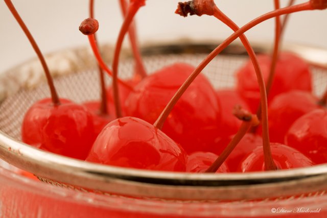
Image © Diane Macdonald. All Rights Reserved.
This is my own stock image and can be found on Alamy
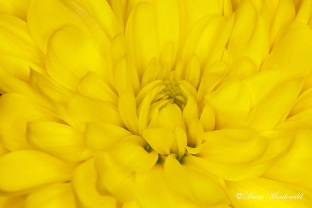
Image © Diane Macdonald. All Rights Reserved.
This is my own stock image and can be found on Getty Images
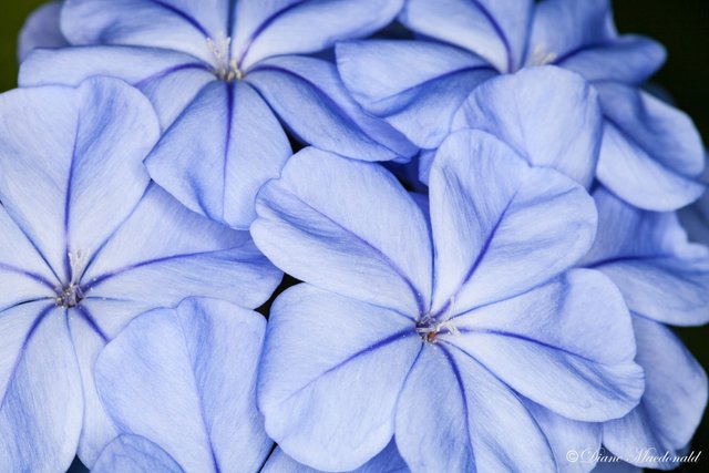
Image © Diane Macdonald. All Rights Reserved.
This is my own stock image and can be found on Getty Images
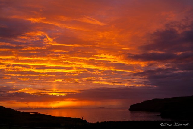
Image © Diane Macdonald. All Rights Reserved.
This is my own stock image and can be found on Getty Images
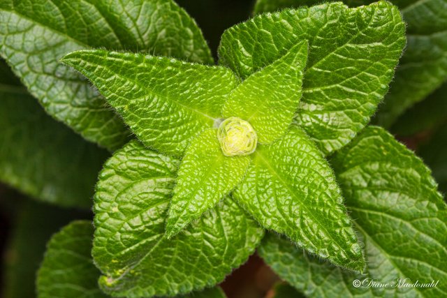
Image © Diane Macdonald. All Rights Reserved.
This is my own stock image and can be found on Getty Images
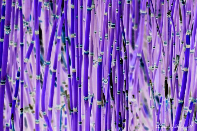
Image © Diane Macdonald. All Rights Reserved.
This is my own stock image and can be found on Getty Images
xxxxxxxxxxxxxxxxxxxxxxxxxxxxxxxxxxxxxxxxxxxxxxxxxxxxxxxxxxxxxxxxxxxxxxxxx
LESSON 3 ASSIGNMENT – AN IMAGE WITH ONE PREDOMINANT COLOR
Remember to add #photography101 as a tag, so that others can find and critique your work! Let's see what kind of emotions you can stir up in your followers!
For a better chance for your work to be found by others, please post a link in this post if you wish.
The One predominant Color challenge will finish next Sunday, October 29. I look forward to seeing your work!
xxxxxxxxxxxxxxxxxxxxxxxxxxxxxxxxxxxxxxxxxxxxxxxxxxxxxxxxxxxxxxxxxxxxxxxxx
Other posts in this series:
[Introductory Post With Rules](https://steemit.com/photography/@dmcamera/new-tutorial-blog-photography-101-basic-photography-for-beginners)
[Lesson 1 Challenge](https://steemit.com/photography/@dmcamera/photography-101-photography-tutorials-new-weekly-challenge)
[Lesson 2](https://steemit.com/photography101/@dmcamera/photography-101-lesson-2-composition-assignment-2-rule-of-thirds-challenge)
Thanks for taking the time to read this! I appreciate it.

To check out my art prints and stock images online, please visit my website.
Beautiful photography!
Thanks! I appreciate that!
Each photo does throw out different vibes. I can see how they bring out certain emotions,
Thanks for dropping by!
I really like what you're doing with this Photography 101 series.
I am a web designer at a university in Canada and we have to be conscious that colours have different meaning/associations depending on the country. For example, we have many international students from China and their association to red is very different than a North American feeling. I find this very fascinating and at times a challenge to design for global audiences. You can find some interesting websites about this.
I love your photos, by the way. :)
Thanks for your very interesting comment and your kind words about my photography and my blog post. It's very interesting how different things have different meanings in other countries. Even gestures, don't mean the same thing around the world. An Indian friend of mine used to shake her head for YES.