Steempeak: An alternative Steem front-end (Review)

Steempeak (@steempeak) is an alternative front-end to view the STEEM chain. It is a complete replacement to the original Steemit website that most newcomers to Steem have become accustomed to. This is an in-depth review of the User Interface and features of Steempeak after many months of using it as my primary and preferred front end for interacting with the Steem blockchain. Most of this review will make reference to the Steemit front-end as that is what most users are likely to be familiar with already as the default blogging platform.
First of all, it must be applauded that the @steempeak team managed to secure the web address: https://steempeak.com. This is a small point, but the ability to easily switch between Steemit and Steempeak with only a small change in the URL is a tiny but noticeable (especially on mobile) point of friction that is thankfully removed!
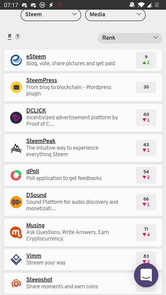
It is also possible to find @steempeak on the State of the dApps listings (@stateofthedapps), curiously categorised primarily as "Media". At the time of writing, it is listed at a healthy number 43 in the complete list of dApps across a number of blockchain platforms.

Landing Page

First impressions count, and currently Steemit has steadfastly stuck to the "Trending" page as it's showcase page for the STEEM blockchain. As all of us on STEEM already know, the "Trending" page is not a showcase of quality, but a showcase of wallet size as the presented posts are primarily those that have been boosted to that position by the huge investment into bid-bots by the authors of the "Trending" posts.
Steempeak has conciously chosen an alternative front-page, which in my opinion is really a much better showcase of the material that the STEEM chain has to offer. There are select accounts (such as @curie, @travelfeed, @utopian-io @photofeed and @steemstem) on STEEM that have been assigned the "curator" role on Steempeak. These curators are well known to long term Steemians, and they are curators and curating organisations of high esteem and high quality. Steempeak has chosen to make the feeds of these curator accounts the front and centre landing page for Steempeak, which truly shows of the highest quality work that appears on STEEM in the categories: General, Science, Technology, Photography and Travel.

Personal Feed
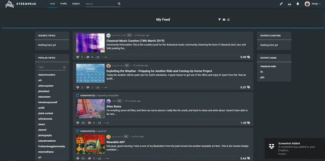
Your personal feed is a similar in function to the original Steemit interface. However, there are many more options for customisation here. For instance, you can pin favourite topics, curators and accounts to the sidebars for quick and easy navigation. I am a dark theme aficionado, and so I'm incredibly happy that Steempeak supports dark theme (unlike some of its competitors), however I would really prefer if they could go darker if possible. Right now, it is gray (at least on the PC) rather than pitch black!
Another nice addition is the option to customise your viewing panes. There are three options; the regular top down listing, the boxed listing and the thumbnail listing.
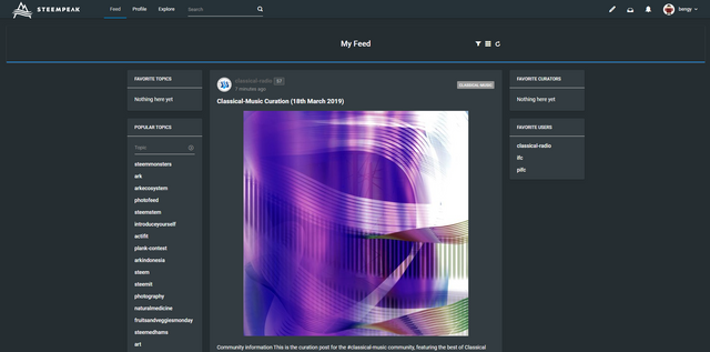

I have a preference for the thumbnail listing as I think it is the most information dense and efficient use of space. The box listing I'm least fond of, as the boxes are of different sizes, which makes it bit messy when they don't line up nicely. I know that is a problem with the featured image size (which comes from the poster), but perhaps this is a point that can be improved and fixed up as it doesn't make for a nice display. Finally, the regular listing... well, it is functional, but it uses up too much screen real estate for each featured image (again a problem of the original post, but perhaps downsizing or re-sizing the featured image would be a better experience?).
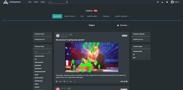
You also have the option to explore (BETA) if you want to leave your comfortable self-curated silo into the wild wild lands of STEEM. It is necessary task to fill up your own curated feed, but it can be a depressing one... although, the occasional foray each week often nets me some potential bloggers for the @pifc Curation Contest, as well as the fodder and trash for @steemcleaners.

Your Personal Blog

Wow... this page looks pretty interesting! I have to definitely bookmark this blogger and make sure to check in daily to read the really interesting content that he posts!
Your own personal blog page is similar in function to the original Steemit page, just a million times more beautiful. If you have the two pages open next to other, you will know what I mean. You don't notice it immediately when using Steemit, but it is a touch ugly! Steempeak adds that little touch that really makes the visual experience that much better.
One feature that is really quite handy is the filtering column on the right. This allows you to filter your blog (and other people's blogs if you are viewing them) by tags. I can't tell you how much handier this is than scrolling down through an infinite list of items. Especially with the loading times when you hit the end of the buffering. Again, a simple but elegant addition!
My only gripe with this, is that the filtering is done by suggested tags, and not by manually entering. I have some gaming posts from a while back that I want to view, but gaming isn't one of the suggested tags... Perhaps a keyword search (integrated with google?) could be a really powerful thing here?
Comments Tab

Comments are handled in a very similar way to the Steemit front-end, an endless scrolling list. Nothing really interesting one way or the other here, it is functional... I don't know about anyone else, but this is one of the least used sections of my blog dashboard.
Replies Tab

Again, replies are handled in the similar infinite scroll format... but with one huge huge improvement...
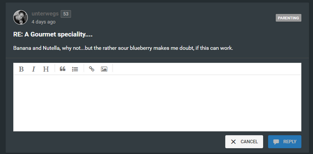
... the ability to reply without leaving the actual replies page (which means no annoying reloading and then trying to find a spot in an infinite list where you were last... or opening a new tab just to make a reply!). This is a big big deal for me, as I tend to be about 5 days behind in replies, which means that there is an issue of finding my spot in the infinite scroll (and reloading...) if I don't open a new tab in Steemit. Steempeak solves this problem very elegantly... however, my gripe is that opening the reply to box should jump your cursor immediately to start typing in the box. After all, if I click on the reply button, it is highly likely that I would be typing immediately. However, you need to use the mouse (or a finger tap) to actually start the typing cursor in the box. It's a small pain point, but a very annoying one when you forget and just start typing immediately!

There are a few other interesting options hidden in the overflow menu. Downvote (Flag), probably a good idea to have this just one step further away from easy reach! Expand gives you the option of expanding the comment preview into a full pane, without jumping to a new webpage (very handy, less loading of new pages is always a good thing!), and the Bookmark feature, which is a handy little tool for saving comments/replies and posts for later use.
There is one feature that I would love dearly for someone to implement. The possibility of having your replies viewed in an email-like format. With "unread" replies being able to be sorted to "finished/archive" or left in the "inbox" to reply at a later date. It would really help with triaging the replies that come into your reply page!
Followers and Follow-ees Tabs


The Follower and Following (does follow look like a really weird word now.. or is that just me?) tabs are nothing special. Very similar to the old Steemit way. I would suggest a way of filtering here, as they are currently sorted in reverse chronological order (your last follow is at the top). Perhaps some way of sorting by REP, chronology, alphabetical or wallet size (hehe...)?
Activities Tab
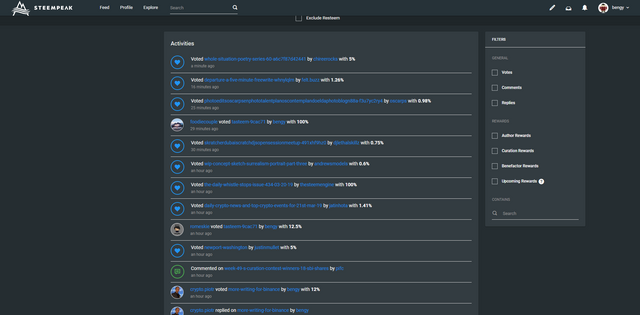
This is another incredibly useful addition, which provides a similar functionality to the SteemWorld account operations section, just in a slightly prettier form. The fact that all the information is actionable, snapping you to the relevant pages is just UX design at it's best!
Filtering and searches make it a breeze to find and analyse what your account has been up to whilst you were sleeping. This level of quality in of search and filtering is the sort of thing that I would like to see in the replies/comments tabs.
Wallet Tab
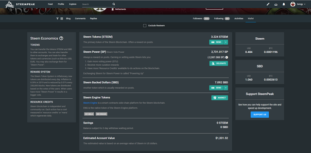
Everything in the all important wallet tab is handled well, there is a good simple explainer of the economic ecosystem on the left, some simple exchange rate information on the right (and a little subtle support button!).
The main section handles all the wallet transactions in a similar style to the regular Steemit interface, but it also has integrated Steem Engine Tokens! This is a really handy integration as it means less faffing around to different websites to check up on balances of SETs. However, actual market transactions will need to be done on the Steem Engine website.
The exchange from SBD to STEEM is handled very easily here (with the 3.5 day waiting time explicit in the description), which means there is less cutting and pasting of URLs to do an exchange. This process is also made more transparent to people who didn't know it was possible either!
Buying and selling is done via the Steemit marketplace, and a notable omission is the lack of the easy access to @blocktrades. I would have to say that that is a bit of a mis-step I know that there are easy ways to get your STEEM/SBD to a large exchange and then sell on market there at better rates. However, there are many crypto noobs (otherwise known as the mainstream regulars) who might not know or want to deal with that and would prefer something like the regular foreign exchange kiosks, simple and easy but you pay for the convenience in the exchange rates.
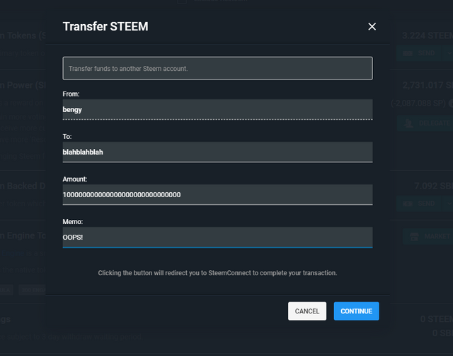
Actual wallet transactions are straight forward and exactly the same as Steemit. However, typing into the TO field doesn't bring down a dropdown list of your followed accounts. This means that you need to be much more careful about your spelling of the receiving account. I think this is not a good option, I often follow accounts just to make the transaction, choosing them from the dropdown list means that I don't accidentally mis-spell anything. I can't say I agree with this choice.
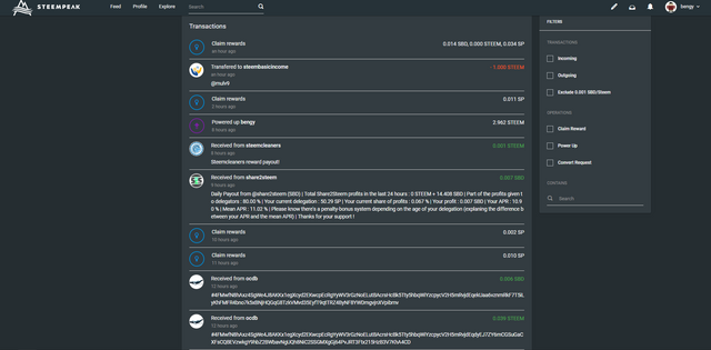
Scrolling a bit further down brings us to the wallet transaction history, with a list of filters and search options on the right. The ability to filter out spam (0.001) transactions is really great! I don't mind the little faucet of crypto, but it is really annoying when you are actually trying to make sense of your transaction history. Some people are starting to send higher amounts to try and get around this limitations, so I would like the filter jacked up a little higher to increase the amount of crypto coming in as a faucet!

Settings
General Settings
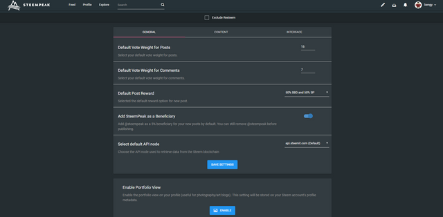
Being able to set a default vote weight is a huge time saver, especially if you are fiddling around on mobile. Playing around with a finicky slider is no fun, and so this sets the default and you are ready to vote away. Different settings for posts and comments is also handy. Ideally, I would like a break out of the posts and comments vote weight. Maybe three tiers for each, which when tapping vote could let me quickly select the good, medium, low tiers of vote power?
Default Post reward. Nothing new, same as Steemit.
Add SteemPeak as a beneficiary! YES YES YES... you want to turn this option on. If you want this front end to survive and thrive, you need to feed the developers. Do this, 5% is a tiny fraction compared to what other front ends are charging, plus they have the decency to make it an opt-in!
Default API nodes. Well, don't play with this if you don't know what you are doing. The default works, but there are times you might want to switch to one of the alternates.
Portfolio view. I'm not a photo/art blog... so I'm scared of this button! Will it turn me into a long-haired hippy painter?
REVOKE. Again, I can't stress how good these guys are with being up-front and transparent (did I mention that you really should turn on the beneficiary option?). Most front ends don't let you know (and most new users will never know) that when you log out and stop using them forever, they still are authorised for your account. You need to pro-actively revoke their access. Kudos to the @steempeak team for putting this option front and centre, other developers, please take note!
Content Settings
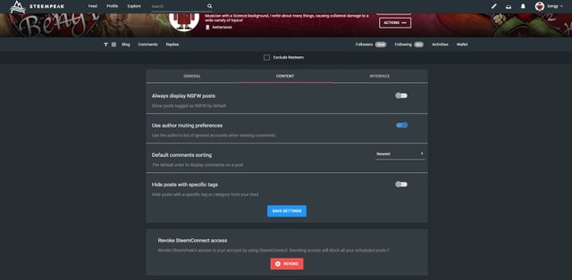
NSFW: Hey, I'm a prude... or maybe I just like a little tease before the reveal!
Muting and comment sorting: I leave these as there were, I'm not really sure why you would sort your comments by REP or reward...
Mute tag-specific posts: Not sure why I would... although there are some tags that I really am not fond of....
Interface Settings
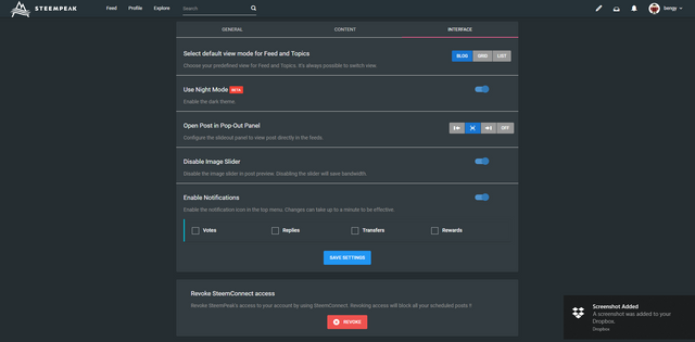
There are a few viewing options that have already been covered in the earlier sections that also appear here. However, the most important option for me was the Night Mode (dark theme) option. I love dark theme everywhere, so this is a big winner for me. As I mentioned, I wish it was more black and less grayish...
There is also a rudimentary notification system for your own personal blog. It would be nice to see this built out in to a complete Gina replacement (sorry @gina, I still love you!).
Witness Votes
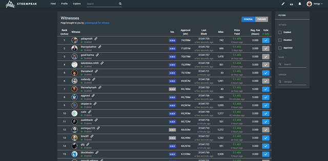
This is your civic duty as a Steemian, vote for your witnesses who keep the chain up and running smoothly. Choose wisely, as your vote really affects the direction of the chain. This is a great layout of the current witness standings, with no page cutoff, just a long scroll down which also has detailed information on each witness and also marks the inactive witnesses. You can even vote for @steempeak as a witness (do it!).

Profile Editing
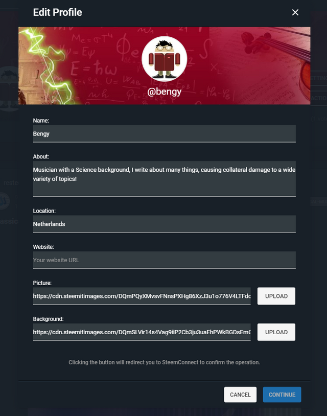
Nothing too interesting here... I can't believe I haven't changed this since my first month here...

Post Creation
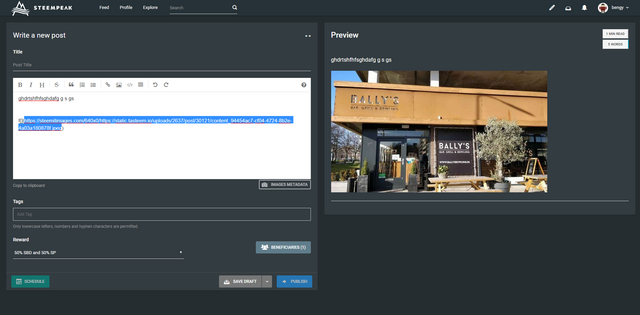
Well, this part had better be good! It is after all why most of us are here! No complaints, markdown is supported, HTML is supported... you have short cut snippets and access to image metadata. You can set beneficiaries directly from this page as well (did I mention you should set @steempeak as a beneficiary?). This is light years ahead of the Steemit interface, and you have a great side by side preview of your post as well!
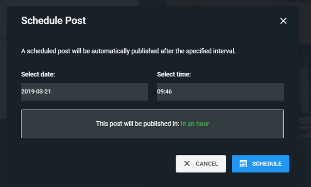
The ability to schedule posts is a great feature, although I have noticed that sometimes it doesn't post (due to other account transactions blocking it...), which means that it gets bumped back to a draft and you repost/reschedule again later.
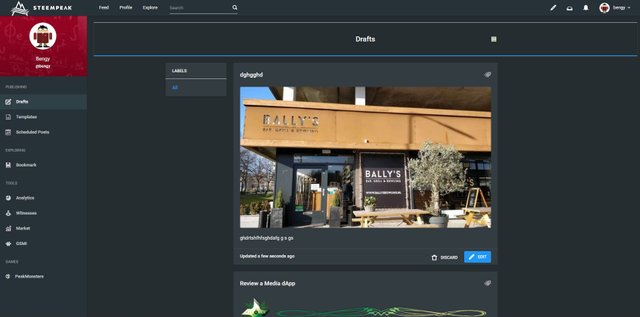
Speaking of drafts... you have the ability to save drafts! This is perfect for me, as I have a number of posts that I slowly work on for days or even weeks before I feel that they are ready to publish. Or I often use them to start a skeleton of a post, so that I can come back later and flesh it out when I have the time.
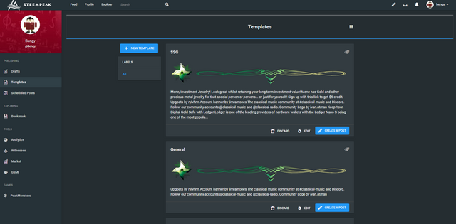
... which brings me to templates! This is phenomenal! I have a number of different templates with slightly different layouts depending on the community or topic that I'm posting about. I also have a number of recurring weekly posts that I can easily save a template for (however, I often still screw them up by forgetting something else....).

Additional extras
Bookmarking
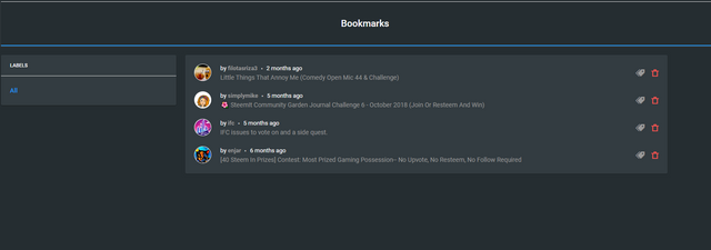
On every post and comment there is a bookmark option, which saves the post/comment to this section for easy retrieval in the future. This is a big gripe on Steemit where you will read something and then lose it in a couple of days time. Resteeming is possible, but a pretty janky way to save something! This is much much more elegant.
Account Switching
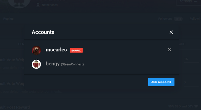
As someone who runs a few accounts on Steem (including @classical-radio, a classical music curation account), the account switching option is a really useful tool. It is quick and pain free, if the account has been authorised via SteemConnect. I have my main account in dark theme, and the other ones set as light theme, just so that I know by the eye-searing pain that I'm not logged in to the main @bengy account!
Analytics
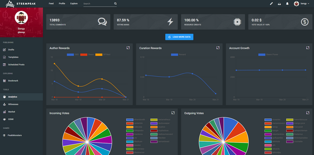
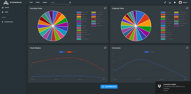
There is an analytics section which would give @abh12345 a run for his money... but they don't seem to be really working properly. I'm not sure if that is personal user error (me fail...) or there is something not quite working here... Anyway, the pie charts are really off... but the other information seem okay.

Brought to you by....
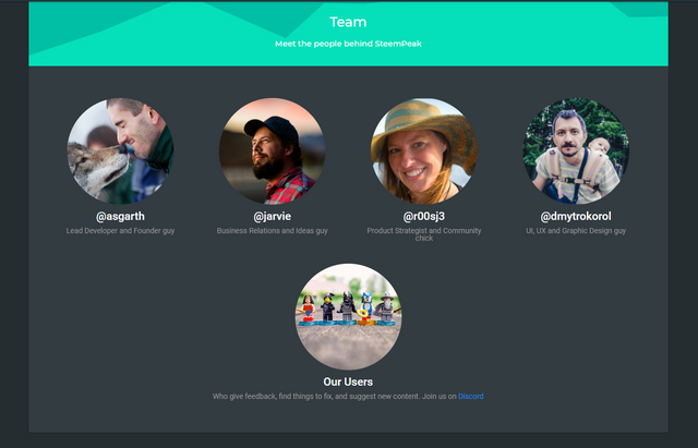
The team behind @steempeak is @asgarth, @jarvie, @r00sj3, @dmytrokorol. I have to give them a huge round of applause for this evolving masterpiece of a STEEM front-end. This is by far and away the most beautiful and enjoyable interaction with the chain (did I mention you should set the 5% beneficiary for @steempeak?... or maybe a @steempeak witness vote?). Great job!
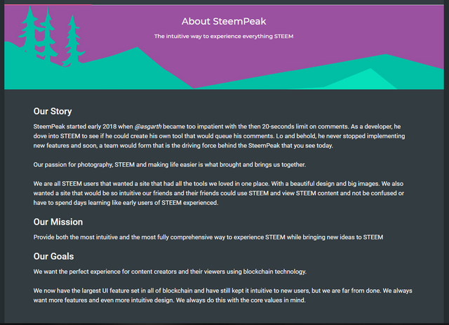
Every superhero needs an origin story... unfortunately, @steempeak wasn't born in tragic circumstances which ended an alien civilisation, and no the team weren't all bitten by radioactive spiders either. Seriously, this isn't going to make a good movie....
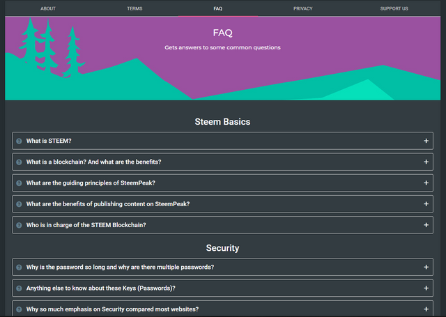
This is one of the better FAQs that I've seen about Steem. Every Steem interface needs something like this (or better still, point to this...). Simple, concise and clear. Remember, most people who arrive here are not crypto-nerds or even technically minded... the mainstream, remember!
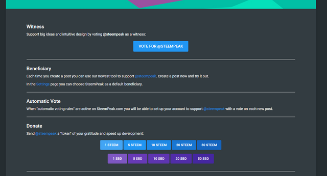
Did I mention you should support @steempeak with a 5% beneficiary and a witness vote?

Conclusion
There is no other way to say this, but Steempeak is hands down the most complete package for interacting with the Steem chain. They have been very modest with the beneficiary model (even making it optional), especially in comparison to their competitors. I love that they are not gaming their upvotes as a way of retaining users. You will use this front-end because it is the best there is, not because they are paying you to use it!
That said, it isn't perfect. It is an evolving platform. I have little gripes here and there about some UX friction... and some wishes for further development. Hopefully, if the dev team reads this, then they might be able to make some of my @steempeak related wishes come true (or tell me to go build my own front end...)!
Try Steempeak. You won't regret it...
I did use SteemPeak for my big 1 year review of Steem and found it a far more enjoyable experience than steemit. Very easy to create posts for sure and the side by side preview was very helpful.
Great review of this front end. I can't say I have used it as in depth as you have so will take your word for it but do like that they set the manual curation initiatives on the home page as we all know the issues with trending don't we 😉
Posted using Partiko Android
I love the templates and drafting the best! I often have posts that I write over several days... and the ability to just put them aside and continue writing later is such a good thing!
I've been using steempeak almost exclusively for months now. In addition to the grid-view in the feed, and the "front page" set to curation trails, my favorite features are scheduled posts (only available when logged in through steemconnect, apparently) and the ability to set beneficiary rewards easily.
You can also see an account's voting trail by appending "/trail" after the account. For example: https://steempeak.com/@classical-radio/trail. Also, not sure if you saw last night's update post, but there was something in there about searching a blog for keywords using the URL. I haven't tried it yet, but you can check the @steempeak blog for details.
As you noted, it's still got some quirks, but it's definitely my favorite interface so far.
Ah... I didn't see the update post, I will check it out as it would be a really handy feature to have! I was trying to find an old post of mine today, and that would have saved me a great deail of time!
Let us know any if the quirks. Presently on discord but soon right on STEEM COMMUNITIES because steempeak will have a community page for sure
I love @steempeak! One thing you didn't mention (and your review is so complete I can't believe I have anything to add!) is you can go the page of anyone's account and at the top right corner, under "actions" you can send them directly Steem or SP or SBD. SO CONVENIENT. I always use this to buy SBI shares right from the @steembasicincome homepage. Great review!
Thanks for that! I did not know you could do that! Handy handy handy!
This is a fantastic lo-down/review of Steempeak!
I only discovered it a few months back too because of using KeyChain browser extension which doesn’t work on Steemit.com - you’ve highlighted all the amazing features and benefits of peak though, it’s a no-brainer! ❤️
Posted using Partiko iOS
Thanks! Glad you enjoyed the review... I have to look into KeyChain, how is your experience with it?
KeyChain is fantastic for when I’m on my Mac. It’s super secure and works in the background, and pops up when you need it to login or authenticate a transaction etc.
You just need one password for it, and from there you can manage logins for you account(s) to almost all STEEM platforms. Worth a go!
Posted using Partiko iOS
BINGO!!! This is the deal-breaker for me. I tried steempeak several times and just couldn't handle that layout. It apparently has a lot of nice features and many people in my various groups just rave about it. But I haven't been back in months -- and don't plan to until & unless that changes.
There are three different views, the thumbnail listing is probably the one you want!
Ever since I did my review of SteemPeak, I started using it as my go-to Steem interface. It's really great to use and you've certainly done it justice with this review!
Thanks, it is really a top front end... So much functionality and they aren't in your face about support. The 5 percent beneficiary is a trifle for the amount of goodness on offer!
The 5% beneficiary is optional ;-). You can change it to whatever you want!
Haha... yes I know! I'm thinking it is actually a good fit, I would prefer that they have a low beneficiary and use the account to vote on the developer team posts, rather than using the account to "reward" users... which I've seen just leads to people gaming and scamming the "curation".
What a great review, @bengy. Fantastic work on this post.
I have tried SteemPeak but I really prefer Busy as the interface is cleaner and much more responsive and faster.
Lately I've been using eSteem quite a lot. It has some weird bugs but it's getting better all the time!
Busy and eSteem are interesting, but I'm not fond of installing a new app or program on my devices! Also, I'm not too keen on their "curation" or "support" model for using their interfaces... I understand the good intentions and reasoning behind it... but it does open them up to a good deal of abuse!
But there are advantages in each one. I believe Busy's interface is a lot better than SteemIt. And eSteem, as far as I see, it's the only interface which isn't downsizing my photos to a ridiculously low resolution.
Man, you really took your time to write this review. I have never used Steempeak before, but after reading your review it feels like I know pretty much anything about it now. You have really written a detailed description of everything we need to know about it. Amazing job, my friend. :)
I will have to check out SteemPeak in the future. Thank you for taking the time to write such a detailed review. Have a great day. :)
Thanks... yes, you should have a look at Steempeak, it is really much more powerful and flexible than Steemit... plus looking good doesn't hurt either!
I love steempeak, the formatting is so much more attractive than Steemit. You have done an amazing crititque @bengy, quite a bit to digest. I'll need to read this several times to get all of the info :) Thanks!
Glad that you enjoyed the review... it is really a more attractive front end... but also just much more flexible and powerful!
Haha. We seem to have had the same idea. :D
Ill get on reading this.
Interesting to see if we share the same opinions.
Yeah, forgot to add this. Was thinking the same thing but didnt add it to my review.
Great review.
You should add it! It's a big omission and I'm not sure why they did it...
Yeah just added that. I also forgot to add r00sj3 as a team member. I must have had older info.
Picked her up on your team photo. whoops. :D
I love this interface so much, I hope they can fix some of the little gripes I have with it!
I loved seeing both of your reviews