Making Steemit Graphs Tutorial


I would like to share how to turn data related to Steemit into graphs/charts for your Steemit Posts.
The tools I use to make my graphs are very basic, all you need is Excel, Paint and an online free pic editor like Lunapic.


In this tutorial I am going use my payouts for the last month as an example.
First thing to do is gather your data. In this case I went to SteemDB to gather the data about my collected rewards for the last month.
Other good sites for collecting Steemit data are:
Steemstats
Steemd
Steemreports
Steem Whales
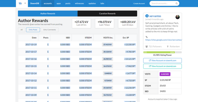
Just copy paste your data into Excel.
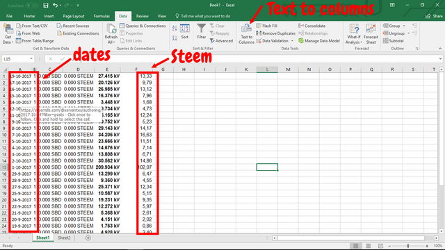
2 things can happen when you copy-pasta your data into excel. Either everything gets nicely divided into different columns which makes your work easy or it all gets bundled into one column which can be a pain but luckily Excel has a wizard under the tab "data" called text-to-columns which you can use to split the data into different columns.

Clicking this icon will start the wizard to separate the text in your column into different parts making it easy to setup your charts.
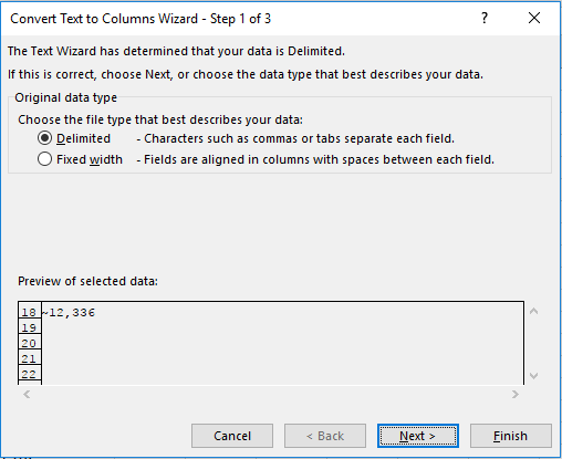
choose the Delimited option
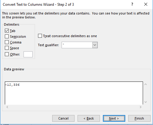
Choose your delimiters, so if you data is separated by a tab, space or comma you select those options. The wizard will separate the data into different columns based on your Delimiters
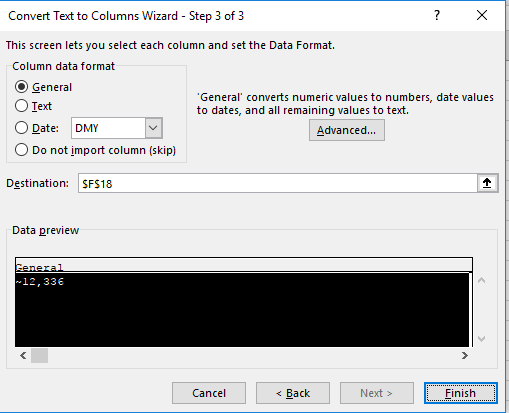
In the last step you can can specify the format of the cells, I usually leave this default. Click finish to close the wizard.
If everything went well, your Excel sheet should look something like this.
Next delete the columns you don't need. I also like to add headers. My Excel sheet ended up looking like this.
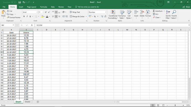
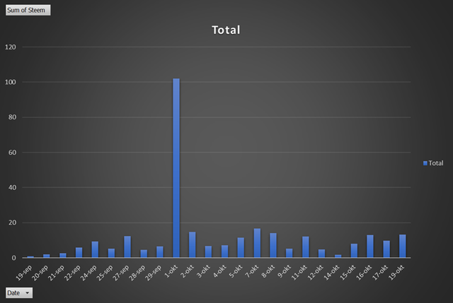
I now have two columns, the first one with the dates and the second one with the amount of Steem received.


Now that we have our data we are going to use a pivot table.
You can find the pivot table under the tab "insert".

Click on the icon and you will be presented with the next option
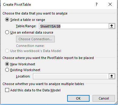
Just go for the default options and click "ok
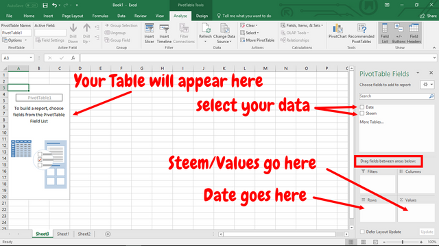
Select the boxes on the right side of the Pivot table menu and drag the boxes to the bottom right areas. Your variable data like in this case Steem goes into the value area and your base stats (dates, names, etc) go into the row area.
Your Finished Pivot table should end up looking like this:
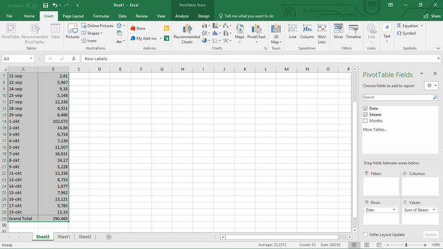


To create a graph go to the "insert" tab and select "Recommended charts". Choose a chart of your liking.
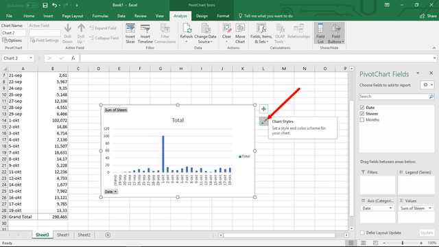
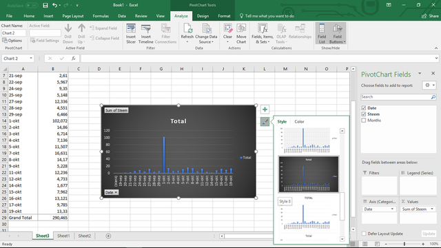
The standard graphs are not much to look at but by clicking on the paint icon on the right sight of the chart you can choose a better looking graph/chart style.
To use the chart in your post we need to convert it to a picture.
Select the chart by clicking on it. Then go to copy option under on the "Home" tab. Next go to "paste" on the same tab and click on the small arrow to get the advanced options. Choose the "paste as picture" option.
Make sure that you click on a random cell in Excel before you paste otherwise you won't get the paste as a picture option.
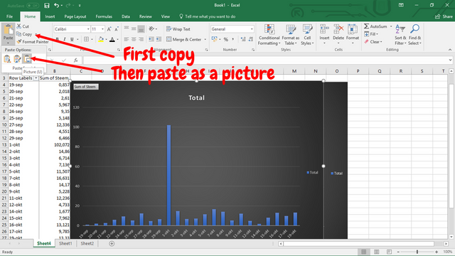
The only thing left is to select the picture of the graph and copy-paste it into an editor like paint. You can resize the picture in Excel before copying if you want a bigger picture. In Paint you can save your picture as a .png and voila, your fine looking pic of a graph is ready for use.


excellent, I like this alot, will save this to my bookmarks.
Thank you, I use graphs a lot and find that my posts with graphs do quite well.
Sneaky Ninja Attack!!
You have been defended with a 93.02 % upvote!
To help keep my Jōki (蒸気) power strong I rely on the townspeople of Sōsharumedia (ソーシャルメディア).
I was summoned by: @xervantes.
I have done their bidding and now I will vanish...
woosh
This wonderful post has received a bellyrub 5.97 % upvote from @bellyrub thanks to this cool cat: @xervantes. My pops @zeartul is one of your top steemit witness, if you like my bellyrubs please go vote for him, if you love what he is doing vote for this comment as well.
Great post. Very well articulated and important for people who love to analyse. Upvoted and following u.
Regards Nainaz
#thealliance
thank, analyzing the Steemit data is very important if we want to improve the platform. I have another post about Steemit statistics coming up. Stay tuned.
Congratulations @xervantes! You have completed some achievement on Steemit and have been rewarded with new badge(s) :
Click on any badge to view your own Board of Honor on SteemitBoard.
For more information about SteemitBoard, click here
If you no longer want to receive notifications, reply to this comment with the word
STOPNice nice!
So you can use this data to see when the best times to post would be based on your past post times?
Ill give this a shot!
I already did some research about what the best time to post was, drawback was that it did not confenient for my time zone. The result was around 2 AM CET.
Very cool