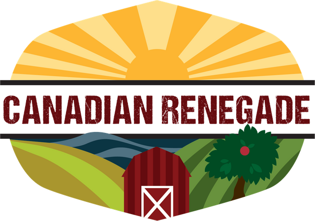
Renegade's Branding Gets an Upgrade: What Do You Think of Our Logo?

With our blog growing as well as it is we think we're about due for a logo. Can you believe we're approaching 800 followers? We are excited to share our journey with you and even more excited that nearly 800 of you want to come along for the ride!
Aimee has been busily clicking away and muttering something about vectors under her breath for the past few days. We still think it's a work in progress but thought we'd run the first draft by you guys for some feedback. So, what do you think?
Aimee and I have been brainstorming different elements for months now so we'll share a bit about the process. For those of you who have been following along you'll notice that there is no tiny house in the illustration even though that project has made up the majority of our content thus far. The reason being, our tiny house was just a stepping stone in our journey and we are planning to build a larger home on our new homestead.
If you've been reading our more recent posts you'll have noticed a few permaculture plants have been featured. I feel like this is my real passion and the logo reflects the new direction we're headed.
Aimee incorporated two different fields that symbolize both pasture and crops. The apple tree signifies edible landscaping, and the barn represents livestock.
If you're wondering what the heck waves have to do with farming, the answer is, a lot! Water is an essential element of life and we plan to harness it passively by adding swales and ponds to our land.
Of course we couldn't forget a brilliant sun because it is the source of energy for everything in this solar system. Aimee was also mindful to keep the elements bold and simple so they wouldn't get lost when the logo was reduced in size.
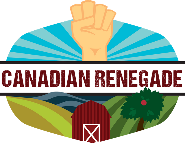
Originally, we wanted to work in a symbol that represented our renegade lifestyle, but that's where we got a little stuck. We tried including a raised fist, a common icon for revolution, but we were worried that people might not make that connection, or even worse, it might give the impression we were shouting white power. Plus, I just thought that it looked a bit awkward.
We toyed with the idea of having the fist holding a plant or a trowel but then would it no longer be obvious that it also stood for revolution? Or it might look like a plant was ripped from the ground!
 This is the first iteration that included the fist.
Well, now that I've covered all the elements, what are your thoughts? Do you think the logo represents us well, or are we off the mark? Are there any elements you were surprised to see or think are missing? Do the colors appeal to you? We really want your feedback!
P.S don't forget to view the logo in Night Mode. I think it looks bad ass!
Night mode rocks!! I personally really like the second rendition, the one without the fist. (And I saw revolution in that fist, not that white power thing).
The colors are spot on I think.
@canadianrenegade just forgot to tell you both about this challenge.... and there's only 3 days left, sorry! It's about making dreams come true and remembering childhood dreams, what do you say?
https://steemit.com/dreamscometrue/@senorcoconut/challenge-let-s-make-dreams-come-true-sbd-for-the-top-3-entries
And by the way congrats on 800 something followers now, you guys are doing a really good job with you content, it's always inspiring. So thanks for being in my life through these intrawebs!!!!
Thanks for the kind words! Maybe we can tweak the one with the fist. I feel like it just doesn't look quite right, but it is close.
I will have to check that contest out as soon as I get home.
You're welcome. I just noticed the "scruffiness" in the red lettering, I like that. Ypu could makebthe fist hold something like you said before...
An unusual veggie or that little hand rake with the three claws (I don't know the name of it!)
The logo looks great, but you forgot the snow (i'm joking) :)
LOL, yeah 5-6 months a year......
They both look great. I really like the fist though. Almost has an anarchist feel to it
That is what I was going for! Maybe I could use both?
I LOVE it!! Honestly, it caught my eye right away in my feed, before I even knew it was you. I am quite fond of it even without your explanation. That being said, the explanation ties it all together so nicely! And I think she did a great job making it simple enough that it won't appear muddled when you shrink it down.
Way to go Aimee!!
Yeah she has Skillz!
I think it is eye catching also!
Nice job! It's got a lot of movement and energy in it.
Thanks for the feedback and compliment!
I like it lot.
I work with CorelDraw so I'm familiar with vectors. The logo has good composition and colours. I think it was a good decision not to use the fist.
Thanks! I am happy with our current version.
Haha whatever is she talking about?
I LOVE IT! Looks super cool!
Thanks!
Do you work with vectors?
"Digital design" is not my strongest point, it takes me waaaay to long to get the things done, I prefer to write code :D
Looks great! I like the colour scheme you guys picked (or perhaps i should say Aimee?) The one with the sun works better colour wise as well as visually. And I understood the logo before reading the description (being familiar with permaculture might have helped) so it seems spot on!
I understand her muttering, having a vector logo is great - having to create one is a different matter. Im about to start working on mine and my husbands logo (2 different ones) and I was actually just sketching on the concept art this morning.
I will give you guys a follow, seems we have a lot in common!
Thanks for your feedback and follow. I am enjoying your articles ☺️
Hy I know i'm going to be offtopic but if you are interested i've write my introduction post.
I wish you a nice day.
That's ok, I will check it out. ☺️
I really like it, but stick with the sunrise thing and definitely not the fist! (or maybe save that for when you're 'fighting the cause'....)
Although, maybe just lines going down the door rather than the X (it looks a bit 'keep out') and maybe mess around with de-centering the house, it might look a little bit more organic (then again, it might look worse! just an idea)
It sort of reminds me of the permies.com logo, which I think is a good thing.... you also need a strap line or two maybe.. although it'll be hard to beat their 'doing good things instead of getting angry at the bad guys' line.
Pretty pictures are everything - I spent a while doing covers like these for my revision resources, I'm sure they're the reason they sell so well, rather than the actual content!
I actually really need to work on my banners/ online vizes, what software did you use to create yer 'logo'>?
Finally a plea, please don't get one of those cartoony avatars (I'm sure we've all considered it), they wind me up something senseless. Stick with your actual face!
The X is a traditional red barn design. If you look them up on you will see what I mean. But you are right it does look a but off from a design perspective. I might try just one white diagonal line instead of the X though and see if it works. Some of the barns are like that too.
Aimee used Adobe Illustrator to make the logo. I don't really like Adobe but most designers use them. They have a bit of a racket going.