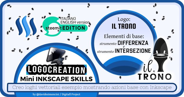
LOGOCREATION - Mini INKSCAPE SKILLS: Strumenti DIFFERENZA e INTERSEZIONE + Logo "IL TRONO" [ITA-ENG]
You can find the ENGLISH translation after the Italian text.
Tutti i diritti sono riservati.
È proibito ogni riutilizzo dei contenuti presenti in questo post – e dei loro derivati –, fatta eccezione la diffusione senza modifiche attraverso canali media e social media.
Le informazioni tecniche che trovi in questo articolo sono frutto di esperienze o ricerche personali. Approfondisci sempre con altre fonti ed esperienze per avere un quadro più completo sulle possibili tecniche o scenari.
Alcune delle informazioni/immagini che trovi in questo articolo potrebbero avere carattere goliardico: non ritenerle uno strumento di offesa perché non sono assolutamente state concepite o diffuse con quel fine, ma solo per alleggerire un post che potrebbe rivelarsi troppo tecnico.
Ciao!
Oggi torno con un altro episodio del mio spazio dedicato alla costruzione di graphic design e all'uso di Inkscape. Di solito tratto sia la creazione di loghi ipotetici a titolo di esempio sia l'utilizzo del programma di grafica vettoriale Inkscape. Oggi mi soffermerò sulla parte che assomiglia a un tutorial, andando poi ad applicare il tutto al logo ipotetico creato nel precedente appuntamento.
Nel nostro ultimo appuntamento, ho parlato dello strumento UNIONE, un utile metodo per andare a unire due figure vettoriali in un unico elemento all'interno di Inkscape. Oggi voglio portare avanti questo discorso, introducendo una serie di ulteriori strumenti di "interpolazione": li ho definiti "strumenti di interpolazione" perché sono strumenti che permettono di mischiare le proprietà di più elementi vettoriali. Questa miscela produce un risultato differente a seconda del comando specifico che applichiamo. Vediamoli.
Altri strumenti di INTERPOLAZIONE in Inkscape: Differenza e Intersezione
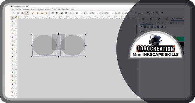
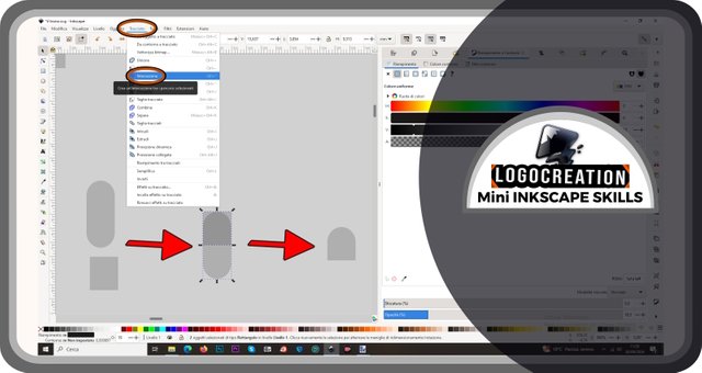
Per prima cosa ho aperto l'interfaccia Inkscape e ho creato delle forme: una rettangolare e due ovoidali. Ho quindi selezionato le ultime due. Per chi si è perso i precedenti episodi, potete trovare maggiori informazioni consultando i link che trovate al termine di questo articolo. Nonostante ciò, facciamo un breve recap: dopo aver portato il cursore e aver cliccato (tasto sinistro del mouse) sull'icona dello strumento selezione, portiamo il cursore sulla prima forma ovoidale; clicchiamo con tasto sinistro del mouse e rilasciamo; spostiamo il cursore sul secondo elemento e clicchiamo con il tasto sinistro del mouse ma TENENDO CONTEMPORANEAMENTE PREMUTO il tasto MAIUSC della tastiera.
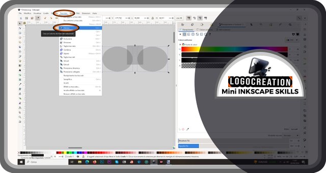
Spostiamo poi il cursore sulla barra in alto, quella in cui troviamo la dicitura File, modifica, eccetera: selezioniamo (clic con tasto sinistro del mouse) sulla voce TRACCIATO. Si aprirà una finestra a discesa nella quale dovremo selezionare la voce UNIONE. In questo modo, le due figure ovoidali diventeranno un'unica figura.
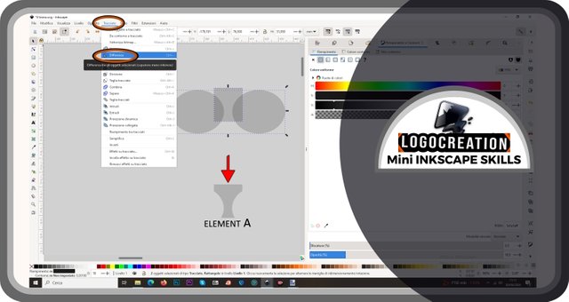
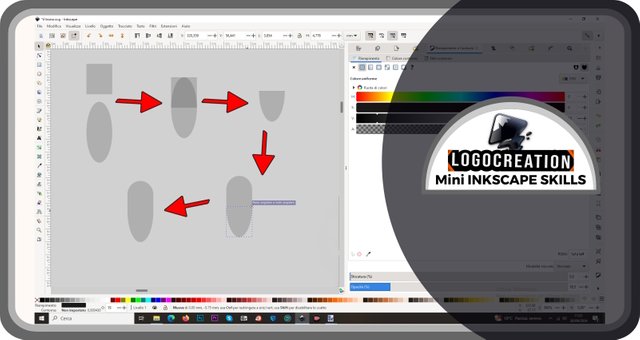
Questo procedimento è necessario per mostrare uno degli altri strumenti di interpolazione: lo strumento DIFFERENZA. A cosa serve? Semplice: se noi prendiamo due figure e le sovrapponiamo, e vogliamo rimuovere la zona sovrapposta da una delle due, dobbiamo ricorrere allo strumento differenza.
Esiste una regola da tener presente in questo caso: usando lo strumento differenza, una delle due figure che usiamo scomparirà del tutto, e l'unica figura che rimarrà sarà quella più in basso. Ma che cosa significa "più in basso"? Significa che se creiamo o introduciamo dei nuovi elementi sulla pagina di Inkscape, questi seguiranno una gerarchia: quelli creati per prima si troveranno più in basso, quelli inseriti per ultimi si troveranno più in alto. Se noi li sovrapponiamo, noteremo che l'elemento dello strato più in alto coprirà quello o quelli degli strati più in basso.
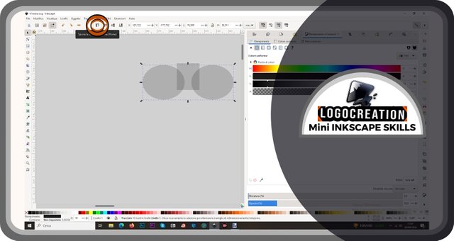
Questo è importante per l'uso dello strumento differenza, poiché dovremo portare in fondo l'elemento che vogliamo mantenere. Ciò è possibile selezionando l'elemento che vogliamo portare in cima e spostandoci con il cursore su un'icona presente nelle barre in alto. Questa icona è segnalata da un doppio contorno rosso e nero (questo metodo, unitamente ad alcune frecce, mi aiuteranno a evidenziare le zone di maggior interesse nelle immagini che vi mostrerò): è rappresentata da una freccia che punta in alto subito a fianco a delle linee orizzontali di cui una più lunga sulla sommità. Cliccando su questa icona, possiamo SPOSTARE IN CIMA la figura selezionata.
Le icone a fianco servono per agire in maniera simile sulla gerarchia: permettono di spostare IN FONDO un elemento, oppure di spostarlo più in alto o più in basso di un "gradino", uno strumento utile quando abbiamo 3 o più elementi grafici separati.
Procedendo, dovremo posizionare gli elementi nella maniera che vogliamo, tenendo presente che:
a - la figura più in basso è quella che rimarrà al termine del processo;
b - la zona in cui la figura più in alto si sovrappone a quella più in basso SARÀ LA ZONA CHE VERRÀ RIMOSSA (cancellata) dall'elemento sottostante.
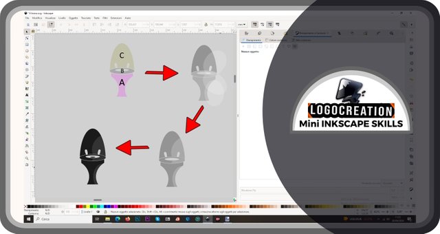
Così: selezioniamo entrambi gli elementi interessati, poi entriamo nella sezione TRACCIATO. Nel menù a discesa, selezioniamo la voce DIFFERENZA. Il risultato, nel caso esempio che ti sto mostrando, è l'elemento che trovi indicato da una freccia rosso-nera nell'immagine sottostante, un elemento che chiamerò ELEMENTO A.
Quando vorrai usare questi strumenti di interpolazione, ti consiglio di utilizzare anche lo strumento OPACITÀ, andando a scegliere un valore di circa il 20-25%. Come forse ti ricorderai dal mio primo post a tema Inkscape, è possibile modificare l'opacità da una barra orizzontale presente nella sezione "Riempimento". Ma ci sarà occasione per richiamarla in maniera più dettagliata.
Nel caso in esempio, la mia creazione ancora agli albori avrebbe dovuto essere un po' più complessa, formata da più elementi. Ho quindi iniziato a cimentarmi nella creazione del secondo: un anello appiattito verticalmente. Non solo: dovevo fare in modo che l'elemento A avesse un bordo uniformato rispetto a quello del mio anello. Come fare?
Ho creato un doppio ovoide: per ottenere l'anello, sarebbe bastato lo strumento differenza, ma non l'ho applicato subito. Ho invece spostato i due ovoidi sopra l'elemento A, poi cliccato con il tasto destro del mouse sull'ovoide maggiore e cliccato infine sul tasto DUPLICA.
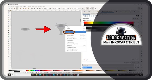
Se vogliamo applicare questo metodo, dovremo a questo punto selezionare l'elemento A ed effettuare la "sottrazione" attraverso lo strumento differenza. Solo a questo punto ho selezionato i due ovoidi e ho sottratto quello più piccolo da quello più grande. Ho poi spostato leggermente i due elementi del risultato (quello che vedi indicato dalla freccia rosso-nera) per farti comprendere gli effetti del processo.
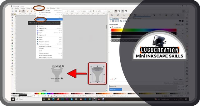
Per i miei scopi serviva un altro elemento (che chiamerò elemento C) e l'ho creato utilizzando ancora una volta lo strumento differenza. Anche in questo caso, importante ricordarsi di spostare in cima l'elemento (o la sua parte) che voglio rimuovere dalla figura principale. Ho poi spostato l'elemento risultante nella posizione appropriata, e ho "limato" il suo contorno adattandolo al resto del gruppo di elementi precedentemente realizzati.
Ma l'elemento C non era terminato, per cui ho deciso di abbellirlo anche grazie all'utilizzo di un ulteriore strumento: INTERSEZIONE. Vediamo meglio a che cosa serve.
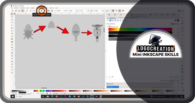
Prima di tutto ho creato un rettangolo e una forma che potrebbe ricordare una specie di pillola. Ho posizionato il rettangolo più piccolo sopra la pillola e ho selezionato entrambi. Ho aperto la sezione "Tracciato" e ho individuato la voce INTERSEZIONE. Per agire, dovremo cliccarci sopra con il tasto sinistro del mouse.
Pertanto, più nello specifico: sovrapponendo due elementi, lo strumento intersezione permette di ottenere un nuovo elemento uguale all'area in cui i due elementi iniziali si sovrapponevano. Nell'immagine qui sotto puoi vederne un esempio. Il primo step è quello delle due forme più alla tua sinistra; il secondo è quello in cui puoi vedere la zona di sovrapposizione (quella zona in colore grigio più scuro); il terzo è l'elemento grigio vagamente a forma di portone più alla tua destra, e rappresenta il risultato ottenuto grazie allo strumento intersezione.
Logo "IL TRONO"
Una volta spiegati gli strumenti precedenti, continuo con la parte più giocosa dell'articolo, mostrando gli ultimi step che mi hanno condotto alla realizzazione di un logo ipotetico. Ricordo che non ha nulla a che vedere con loghi (o nomi commerciali e non) realmente esistenti.
Ho creato una nuova forma da unire a quella vista nell'immagine precedente, così da ottenere qualcosa che potesse avvicinarsi alla sagoma di un proiettile.
Questa sagoma mi è servita per creare un'interruzione nell'elemento C (uno di quelli che abbiamo visto in precedenza). Una volta fatto ciò, ho posizionato come volevo tutti gli elementi creati prima, creando poi degli aloni di colore più chiaro grazie allo strumento "intersezione". Ho infine portato l'opacità alla massima gradazione, ottenendo un elemento diviso tra colore nero e grigio.
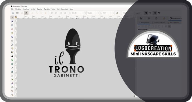
A quel punto non mi restava che trovare dei caratteri adatti per la parte testuale del logo. La parte che doveva rivestire un ruolo centrale era la dicitura "Il Trono" (in inglese, qualcosa come "the throne"), mentre il testo secondario – a finalità descrittiva – era "Gabinetti" (in inglese, "toilets"). La ricerca dell'abbinamento ha reso necessario una sorta di brain storming, rispolverando varie idee e procedendo per tentativi.
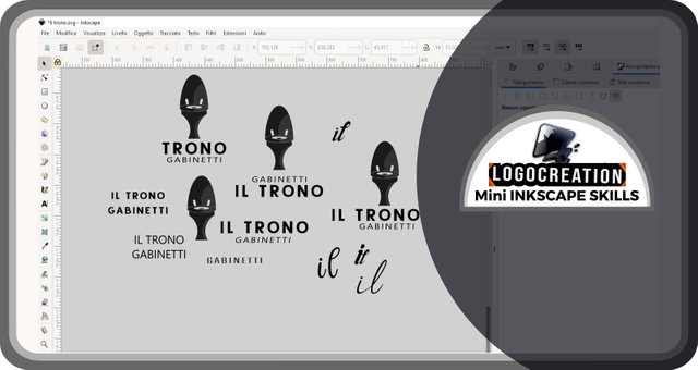
Il risultato finale è quello che puoi vedere nell'immagine qui sotto:
E anche per oggi abbiamo concluso. Spero che tu abbia compreso il funzionamento degli strumenti Unione, Differenza e Intersezione. Se avessi domande, usa pure la sezione commenti. Io ti saluto e ti lascio i link dei miei precedenti post:
Ciao!
Below, the ENGLISH translation I previously published on Blurt.
All Rights Reserved.
All the uses of the contents herein - and their derivatives - are strictly prohibited without the explicit consent of the author, except for dissemination without modification through media and social media channels.
The technical information you find in this article is the result of personal experiences or research. Always delve further with other sources and experiences to have a more complete view of possible techniques or scenarios.
Some of the information/images you find in this article may have a joking nature: don't consider them an instrument of offence because they weren't conceived or distributed with that purpose, but only to lighten a post that could prove too technical.
Hello!
Today I'm back with another episode of my space dedicated to building graphic design using Inkscape. I usually discuss creating hypothetical logos as examples and using the vector graphics program Inkscape. Today I will focus on the part that resembles a tutorial, then apply everything to the hypothetical logo created in the previous appointment.
In our last appointment, I discussed the UNION tool, a useful method for joining two vector figures into a single element within Inkscape. Today, I want to continue this discussion, introducing a series of additional "interpolation" tools: I called them "interpolation tools" because they allow you to mix the properties of multiple vector elements. This mixture produces a different result depending on the specific command we apply. Let's see them.
Other interpolation tools in Inkscape: Difference and Intersection
First, I opened the Inkscape interface and created some shapes: one rectangular and two ovoid. I then selected the last two. Those who missed the previous episodes can find more information by consulting the links at the end of this article. Despite this, let's do a quick recap: after moving the cursor and clicking (left mouse button) on the selection tool icon, we have to move the cursor to the first ovoid shape; we have to click with the left mouse button and release; move the cursor to the second element and click on it with the left mouse button, but HOLDING DOWN the SHIFT key on the keyboard.
We then move the cursor to the top bar, the one where we find the words "File", "edit", and so on: select (left button of the mouse) on the item PATH. A drop-down window will open, in which we will have to select the item UNION. In this way, the two ovoid figures will become a single figure.
This procedure is necessary to show one of the other interpolation tools: the DIFFERENCE tool. What is it for? Simple: if we take two figures and superimpose them, and we want to remove the overlapping area from one of the two, we must use the difference tool.
There is a rule to keep in mind in this case: using the difference tool, one of the two figures will disappear completely, and the only remaining figure will be the one at the bottom. But what does "lower" mean? It means that, if we create or introduce new elements on the Inkscape page, these will follow a hierarchy: those created first will be at the bottom, those inserted last will be at the top. If we superimpose them, we will notice that the element of the uppermost layer will cover the one or those of the lower layers.
This is important for using the difference tool, because we will have to bring the element we want to keep to the bottom. This is possible by selecting the element we want to bring to the top and moving the cursor over an icon in the top bars. This icon is marked by a double red and black outline (this method, together with some arrows, will help me highlight the areas of greatest interest in the images I will show you): it is represented by an arrow pointing upwards immediately next to some horizontal lines, one of which is longer at the top. By clicking on this icon, we can MOVE TO THE TOP the selected figure.
The icons on the side are used to act similarly on the hierarchy: they allow you to move an element TO THE BOTTOM, or to move it higher or lower by "one step at a time", a useful tool when we have 3 or more separate graphic elements.
As we proceed, we will have to position the elements in the way we want, keeping in mind that:
a - the lowest figure is the one that will remain at the end of the process;
b - the area in which the highest figure overlaps with the lowest one IS THE AREA WE WILL REMOVE (delete) by the underlying element.
Like this: we select both elements involved, then we enter the TRACE section. In the drop-down menu, we select the DIFFERENCE item. The result, in the example case that I am showing you, is the element that you find indicated by a red-black arrow in the image below, an element that I will call ELEMENT A.
When you want to use these interpolation tools, I recommend you to use the OPACITY tool, choosing a value of about 20-25%. As you may remember from my first Inkscape-themed post, it's possible to change the opacity from a horizontal bar in the "Fill" section. But there will be an opportunity to recall it in more detail.
In the example case, my creation, still in its infancy, should have been a little more complex, made up of multiple elements. I therefore experiment with the creation of the second one: a vertically flattened ring. Not only that: I had to make sure that element A had a uniform edge compared to the one of my ring. How to do it?
I created a double ovoid: to get the ring, the difference tool would have been enough, but I didn't apply it immediately. Instead, I moved the two ovoids above element A, then right-clicked on the larger ovoid and finally clicked on the DUPLICATE button.
Now, if we want to apply this method, we will have to select element A and perform the "subtraction" through the difference tool. Only at this point, I selected the two ovoids and subtracted the smaller one from the larger one. I then slightly moved the two elements of the result (the one you see indicated by the red-black arrow) to help you understand the effects of the process.
For my purposes, another element was needed (which I will call "element C") and I created it using the difference tool again. And again, it's important to remember to move to the top the element (or part of it) that I want to remove from the main figure. I then moved the resulting element to the appropriate position, and "filed" its outline to fit the previously created element.
However, element C needed an edit, so I embellished it using an additional tool: INTERSECTION. Let's see better what it is for.
First, I created a rectangle and a shape that could resemble a kind of pill. I placed the smaller rectangle over the pill and selected both. I opened the "Path" section and found the INTERSECTION item. To act, we have to click on it with the left mouse button.
Therefore, more specifically: by overlapping two elements, the intersection tool allows you to obtain a new element equal to the area in which the two initial elements overlapped. In the image below, you can see an example. The first step is that of the two shapes to your left; the second is the one in which you can see the overlapping area (that darker gray area); the third is the gray element vaguely shaped like a door to your right, and represents the result obtained thanks to the intersection tool.
"IL TRONO" ("The Throne") Logo
Once the previous tools have been explained, I continue with the most playful part of the article, showing the last steps that led me to the creation of a hypothetical logo. Remember that it has nothing to do with logos (or commercial names or not) that actually exist.
I created a new shape to join to the one seen in the previous image, so as to get something close to the shape of a bullet.
This shape was useful to create a break in element C. Once this was done, I positioned all the elements created before as I wanted, then created halos of lighter color using the "intersection" tool. Finally, I brought the opacity to the maximum gradation, getting a black and grey element.
At that point, I wanted to search for suitable fonts for the text part of the logo. The part that had to play a central role was the wording "Il Trono" (in English, something like "the throne"), while the secondary text - for descriptive purposes - was "Gabinetti" (in English, "toilets"). Finding the right match required a sort of brainstorming, dusting off various ideas, and proceeding by attempts and failures.
The final result is what you can see in the image below:
And that's it for today. I hope you have understood how the Union, Difference and Intersection tools work. If you have any questions, feel free to use the comments section. I'll say goodbye and leave you the links to my previous posts:
Bye!