SEC20/WK1: Introduction to Graphic Design and Principles.
 |
|---|
Hello dear student, it's my utmost pleasure to bring to you the first lecture for this season. I believe you've been anticipating this very lecture, and now it's before your very eyes. Welcome to Graphics Design Class.
All I want from you now is your rapt attention, once you get attentive, you would enjoy every bit of the lecture. Let's get into it guys.
• Introduction to Graphic Design
• Principles of Graphic Design
• Practical Demonstration of a basic task.
• Homework Task / Rules
Graphic design simply means visual communications. You would agree with me that communication exist in diverse form which includes sign languages. But in graphic design we communicate our ideas using visuals elements.
These visual elements include colour, shapes, images, lines and what have you. All these perfectly put together is what gives us a very good design, which helps in communicating our ideas absolutely.
We have different kind of designs out there which includes posters, fliers, bill board designs, product design, Corporate design, Illustration, UI/UX, Motion design etc. Each of these designs is a field on it own but our emphasis for this season is to equip you with the prerequisite knowledge for creating simple but classic designs.
In this section We would be talking about the principles of Graphic design. I would be writing briefly on it and also show you a graphical representation. We have quite a number of them but am going to limit it to just 9. Let's explore it guys
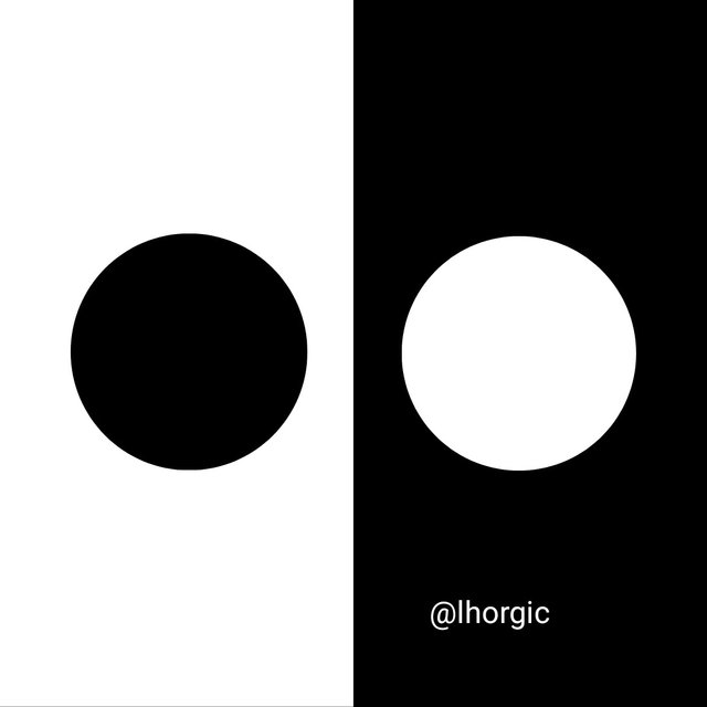
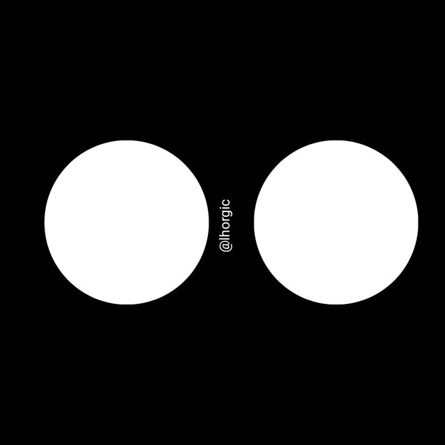
• Contrast: This principle helps to point out the distinction between elements that are similar in a design. This is done by placing element in opposition to each other. It make them distinct even though they share common features. This can be expressed in form of Dark vs Light, Thick vs Thin, Large vs. Small etc.
 |  |
|---|
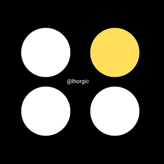
• Emphasis: This principle is used to make certain elements in our design stand out and unique from the other. It can also be used to make an element less obvious depending on the way you decide to use it. This principle helps subject your viewers eyes in such a way that it makes them see or acknowledge your emphasis.
 |  |
|---|
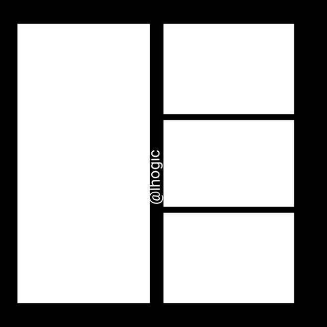
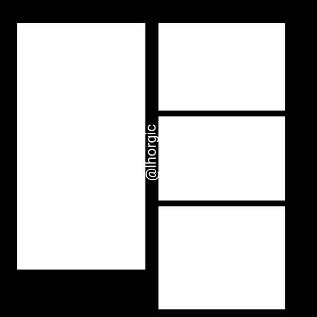
• Balance: The principle of balance in design helps to distribute weight evenly in a design. Graphics element such as our shapes, images, text are carefully distribute equally in a design layout such that none of the side of the layout is lopsided, overweighted or underweighted. Basically we have the symmetrical, Asymmetrical and radial balance.
 |  |
|---|
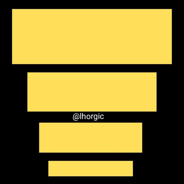
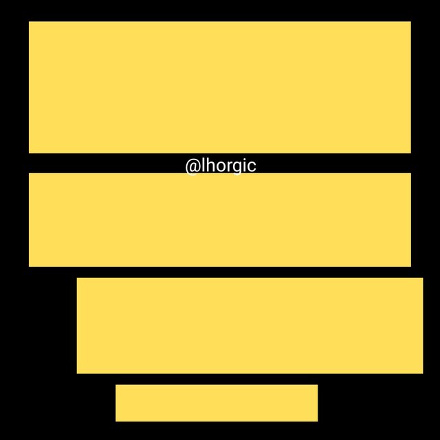
• Hierarchy: The principle of Hierarchy is key, it helps point the eyes of our viewer to your element in the order of their importance.This method uses dominance and priority via giving extra weight to certain elements. I.e highlighting titles, adding shapes to frame, maximizing colours & strategically positioning key message.
 |  |
|---|
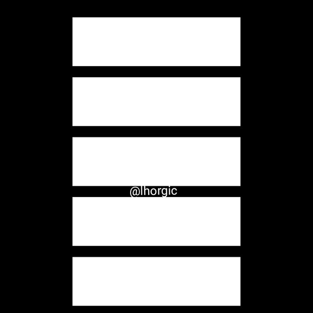
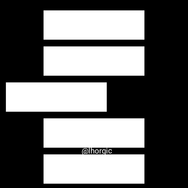
• Alignment: This principle is cleary based on visual arrangement and order in a design layout. Various elements in a design have a particular connection by following a particular direction i.e center alignment, left/right alignment. The goal is to ensure that there is no distortion in the movement. If you decide to use center, it must be center all through just as seen below, the same applies to the other alignment pattern.
 |  |
|---|
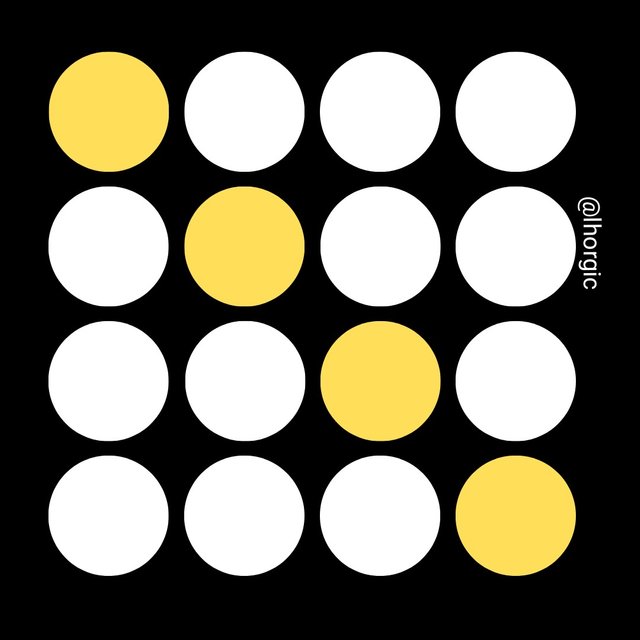
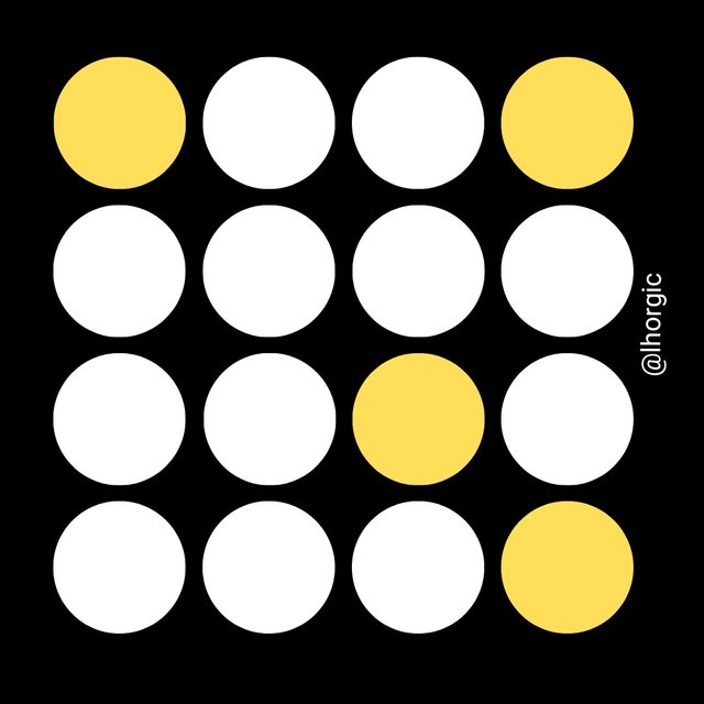
• Rhythm: This principle helps present different elements in a rhythmatic manner giving them an organized and consistent look. Rhythm can be in fluid form, keeping the rhythm or flow in a single direction or progressive; flowing in a particular visual movement/sequence.
 |  |
|---|
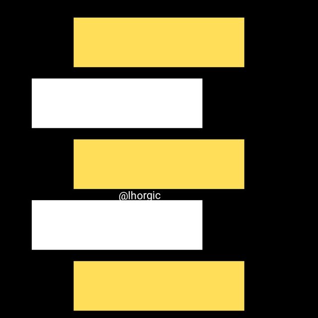
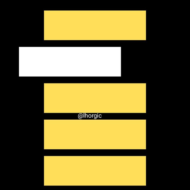
• Repetition: This is the repeated or continuous use of an idea or element in design just to achieve some level of uniformity and consistency with your design approach.
 |  |
|---|
• Unity: This principle helps to sync every design element use in a design such that the relation between all the element can be clearly seen. The goal here is the harmony shared by every element. If everything seems to fall into place appropriately without any form of distortion then you have achieved UNITY.
• White space: This principle states that a significant blank space should be left in your design...these are spaces between your element so they don't end up looking cluttered and chocked up. The white there doesn't only mean white, your background colour (irrespective of the colour) can play the role of the space.
In this section I would love to practically show you how to navigate your path on canva by performing a simple task of recreating one of the graphical images in this post...just as seen below. All in 5 steps
 | Using Size/Dimension 1080x1080 |
|---|
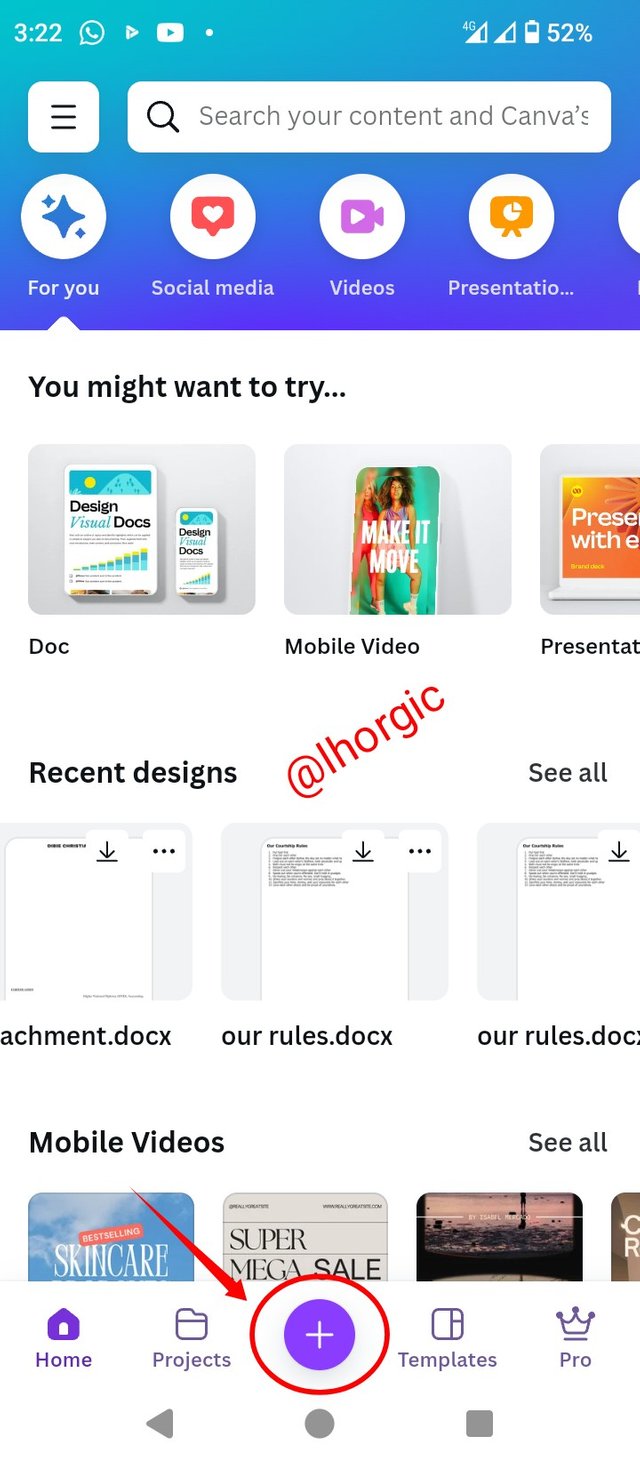
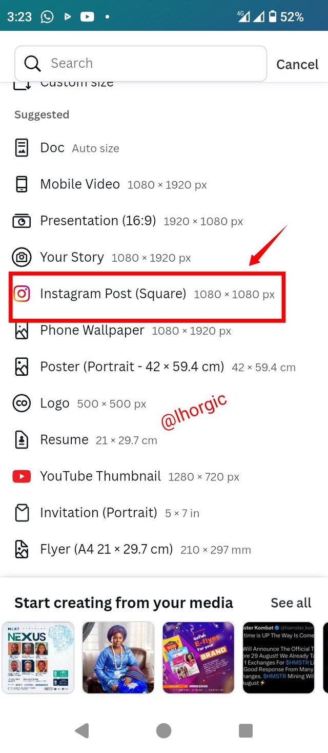
• Step 1: Launch your Canva app, locate the plus "+" icon to select size/dimension just as seen. I used the Instagram 1080x1080
 |  |  |
|---|
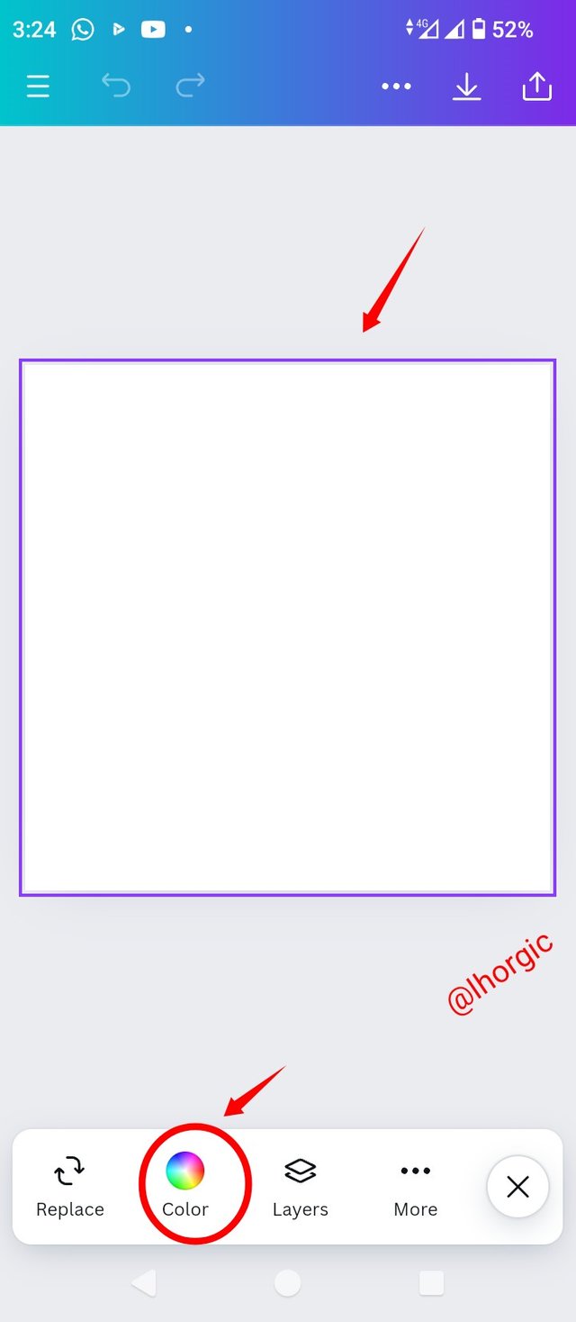
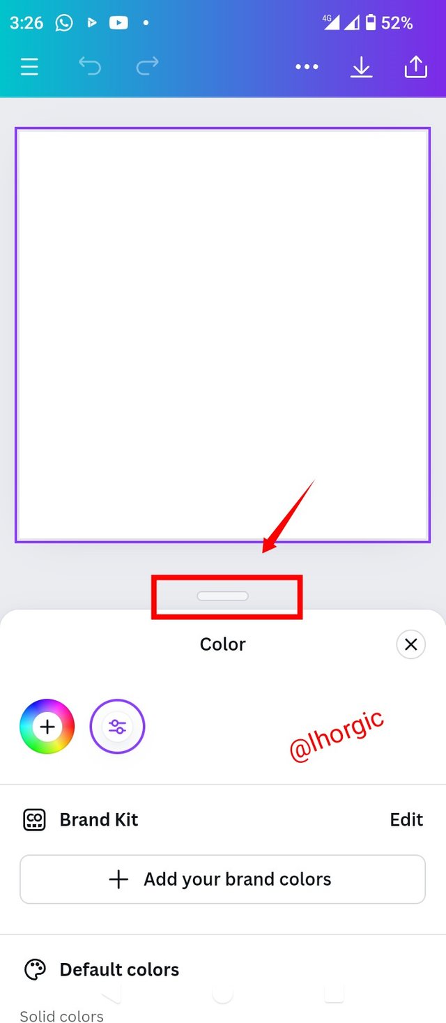
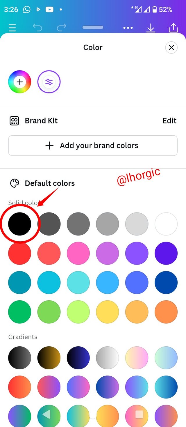
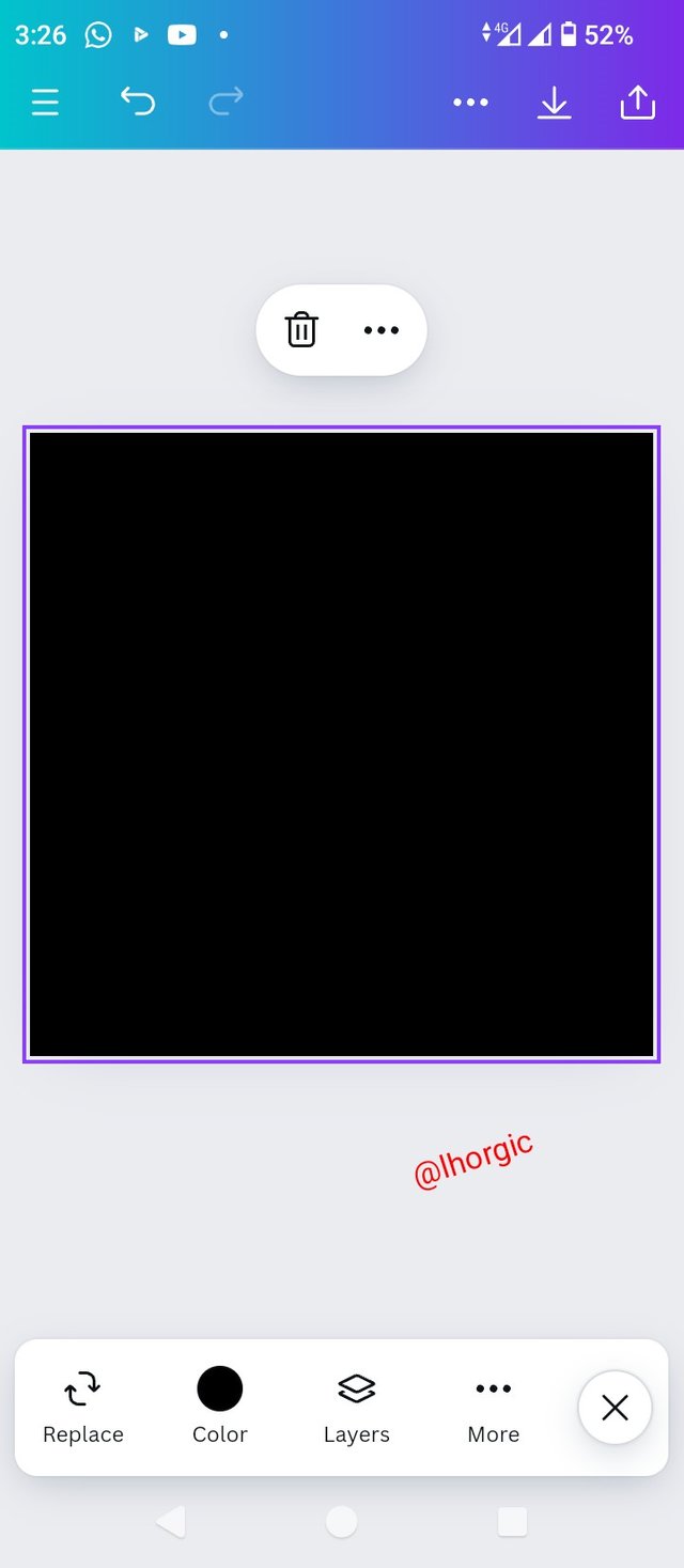
• Step 2: I changed the colour by locating colour icon on the tool bar. I dragged up the highlighted part (slider) on the second slide to get variety of colour from which I picked black
 |  |  |
|---|
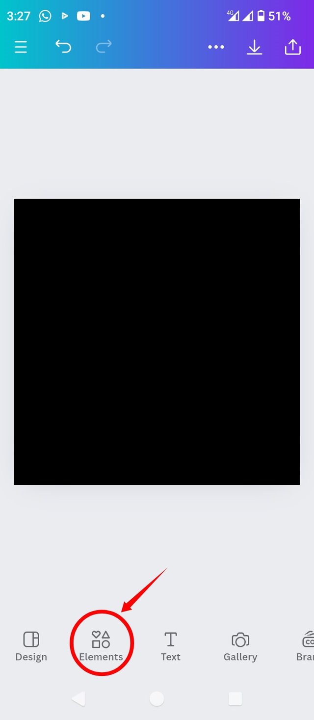
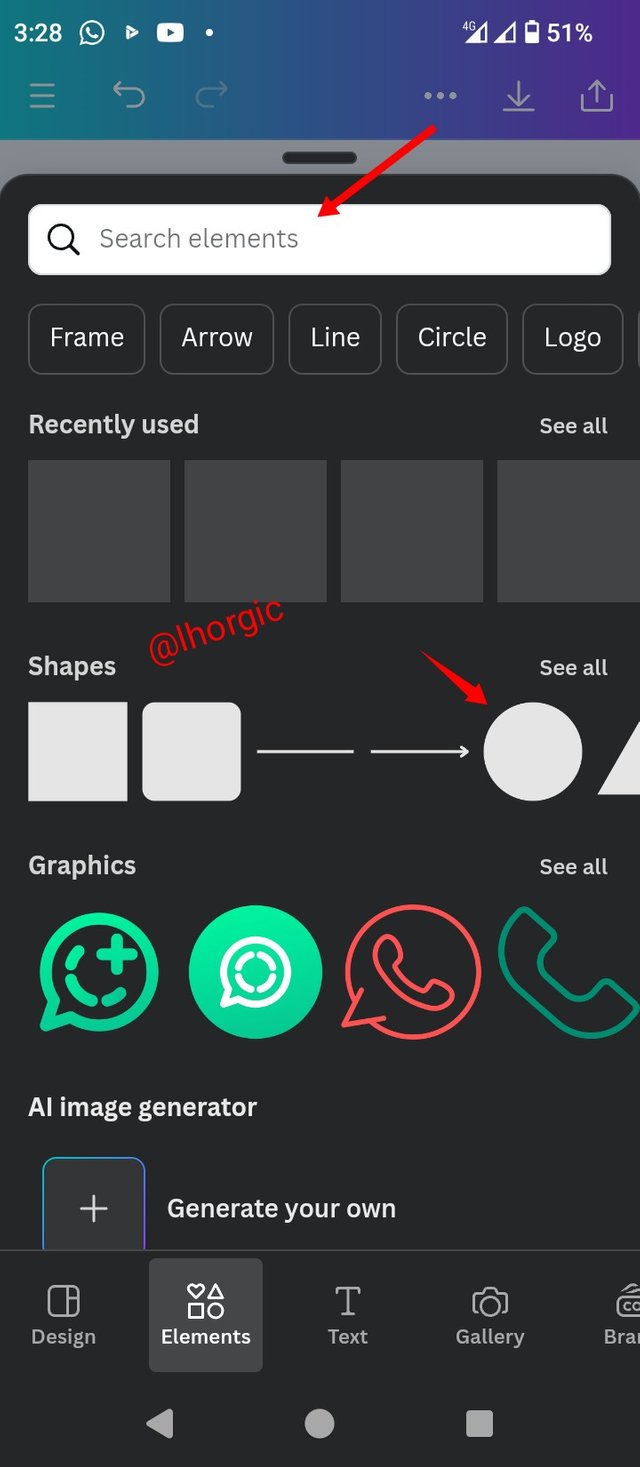
• Step 3: You can see we now have a black background. Next is to bring in our shape (circle) by clicking element. You can use the search bar to find circle if it your first time then select it.
 |  |  |
|---|
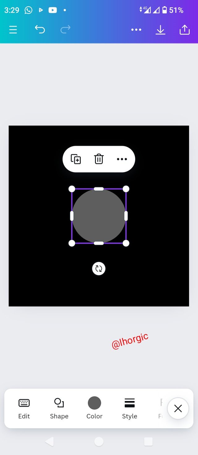
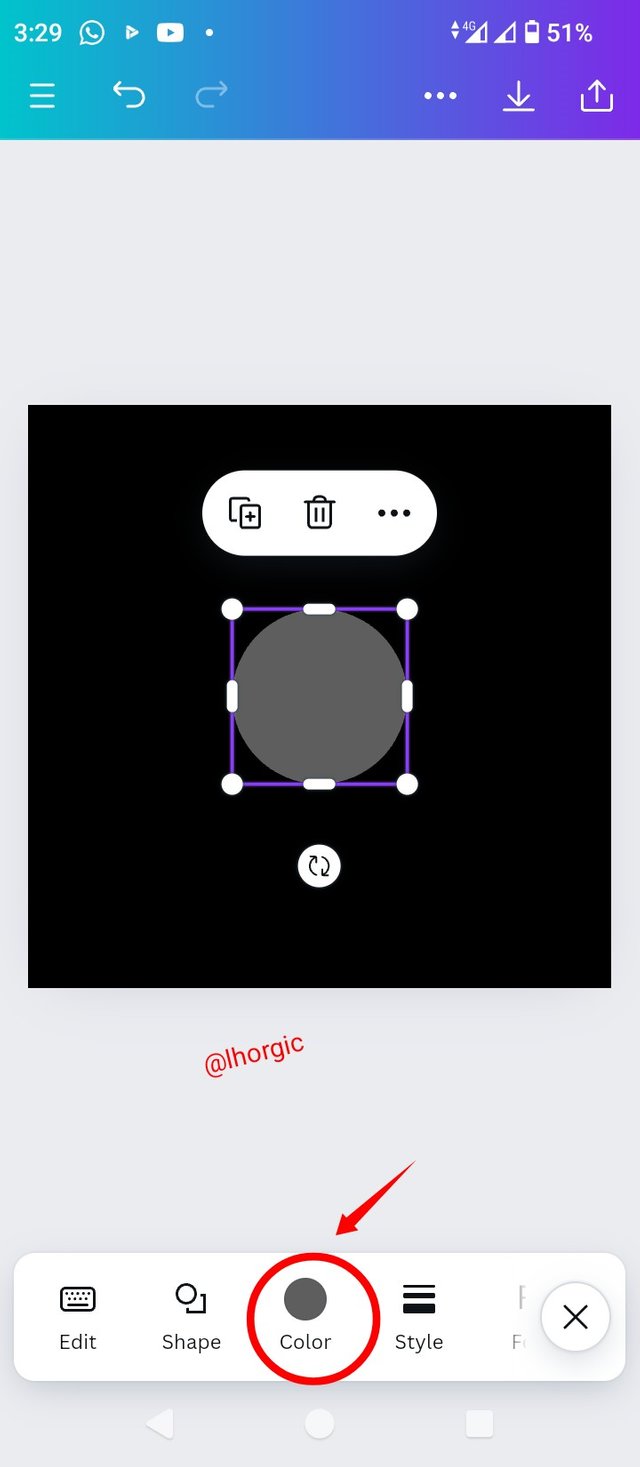
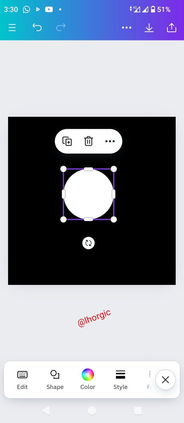
• Step 4: You can see we have the circle shape on our background. Next is change it colour to white,using the method taught above.
Note: Drag by the tip of the circle shape to enlarge shape.
 |  |  |
|---|
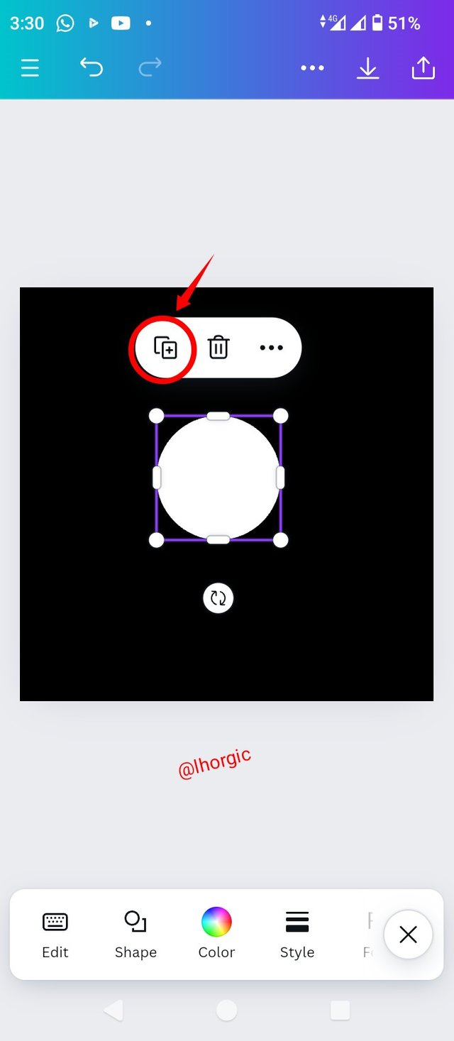
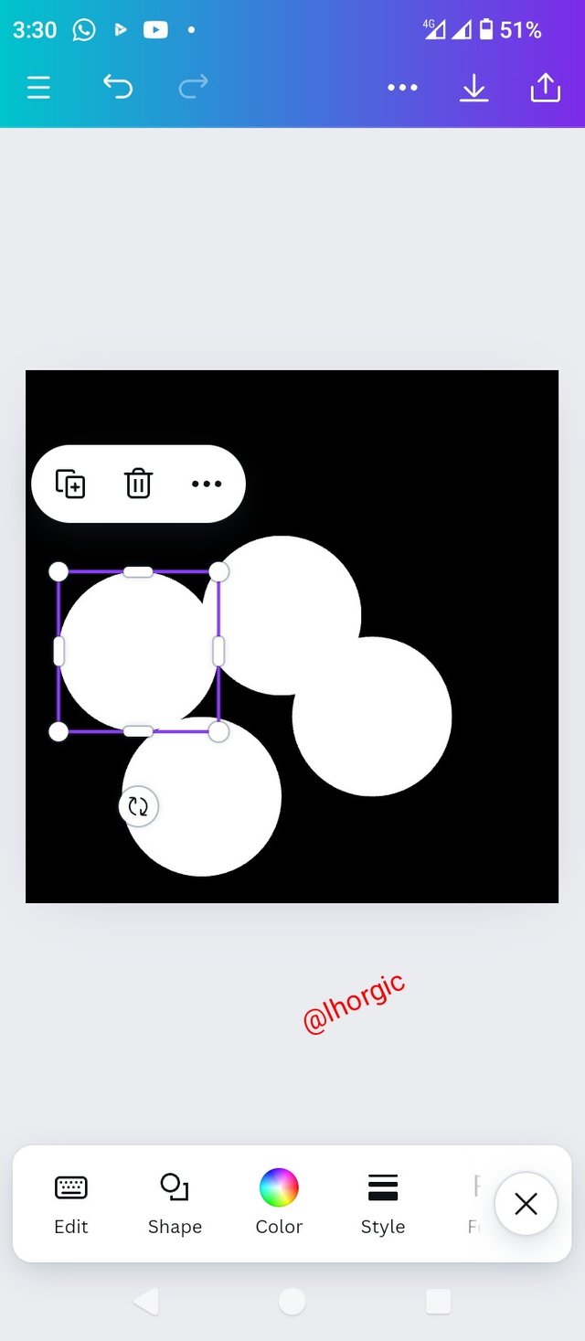
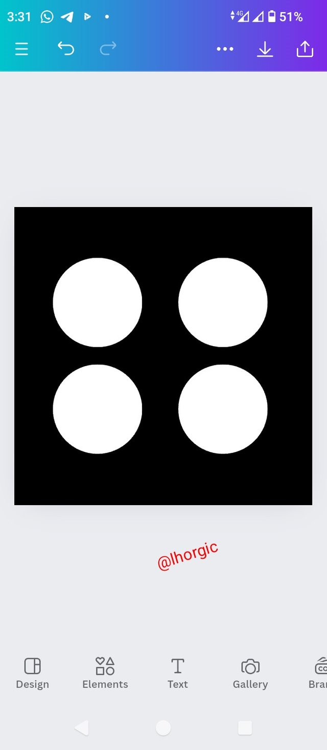
• Step 5: We now have our circle shape in white just as seen. Next thing is to click on the boxed + icon 4 times to duplicate your circle into four. Afterward arrange by dragging each to your desired position just as seen.
 |  |  |
|---|
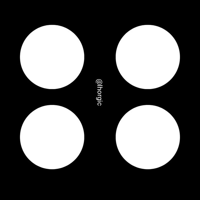
As you can see, we have successfully created one of the graphical images we have above in just five basic steps. I had to make it well detailed with those multiple images so you don't get confused at any point. If you understand the steps thoroughly, you could do yours with just 3 or 4 steps.
• Question 1: What is Graphic Design?
Briefly Share with me your understanding about graphic design
• Question 2: Pick any three of the principles of Graphic design and talk about them based on your level of understanding .
• Question 3: Practically show us how to make the graphical image below.
 | Using 1080x1080 size/dimension. |
|---|
Note: You're to show every procedure as you're taught,your attention to detail positions you for better grades. Also do well to protect your images/screenshot by inscribing your username to prevent intellectual theft by lazy students.
• Your title should be "SEC20/WK1: Introduction to Graphic Design and Principles."
• You can publish your homework task anywhere you deem fit and in any language.
• You're are to use the special tag #graphics-s20wk1 among other relevant tag like #country and your #steemexclusive.
• Plagiarism/AI generated content will not be tolerated. The penalty would be absolute disqualification.
• You're encouraged to continue with your club status, however it will not be taken into account for your grading & assessment.
• Invite 3 of your friends and don't forget to leave valuable comments on their posts.
• Use the burnsteem25 tag only if you have set the 25% payout to @null.
• Feel free to upvote and resteem this post if you want to.
• Participation schedule is between Monday, September 9 , 2024 at 00:00 UTC to Sunday, - September 15, 2024 at 23:59 UTC.
Outstanding Students will be rewarded with a sumptuous upvote for participating. A total number of 5 entries would be selected to get this compensation weekly from SC01 & 02
However, kindly bear in mind that upvotes are not guaranteed just for making an entry.
I wish you the very best.
Regards
@lhorgic❤️
https://steemit.com/hive-147599/@ngoenyi/sec20-wk1-introduction-to-graphic-design-and-principles
Congratulations, you have enabled UVF by @httr4life
Common UVF commands:
1.uvf_info
Reply any post use "!uvf_info"
Display your UVF information
Congratulations, you have enabled UVF by @httr4life
Common UVF commands:
1.uvf_info
Reply any post use "!uvf_info"
Display your UVF information
Here is my entry: https://steemit.com/graphics-s20wk1/@jyoti-thelight/sec20-wk1-introduction-to-graphic-design-and-principles
Hi friend
Can we use the laptop for practical work?
You can install your Canva on your laptop, there's a software version. I wish you the very best.
I used free web version, Professor @lhorgic.
Saludos, mi participacion
https://steemit.com/graphics-s20wk1/@mayberling/sec20-wk1-introduction-to-graphic-design-and-principles
Hola amigo gusto en saludarte, que bien este concurso para aprender sobre cada diseñó de gráficos nos ayuda conocer cada paso que debemos tomar en cuenta.
Mis mejores éxitos.
https://steemit.com/graphics-s20wk1/@nahela/sec20-wk1-introduccion-al-diseno-grafico-y-principios
Hi :)
My participation.
https://steemit.com/graphics-s20wk1/@josepha/sec20-wk1-introduction-to-graphic-design-and-principles
https://steemit.com/burnsteem25/@simonnwigwe/sec20-wk1-introduction-to-graphic-design-and-principles
Here is my entry:
https://steemit.com/graphics-s20wk1/@ahsansharif/sec20-wk1-introduction-to-graphic-design-and-principles
My entry
https://steemit.com/burnsteem25/@ruthjoe/sec20-wk1-introduction-to-graphic-design-and-principles