SEC20/WK1: Introduction to Graphic Design and Principles."
 source source |
|---|
Hello friends
Am so excited to be a student in this class, I have always been a fan of graphics and I have been searching for ways to improve myself in graphics designs. This is an opportunity for me to learn.
Question 1: What is Graphic Design?Briefly Share with me your understanding about graphic design |
|---|
Graphic Design is an expression of creativity through the use of colours, images and text. Since graphic Design is a way to which we express our self it can also be seen as a form of language to which we can communicate our thoughts and feelings.
Graphic Design is a skill, anyone can learn how to design. In graphic design, the perfect combination of images, colours, shapes and text can produce an amazing presentation of art.
Graphic Design can be used for business advertising, marketing of goods and services and branding of products. The type of graphic design done can influence the way possible see a product.
Over the years, the use technology has greatly influenced the trend in graphic designing, this simply means the way graphic design was many years back and today is not the same.
There are several career one can choose from Graphic design such as been a graphic designer, makeup artist , production artist, graphic animator ans many more. I have friends today who make their income from been a professional graphic designer.
Question 2: Pick any three of the principles of Graphic design and talk about them based on your level of understanding |
|---|
Contrast
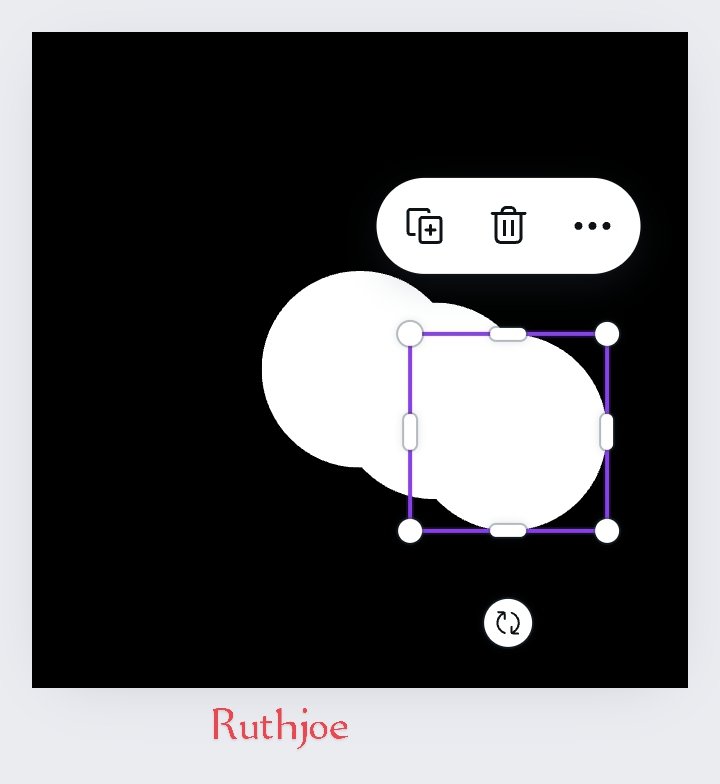
Contrast is a graphic principle used in graphic design to tell the difference between elements. These elements can be two or more, especially when the are closely related and placed closed together. Contrast can be done through the use of size , colours or shape. As you can see from the screenshot below.

Emphasis
This is a graphic principle used in graphic design for making some particular elements more visible than the others. Sometimes in making some elements more visible, some elements are made less visible so that the more important once can be seen. It's is a principle used to focus your audience on the most important item.

Hierarchy
This is a graphic principle used to arrange items in other of importance. So the more important the element is ,the more visible it is made until it gets to the least. This is done through the way the elements are positioned or the size used. See screenshot below.

Question 3: Practically show us how to make the graphical image below |
|---|
 screenshot from teachers contest screenshot from teachers contest |
|---|
Here are my practical steps on how I made my design.
Step 1
I logged into my canvas app and clicked on the image where the arrow is pointed to as seen on the left screenshot
 step 1 step 1 |  Step 2 Step 2 |
|---|
Step 2: As soon as it opens, I select my desired size which is Instagram post square 1080 x 1080 px as you can see from the right screenshot above.
Step 3 : After selecting the size , what appears is a white blank interface as seen in screenshot 1. What I did next was to click on the white square. When I click on it, the white square is highlighted, what appears next is the instruction underneath as seen in the screenshot 2, I went ahead to click on colour then selected the colour black as seen in screenshot 3 below.
 screenshot 1 screenshot 1 |  screenshot 2 screenshot 2 |  screenshot 3 screenshot 3 |
|---|
Step 4: when I select the colour black, I click on it , then the black colour refects on the square changing from white to black. As seen on the left screenshot before. After that, I selected element as seen at the middle screenshot. When it opens up I selected the white circle shape as seen at the right screenshot.
 |  |  |
|---|
Step 5: after clicking on the circle shape, it reflects on my square image so I highlight it as seen on the screenshot at the left. I go further to make the circle shape brighter with colour white by clicking on colour below as seen on the middle screenshot. Then colour white refects on the circle as seen on the screenshot at the right below.
 |  |  |
|---|
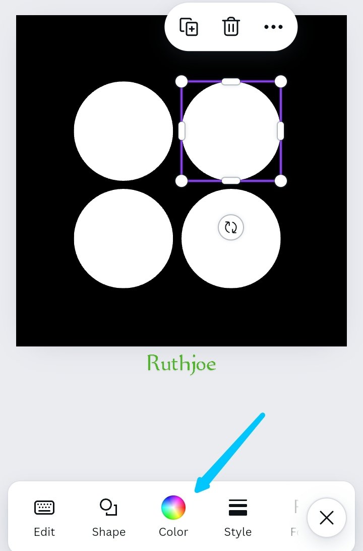
Step 6: I highlight the circle again and I click on the icon bearing the + sign to make duplicate of the circle. I click it 4 times which makes 4 white circles. As seen on the screenshot below, I went further to arrange the 4 circles well.
 |  |
|---|
Step 6: After arranging the circles. I click on one of the circles, highlighting it, then click on colour at the tool bar. I searched for the colour yellow and I selected the colour yellow to differentiate that particular shape from others. Immediately the yellow colour reflects on the circle highlighted.
 |  |  |
|---|
Now i have the image as instructed by the teacher below
| using 1080x1080 dimension/size dimension |
|---|
Hello @ruthjoe thank you for participating in this week's lesson. We have assessed your entry and we present the result of our assessment below.
Feedback:
• You have clearly defined Graphic design the way you best understand it, and I appreciate the fact that you went beyond the surface with your definition That's quite commendable.
• Your selection on the principles of design is apt, not only did you explain them, you also gave a visual representation of those principles just as you were taught, kudos to you
• Finally, your practical is quite detailed and comprehensive, you must have taken your time to work on this diligently...to finally get this result. Well-done. I hope you keep up with the energy level.
Regards
@lhorgic❤️
Hola mi querida amiga @ruthjoe, un placer saludarte
Has realizado un excelente trabajo amiga, se puede observar a lo largo de tu muy clara exposición como seguiste cada regla e instruccion dada por el profesor y además incluiste ejemplos a cada principio para hacernos entender más claramente su significado y objetivo dentro del diseño.
Gracias por compartir con nosotros detalladamente como realizar de una manera correcta la tarea de diseño encomendada por el profesor, ofreciendo ese paso a paso hasta ver el resultado final que te quedo impecable.
Te deseo mucho éxito. Un abrazo 🤗
Feliz y bendecido día @saintkelvin17. Gracias por tu apoyo. Que tengas un excelente día.
Upvoted. Thank You for sending some of your rewards to @null. It will make Steem stronger.
I like that you complete your task in very good way. And in this your work your interest is really showing your amazing work. And I really appreciate your efforts I am giving you a very best of luck for this
Te felicito . Con el resultado de tu trabajo se puede decir que lo hiciste muy bien ya que nuestro profesor es bastante estricto jejejeje suerte
TEAM 5
Thank you @nahela
Dear steemit member,
Your article & post is very nice.