SEC20/WK1: Introduction to Graphic Design and Principles.
Hello guys,
It's the first week of the Steemit engagement challenge for season 20 and I'm delighted to share my participation in this week's contest which is titled Introduction to Graphic Design and Principles. This is indeed a beautiful topic by @lhorgic as he has presented the lecture perfectly well.
I will be attempting the course today after reading through it carefully. I love graphic design and it will be an honor on my part to learn more. Without further ado let's get started.
| Question 1: What is Graphic Design? Briefly Share with me your understanding of graphic design |
|---|
The term graphic design simply means the art or model of communication with one another via graphics. This means that graphic design can also be seen as a means of communicating with one another through works of art such as topography, color, and many more.
Whatever one can see that passes the required message to the people around can be said to be graphics. So a graphic must always communicate a message and that is the main essence of it. If a graphic does give out the required message then the essence of it has been defeated.
So in summary, graphic design has to do with the design that is done by graphic designers with any of the graphic design tools such as computer software designers and many more.
When these tools are made available, a graphic designer will always creatively design something beautiful which is an idea that always comes from their mind with regards to passing a message to his or her audience or those outside the world.
Based on all we have said you will notice that graphic design is all about creating something that communicates a particular thing to the people who are watching or seeing the design.
So images, lines colors, shapes, and many more are the basic things that when put together give us the graphic design that we need. These designs can be signposts, billboards, fliers, and many more.
Seeing them alone gives you an idea about what the graphics are trying to communicate to you as a person. For instance, when you see a signpost, you will always see a description of a particular thing that made the signpost be kept there so that is the communication we are talking about.
| Question 2: Pick any three of the principles of Graphic design and talk about them based on your level of understanding. |
|---|
The lecture discussed various principles of graphic design but the ones I would like to talk about today include contrast, emphasis, and Rhythm.
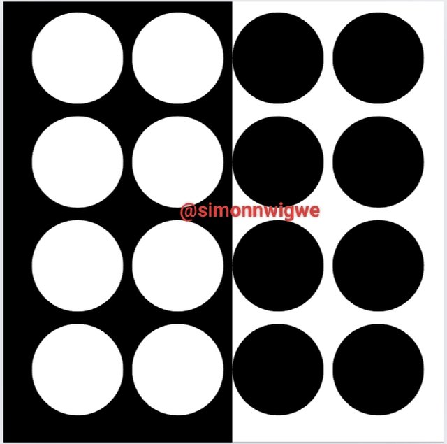
Contrast: This is an important principle in graphic design and the main aim of this principle is to show a distinction between two or more elements that look alike or are similar to each other in a presentation.
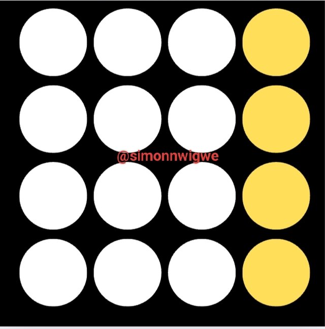
This distinction can be in terms of color, width, and size such as Dark vs Light, Thick vs Thin, Large vs. Small, and many more. Let's consider the image above as a guide to show us the impact of contrast in graphics.
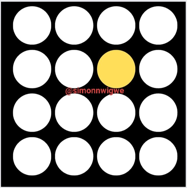
Emphasis: Emphasis as the name implies, is a principle used in graphic design to draw the attention of the viewers to a particular design or shape among a group of many designs. You can have a group of designs of similar things the only way to make one or more stand out among the others is to apply the emphasis on it.
Considering the screenshot of the image above you can see the image where this emphasis has been placed. I guess the moment you looked at the work what drew your attention was the shape with a different color as you will always want to find out what is so special about it that made it has another color.
Rhythm: Another unique principle that caught my attention deeply is the rhythm. These principles help to give elements an attractive and presentable look. Now let's consider a work below where we see rhythm in action.
When you have a list of items and then you have a particular color you wish to align in the same direction you can go ahead and keep it in a proper way as such so that it captivates those who view it. So rhythm is a nice principle that makes design more beautiful.
| Question 3: Practically show us how to make the graphical image below. |
|---|
Based on the guide given in this course, I will follow the same steps to show how I can perform this task. So let's go ahead together to see how it goes.
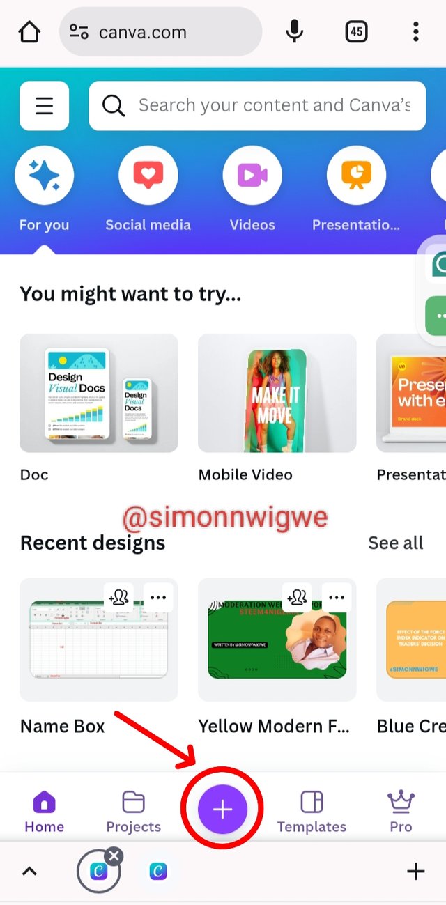
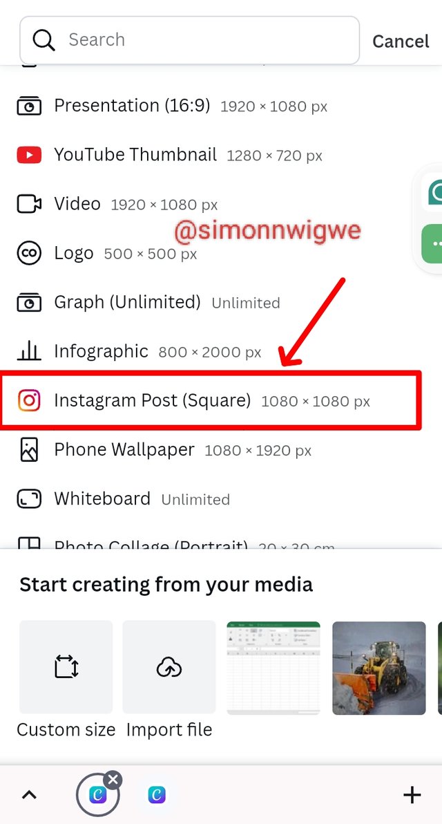
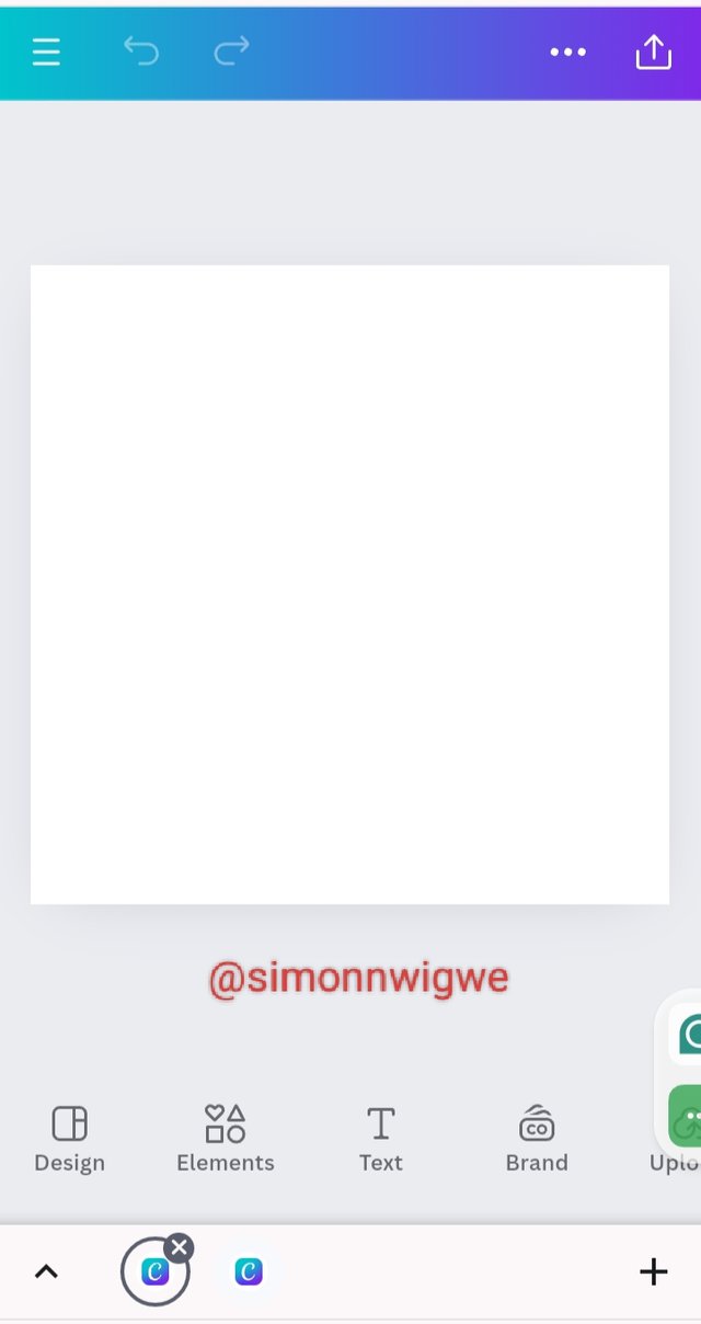
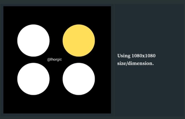
Step 1: GOTO your canvas app or browser and then click on the plus "+" button as seen in the screenshot below, this allows you to select size here we are to use the 1080 * 1080 as seen in the image below.
 |  |  |
|---|
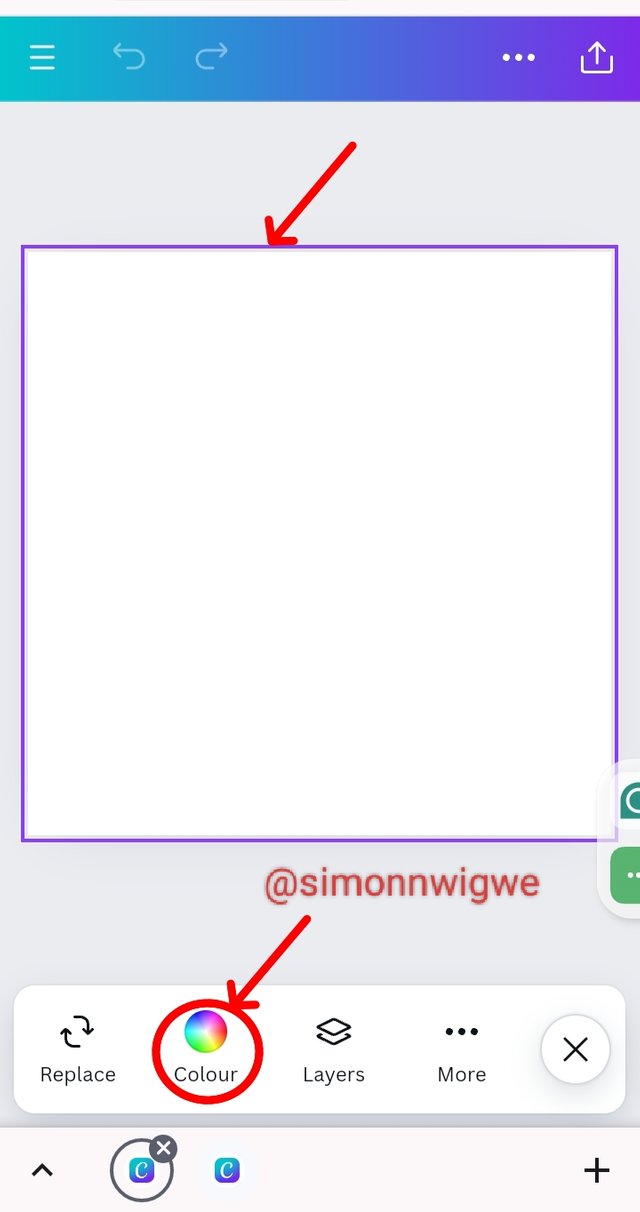
Step 2: Change the color by going to the color icon present on the toolbar. Drag the highlighted part upward to show the range of colors. Select the black color.
 | 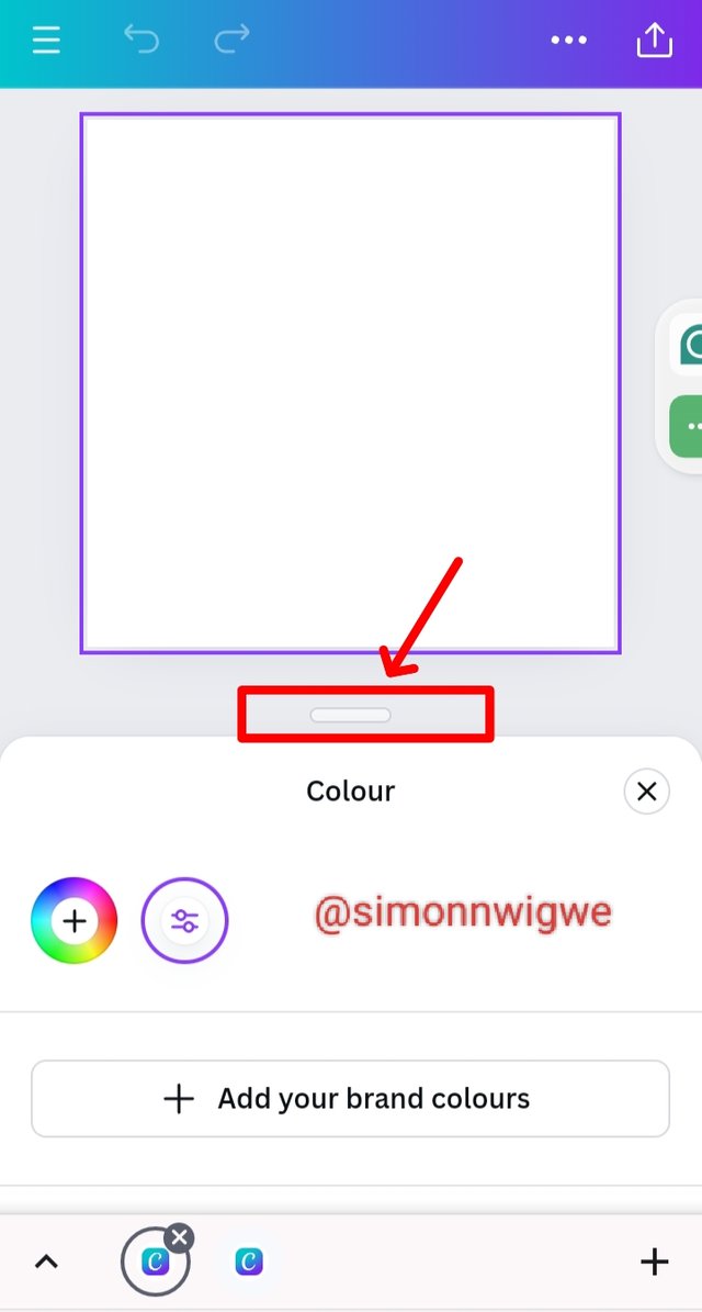 | 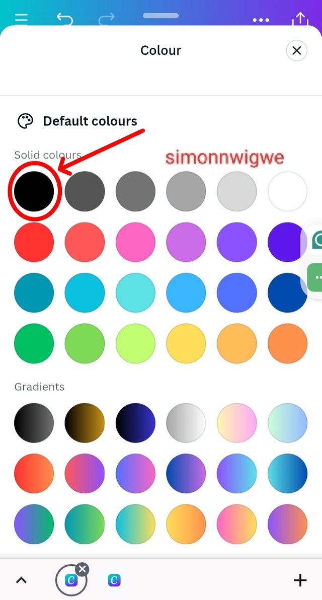 |
|---|
Step 3: From the above images you will see we have a black background already. Go to Elements and then search for a circle and then click to add it to your background.
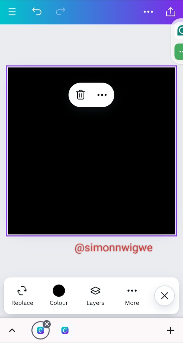 | 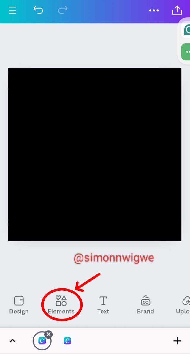 | 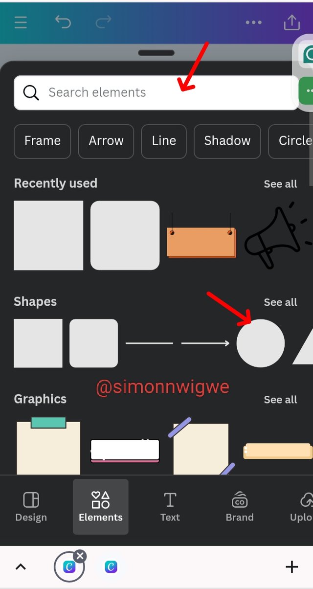 |
|---|
Step 4: Seeing the circle shape in our background we may want to change the color by clicking on it and then going to the color panel and selecting a color of our choice in this case white. You can hold the tips to the sharp to enlarge or reduce.
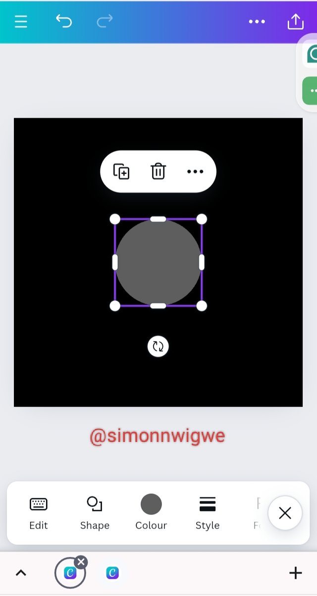 | 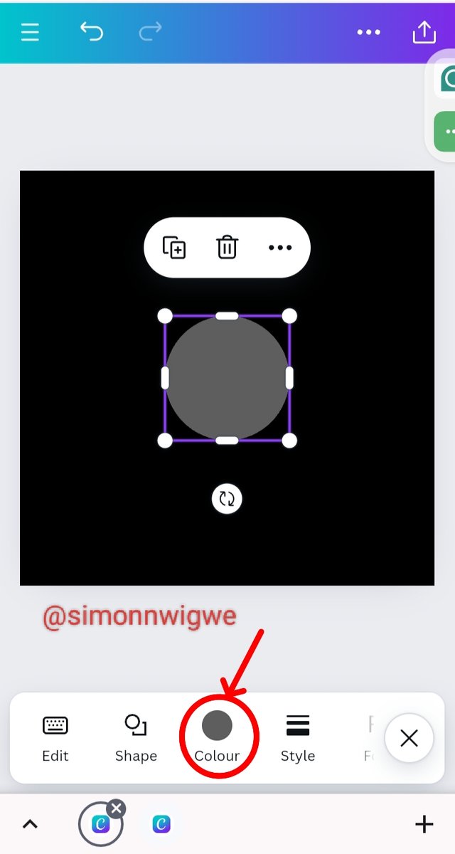 | 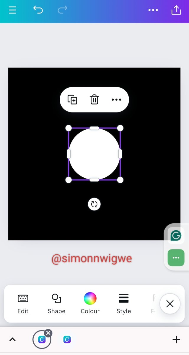 |
|---|
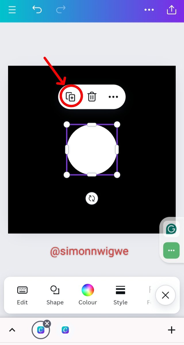
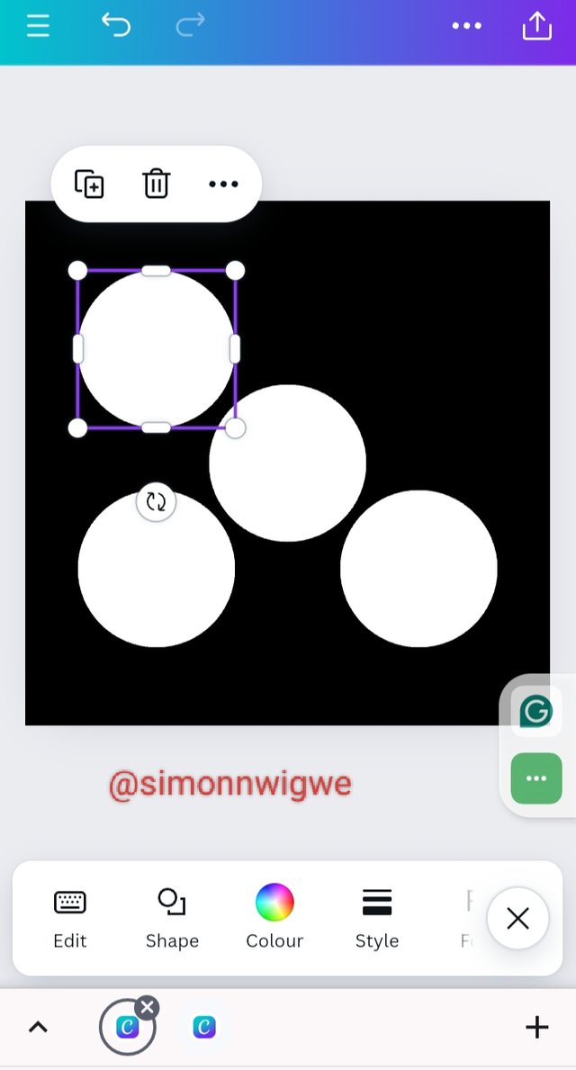
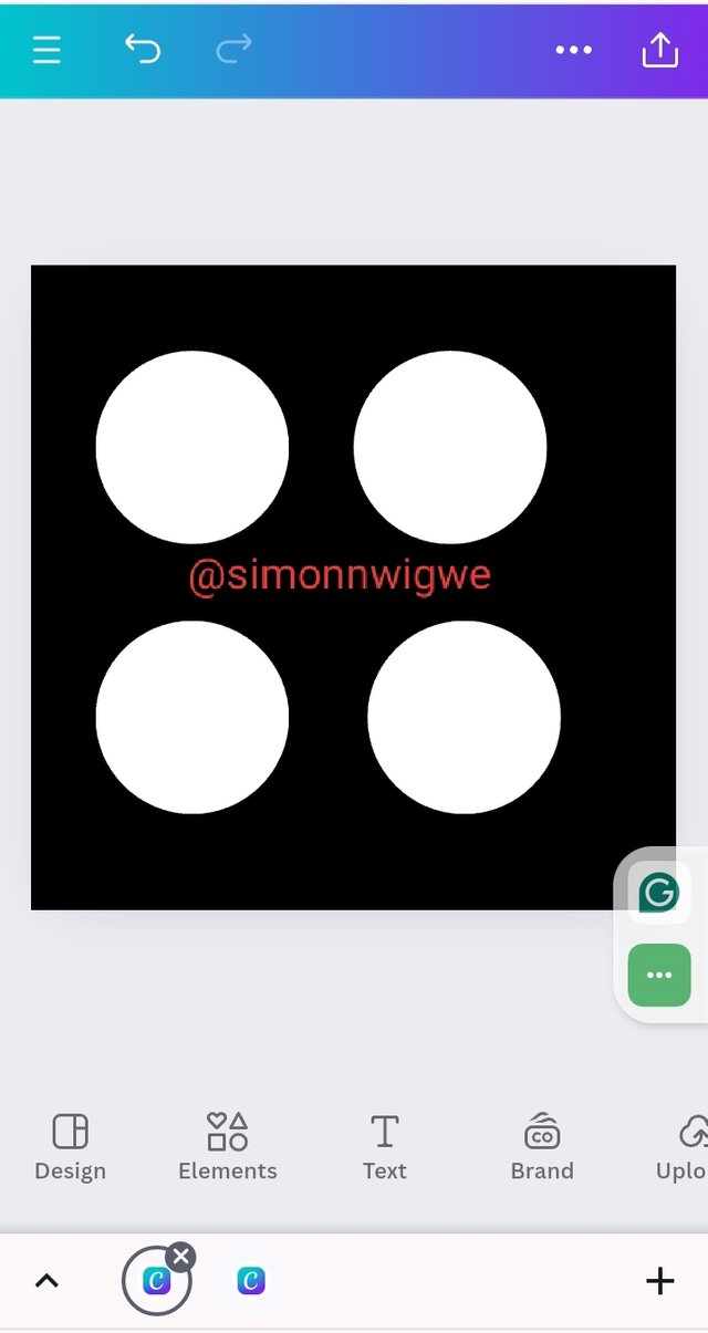
Step 5: Since we have the shape in white, the next thing to do is to click on the plus button and duplicate it into 4 as seen below, and then take your time to arrange them thereby dragging them and putting them in where you want them to be.
 |  |  |
|---|
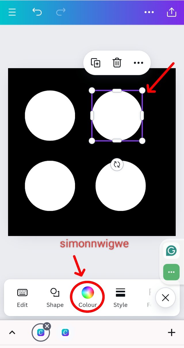
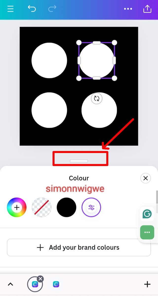
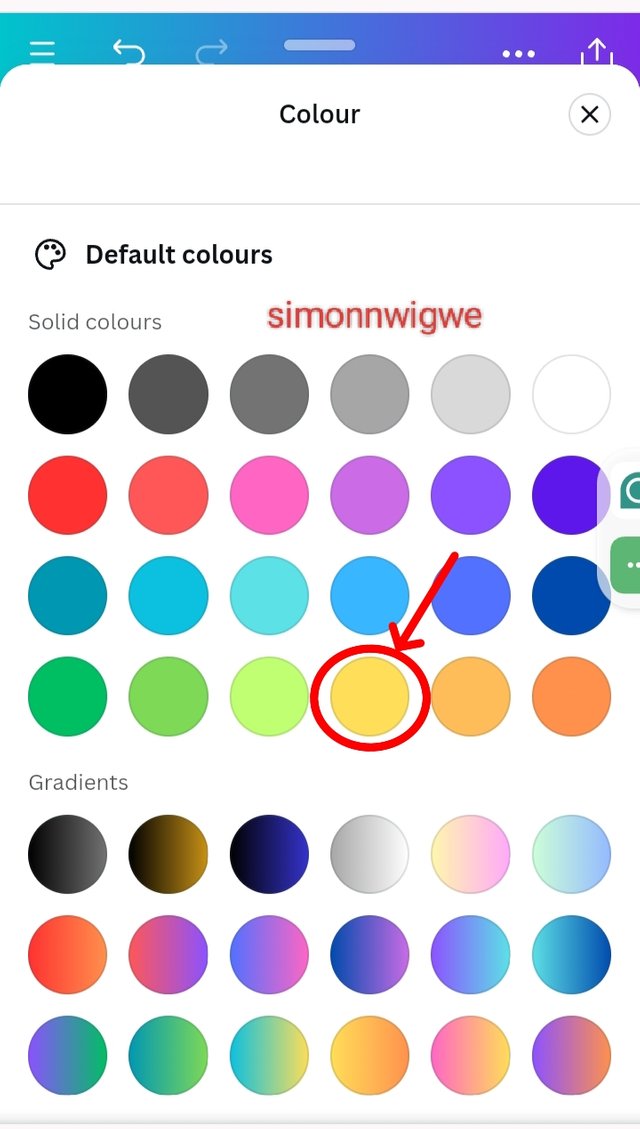
Step 6: Click on anyone and then the color panel will appear, click on it and the point marked in the image below, and then select from the colors the one you want to see as you can see from the screenshot below.
 |  |  |
|---|
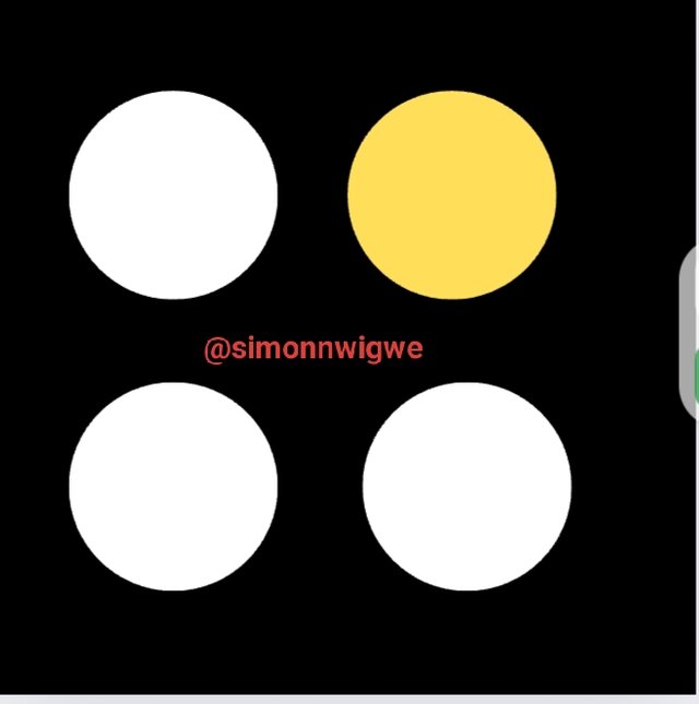
Step 7: If you did that properly you should have the output of the result presented below.
From the work seen above you will agree with me that I learned very well from the tutor as I was able to replicate the same thing he talked about. I want to invite a few friends like @josepha, @suboohi, and @dove11 to join the contest.


Hello @simonnwigwe, thank you for participating in this week's lesson. We have assessed your entry and we present the result of our assessment below.
Feedback:
• You have clearly defined Graphic design the way you best understand it, and I appreciate the fact that you your time to delve even deeper. That's quite commendable
• Your selection on the principles of design is apt, not only did you explain them, you also gave a visual representation of those principles just as you were taught, kudos to you
• Finally, your practical is quite detailed and comprehensive, you must have taken your time to work on this diligently...to finally get this result. Well-done. I hope you keep up with the energy level.
Regards
@lhorgic❤️
Thank you, friend!


I'm @steem.history, who is steem witness.
Thank you for witnessvoting for me.
please click it!
(Go to https://steemit.com/~witnesses and type fbslo at the bottom of the page)
The weight is reduced because of the lack of Voting Power. If you vote for me as a witness, you can get my little vote.
Upvoted. Thank You for sending some of your rewards to @null. It will make Steem stronger.
I will bookmark your post as I have never used Canva for anything so far but I am eager to learn it. I am sure your post will make me wiser in this department.
It is really an amazing practical work. Your explainiing method is really impressive. Because you have explained in very detail by step by step method. And in this way you showed very easy method. And I really appreciated. Good luck
Hola mi querido amigo @simonnwigwe, un placer saludarte
Debo felicitarte por tu excelente trabajo amigo, cuídaste cada detalle y cada instrucción dada por el profesor, incluso profundizaste un poco más dejando bien concreto como realizaste este reto y como llegaste al resultado final exigido para la valoración de este 1er curso.
Gracias por compartir con nosotros tus conocimientos tan bien detallados. Te deseo mucho éxito. Un abrazo 🤗