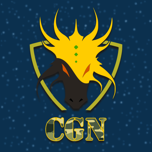
Look at the logo I made for my private gaming team

I took the dragon shape from the Internet, but the final coloring, composition and details are mine. Feel free to post your opinions, criticisms, and to use it freely!
NOTE: I'm new to Steemit, so if you have any tip for a newcomer like me, please share it 😊 !
There doesn't seem to be enough contrast between the bottom dark half of the head and the blue background. It's hard to tell where the head ends and the background begins. Just my personal thoughts. Despite that I still very much like the design :)
Actually, the head was white before :D . We spent 15 minutes trying to choose what we preferred, and we chose the black. In fact, I thought the same as you, but it was a group decision, and I liked black too.
Congratulations @josem11200! You have received a personal award!
Click on the badge to view your own Board of Honor on SteemitBoard.
Congratulations @josem11200! You have received a personal award!
Click on the badge to view your Board of Honor.
Do not miss the last post from @steemitboard:
Congratulations @josem11200! You received a personal award!
You can view your badges on your Steem Board and compare to others on the Steem Ranking
Do not miss the last post from @steemitboard:
Vote for @Steemitboard as a witness to get one more award and increased upvotes!